Supermarket Eurospar Vorkloster
Austria
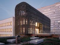
The 100-meter long structure creates a single large form that stands out in its clarity from the neighbouring buildings. It is impossible to miss the vast sign made of perforated trapezoidal copper sheet, which spans the entire horizontal scale of the building. Large parts can be mechanically lowered, which signals passing customers either “open” or “closed”.
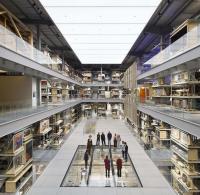
Behind the finely perforated umbrella, which also shades the mostly glazed southern front, the sales hall and a covered ground-level parking share the space. The entire basement serves as an underground parking. Two escalators facilitate access to the sales floor. The structure of the one-story building is based on a wide-meshed column grid of 12 x 16 meters, which hardly appears in the sales hall, even if the columns made of reinforced concrete remain visible. Their slim proportions, fostered through the generous ceiling height and low roof loads, grace them with unusual elegance. The solid fir wood ceiling, which rests on high and slender glulam beams, forms the roof. Planks, twelve centimetres thick and 20 centimetres wide, form slabs, whose material effect determines the architectural space. The positive impression of wood does not need to be shielded. The sparingly and accurately set up lighting, ventilation and security technology installations fade into the background given the clarity of the support structure.
As with all supermarkets, the interior design follows micro-economic and company-specific considerations. The architectural means used in the Eurospar supermarket are rather sparse. This includes an architecturally effective but economic structure, a clearly structured floor plan, carefully defined proportions and the special element embodied by the perforated sign. This building encompasses more architectural content than a common “decorated shed” and is, at the same time, a good example where less is more.
- Architects
- Dietrich Untertrifaller
- Location
- 6900 Austria
- Year
- 2006
- Structural engineering
- Mader Flatz, Bregenz
- Building service
- Synergy, Dornbirn


