Aesop Bibliotekstan
Stockholm, Sweden
- Architects
- In Praise of Shadows Arkitektur
- Location
- Stockholm, Sweden
- Year
- 2014 Architect
In Praise of Shadows Architecture / Fredric Benesch, Katarina Lundeberg, Klara Stigner
Artist/Sculptress / Elm
Lies-Marie Hoffmann
Wood
Dinesen Hearth Oak
Lighting
PSLab
Suspended lamps
Simon Klenell
Aesop Bibliotekstan / In Praise of Shadows Architecture with Lies-Marie Hoffmann
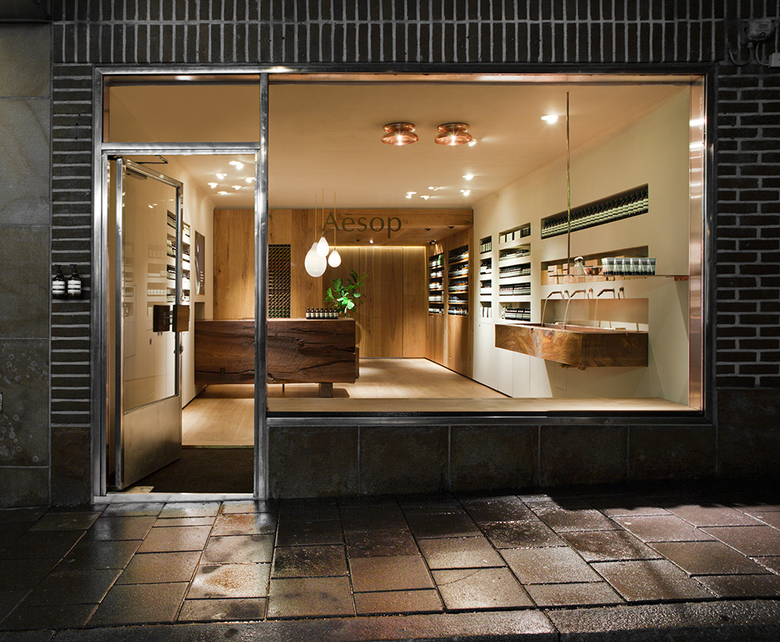
Aesop Bibliotekstan is Aesops first Swedish signature store and also the first store in the Nordic countries. For Aesop Bibliotekstan we have worked with three primary sources of reference, the philosophy of Jun'ichirō Tanizaki and the films of Ingmar Bergman and Lars von Trier. The essay “In praise of Shadows by Tanizaki is a book of reference for Aesop as well as the book from where we borrowed the name of our office. In this essay Tanizaki praises the traditional Japanese architecture and aesthetic and brings forwards the qualities of materiality, patina and tactility. Our brief also included the ambition to be local and the reference to the movies of Trier and Bergman was a way to pin down the character of the space and the view of what kind of Swedish the store should “speak”. To us this was an attitude allowing us to turn away from the mainstream “Nordic design” tradition.
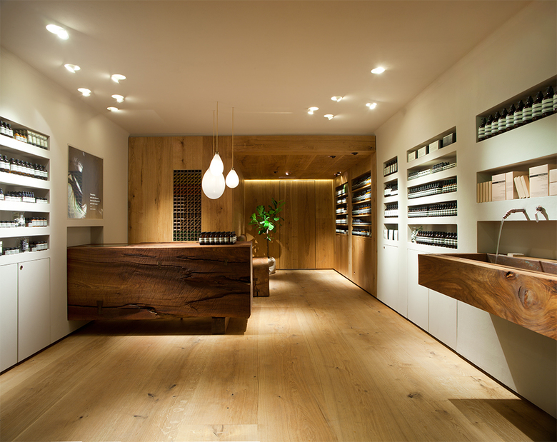
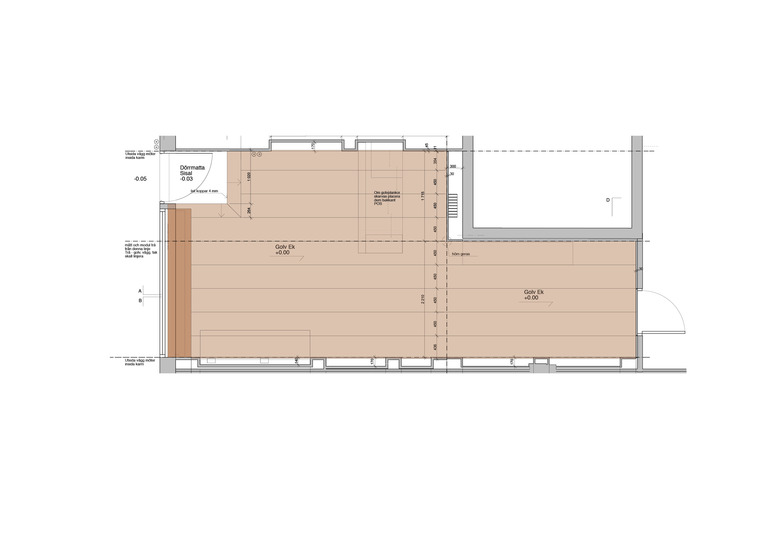
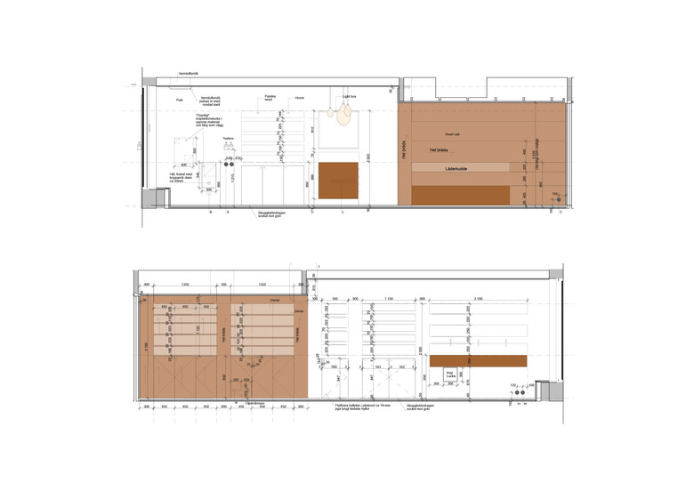
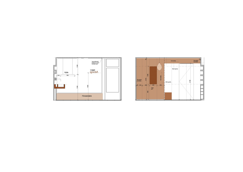
The reference to Tanizaki guided us to a spatial thinking inspired by the traditional Japanese architecture where a spatial grid and module guides the space, the borders of the rooms and how they connect to the outside as well as the division of its surfaces. Within this grid, scale, mass and materiality have been our tools to create a space with the ambition to be comfortable, inviting and although the room is small, creating a rich tactile experience and a sequence of spaces.
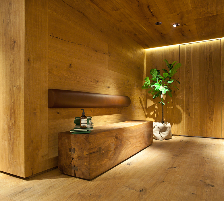
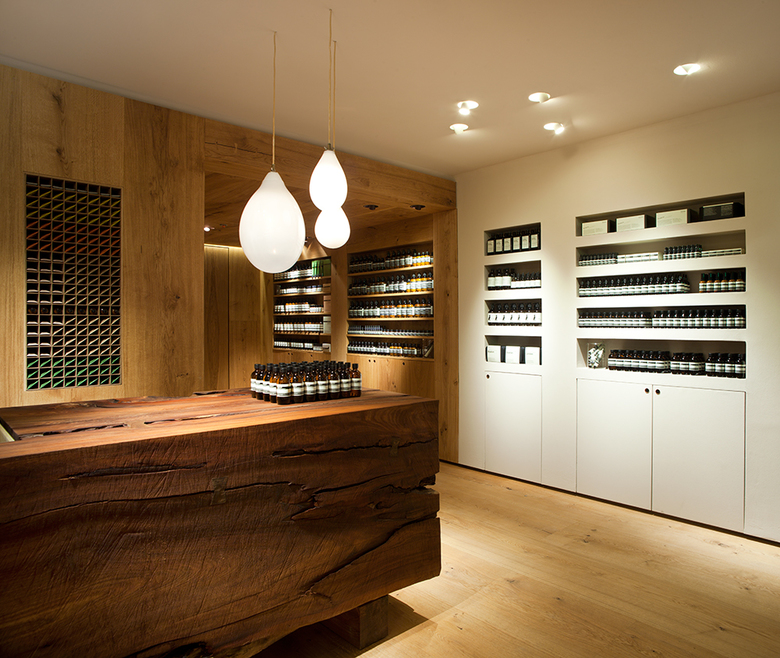
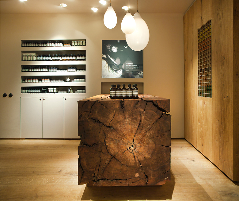
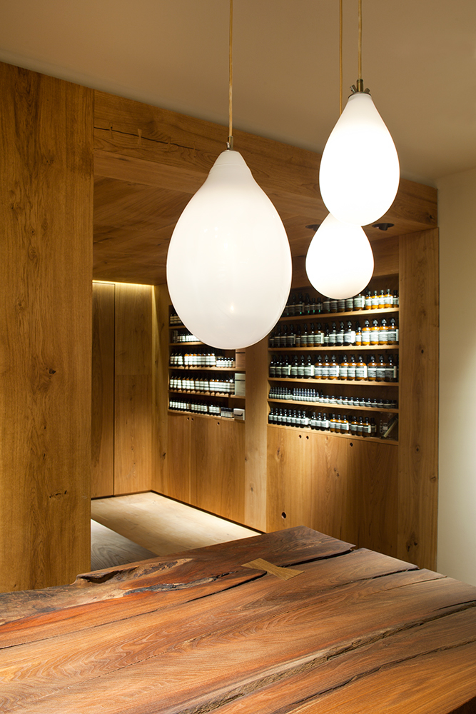
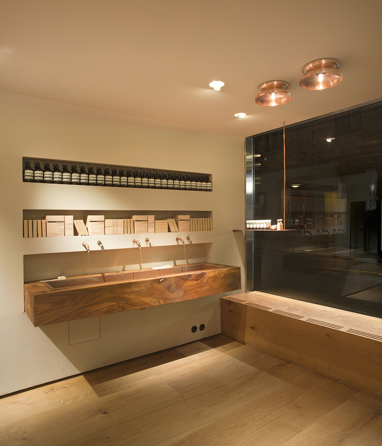
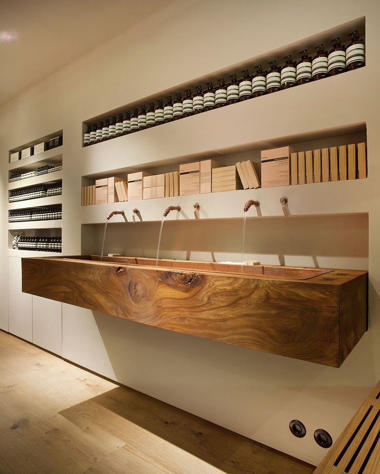
Old wood and plaster shapes a store space divided in two, the open and the intimate. The floor as well as the walls and roof of the inner space are Heart Oak from the Danish producer Dinesen. With reused elm tree timber from Djurgården in Stockholm and Järna (taken down since infected by the Dutch elm disease) we have together with wood artist Lies Marie Hoffman shaped three functional pieces the point-of-sale counter, sink and complementary bench. Lies- Marie works the wood using chainsaw and chisel and we have together formed a geometry that lifts the timber´s inner growth lines and reveals its unique beauty. Oak butterfly joints keep cracks together. All the wood is oiled to keep the tactility of the material intact.
The contrast of the timber’s controlled shape and uncontrolled structure is very important to us. Just as in the films of von Trier and Bergman, where the inner forces of the characters are suppressed and controlled by social conventions and/or relations to others, the drama lies in the contrast. These massive, simply hewn forms also provide textural contrast with smooth beige plaster wall, and timber floor, walls and ceiling. The plaster wall has a warm light beige colour. Interior details in copper and leather will age beautifully together with the elm and the oak and the patina of time and use will work the materials even closer to each other.
A complement to the roof light by PSLab is the hand blown suspended lamps by Simon Klenell.
Related Projects
Magazine
-
Being Arthur Erickson
2 days ago
-
NEOM Updates
3 days ago
-
Mind the Gap
3 days ago
-
Watchtower Einderheide
5 days ago
