Adelaide Wharf
London, Great Britain
- arkkitehdit
- Allford Hall Monaghan Morris
- Year
- 2007
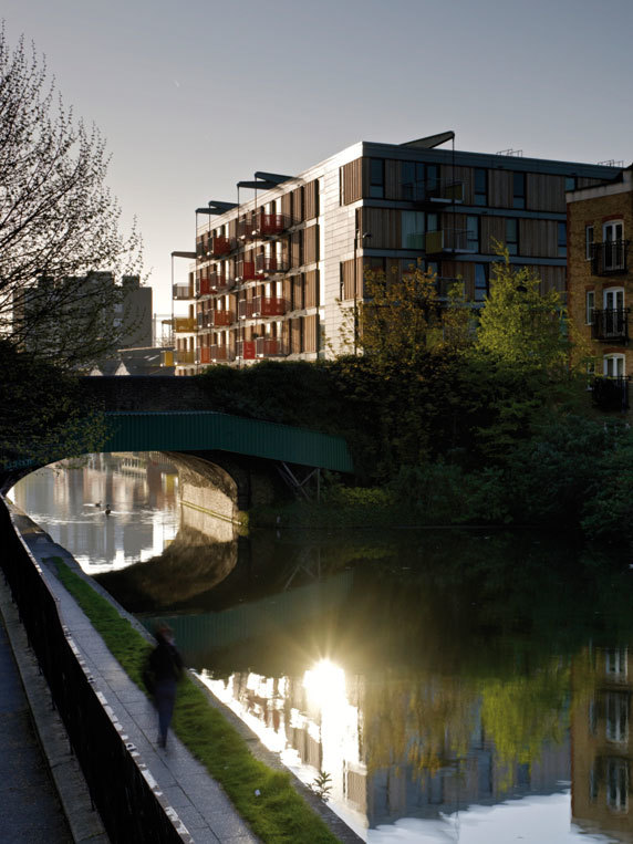
Adelaide Wharf is a pioneering mixed tenure housing scheme comprising 147 new homes and 650m² of workspace. Located on the Regent’s Canal in Hackney, a key regeneration area of London, First Base has created sustainable, adaptable and well designed homes set within a safe environment with communal facilities for all residents.
The scheme is the first to be delivered as part of English Partnerships’ London-Wide Initiative (LWI) with a mix of privately sold, Key Worker and socially rented apartments. There is no visible differentiation between tenures and all of the homes are built and managed to the same high specification.
Adelaide Wharf combines sophisticated urban intervention, emerging efficient construction technologies and the latest thinking in residential development.
Social Housing and Tenure Mix
The LWI is a scheme by English Partnerships that aims to substantially increase the supply of affordable homes for Key Workers in London, in mixed tenure schemes. The LWI scheme also aims to encourage exemplars for regeneration of disused and abandoned property in key London Boroughs.
In September 2004 Allford Hall Monaghan Morris submitted designs for First Base’s London Wide Initiative bid, based on the prototype developed in the housing study above. The bid having been successful, Adelaide Wharf in Hackney was then one of three sites allocated by English Partnerships for First Base to develop. The site had an existing planning consent for 131 flats (33 of social rented flats), and 1600 m² of B1 office space. Allford Hall Monaghan Morris rationalised the proposals and a new planning application was consented by LB Hackney in December 2005.
Adelaide Wharf combines high quality privately owned apartments with shared equity Key Worker and social housing in a non-hierarchical architecture and no visible differentiation between tenures. Whilst the private apartments overlook the canal, the social housing element enjoys views over the expansive park to the south and beyond to the City skyline. The effort to ensure a social mix stripped of stigmatisation is a profound and important innovation, one that more than meets the Mayor’s criteria, indeed pushes ambition far beyond the mandatory concessions to affordable housing. This is a major milestone for English Partnerships and the Housing Corporation, which provides significant funding for the socially rented homes at Adelaide Wharf.
Also at Adelaide Wharf, First Base developed an innovative home ownership scheme, HomeHold™, which enabled purchasers to own their home with no extra rent to pay, and a proportion of any uplift in value being shared with the landowner when the property is sold on. The 41 Key Worker apartments at Adelaide Wharf were reserved within three hours of going on sale through HomeHold™.
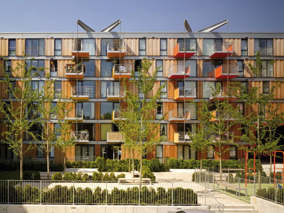
The Adelaide Wharf site is in a residential part of Hackney, with the Regent’s Canal to the north and Haggerston Park to the south. It was previously used as warehousing in a brutal building, on the site of an old timber wharf. The six storey block wraps around three sides of a landscaped courtyard defining the edges of the city block, and the two street elevations have coloured entrance courts lined in glossy vitreous enamel cladding panels punched through between streetscape and courtyard, linking into the circulation cores in each corner. The plan of the upper residential floors is based on a rotational symmetry about the two cores, from which the corridors radiate out. The three blocks express this rotation externally in the way in which they turn the corners and their gable ends are clad.
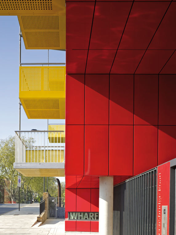
The two main entrances to the building are sheltered and gated outdoor spaces, double height slots extruded through the building, which are lined in glossy vitreous enamel cladding panels. They emphasise the break in the block at street level and frame views of the garden from the streetside. Graphics and the strong colour give each entrance a clear identity and address. Enclosed stair lobbies, post-boxes and concierge’s facilities for the housing above are located to the side of these entrance courts. The cores take up the shift in the building grid at each corner, and the break is used to provide a full height slot window from lobby glazing up to a roof light, maximising daylight in the circulation, and providing views into the landscaped courtyard from each lift and stair landing.
The circulation is arranged in double banked corridors, each with daylight at one end to orientate the user. The corridor ending at the canal has a fully glazed slot, and double and triple height voids next to the window, to maximise the amount of daylight falling into the corridor, and to dramatise the view.
The main entrance lobby and stairwell is lined with a 16m tall printed timber pattern by local artist Richard Woods echoing the former use of the site and the external cladding. Richard Woods was selected after a design competition run by First Base at neighbouring artist studio The Tannery.
The ground floor is a smooth engineering brick base, taking up the changes in level as the road climbs towards the canal bridge. Recesses and projections on the ground floor create a series of events on the street, with coloured doors acting as a contrast to the brick. The entrances to the ground floor 4 bed flats each have stairs projecting onto the street, defining their defensible space.
The cladding to the upper storeys is lighter and more textured in character, and consists of vertical boards of rough sawn Siberian Larch, fixed board on board to emphasise the vertical grain, set between bands of smooth zinc. Its fenestration has two repeating window patterns, one of large window openings to the living rooms, and one of vertically proportioned windows onto the bedrooms. This pattern repeats around the building reflecting the arrangement of the flats inside, and the whole treatment is unified by the horizontal zinc band running at each floor level.
Each flat has a balcony supported from beams at roof level, cantilevering like lifting beams on warehouses. Each balcony is clad with a coloured plane with a single fold in it, and offset from the windows, cantilevering in alternate directions at each floor to produce double height gaps between them and reduce overshadowing to the living rooms below. The colours on the planes of the balconies are then graduated across the façade, which are seen to best advantage obliquely down the street.The courtyard at the heart of the scheme is a shared garden for use by the residents, the landscaping providing a focus when viewed from above and from the street. Simple use of geometric lines relating to the façades, circulation and lines of movement through the site create a variety of smaller spaces for the use of different groups of people for resting or playing in the space simultaneously. These are formed by lines of hedges and trees delineating different simple surface finishes.
Related Projects
Magazine
-
NEOM Updates
Today
-
Mind the Gap
1 day ago
-
Watchtower Einderheide
2 days ago
-
An Uplifting Architecture
3 days ago


