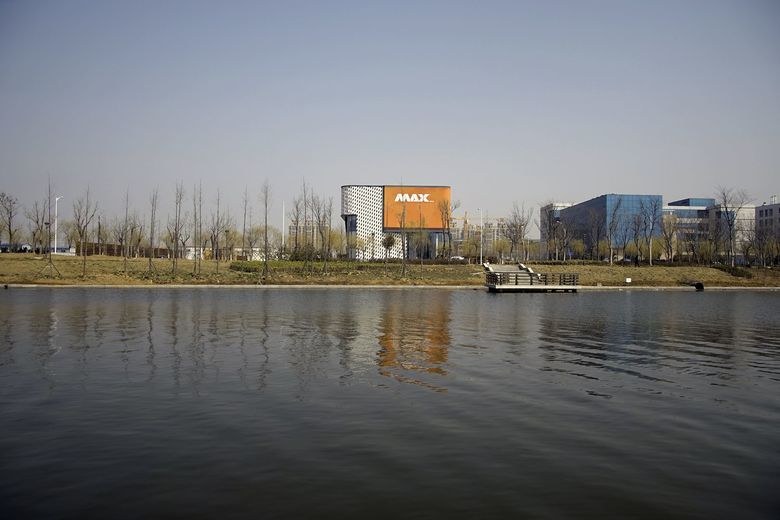
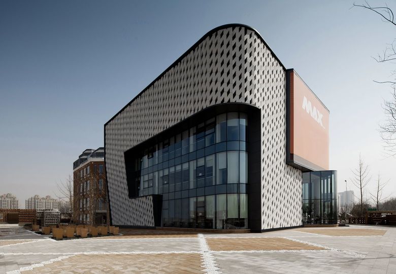
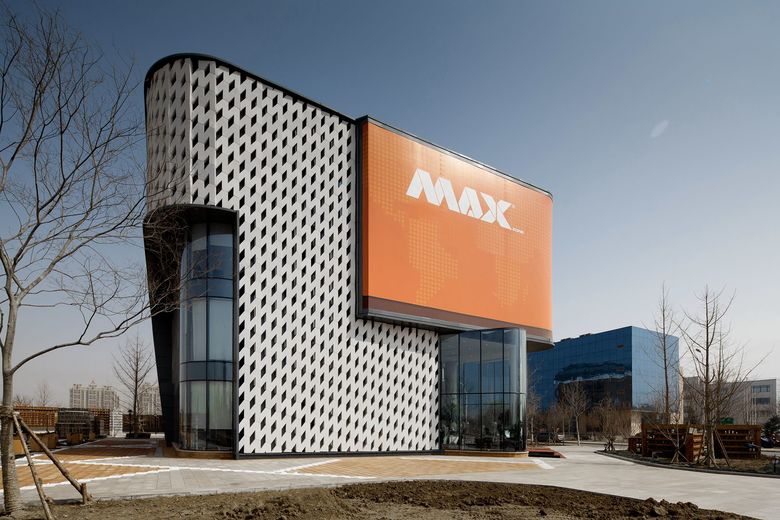
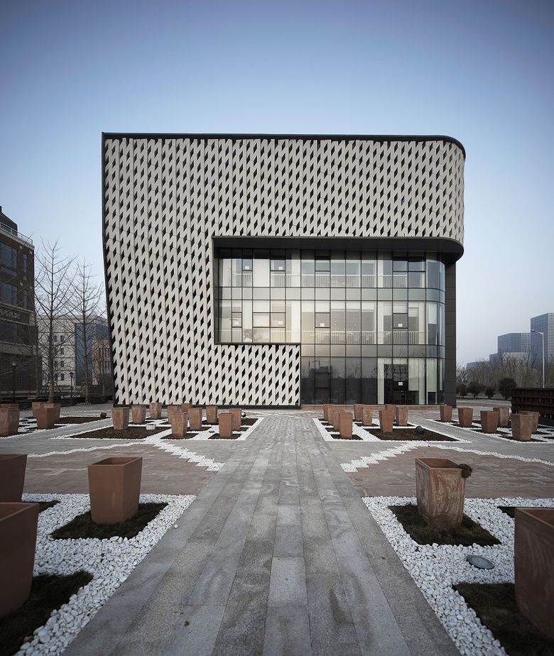
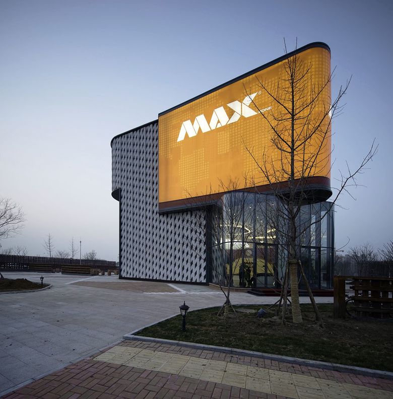
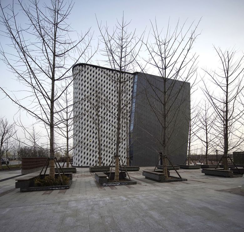
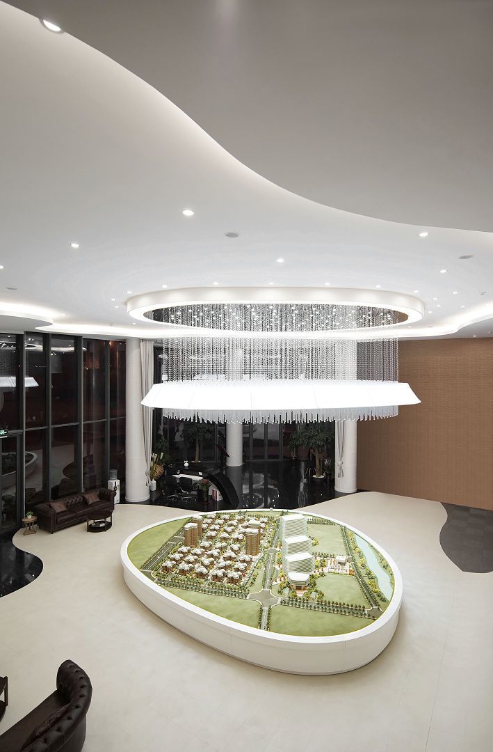
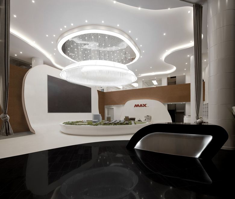
Our client for this project is under process of developing the company into enterprise groups. The MAX Show Center, along with the grouping process, will be located in multiple cities. In order to receive a maximum visual presence, the show center will always be placed at a corner of a road crossing. For purpose of building efficiently as well as economically, the show center was to be designed as a prototype and multiplied in different cities.
With no reference to a specific physical or cultural context, the design started from understanding culture of the company, and rationalizing the show center’s inner structure and space use. The architecture then is conceived as a “gift box” to present a proposal represented through a physical model showing the company’s vision of development for that area .
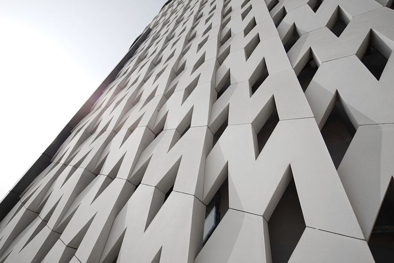
For visitors the “gift” is revealed through a spatial sequence constructed by an architectural adaptation of the company’s logo “MAX”: M as module of the facade, A as a front desk, and X as wrapping of the gift – floor material extending to the wall. The “M” screen and “M” patterned perforated metal panel add refinement and delicacy to be inviting to visitors. The screen is made from GRC blocks in the shape of “M”. Four M blocks comprises a unit that repeats on the facade, creating a three dimensional screen that facilitates natural ventilation from inside and registers change of day light from outside.
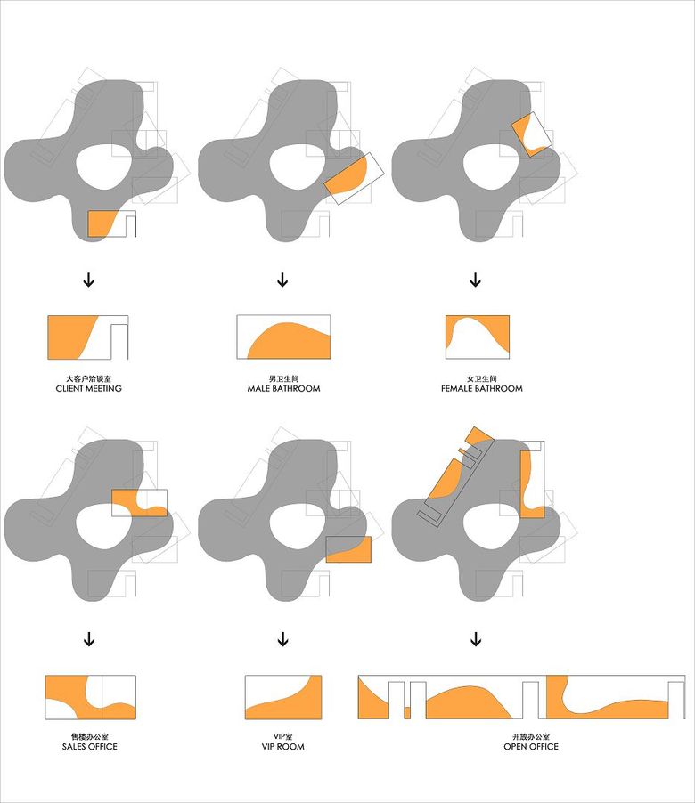
The interior design has left some room to bring in a local feel. The show center’s first location is Qingdao, a previous German colonial city. In this case, part of interior wall was applied with red brick that is typical impression of old part of the city. Some segments of curves from the “X” in the show room is carried onto walls of other individual spaces to emphasize the theme symbolized by “X”, reiterate color of the logo, and to provide visual pleasure as well.
