Aesop SoFo
Stockholm, Sweden
- Architects
- In Praise of Shadows Arkitektur
- Location
- Stockholm, Sweden
- Year
- 2016
Architects
In Praise of Shadows
Fredric Benesch and Katarina Lundeberg
Carpenter
SoloSuMisura, Milan
Light Design
Concept Design, Oslo
Glass vase
Simon Klenell
Work on site
Öhmans Bygg och Fastighet AB
Photos
Ludger Paffrath
Ludger Paffrath
A domestic character – a living room
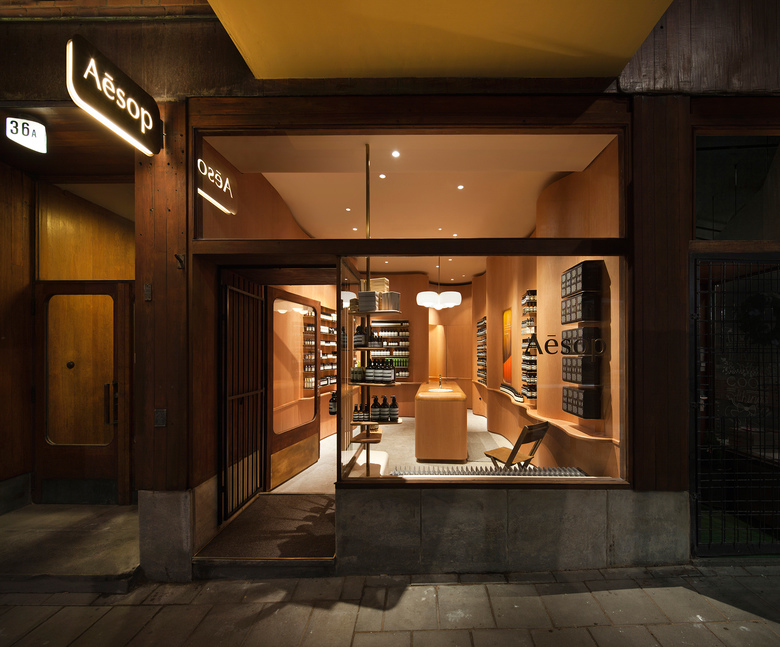
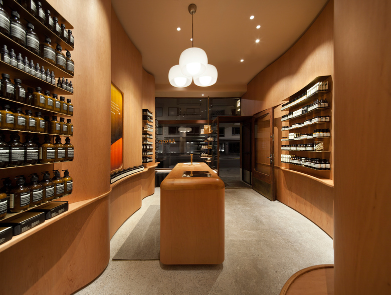
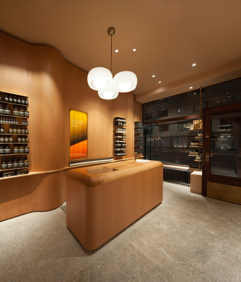
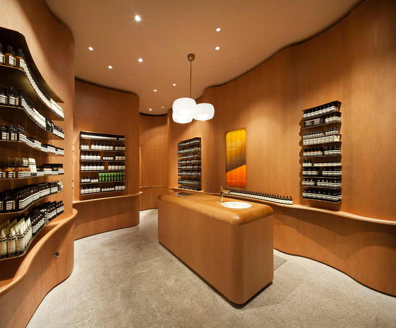
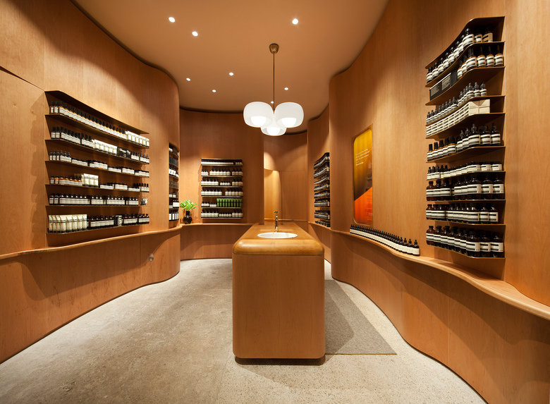
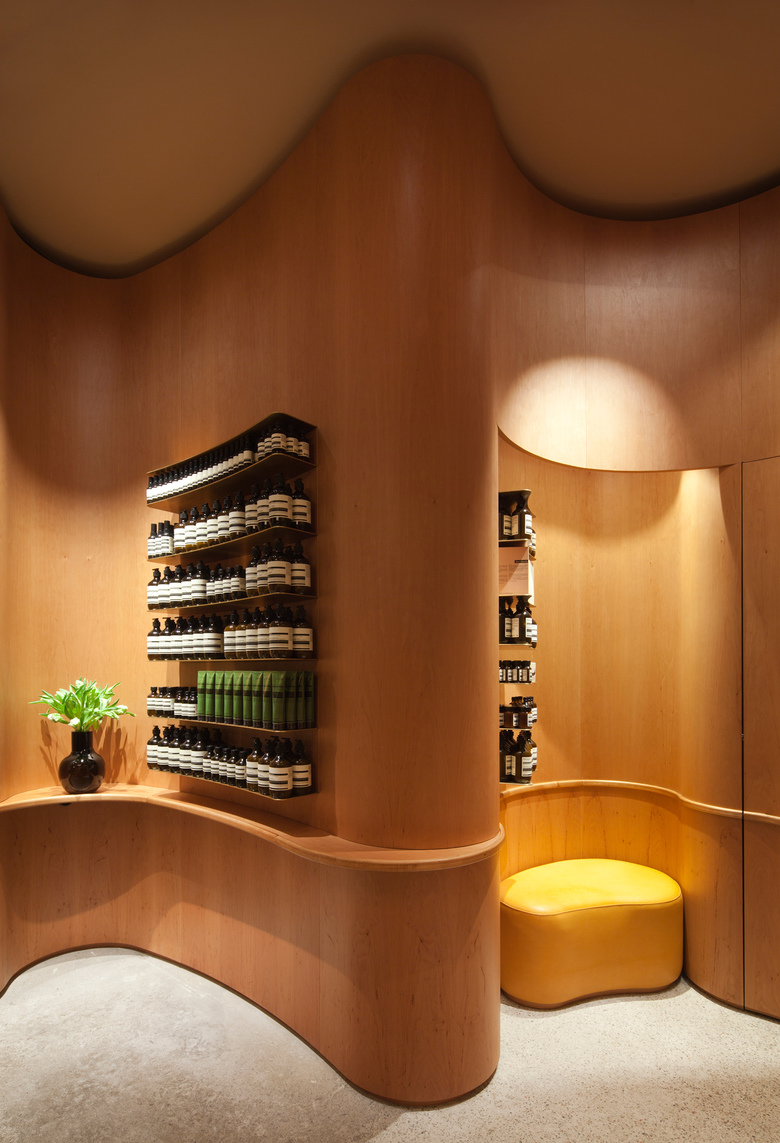
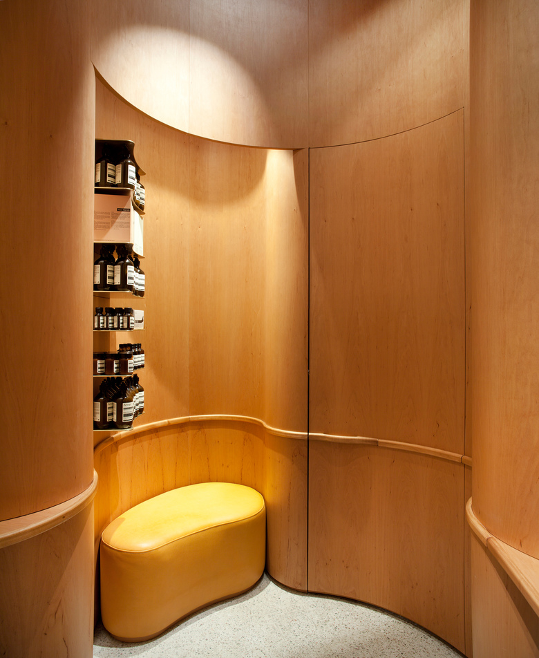
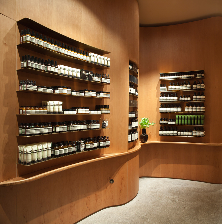
The character of the SoFo area in Stockholm is informal and intimate and we wanted to bring this atmosphere also in to the design of the Aesop SoFo store. The space is very small and we wanted the space to be open and inviting and like a domestic living room. Inspired by the architect Gunnar Asplunds way of using bent wood in an functionally and spatially defining way at the Woodland Cemetery chapels we choose to use wood in a 0.7 mm thin layer of veneer of that is curved to a geometry that unifies the space that was shattered by pillars and stair volumes. While shaping the room in this soft manner way we also sought the resemblance to the draped curtain of a domestic living room. As for a curtain the materiality and colour gains very tactile and subtle qualities by the play of light and shadows created by the geometry. The geometry is also formed to create situations for the product displays and a seating niche in the back and the verticality of the geometry enhances the height of the space.
Materials
The materials chosen are simple in the tradition of Swedish handicraft and design sprung from the Swedish culture of reduction and simplicity. The wooden veneer is alder. The pattern of the wood is clear but calm and the colour is warm. It matches the existing teak on the façade and in the entrance area but is a bit lighter. The alder veneer of the curved walls are paired with massive alder wood in details when needed due to durability, construction or for an appearance of solidity. The brass shelves for product display are slightly patinated.. The lower continuous wooden shelve transforms in relation the different situations to create shelves for display, a door handle or just a horizontal line that ties the geometry together. The concrete of the floor is a massive contrast to the thinness of the veneer. The existing concrete floor, hidden for 80 years under layers of tiles was grinded to a smooth but still rough surface, so that the aggregate becomes visible. The roof is painted in a pink/beige colour to match the veneer but lighter to achieve a contrast to the walls and to show the shape of the space in the relation to the roof where it is readable as a whole. The leather of the Bench is of vegetable tanning from Tärnsjö and will age beautifully.
The centrepiece
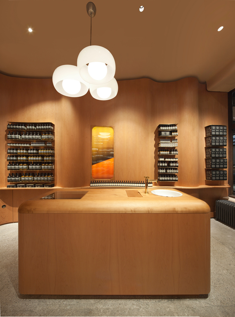
In contrast to the complex geometry of the surrounding walls the shape of the centrepiece, with point of sales area and demonstration sink is strict and simple but softened by rounded corners in plan and in section. A detail that relates to the rounded corners of the frame of the glass in the original entrance door. The lower part is of veneer as the walls and the top of massive alder for a more solid character. The sink recessed in the top is a vintage one of enamelled metal.
Handicraft materials / Everyday objects
The further enhance the domestic character and to take on the handicraft tradition of the area we have sought a set of interior objects with high quality of design and handicraft. The vintage lamp and chair are accompanied by a contemporary handicraft design object, a vase in black glass blown for this project by Simon Klenell.
Local Tradition
In the 19th century poor, energetic hard working people started to create the Södermalm atmosphere of handicraft with leather-, glass-, weaving- and woodworking located on the hills close to the old town and the shipping and merchandise area for exchanging goods. Today Södermalm and the SoFo area (South of Folkungagatan) is still a hub for the creative and people dedicated to quality in all sorts of small scale production and design. We where lucky when we together with the Aesop team found finally found a suitable space in the beautiful 30 s house by well renowned architects Backström & Reinius. The building is well sustained with most original details intact and the building in itself became one strong source of inspiration for the design.
Related Projects
Magazine
-
Winners of the 5th Simon Architecture Prize
6 days ago
-
2024, The Year in …
1 week ago
-
Raising the (White) Bar
1 week ago
-
Architects Building Laws
1 week ago
