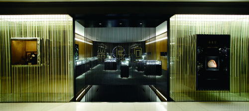
CUIFOTANG DEJI SHOP NANJING
Nanjing, China
- Architects
- ATELIER XUK
- Year
- 2010
Chinese has a special affection of stones, Jade-dubbed as the king of the stones, has been loved and collected by Chinese since long time ago. In 2010, XÜK was committed by CUIFOTANG, one of the biggest vendors of jade stone in Yangzi river delta area, to redesign one of its speciality store in DEJI square, the most exclusive shopping mall of Nanjing by now.
We extracted colour elements from the brochure of CUIFOTANG and selected a colour combination of gold, white and black as the main tone for the appearance of the shop.
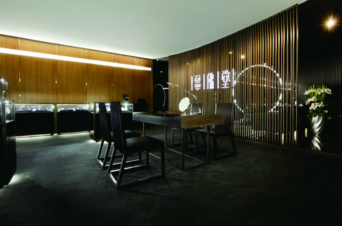
Logo of CUIFOTANG is composed by two elements, Chinese letters and vertical partition lines. We were inspired by this logic and appropriated it to our design. In the shop space, we introduced vertical golden lines every 1 meter, forming a frame for the shop space. Display shelves were then inserted into the space and framed by this hidden grid as how Chinese letters are structured in the logo.
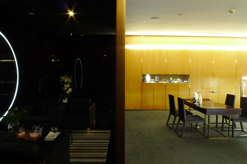
The space of the shop was mainly divided into 4 parts, entrance lobby, main display space, VIP area, and stuff area.
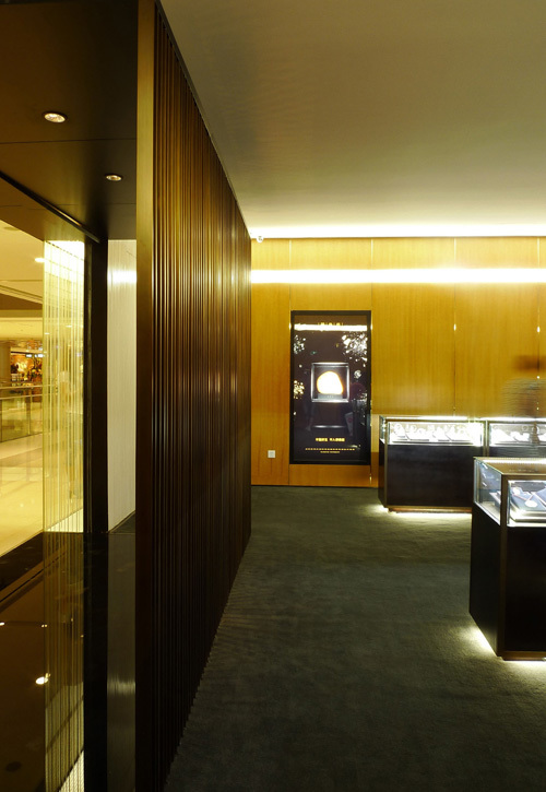
We implemented 2 copper grills to in-between the former 3 spaces, which separated the spaces and kept view connection at the same time. The vertical lines of the copper grill also echoed with the 1 meter partition lines on the wall.
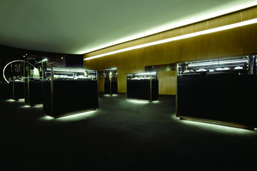
In terms of circulation, we arranged 2 paths to experience the space. High-end merchandise was displayed independently in island-style shelves. Lower-end merchandise was displayed in more concentrated bar-shape shelves. Space behind the bar-shape shelves was the main passage of shop staff, which has the most direct connection to the storage and changing room.
After the general study of program and circulation, we started to apply different strategies to the outside (shop window) and the inside space. For the design of the shop window, we strengthened the impression created by the copper grill and printed white and gold lines onto different sides of the window glass. The staggering effect of the lines was further more emphasized by a mirror wall offset 70cm back from the glass. As a result, when people were passing by or approaching the shop, the shifting and offsetting effect of the shop window would create an illusion of depth and transparency, tempting people to walk in.
For the interior shopping space, we focused on the creation of a tranquil space, a place where jade can be viewed and appreciated as art instead of merchandise. In order to achieve that goal, we cancelled all the traditional down-lights which are typically used from environmental lighting because we think they are a disturbance to the eyes. Instead, we implemented professional wall washers in the wall to light the ceiling up to give the space enough luminance from the reflection from the ceiling. We then bent the ceiling in the longitudinal direction, to better the distribution of the light and more important, to give the whole space a touch of softness and a likeness of ancient oriental space.
Related Projects
Magazine
-
Being Arthur Erickson
Today
-
NEOM Updates
1 day ago
-
Mind the Gap
2 days ago
-
Watchtower Einderheide
3 days ago

