PRwanshesheji2018
- Architects
- Various Associates
- Location
- Year
- 2021
Project name: PLASTIQUE MO DEPO (Taikoo Li Qiantan)
Client: PLASTIQUE MO DEPO
Location: L2-24, Stone House, Taikoo Li Qiantan, Shanghai
Completion time: Dec. 2021
Design firm: Various Associates
Website: https://various-associates.com/
Lead designers: Qianyi Lin, Dongzi Yang
Design team: Zebing Li, Alan Huang
Construction: Shanghai Yubin Construction Engineering Co., Ltd.
Photography: SFAP
01
PMD
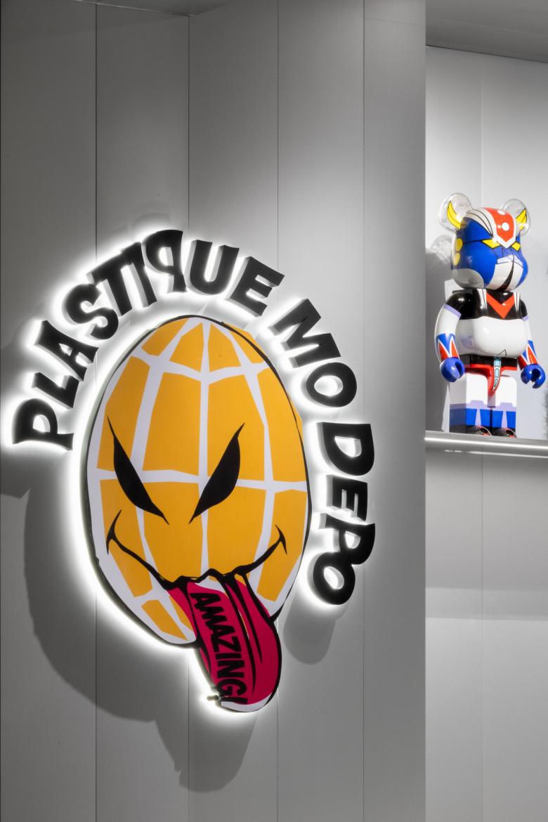
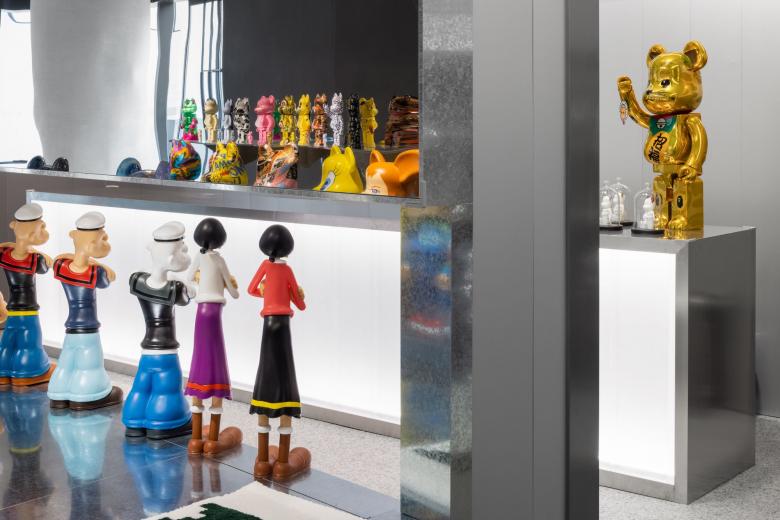
PLASTIQUE MO DEPO, abbreviated as PMD, is a new commercial concept that combines toys with fashion and contemporary art proposed by the Communiti. As a retail brand offering superior toy display and retail experiences, PMD hopes to bring global trends and popular art into the life of young Chinese, attract more toy-lovers and enable them to have their own toy depots. As a franchisee for renowned Japanese toy manufacturer MEDICOM TOY, PMD supplies all of the brand's products including the popular BE@RBRICK series.
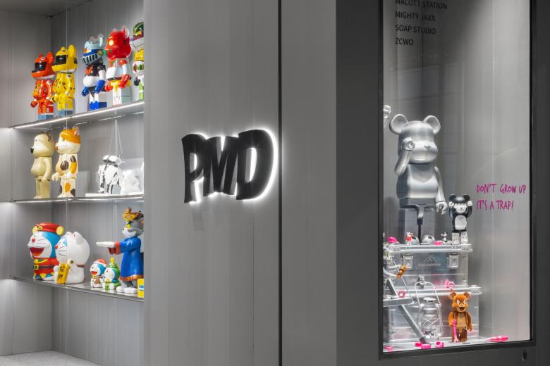
With "Don't grow up, it's a trap!" as the slogan, PMD intends to provide customers with a space where they can temporarily forget about daily pressure and troubles, enjoy their hobbies and experience pure love, passion and joy.
02
Floating "kaleidoscope" of toys
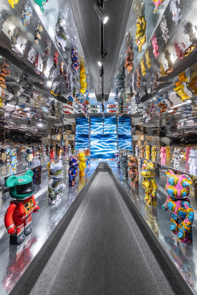
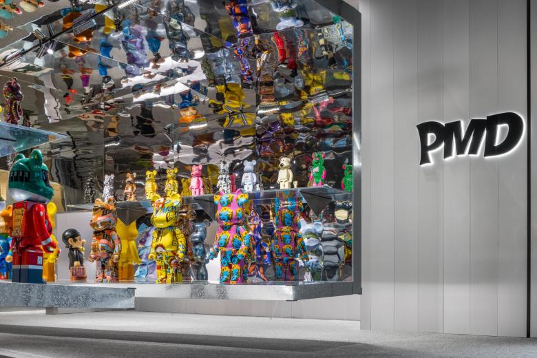
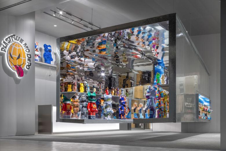
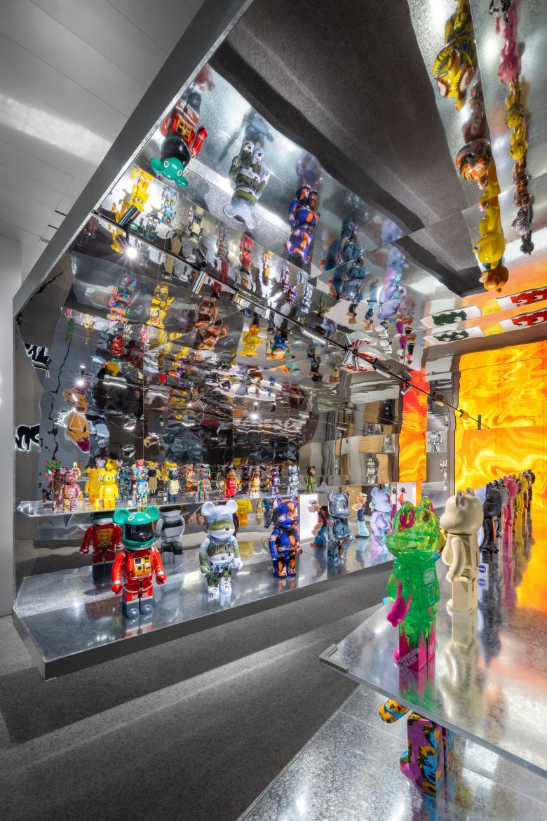
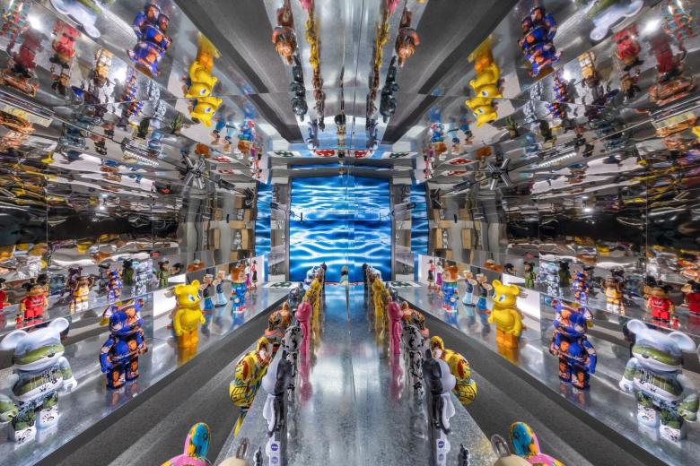
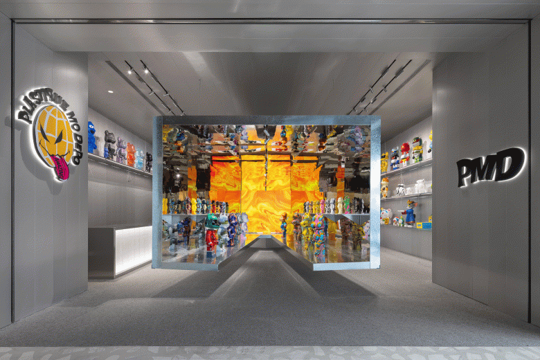
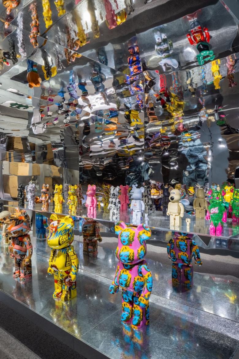
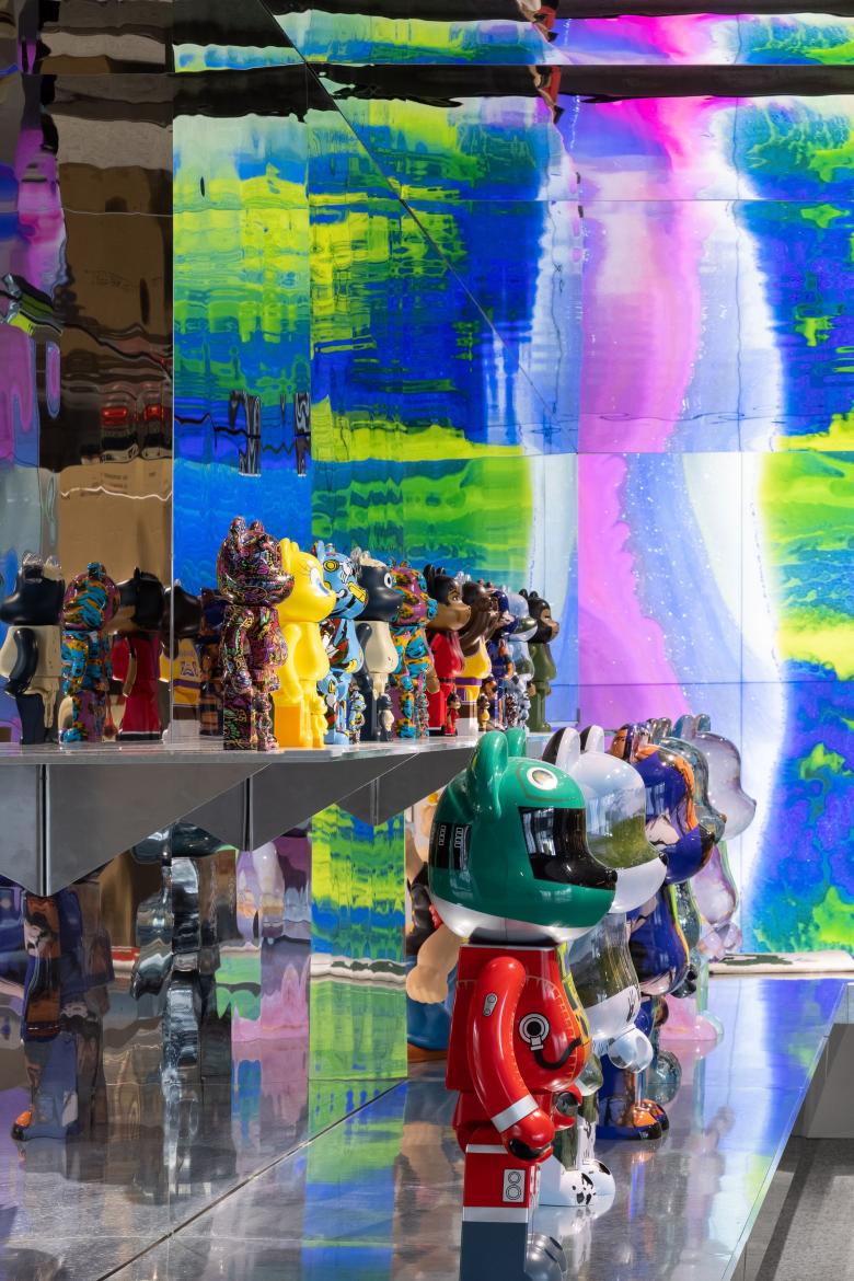
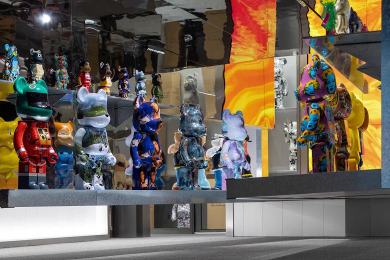
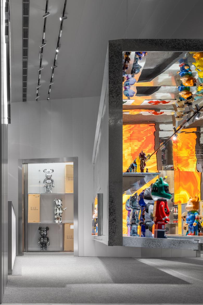
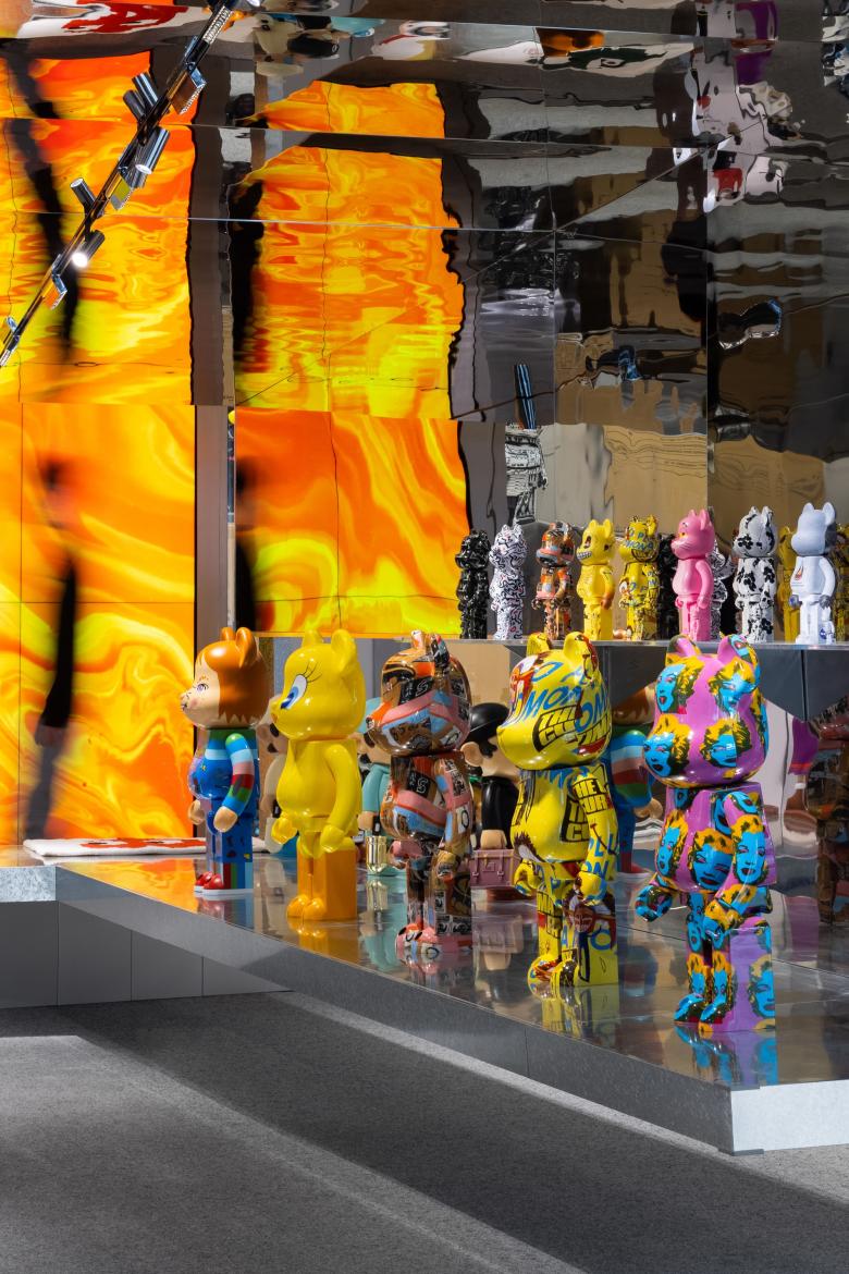
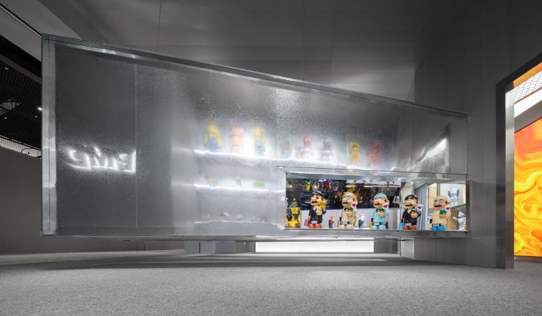
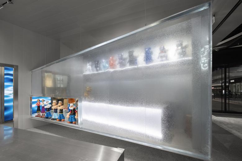
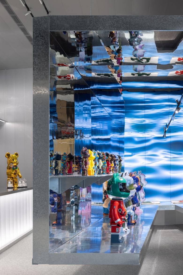
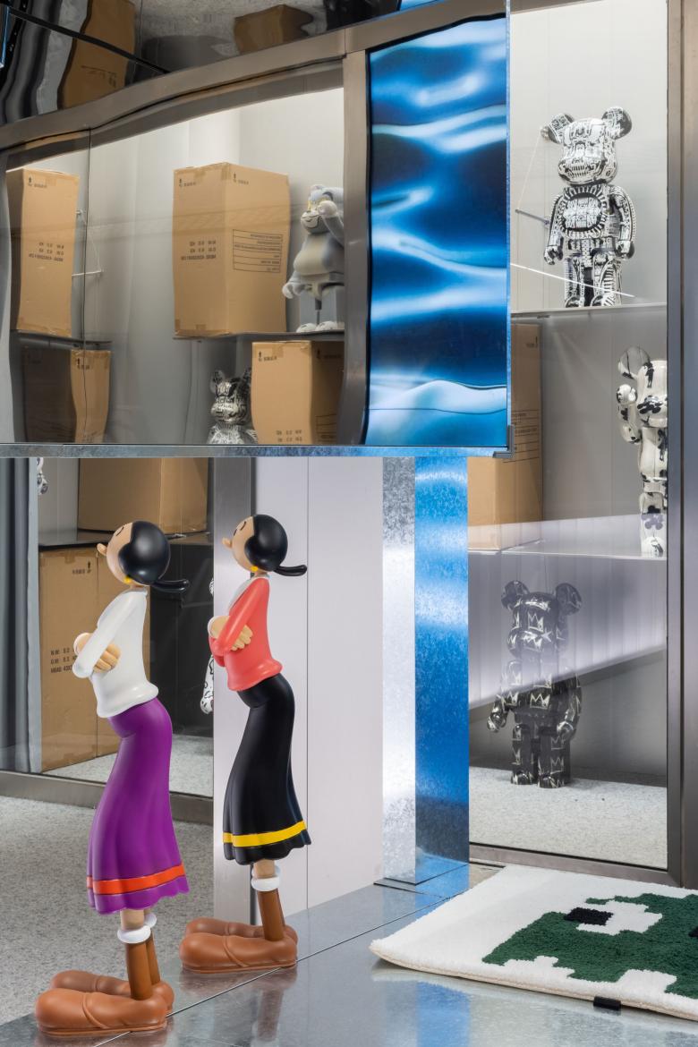
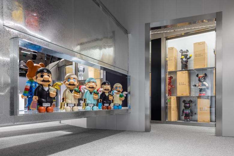
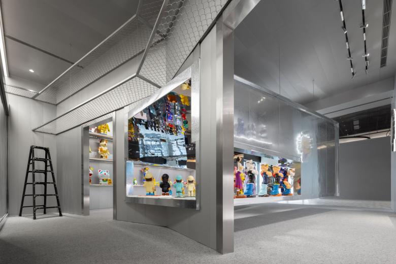
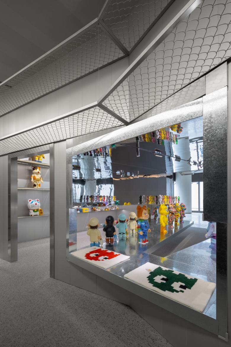
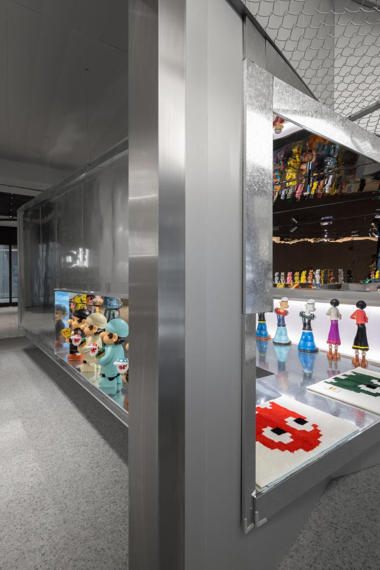
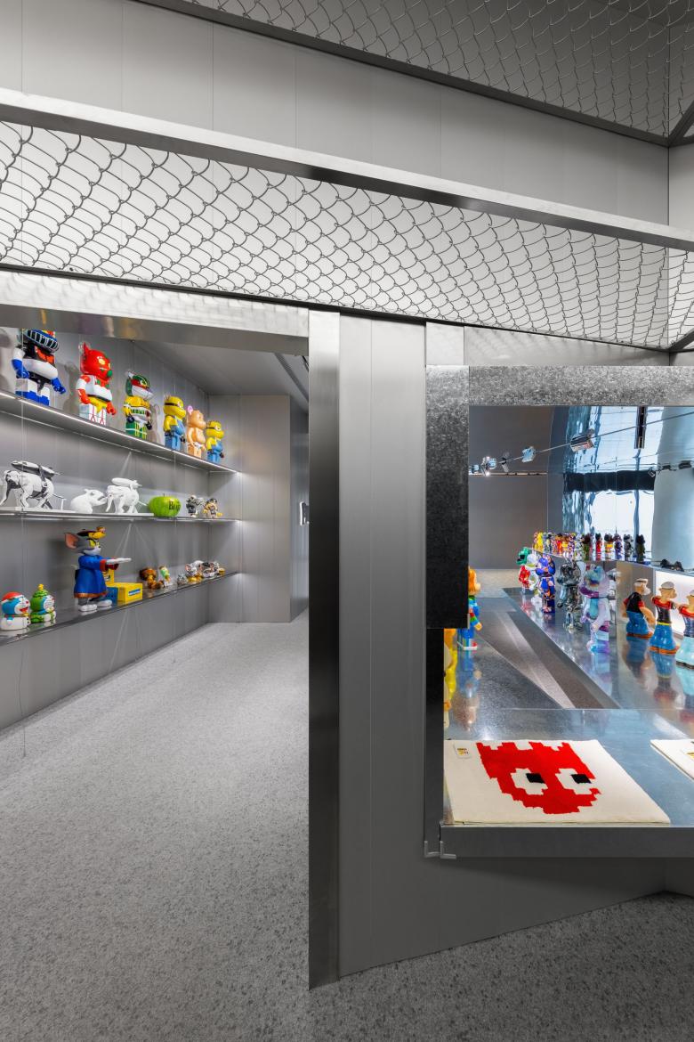
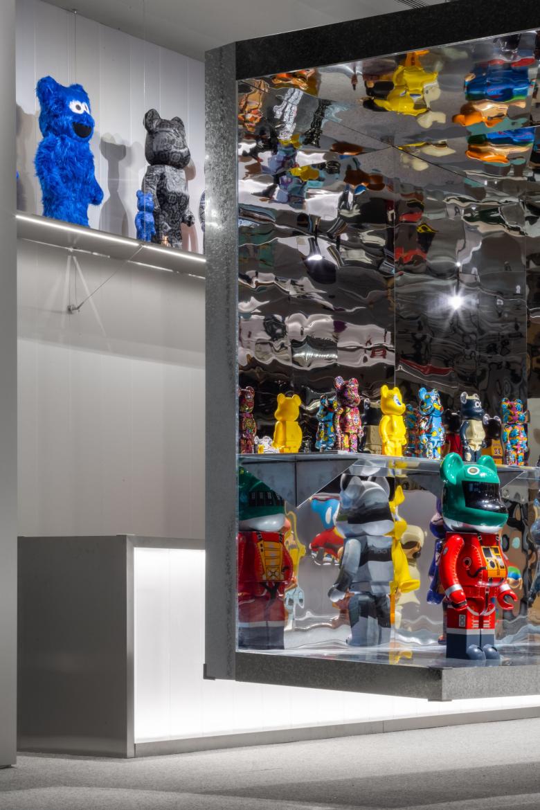
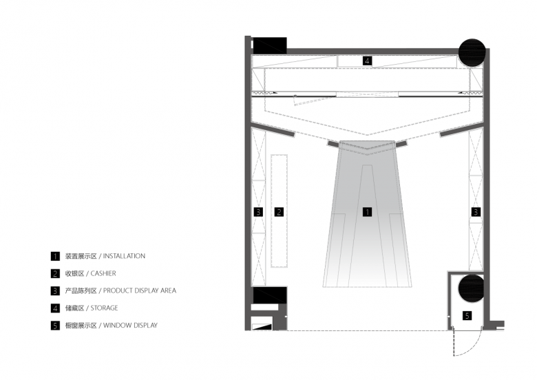
The soul of the project is the reflective toy world floating at the center, which takes design cues from kaleidoscope — a familiar optical toy. As the core area for toys display in the store, the floating installation creates a fantastic world awash with magical variations in a simple form.
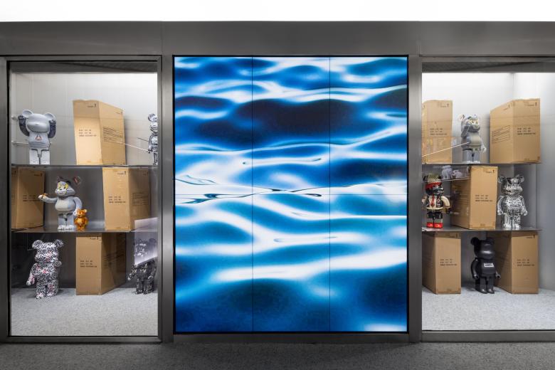
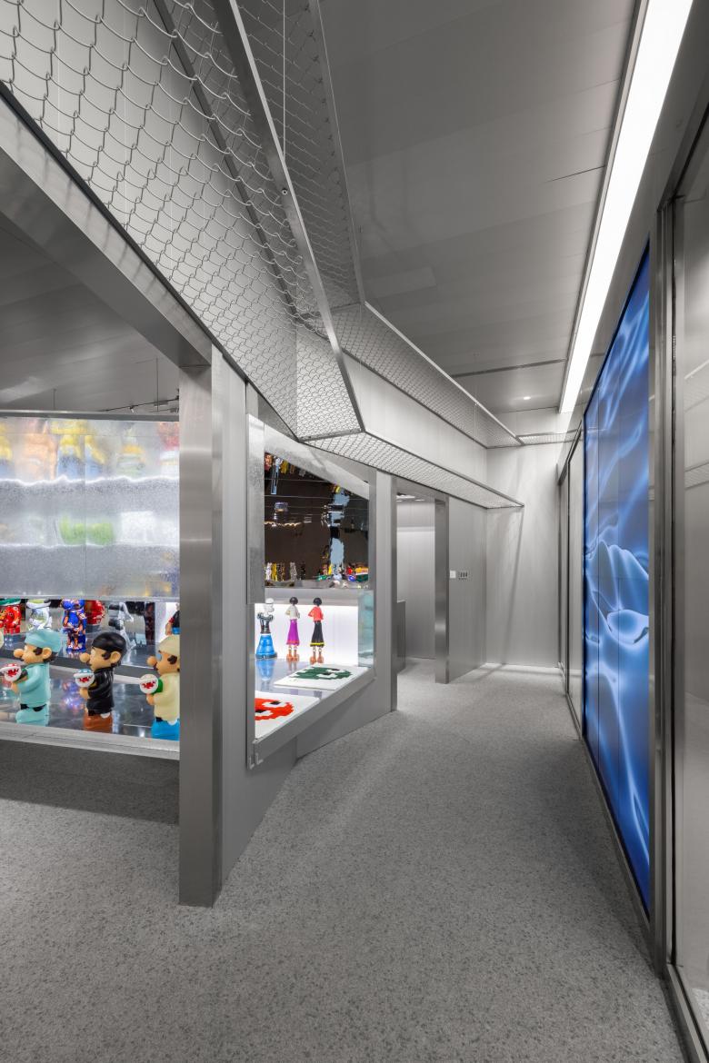
Dynamic elements on the screen create a vigorous, flexible backdrop efficiently.
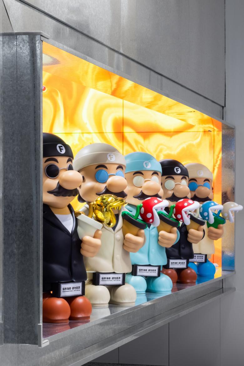
The floating structure reflects the colorful displayed toys, not only balancing visual highlights but also resulting in a breathing space.
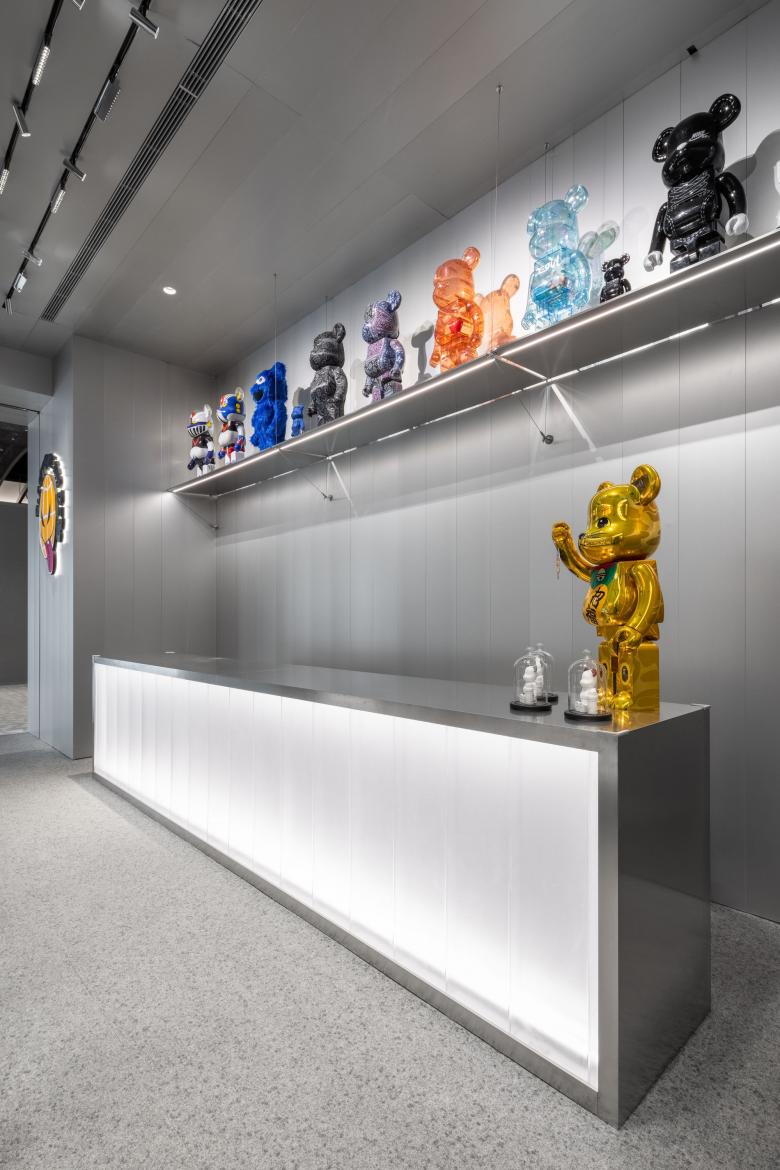
The cashier's counter is set beside the kaleidoscope-themed area. The design team made the most of the limited available space to fulfill various functional needs.
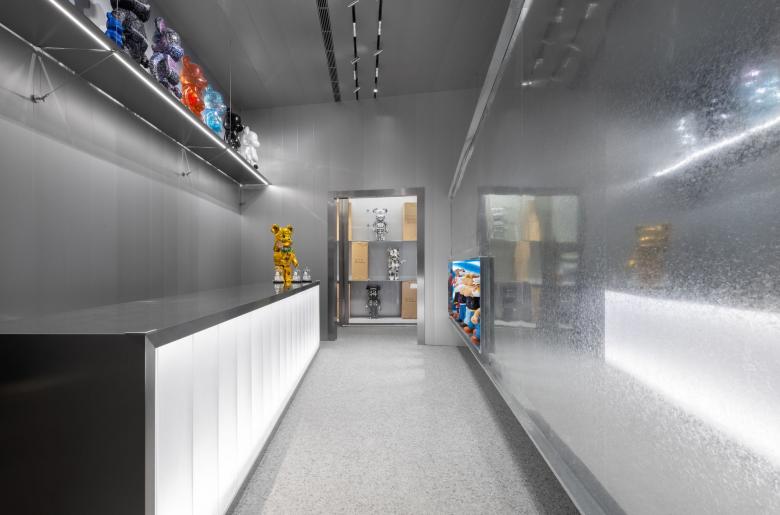
To create a pure, clean space outside the core area, the designers applied common aluminum grained panels, galvanized iron and mirrored stainless steel as wall and ceiling veneers, to respond to the design concept of "depot" and control cost as well. Besides, the floor is covered with carpet, minimizing the damage rate of toys falling on the ground.
03
Toys are companions rather than lifeless commodities
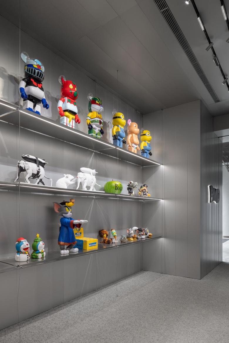
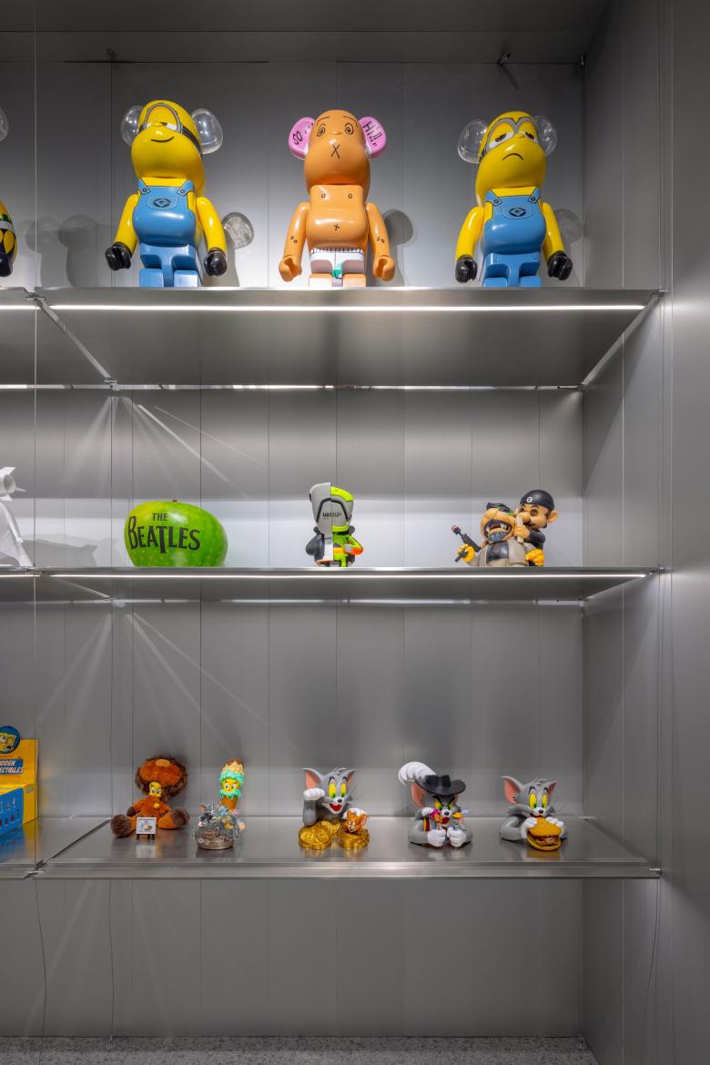
PMD believes that toys are not plastic products or commodities, but companions with human personality and warmth. In response to that, the designers took the perspective of human as conceiving the design, and organized different display areas in a way to echo each other, thereby accentuating the interaction between displayed toys and resulting in a more human space.
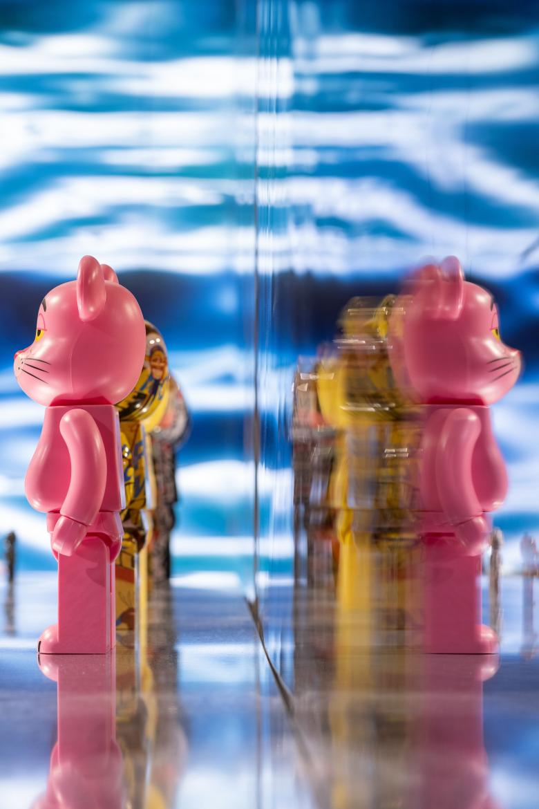
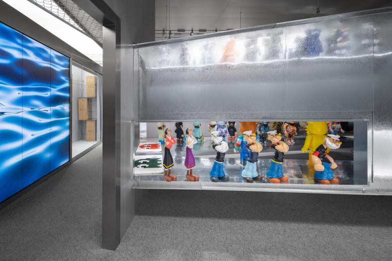
Olive and Mario have their backs to each other, as if they just quarreled. This display scene evokes customers' infinite imagination about vivid stories.
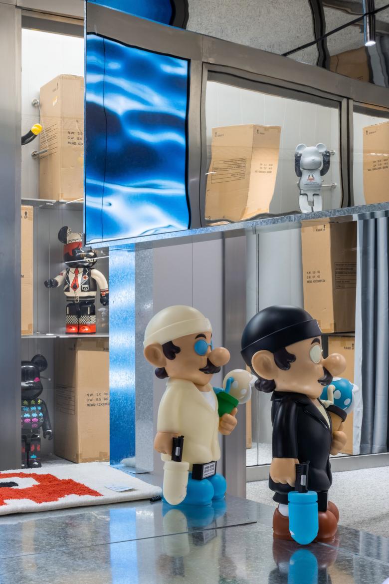
Super Professional Mario series carrying cannibal flowers are placed at the openings on the two sides of the display shelf, seeming to welcome customers.
04
Depot in "Depot"
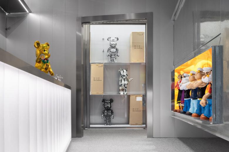
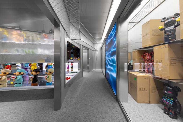
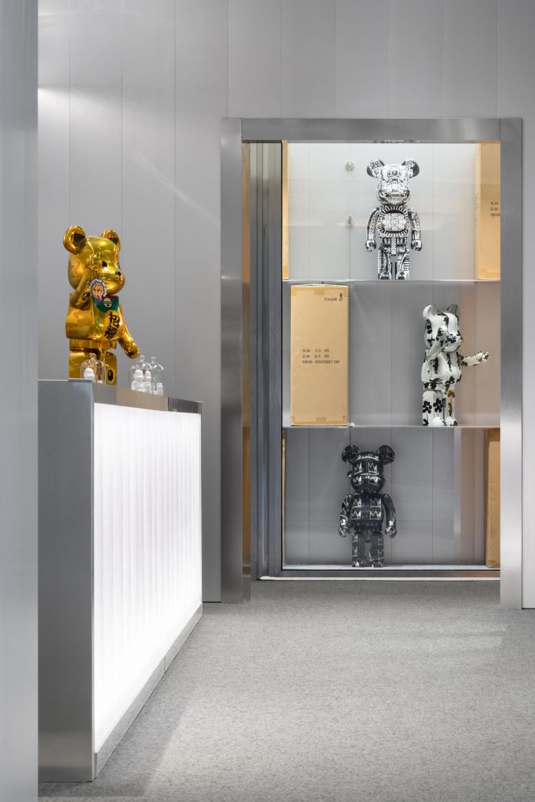
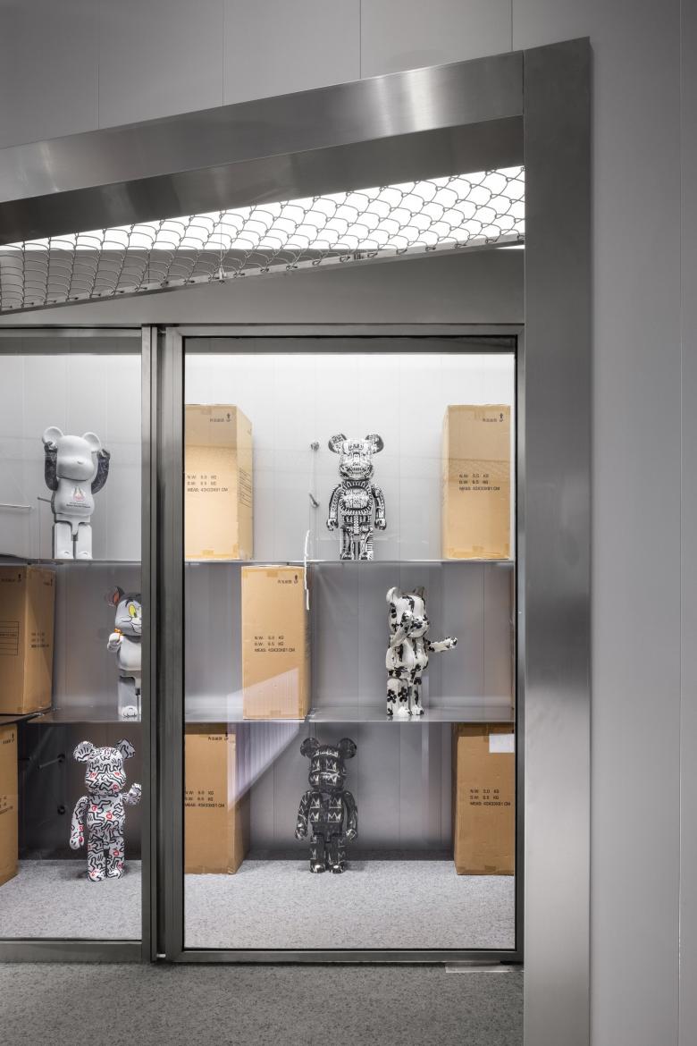
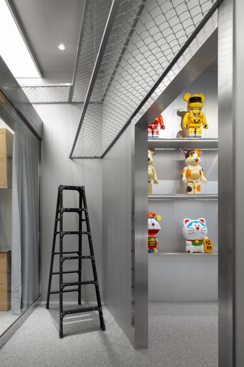
The store is conceived as a "toy depot", and its real depot is set at the back area, which is a highlight that echoes PMD's brand concept. The designers made the store's depot visible, to convey the brand's values. After customers buy the toys they like, the staff will write down consumers' names on cardboard boxes and then put them on the shelves in the depot, waiting for delivery persons to take them away. People outside the depot can see the toy owners' names written on the packages and the rare toys already bought by others through the glass partition.
The depot faces the center of the store and the circulation loop. Its left and right sides are available for storing large toys, and high shelves are set in this area to expand the storage space.
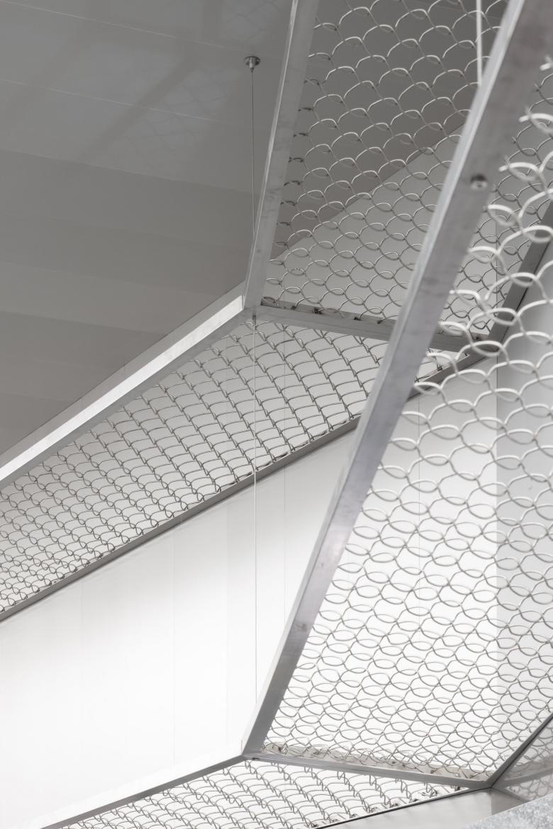
The meshed shelves are convenient for the staff to see the marks on packaging boxes through hollows, hence avoiding getting or placing wrong products and improving working efficiency. All these elaborate details fully show the ingenuity of the designers.
The small, delicate metal wheels and bars stabilize the display shelves in a lightweight way, and also offer flexibility for adjusting the height of shelves, to adapt to commodities of different heights.
05
Always be a kid
Toys have magic power, and are an integral part of our childhood and growth. They're our faithful companions in childhood, spending countless days and nights with us and affording our affection. After we grow up, toys may become a symbol, a hobby, or merely a valuable commodity. But it doesn't matter. The most important thing is that they're still by our side as always.
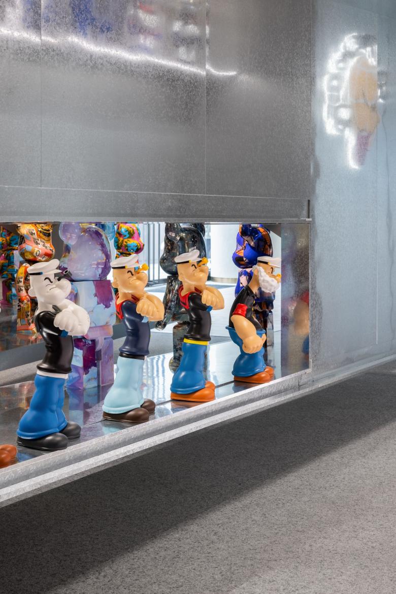
As a quote from Toy Story goes, "Life's only worth living if you're being loved by a kid". Hope everyone can always be a kid in the inner mind, and always be protected by the sailor Popeye.
Related Projects
Magazine
-
Winners of the 5th Simon Architecture Prize
1 week ago
-
2024, The Year in …
1 week ago
-
Raising the (White) Bar
1 week ago
-
Architects Building Laws
1 week ago
