UP! Berlin
Berlin, Germany
- Architects
- Jasper Architects
- Location
- Koppenstraße 8, 10243 Berlin, Germany
- Year
- 2021
- Client
- Signa Holding
- Team
- Martin Jasper, Dennis Trutty, Sara Staschiok, Simon Lindenberg, Joerg Westphal, Astrid Pudszuhn, Lene Nettelbeck, Tobias Becker, Alexander Mendelsohn, Henry Pudewill, Georg Gewers, Andrey Yordanov, Andre Flaskamp, Nabil Rajjoub, Santiago Flagel
- General Planning and Building Planning
- Jasper Architects und Gewers Pudewill
- Structural design, facade design
- Bollinger und Grohmann
- Technical building equipment
- Ingenieurgesellschaft Meinhardt Fulst
- Landscape Planning
- YEWO Landscapes
- Interior Design Zalando
- Studio Aisslinger
- Building physics
- Müller BBM
- Fire protection
- hhpberlin
- Lighting Consultant
- Licht Kunst Licht AG
- Area
- 67.000 m2
Martin Jasper and his team at Jasper Architects won the competition in 2016 to transform an aging iconic shopping mall into a modern place for work and retail in Berlin.
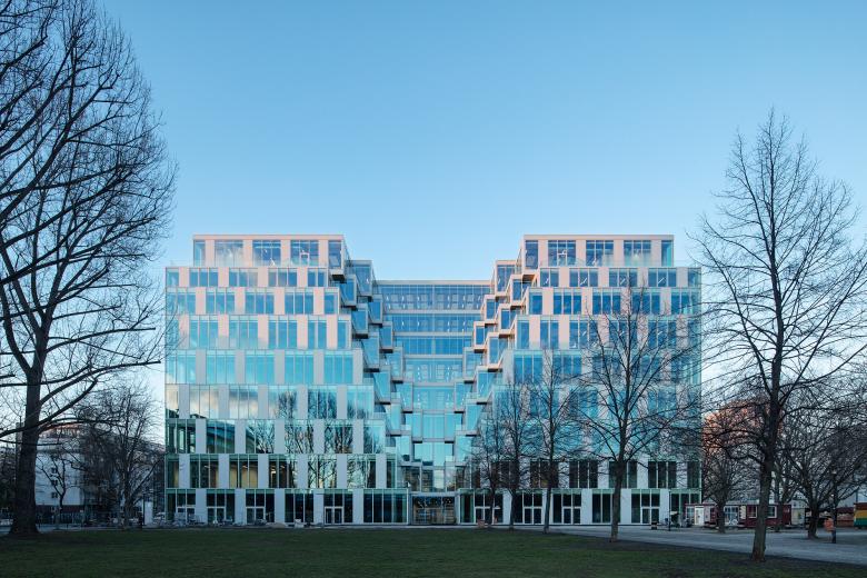
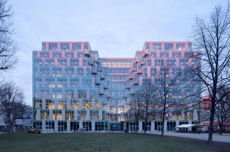
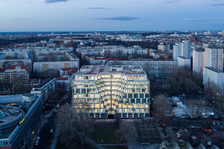
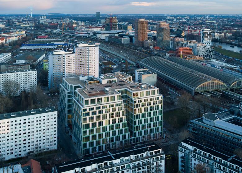
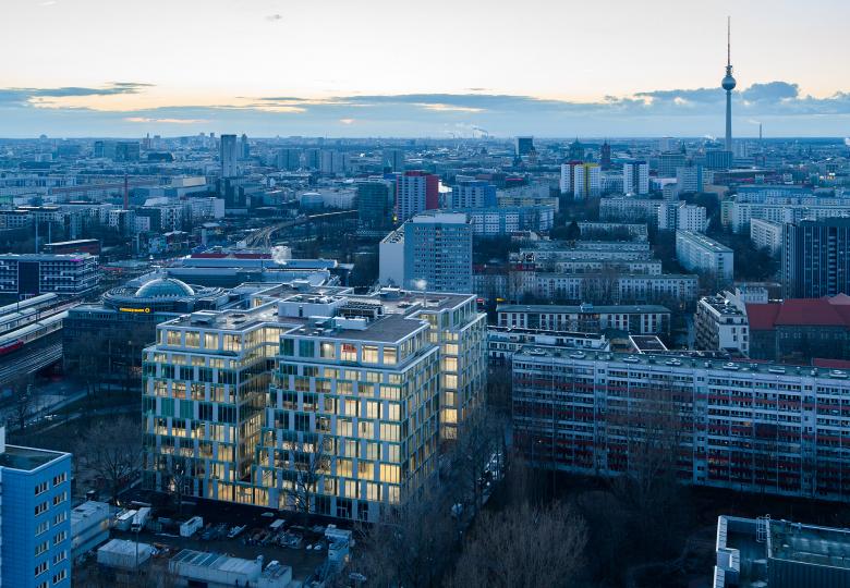
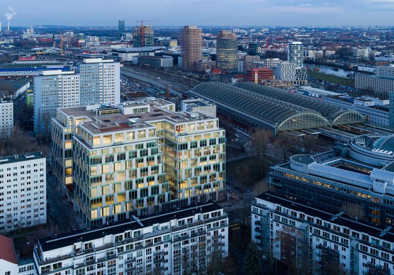
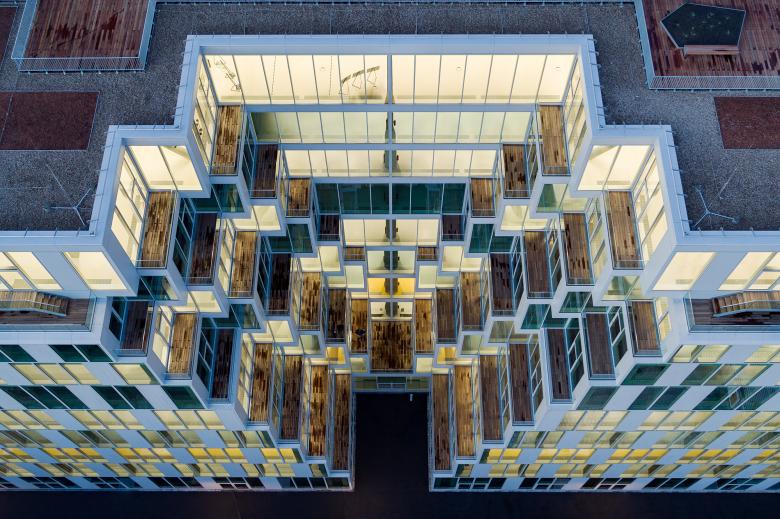
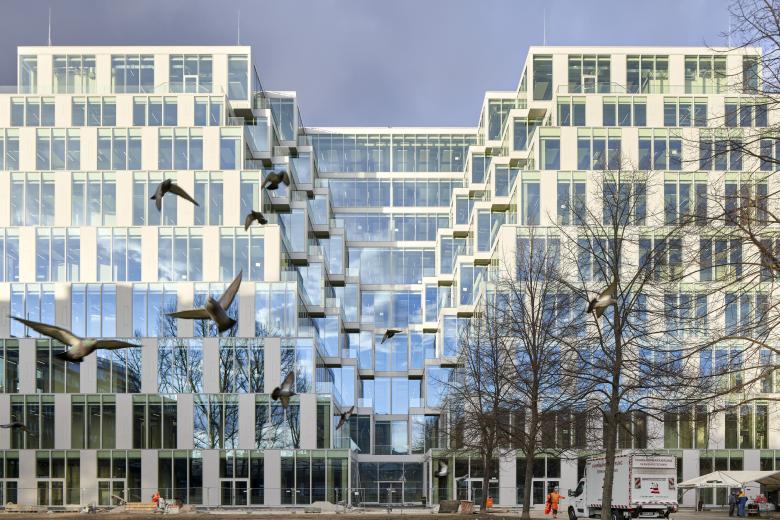
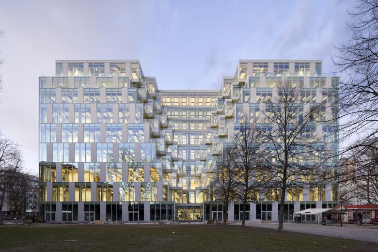
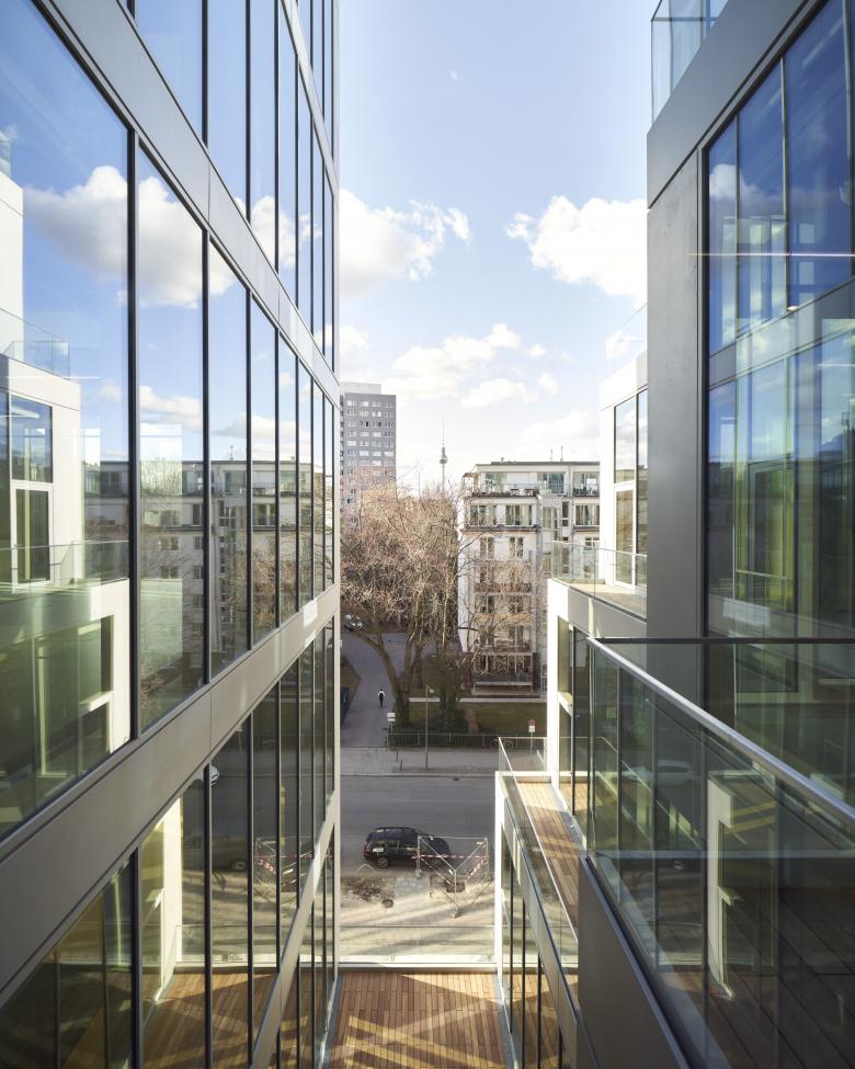
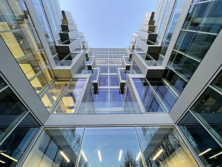
The Project named “UP!” reveals the building’s past and points to its future with a new volumetric appearance and a new, entirely glazed building envelope. In order to create bright spaces for the new functions, the formerly closed cube was first gutted and then flooded with natural light via subtractions on all four sides.
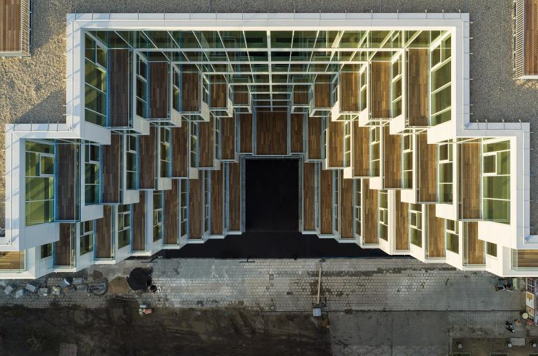
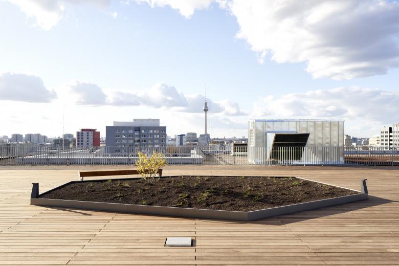
In addition to these terraced incisions, two additional floors and a roof terrace bring plenty of light and air into the future offices.
“As an office that, among other locations, worked a lot in Argentina, the dimensions of the UP! were all too familiar: the existing building looked like a monolithic extrusion of a city block of Buenos Aires. Those are based on a grid size of around 100 by 100 meters - and keep confronting the architects with one main challenge: How is the provision of natural lighting for the buildings inside this city block granted and dealt
with? To address this, cut outs of all sizes and forms are made into the urban mass or some areas of the property are left free. In addition, urban planning regulations of different times overlap - and thereby create complex urban geometries that always arise from the same squared base of the city block. For us, this was an inspiration for our thoughts for UP! when designing the intervention to the existing building - and which gave us answers to a very specific problem through an international reference."(Martin Jasper)
HISTORY
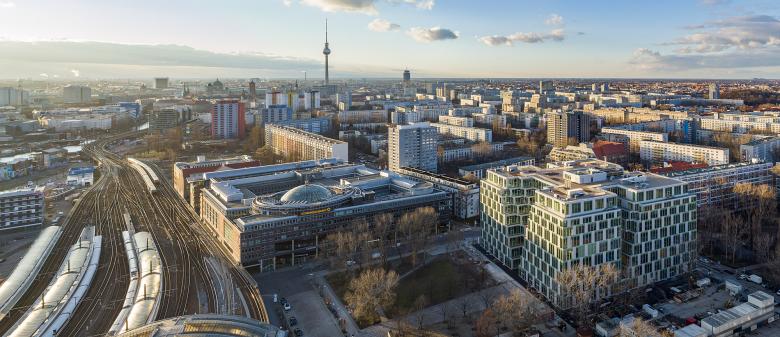
In 1979 the department store with its orange-turquoise facade pixels was inaugurated as, at the time, largest and most modern building of the GDR shopping mall chain “Centrum Warenhaus”. The Location contributed to its importance: The "main station of the capital of the GDR", today's “Berlin Ostbahnhof”, was within walking distance. Since then, the colossal building with its concrete skeleton has undergone some reforms. After the fall of the Berlin Wall, first the retailer “Hertie” took over the building, later the “Kaufhof” group. But over time, the competition of the online retailers and the solitary location generated financial difficulties, and, in 2017, the Mall was finally closed. A contemporary usage concept and a structural conversion had to be developed for the striking building and its 45,000 square meters of usable floor area. The new tenants: The online fashion retailer Zalando.
DESIGN
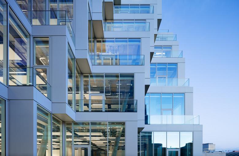
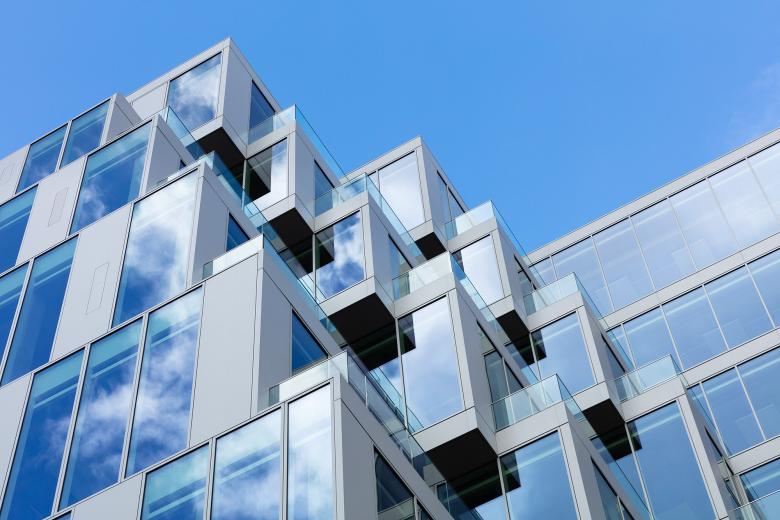
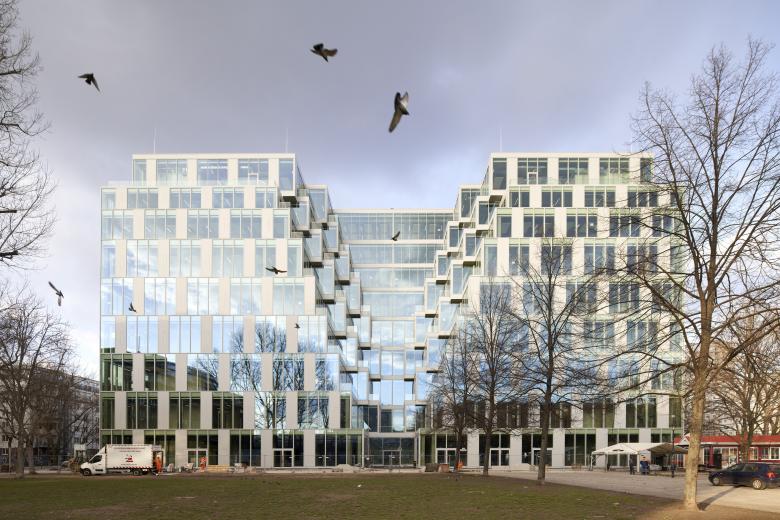
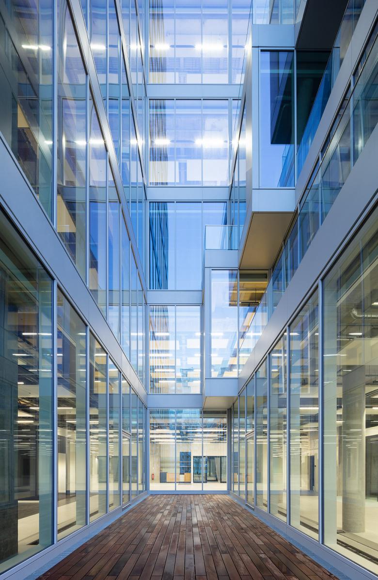
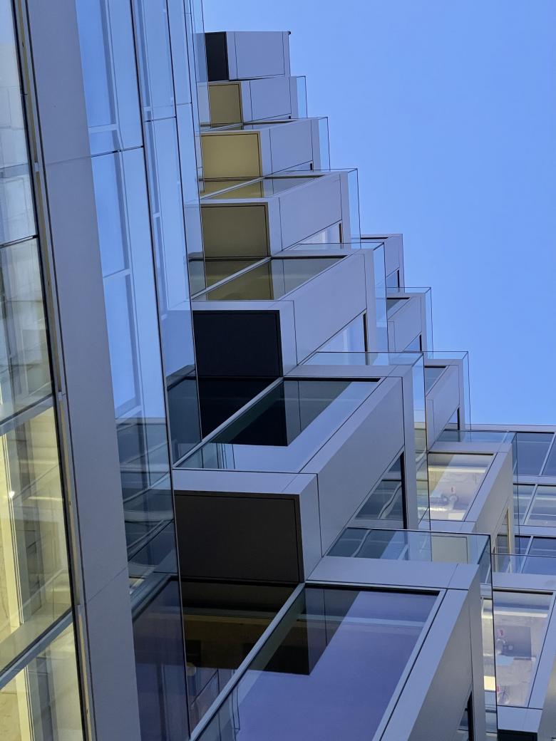
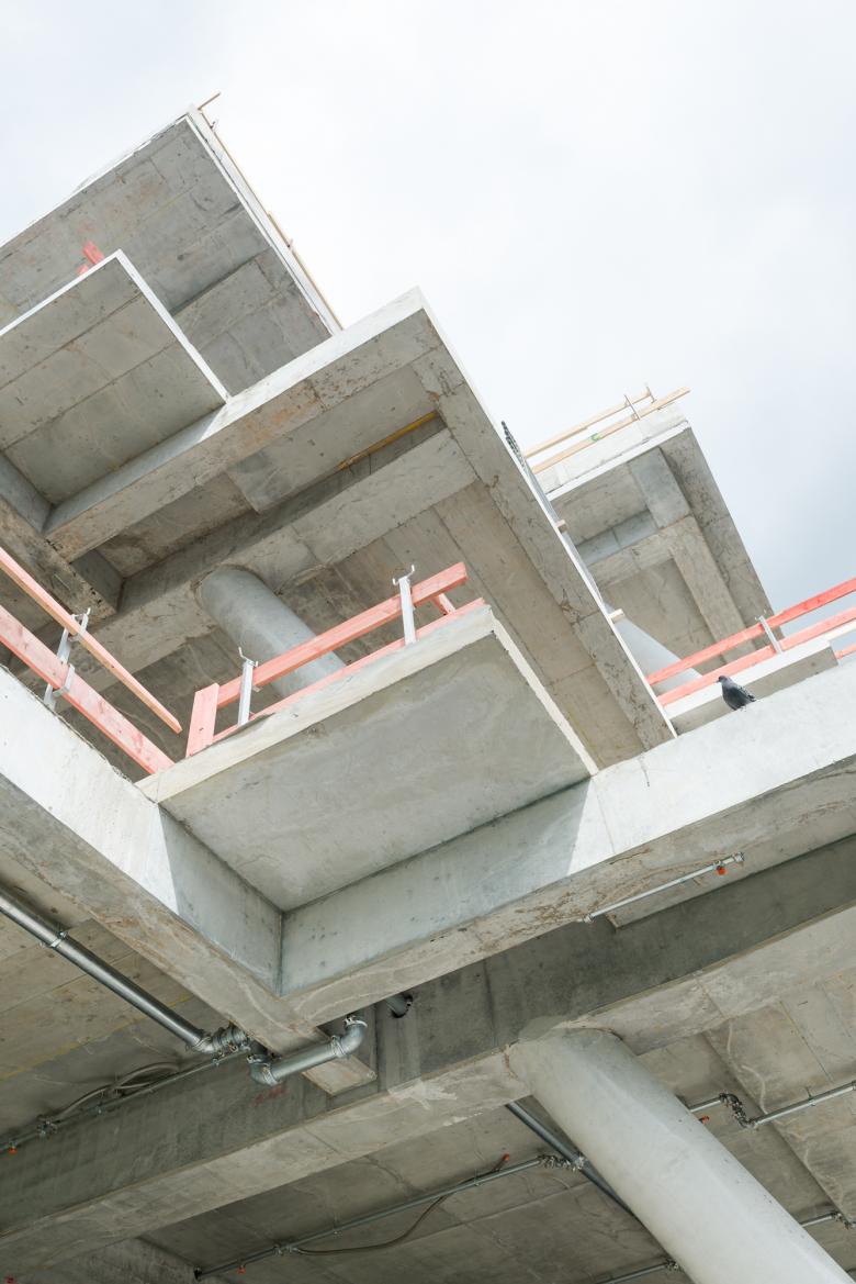
After the acquisition of the building by the Austrian real estate company Signa Holding, Jasper Architects won the design competition for the transformation of the building. The old department store was originally conceived as an introvert building without openings to the outside, the new use as a place of work and retail demanded a reversal of that principle. The daylight situation was a major challenge. The 80 meters side lengths of the cube resulted in a floor space of 6400 square meters and the task was to bring natural light into the center of the building, where high-quality office spaces should be created, even in those central areas. Jasper Architects was looking for an alternative to centrally positioned courtyards and developed the concept of the Voids: triangular prisms were cut out on each of the building’s sides, creating canyons that widen upwards. This intervention increased the surface of the facade by more than a third and created X-shaped floorplans that reorganized the interiors. On each floor there are four office areas arranged around a central core. As an add-on, terraces of different sizes are created along the side walls of the canyons or voids. The floor space that has been cut out from the building’s volume is regained: two floors have been added on the top of the existing structure, plus a roof pavilion that is surrounded by an extensive rooftop terrace.
PLANNING AND CONSTRUCTION
SIGNA then commissioned JASPER ARCHITECTS together with the local berlin architecture office GEWERS PUDEWILL to do the Building and General Planning.
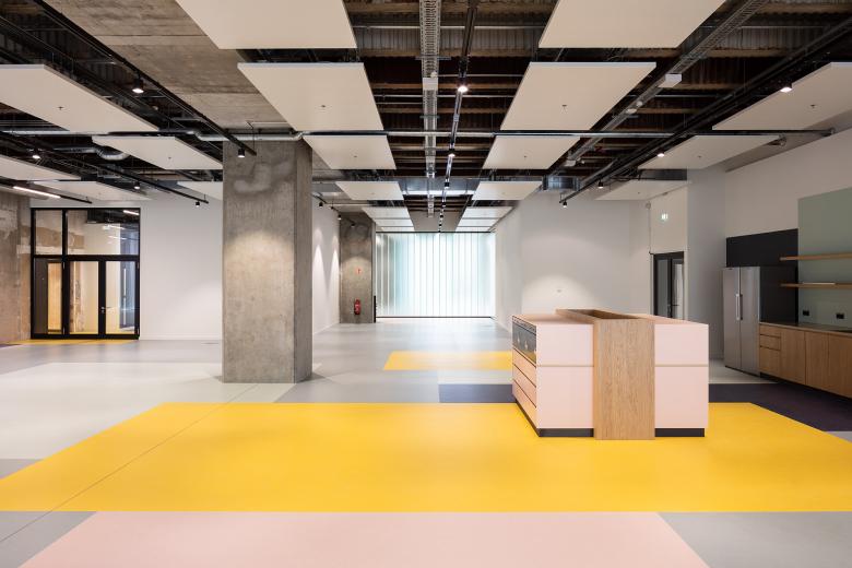
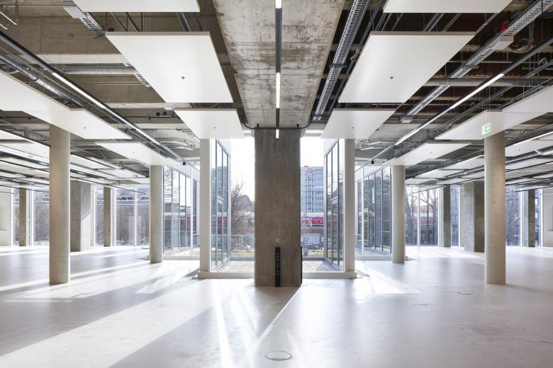
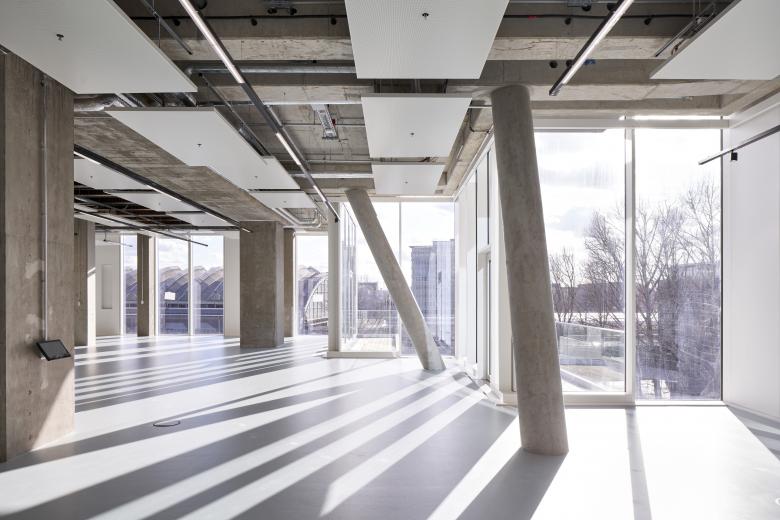
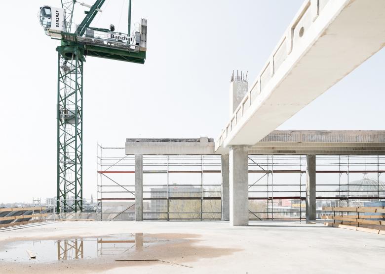
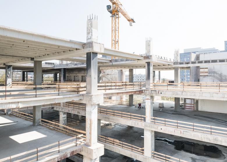
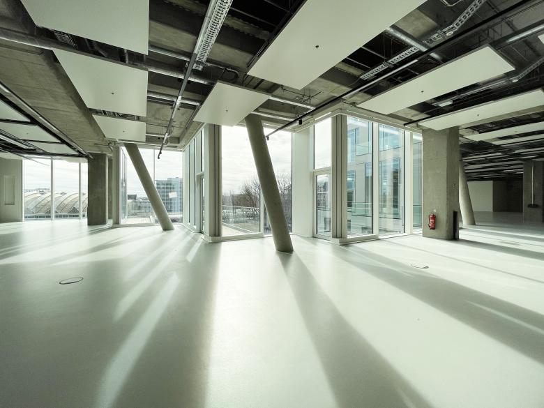
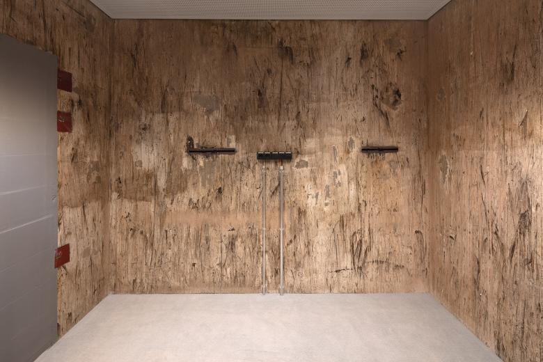
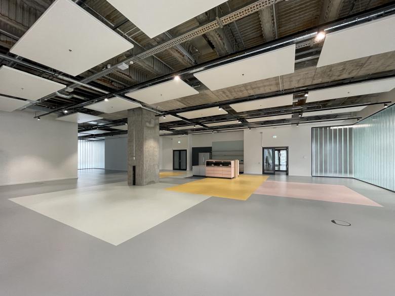
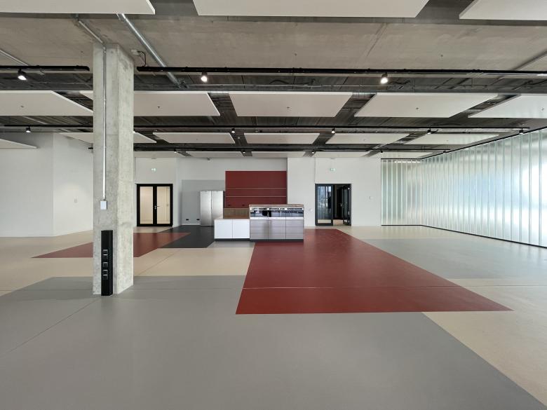
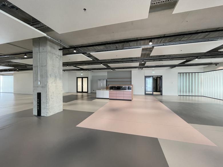
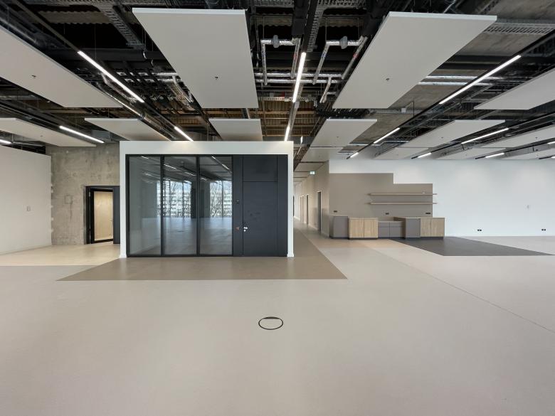
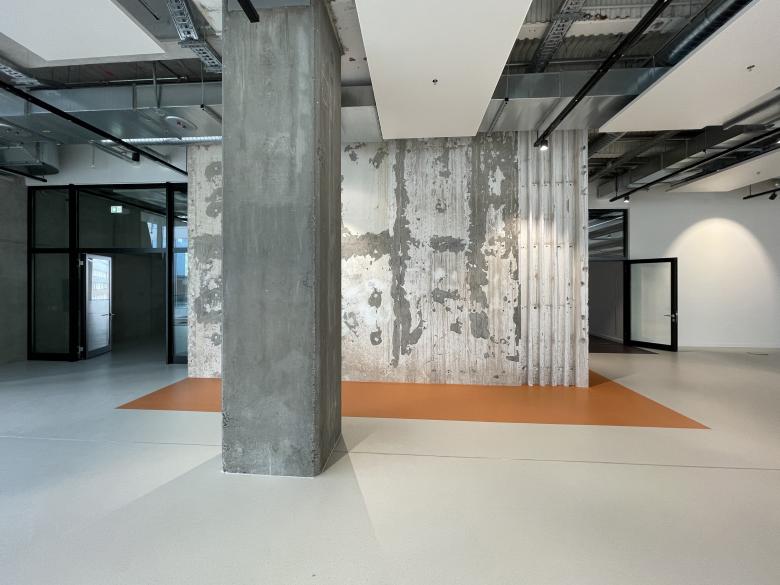
For the modernization, the entire old facade was removed and the building block was reduced to its concrete skeleton. With huge circular saws the voids were cut out of the old structure. What remained, were vast open spaces with a regular grid of concrete columns that rhythmically subdivide the floor plan every twelve meters, as well as four old vertical circulation cores. During the process, parts of the history of the building were uncovered. Decades of history left their patina on the bare concrete; old technical infrastructure, holes and rusty traces became visible and were kept in place. The rough, industrial charm is a quality of the building - and becomes a canvas for its new era. In order to use the impressive floor height of 5.40 and the striking concrete rib structure of the ceilings both aesthetically and functionally, all new necessary technical installations are mounted visibly. The white, acoustically-active and temperature-regulating ceiling elements with integrated fire protection sprinklers form a new floating, transparent ceiling layer. Ventilation, cables, pipes, rails - all technical installations of the building remain visible behind them.
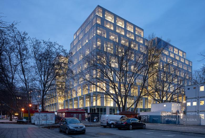
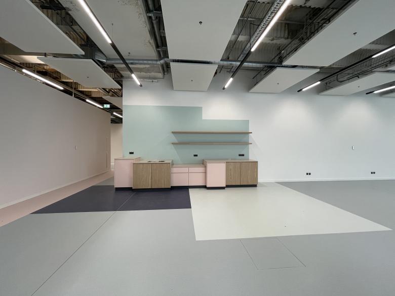
The facade is composed of two types of modules: a fully glazed module and an opaque module that has integrated casements. The modules cover the entire exterior façade of the building in a ratio of three to one, providing the necessary amount of opaque Elements for sunlight regulation. In the voids, only glass elements were used, with integrated glass doors to give access to the terraces. The view into the building is as spectacular as the view of the urban landscape from the inside. The old department store skeleton is revealed to passers-by behind the new glazed Envelope, and the urban environment can be experienced as a full panorama view from all levels. In order to organize the vast floor areas into different zones, meeting room boxes and translucent cast-glass walls are distributed strategically along the floors. The flooring color concept adds another layer to the zoning. The differently colored surfaces define functional areas without actual physical boundaries.
FUNCTIONAL CONCEPT
The ground floor, which was originally designed with a portico towards the public space when the building was functioning as a department store, was extended in continuation of the rest of the façade. The lobby of the building is located centrally at the south front. All other ground-level areas are intended to be used by shops, supermarkets and food & beverage tenants. They become both the local infrastructure for the office employees, but also the point of interaction and socializing for the residents and users of the surrounding residential and commercial buildings. The retail areas are effectively oriented towards the public on all four sides of the building and enliven the building’s surrounding pedestrian areas. A car access is embedded in the back of the building, the vehicles are transported into an underground car park with 100 parking spaces via an elevator. The main tenant of the office space is the online fashion retailer Zalando, which had already signed its lease when the transformation process began. For Zalando, the location is a useful extension to the nearby Zalando Campus at Berlin’s East Side Gallery.
FROM OFFICE TO AN INTELLIGENT WORKSPACE
When Jasper Architects started designing the building, the effects of the latest developments in the office real estate sector were not foreseeable. Nevertheless, the UP! is also an anticipation. The pandemic has fast forwarded the development which in the past progressed dynamically, but at a slower pace. The then sudden and immediate shift of presential office work towards home office, strongly encouraged digitalization of the workplace and revealed what is actually needed in terms of a physical place of work: spaces for direct interpersonal and interdisciplinary exchange. The office we are returning to after the pandemic, has to offer more than desk space. It needs communicative islands, quiet rooms and collaborative centers. It has to respond to its users and adapt quickly and easily to changing needs. It is a place that is actively used, not passively consumed. In the open and bright areas of the UP!, soundproofed meeting boxes are available for retreat. Coffee points and open kitchens are as naturally a part of the infrastructure as the sanitary areas. Every employee is only a few steps away from the nearest balcony and the green roof landscape is an elevator ride away. The office conceptually becomes a service provider that, thanks to intelligent building management, also regulates temperature, brightness and humidity.
SUSTAINABILITY
Concrete construction has a high impact in climate change due to the CO2 that is released during its production. Therefore, where possible, the usage of concrete in new building should be avoided or reduced where possible and existing buildings should be re-used to avoid new construction. The concept of the UP! is based on the maintenance of the existing concrete structure and is therefore way ahead of the new buildings with comparable dimensions in terms of its CO2 footprint. The sustainable goals were also consistently followed with regard to the building equipment. The quiet and constant beating heart of the building is its modern technology, which acts sustainably and automatically. Both, the lighting as well as the internal glare protection, are regulated through the building’s own weather station, that reacts to the indoor and outdoor temperature and the position of the sun. At a few selected concrete columns control stations are integrated, at which users can individually intervene in the programmed processes via touchscreens. A re-cooling plant is installed on the roof, that, together with heat exchangers in the sewer, becomes an independent energy center. This turns the UP! into one of the most sustainable buildings in Berlin - and it proved itself as such: the building was certified with the LEED Gold Standard Certification for sustainable buildings.
Related Projects
Magazine
-
Winners of the 5th Simon Architecture Prize
1 week ago
-
2024, The Year in …
1 week ago
-
Raising the (White) Bar
1 week ago
-
Architects Building Laws
1 week ago
