Xiao Xiang Fu (Zhongguancun No. 1 Restaurant)
Beijing, China
“Sleeping upstairs in diaojiao house for a night, one will have romantic dreams for ten years.”
Whether it is in Western or Southern Hunan, the precious plain land of Hunan has been used for farming for generations, and people there have built stilted house (which is also called diaojiao house) on the riverside and at the foot of mountain to settled down, spread, and flourished. The story is too much to be told, which becomes the "border town" in everyone's memory.
Born under the rising water vapor and in the lush mountains and forests, the delicious Hunan cuisine is one of the most important eight cuisine-dishes in China. As a well-known brand of Hunan cuisine restaurant, Xiao Xiang Fu has served for countless diners for 18 years.
Now, Xiao Xiang Fu (Zhongguancun No. 1 Restaurant) - designed by Wu Wei, has officially open to the public. The brand-new image and taste will gradually become a new memory and preference of diners.
To be seen
Develop the space design strategy
The restaurant is located in the science and technology industrial park in a business area,where the consumer group have the ability to consume and they also have higher requirements for environment.
However, the project is located on the second floor of the building without dining space on the ground floor.A restaurant that cannot be seen will inevitably become harder to attract the target group.
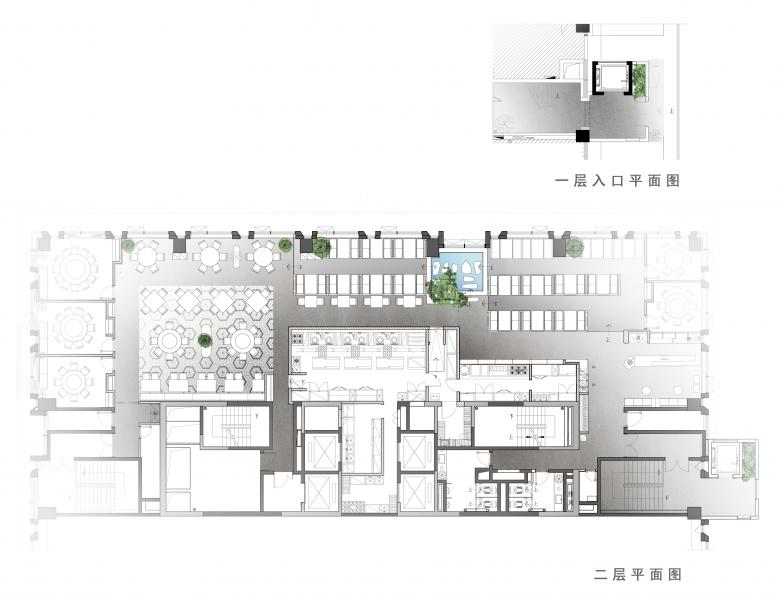
Therefore, in order to increase the restaurant's exposure in the business area, the designer Wu Wei added an independent storefront signboard on the first floor and an elevator connecting the first and second floors. Although it increases the cost, the traffic flow arrangement is so convenient to meet the fast consumption need of the target customer group, so as to achieve the purpose of attracting diners.
The long windows on the second floor facing the street indistinctly reveal the inside warm lighting and the dining scene in the restaurant. Through the window, the spicy and tender flavor of Hunan cuisine seems to linger in the tongue, and it becomes natural to walk into the restaurant.
To be remembered
Find the image of taste
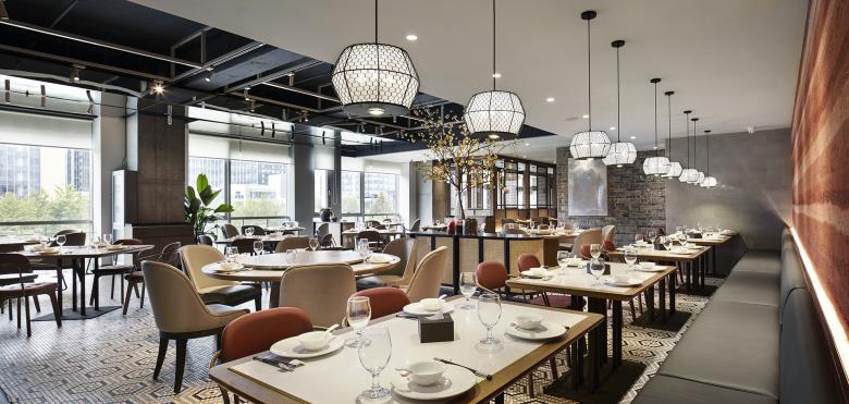
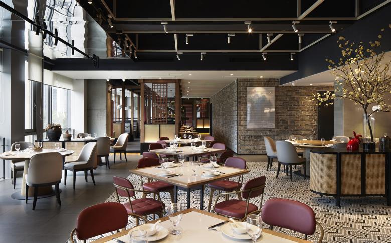
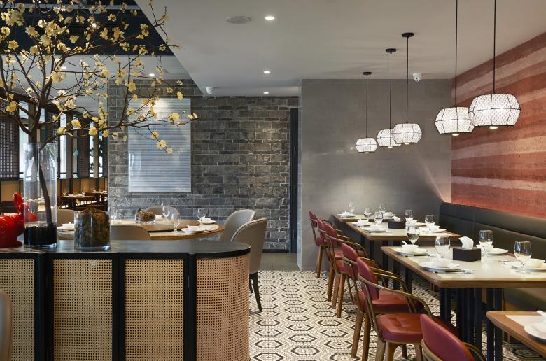
After reorganizing the layout, the space presents a compact and lively dining atmosphere. The welcoming feeling and the elements that evoke the traditional memories of Hunan become the unique features of Xiao Xiang Fu restaurant.
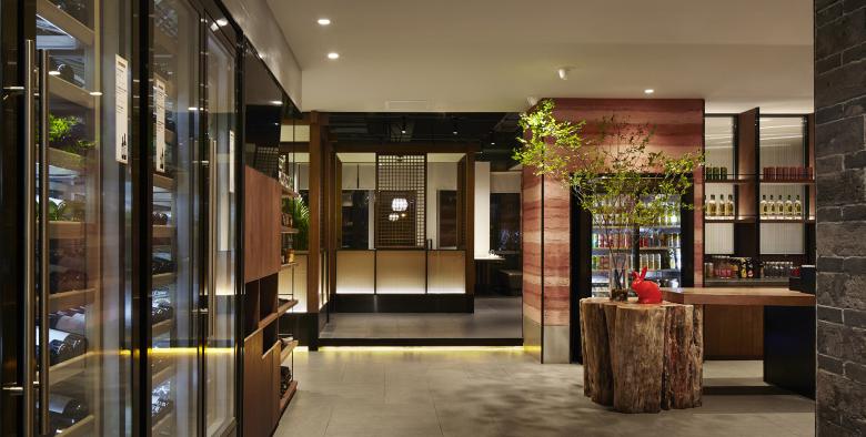
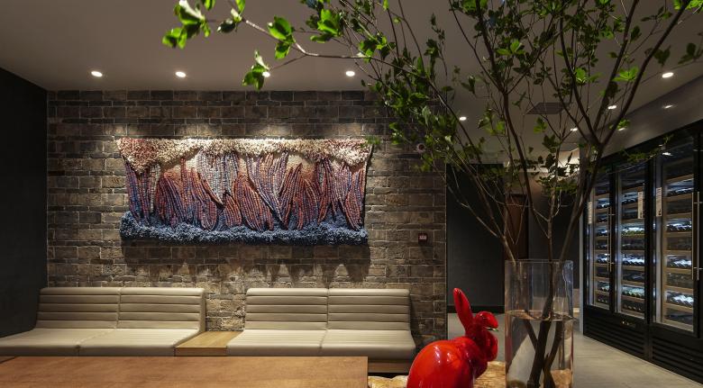
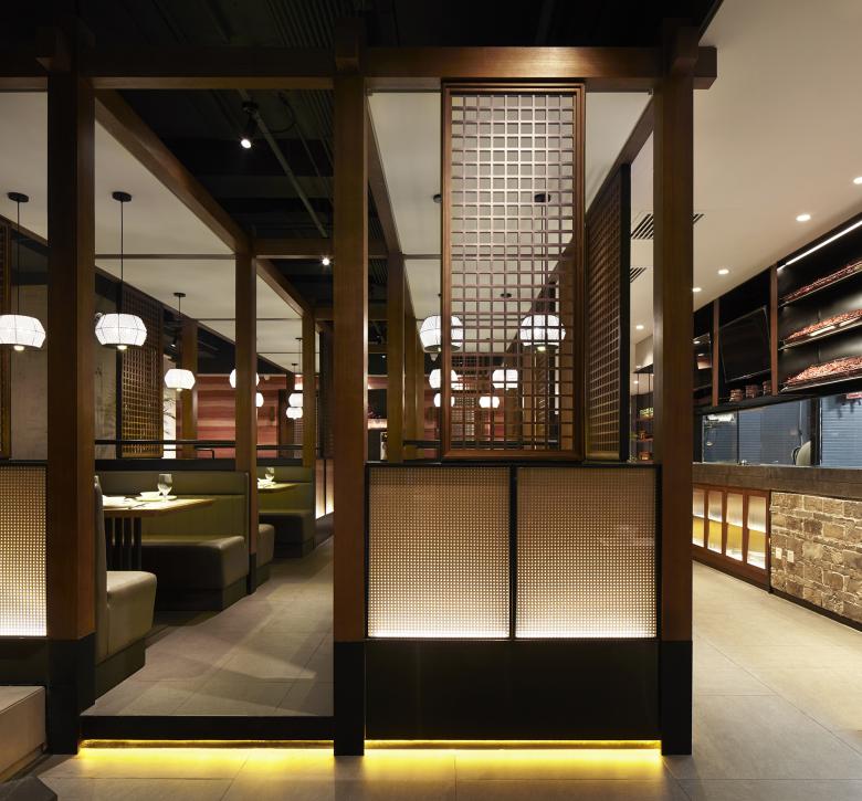
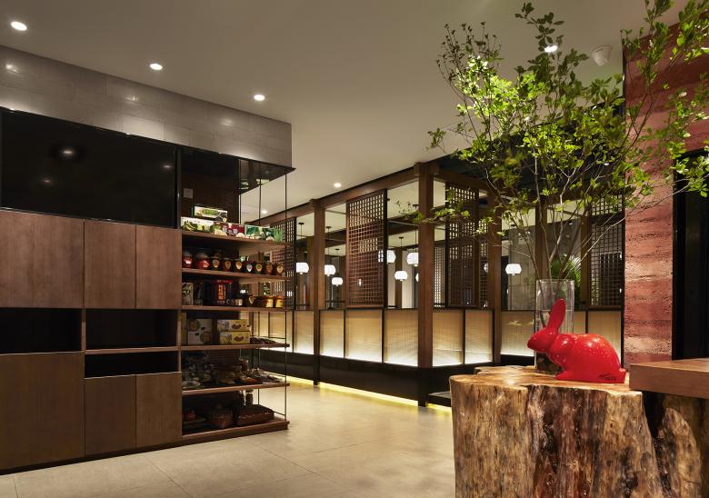
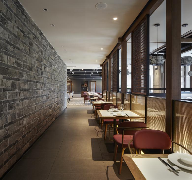
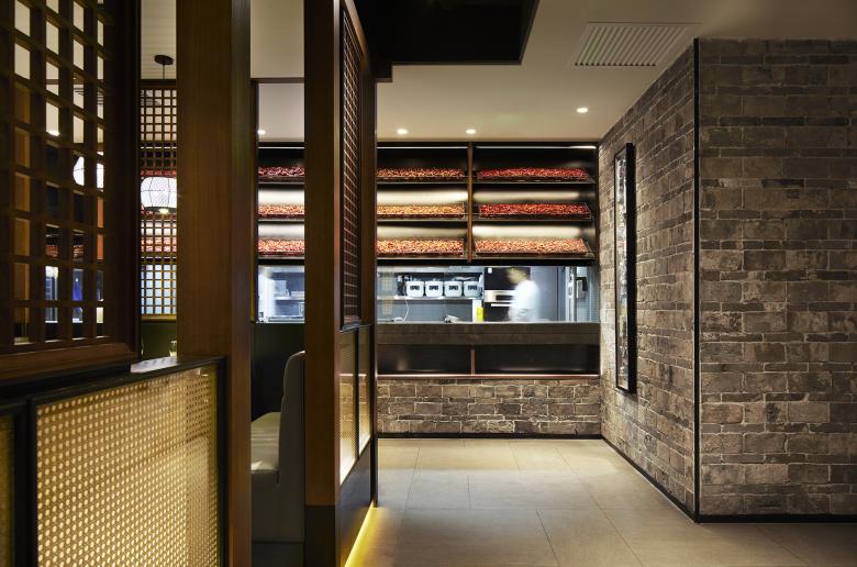
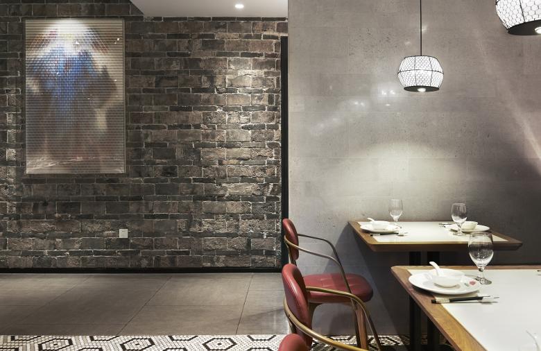
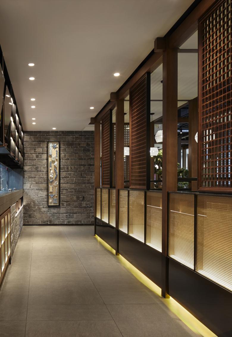
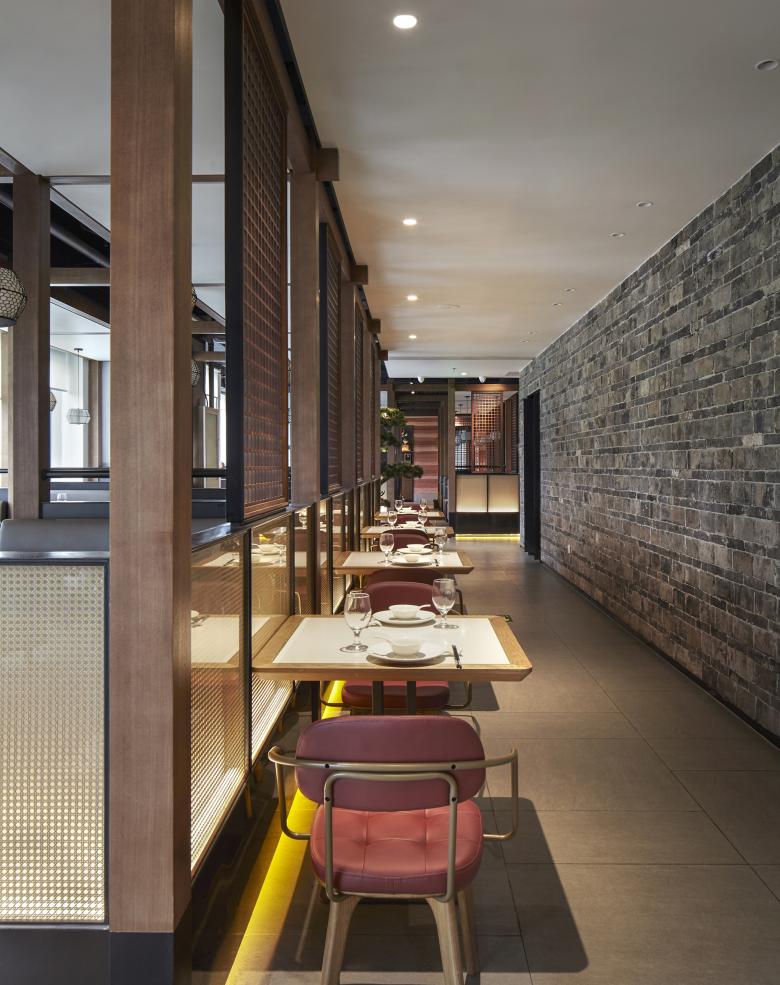
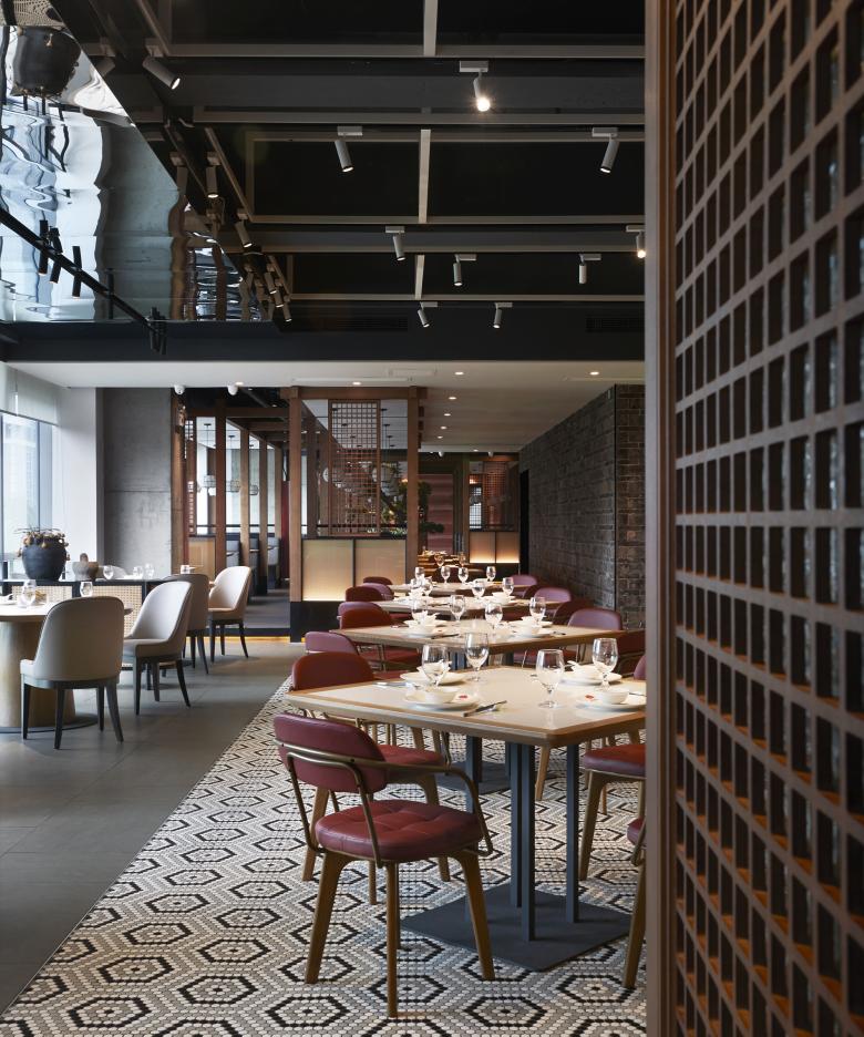
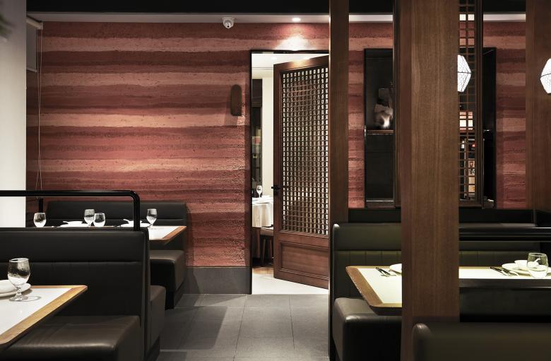
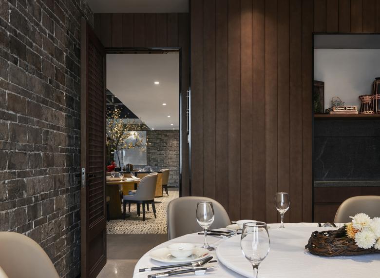
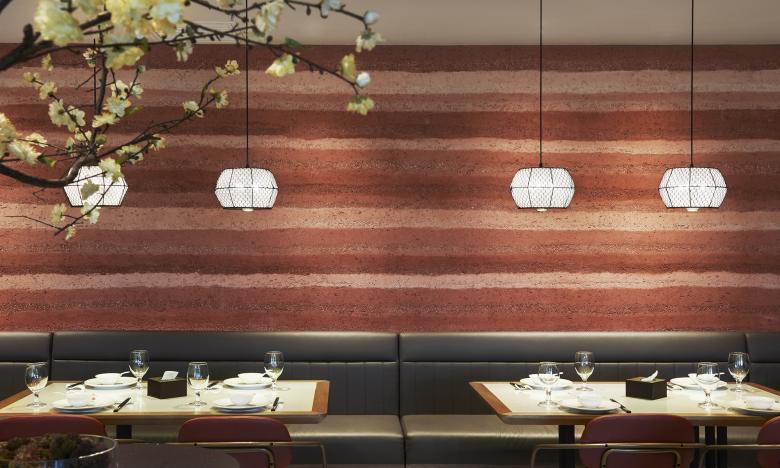
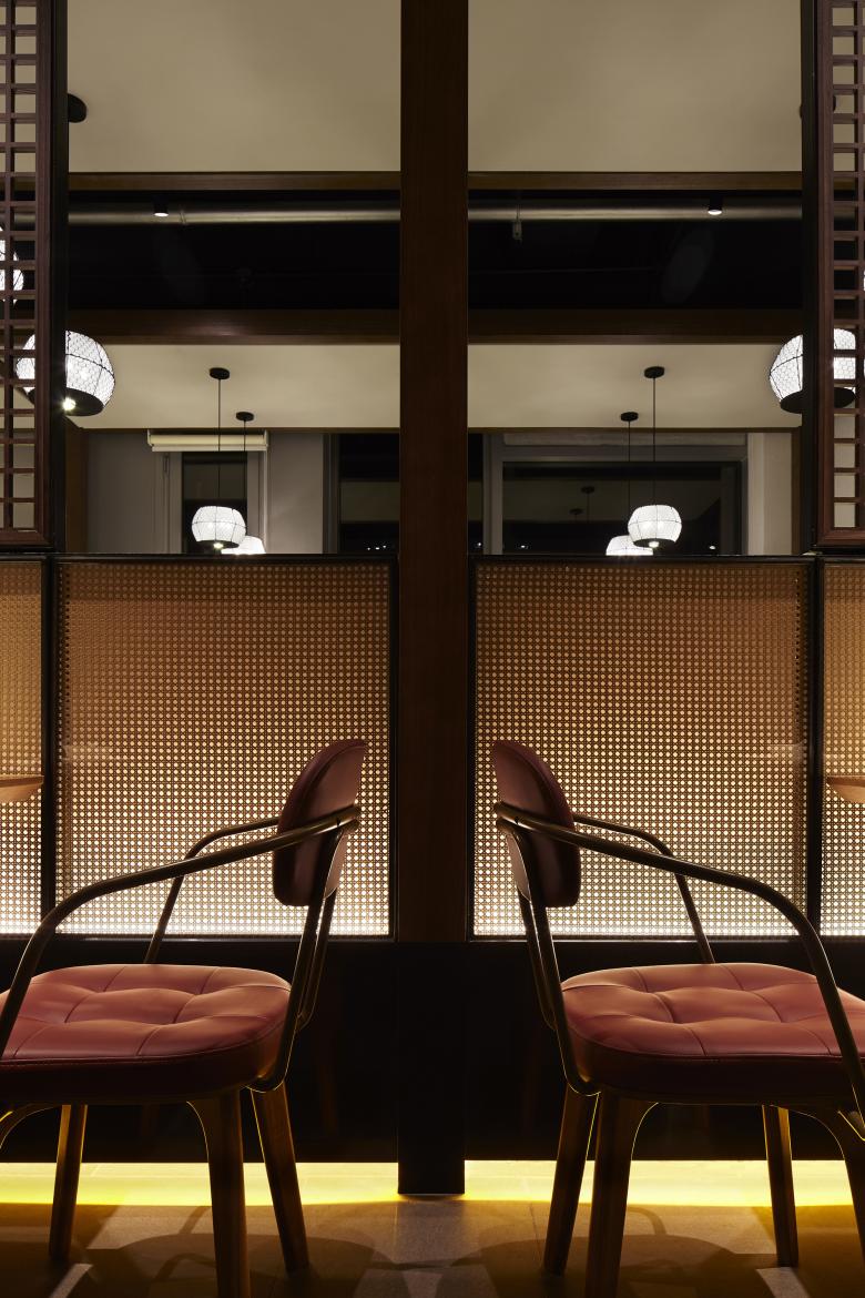
In order to connect the space with the brand Xiao Xiang Fu more effectively, the designer dismantled the traditional stilted building in Hunan, and put local materials such as black bricks and rammed earth into the space. After rearrangement, the traditional elements are transformed into structures such as walls, grilles, and facades in modern space,becoming the space palette in a flexible and orderly way.
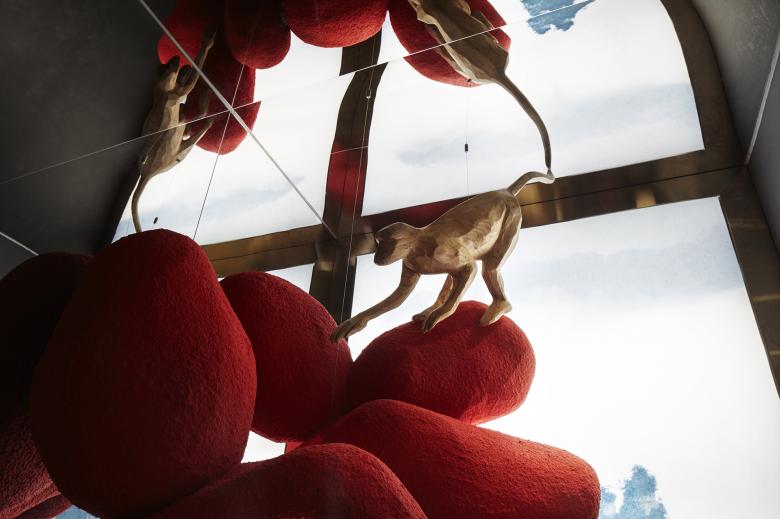
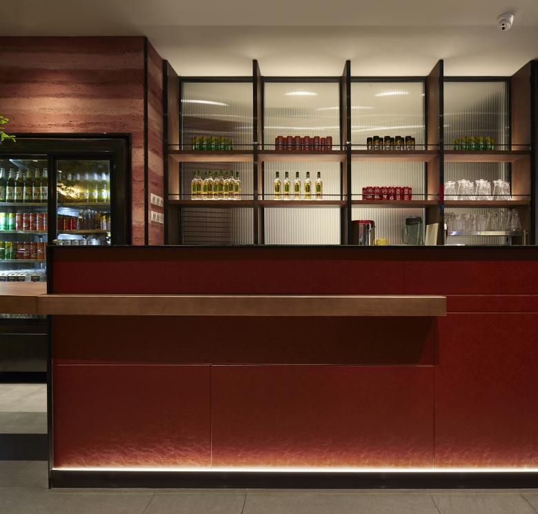
Other materials and elements that have Hunan characteristics are also considered for furniture and artwork. The low-brightness red is dotted in the wood and earth color, symbolizing a taste of Hunan cuisine.
The taste that different from other restaurants is reflected in the details of traditional imagery design, which will also be firmly connected with the brand to form a new impression of Xiao Xiang Fu.
Design code under the smell of cooking
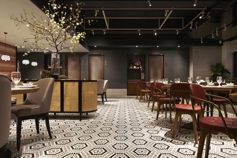
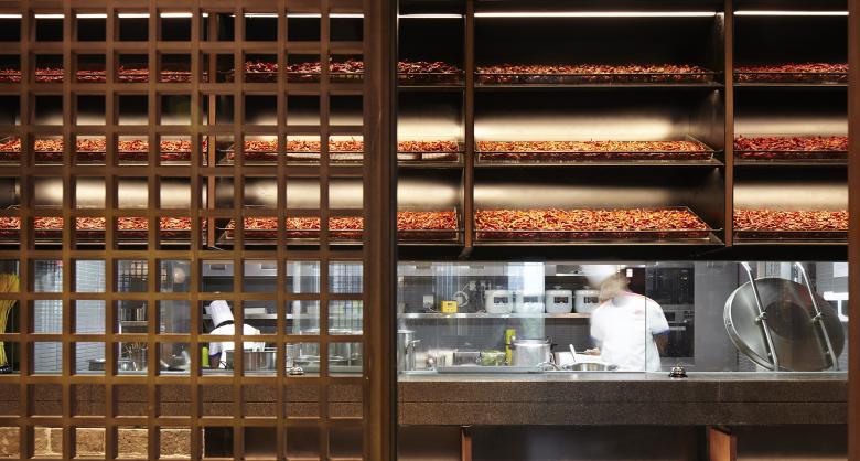
The original layout of second floor is relatively long and narrow. In order to improve the efficiency of food delivery and enhance the brand display effect to form a visual memory at the same time, the designer sets the open kitchen in a relatively central position. The surrounding booths, window seats and private rooms form three types of dining areas distributed throughout the space.
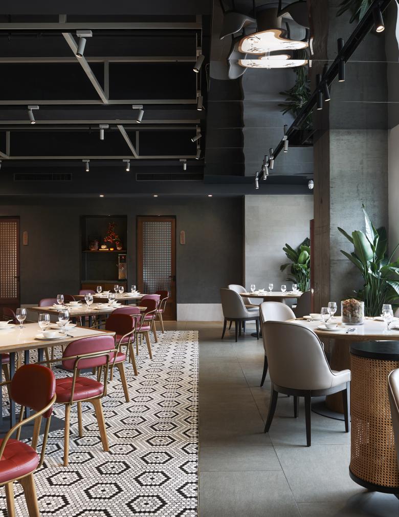
Passing through the booth area, it comes to the scattered window seating area,where bright natural light covers the entire space. Red earth rammed walls, tiles and cement-colored ground divide the dining area into another three parts, making the originally compact dining space in order.Lively but not complicated, the dining space and open kitchen form a perfect integration of motion and quietness and a wise combination of opening and closing.
The bare ceiling structure is processed into dark color, and the light gray steel structure is like a space framework, where roughness blends with refinement, and industry mixes with cooking softly.
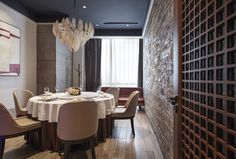
The private rooms at both ends of the space connect the entire space as a whole. The combination of old brick walls and wood furniture echoes the space temperament, while the concise design without too much decoration adds a neat contemporary space experience to the private rooms in the traditional restaurant.
— —
The well-leveraged space strategy of attracting crowds and the exclusive space visual impression have injected more vitality into the old catering brand. The previous customer group and the new diners who can better represent the modern consumption concept will write together the next chapter of Xiao Xiang Fu - which is about the taste, memory and their lasting affection.
- Architects
- IN•X Design Co. Ltd.
- Location
- Beijing, China
- Year
- 2020
- Team
- Interior design: IN.X, Designer: Wu Wei, Design team: Liu Chenyang / Jia Qifeng / Liang Pengfei / Zhang Peng, Interior decoration: Jin Shengxu / Ying Zheguang / Song Jiangli, Project planning: Lele Brand Strategy, Owner: Beijing Xiao Xiang Fu Catering Management Co.
