First Look: McMurtry Building for the Department of Art & Art History
Fred Bernstein
11. de setembre 2015
Photo: Iwan Baan
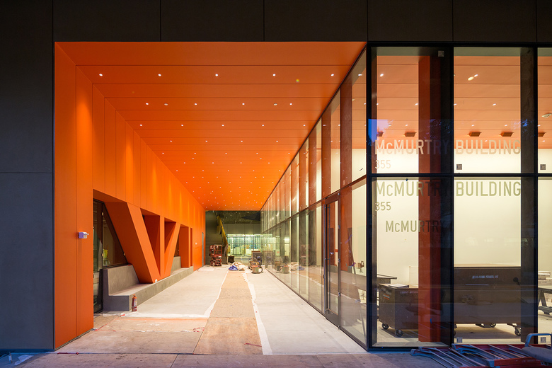
Diller Scofidio + Renfro recently completed the McMurtry Building for the Department of Art & Art History at Stanford University. Writer Fred Bernstein got a tour of the building from Charles Renfro and filed this report for World-Architects.
Photo: Iwan Baan
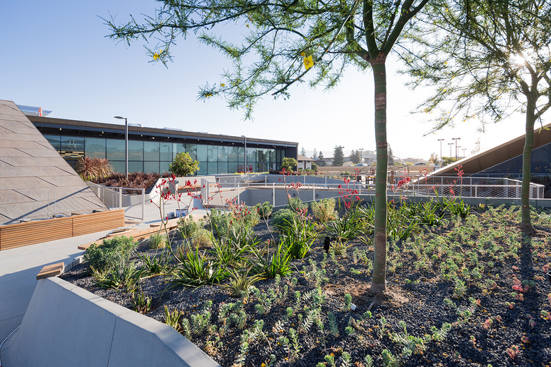
Under a president who values creativity, Stanford University has been constructing an "arts district" near the main entrance to its sprawling campus in Palo Alto, south of San Francisco. The first two buildings in the district were the Anderson Collection, a contemporary art museum, and the Bing Concert Hall, both designed by Richard Olcott of Ennead Architects. The former is open 39 hours a week; the latter, on the rare evening when there’s a concert. That created a need for a gathering place, which the latest addition to the arts district, the McMurtry Building by Diller Scofidio + Renfro, is prepared to fill: Indeed, large parts of the $85 million building, including a remarkably inviting rooftop garden reached by two large outdoor stairways, will be open to the public 24-7.
For that reason, lead principal Charles Renfro thinks of the building as not just an arts center but a campus amenity. "We like our buildings to be exceedingly generous," he says, "to provide more than the client ever anticipated." During a tour of the building he points out some of its “bonus” features. Its central courtyard hosts a hexagonal grandstand made of two-by-four ipe boards, which will serve alternately as stage and dance floor; overhead, a balcony cantilevered from one of the outdoor stairways will function as a DJ booth for the parties Renfro envisions taking place below.
Photo: Iwan Baan
But while Renfro sees McMurtry serving the entire campus, it is to art students that he really dedicated his efforts. The building had to accommodate undergraduate and graduate art history programs (which Renfro calls the "studying strand"), and undergraduate art studios ranging from photography to painting to sculpture to design to documentary film (the "making strand"), plus an architecture and art history library. Renfro says he spent a long time getting to know each group of users. "They’re very particular about how their spaces work," he says. It soon became clear that one type of room wouldn’t fit all — that a multiplicity of uses would require a concatenation of forms. The building’s closest analogue may be Rem Koolhaas's McCormick Tribune Campus Center at the Illinois Institute of Technology in Chicago, another case in which a grab-bag program led to a joyful explosion of formal invention.
Photo: Iwan Baan
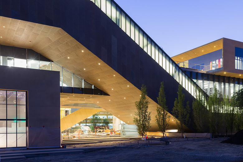
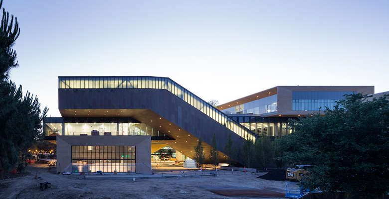
DS+R (working with executive architect Boora Architects) came up with a relatively simple parti. The "studying strand" and "making strand" slant up from the ground in opposite directions. Those inclined planes, almost a DS+R trademark by now, seem radical in a setting dominated by a collection of Rodin sculptures and a hulking neoclassical museum.
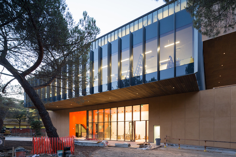
In a stab at contextualism, the "studying strand" is covered in beige stucco and the "making strand" in brownish zinc. Both materials, Renfro says, are "highly deferential to the traditional Stanford palette"; at the same time, he correctly observes, they are different enough to give each strand its own identity. The third large component of the new building, the library, is a Miesian box, with a blackish glass skin and I-beam mullions. It is cradled by the two angled strands, as if the building were a scissor-lift holding a parcel.
Photo: Iwan Baan
But if the parti sounds simple, the resulting building isn't. Running through the angled strands are outdoor stairways that Renfro sees as updates of the campus's traditional arcades. And he wanted the arcades to offer views of what's happening inside the building. (He also wanted to create openings that allow users to see from room to room.) Stanford was "hesitant to embrace all the transparency we proposed initially," says Renfro, who believes the users of the building don’t want or expect privacy. Having grown up in the era of Facebook, Twitter and Instagram, they are happy to be on display, he says. (Compromising, Renfro coated one row of windows with translucent film, which can be removed if more openness wins out.) Another problem: Fitting rooms into structures that angle upward at 27 degrees. The "studying strand" contains stepped tiers of study carrels. The "making strand" contains a series of painting studios with angled ceilings and clerestory windows; Renfro compares them to artists' garrets.
During a tour of the building, Renfro introduces himself to an art history professor, who gushes, "There are surprises everywhere." Then a county building inspector greets Renfro and tells him it's great to see the building finished. "When people are using it, that's when it's finished," Renfro responds. He couldn’t be more unlike those architects who don't want their pristine creations sullied. Renfro is dying to see the building occupied, to see how students finish what he started.
Photo: Iwan Baan
The McMurty Building is just one of three new Diller Scofidio + Renfro projects in California. The Broad opens in Los Angeles in September, and the Berkeley Art Museum/Pacific Film Archive is being readied for a spring debut. At 100,000 square feet, McMurtry, with its myriad constituents, is the most complicated of the three. Renfro’s ability to transmute those complications into confident and compelling architecture bodes well for the firm's other projects.
Fred Bernstein is a writer based in New York City.
A note on the photographs: These preliminary shots by Iwan Baan were taken before the building was completed and students and faculty moved in for the fall semester. World-Architects will feature Baan's finished photos in a separate post once they are available.
