21. de juny 2023
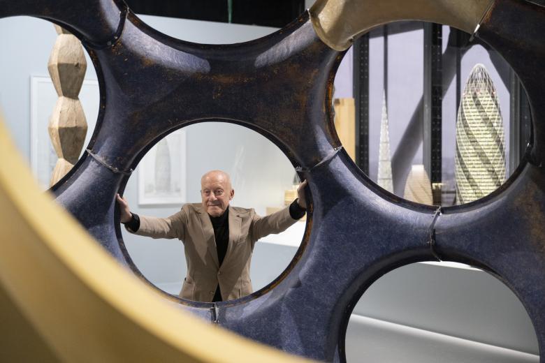
Photo: Nigel Young / Foster + Partners
Norman Foster, the massive monographic exhibition at the Centre Pompidou in Paris until August 7, 2023, looks back at six decades of arguably the world’s most successful architect. Ulf Meyer asks if it is a premature obituary.
When the King or Queen of England makes you a Lord or Lady, you are given a seat in the UK Parliament. It is rare for an architect to receive such an honor and the potential for power that comes with it. When Norman Foster got that recognition, in 1997, it seemed well deserved because he has been seen as his generation’s super hero of architecture — in and beyond England. So it is a great irony that a venue in the heart of Paris, not London, now hosts a great monographic exhibition about the architect and Sir-turned-Lord-turned-Baron, and that it takes place in a building designed by his alter ego, Richard Rogers.
The Centre Pompidou, designed by Rogers with Renzo Piano, was in some way an early climax of Italo-British-High-Tech, but in other ways it did not detract from what Foster presented in his marvelous career over the next three or four decades. While Foster, unlike Rogers, is still alive and well, his ideas of super-elegant, technology-driven architecture now seem passé. Fancy race cars and ultra-sleek aircraft are no longer the epitomes of the new generation of designers. His fascination with space exploration seems even more done, as people frantically worry about ruining this planet for good. But the great Paris exhibition does not problematize this; it celebrates an oeuvre and lifetime of achievements without question — not least because Foster himself worked on his own show, an irritating but increasingly common detail in architectural exhibitions.
Foster’s lifelong fascination with planes, trains, and automobiles is on display. (Photo: Nigel Young / Foster + Partners)
Foster’s architectural expression grew less out of “mechanization taking command,” à la Sigfried Giedion’s book, or even a Yellow Submarine-like milieu that was a fertile ground for his counterpart Rogers, but more out of Foster’s boyish yet literally lifelong fascination with planes, trains, and automobiles. Foster was able to turn this tic into some of the best airport, bridge, and train station designs of the late 20th century; he reinvented international rail and air terminals as heroic and symbolic gateways to nations and cities. His designs for moon dwellings and spaceports, though their designs are comparatively dated, strive to shift these gateways beyond Earth.
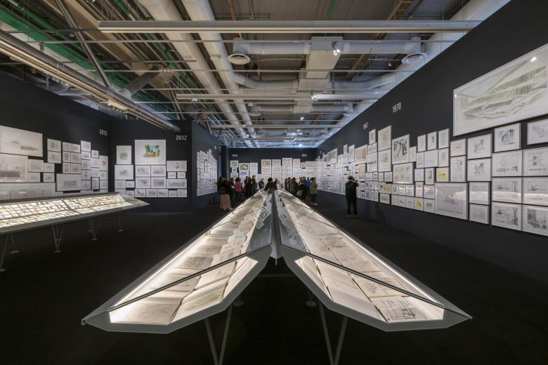
The Norman Foster exhibition at the Centre Pompidou — the most extensive architectural exhibition it has ever held — starts with an impressive selection of Foster’s A4 sketchbooks that are displayed in cabinets to reveal that almost all aspects of his oeuvre were developed early on: the clarity of thought and line; the clever use of the laws of physics, such as using stack ventilation to minimize the need for artificial ventilation or, in some cases, for cooling and heating. Foster even coined the phrase “breathing building.” This became the leitmotif of the work of the world’s most successful architect.
The exhibition starts with an impressive selection of Foster’s A4 sketchbooks. (Photo: Nigel Young / Foster + Partners)
The crucial question the show raises about Foster’s work and high-tech architecture at large is: Does it actually work? Claims that the buildings designed by Foster + Partners “harvest water and solar energy, recycle waste and absorb carbon dioxide,” as the companion catalogue states, have become commonplace today. But how robust are these claims, really? The city hall Foster designed for London, for example, reportedly had terrible performance data belying its claims of energy efficiency. It now sits empty on the banks of the Thames.
How to achieve sustainability in architecture is core question: Is high-tech (architecture) the proper solution to address climate change, pollution, and deteriorating environments? Currently, the architectural scene overwhelmingly says “no,” since low-tech solutions like the rediscovery of wood as a load-bearing material point in the other direction, while the adaptive reuse of buildings and their components increasingly questions the ethical justification of building anything at all. The Centre Pompidou has even seemed more interested in low- or no-tech approaches, as when they collaborated with Shigeru Ban for the timber-framed Pompidou Metz.
A model of Stansted Airport's steel structure sits in the middle of a display of numerous airports designed by Foster + Partners. (Photo: Nigel Young / Foster + Partners)
While Piano and Rogers painted the ducts and pipes of the Centre Pompidou in bright colors, celebrating the services on the outside, Foster turned to less trendy, more slick, smooth, and thus visually longer lasting ways of integrating building services. The idea of environmentally sensitive design started with Team 4, established by Foster with Georgie Wolton, Wendy Cheesman, Su Brumwell, and Richard Rogers in London in 1963. Soon thereafter, Norman and Wendy married and together founded Foster Associates. The Ipswich headquarters for Willis Faber & Dumas (1975) was a major breakthrough for them. Its open-plan office floors, roof garden, and swimming pool were as revolutionary as the full-height glass facade that looked opaque during the day and glowed when backlit after dusk. The play of external skin, or “envelope” as Foster likes to say, and the skeleton, or “structure, services, and cladding,” were almost fully formed here.
“In a medieval cathedral, the structure is the architecture and the architecture is the structure, as in several of our towers,” Foster says. In a similar sentiment but updated context, he also references Fernand Léger’s postwar painting The Builders (1950) depicting construction workers entwined within a network of iron girders. His ability to bring the disciplines together, collaborating with engineers to mutual benefit, is a great skill. It is evident in the journey from Foster’s early successes, such as the Sainsbury Centre on the campus of the University of East Anglia in Norwich (1978), to highlights that irrevocably became part of the canon of 1980s and 90s architecture, including the airports in Hong Kong (1998) and London Stansted (1991) and elegant high-rises like the HSBC Bank in Hong Kong (1986, then the world’s most expensive building) and the Commerzbank (1997) in Frankfurt. Structure and services were integrated at the Sainsbury Centre, an expression of how Foster sees buildings as “an integration of “structural and environmental systems.” For him, “technology is also a means to social ends — to protect from the elements and lift the spirits.” Sometimes that works: Stansted Airport, for instance, liberated the roof for sunlight.
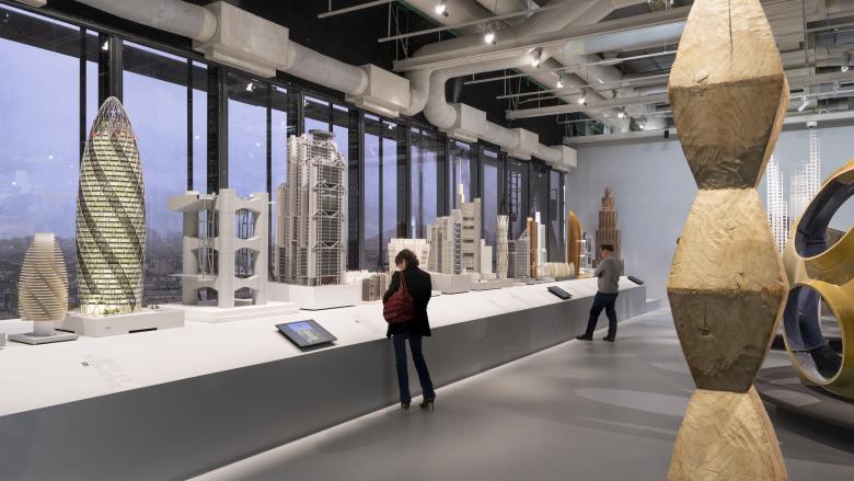
Models of the elegant high-rises designed by Foster from the 1980s to the present. (Photo: Nigel Young / Foster + Partners)
If you take big step back, credit needs to be given to Foster (and some of his contemporaries) for overcoming both the PoMo wave that quickly became silly and the heavy postwar brutalism. When Foster studied architecture at Yale in the 1960s, it was Paul Rudolph and Louis Kahn who inspired him. Charles Eames, Ezra Ehrenkrantz, and R. Buckminster Fuller were his mentors. Still, Foster is very much a self-made man who owes his success to his ambition and willingness and ability to work things through.
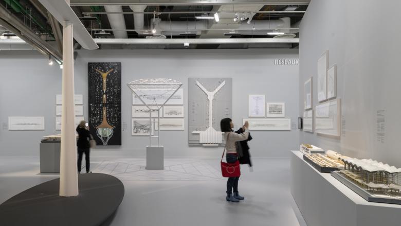
Across an astounding 2,200 square meters (23,680 sf), Foster’s oeuvre is laid out with meticulous models and beautiful 3-D drawings depicting the phases and typologies that Foster is most famous for. Curator Frédéric Migayrou highlights how Foster’s designs were often cutting edge both aesthetically as well as technologically, but also shows how some of his best buildings took their cues from existing structures, such as with the Carré d’Art in Nîmes (1993) and the splendid cupola that adorns the Reichstag in Berlin. The ultra-elegant roof over the courtyard surrounding the famous reading room of the British Museum in London should also be counted as one of Foster’s best works. In this sense, recent projects like Apple Park in Cupertino, California (2017) disappoint in their unwillingness to connect to anything around them — the “great indoors” occasionally trumps good urban design.
Needless to say, Foster’s office has long been truly global and has designed hundreds of buildings on all continents. Still, the exhibition resists the temptation to be too comprehensive. The scenography was “designed by Norman Foster with Foster + Partners and the Norman Foster Foundation” — a case of a self-hagiography — but it is pleasantly cool, as such. Foster is now 88 years old, has sold most of his firm, and enjoys life in Switzerland. Will his body of work be seen as a fair expression of one branch of the ecological movement, or is the focus on performance-driven design just making ecological destruction more efficient? Time will tell. The “Architecture of the Well-Tempered Environment,” as Reyner Banham coined it, took shape in Foster’s designs in a clarity that has not been rivaled by another architect since. In this sense, Norman Foster can be seen as a reckoning with the whole UK architecture scene from the 1980s until today and, in particular, the life and work of Norman Robert Foster, Baron Foster of Thames Bank.
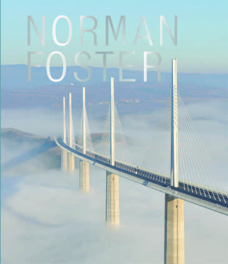
Norman Foster
Under the direction of Frédéric Migayrou
24 x 28 cm
272 Pàgines
400 Illustrations
Paperback
ISBN 9781788842273
Editions du Centre Pompidou
Purchase this book
Articles relacionats
-
A Film By and About Foster
24/1/24
-
The End of an Era
21/6/23
