30. de maig 2018
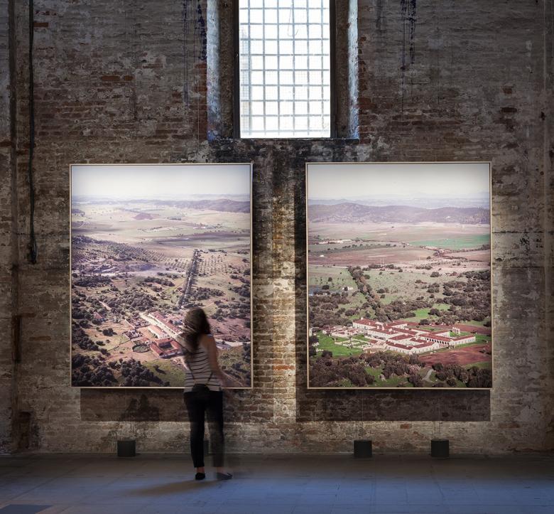
Souto Moura – Arquitectos: "Vol de Jour" (Photo: Francesco Galli, courtesy of La Biennale di Venezia)
With three of four prizes in FREESPACE, the 16th International Exhibition at the 2018 Venice Architecture Biennale, being given to displays of large photographs, the question arises: has architectural photography displaced drawings and models to become the mode for explaining the work of architects to the larger public?
I'm still taken aback that Souto Moura – Arquitectos, the firm of 2011 Pritzker Prize-winning architect Eduardo Souto de Moura, won the Golden Lion with two large, wall-mounted aerial photographs. Mounted in the Arsenale's Corderie, they depict the before and after in the transformation of a convent into a hotel in Portugal's countryside. Taken from slightly different vantage points about ten years apart, the photographs function like find-the-difference puzzles for children — so subtle are the changes the architect carried out. Limited to the two photographs, their framing, and their lighting, the Golden Lion to Vol de Jour justifies the photographic presentation as much as it does the restrained project. Except for perhaps fellow Pritzker Prize winner Paulo Mendes da Rocha, whose contribution to FREESPACE is a sketch enlarged and applied to a wall in a small room in the Central Pavilion, Souto de Moura's exhibition piece is the most minimal in the whole exhibition. It also shifts the responsibility for telling the story of the project from the architect to the photographer.
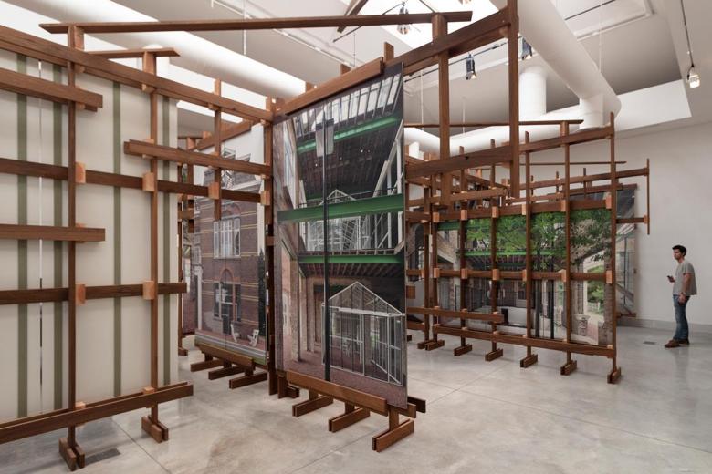
architecten de vylder vinck taillieu: “Useless Ever People: Caritas for Freespace" (Photo: John Hill/World-Architects)
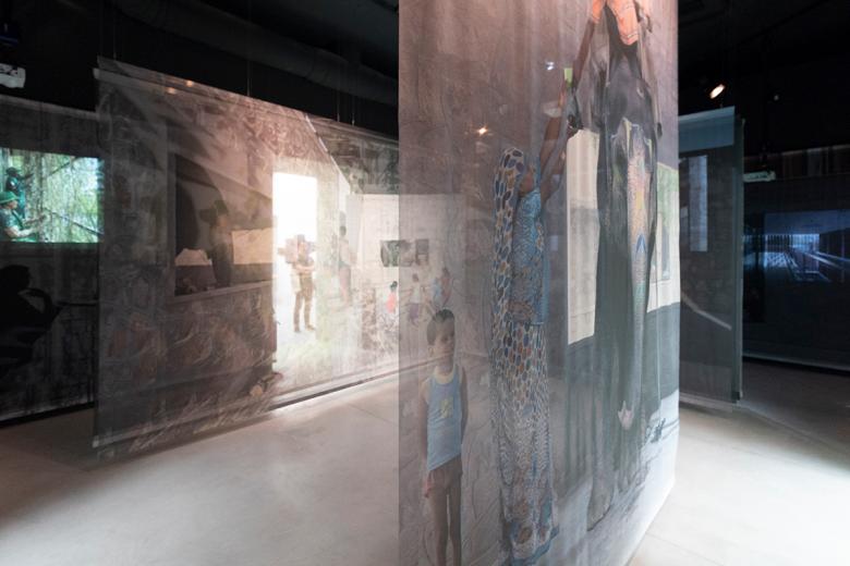
Two of the other three FREESPACE prizes – architecten de vylder vinck taillieu's Silver Lion for a promising young participant for Useless Ever People: Caritas for Freespace and RMA Architects' special mention for Soft Threshholds – use large-scale photographs to explain buildings. But both go beyond gallery-like images on walls to define spaces and paths within their respective rooms in the Central Pavilion. The Belgium architects mounted photos on wooden frames that attempt to capture the qualities of the glass greenhouses they inserted into an old "villa" at a psychiatric clinic in Melle, Belgium. The firm of Indian architect Rahul Mehrotra, on the other hand, put the people-saturated photos on translucent scrims that define a meandering path but also echo the "soft threshholds" of three realized buildings in India. Unlike Souto de Moura's contribution, these two pieces exhibit the hand of the architect, through tectonics and the creation of spaces. Nevertheless, they rely primarily on photographs for explaining architecture and in turn create what are in effect mini-galleries for looking at photos.
RMA Architects: "Soft Threshholds" (Photo: John Hill/World-Architects)
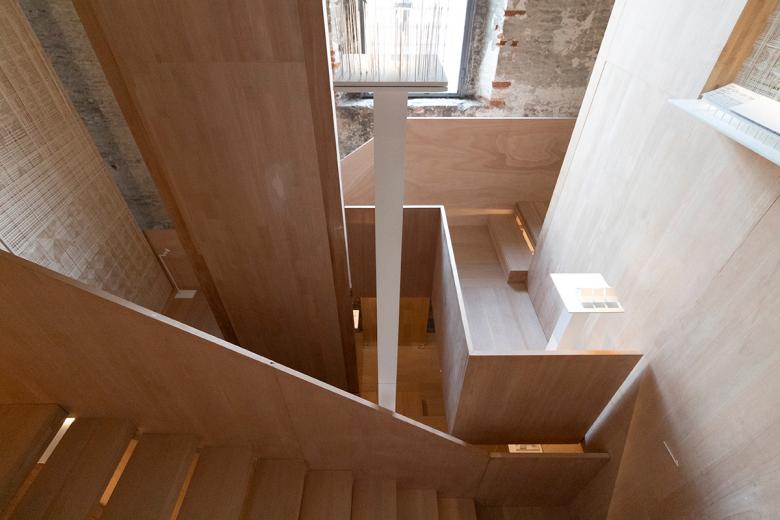
The remaining prize winner – andramatin's special mention for Elevation – eschews photographs completely, focusing instead on models to document the architecture studio's research of vernacular forms in Indonesia. The small white models are housed in a woven enclosure that is traversed by a looping path of steps and walkways made of wood. Architects designing small installations for displaying representations of architecture is a common tactic in the Biennale, particularly in the Arsenale's impressive Corderie, where models and drawings can fade away without an enclosure to mediate between the visitor and the 300-meter-long space. In the case of Andra Matin's "house," it creates intimate pockets for the display of the models and their appreciation. It also exhibits the architect's understanding of his research – extending traditional forms to contemporary practice.
andramatin: "Elevation" (Photo: John Hill/World-Architects)
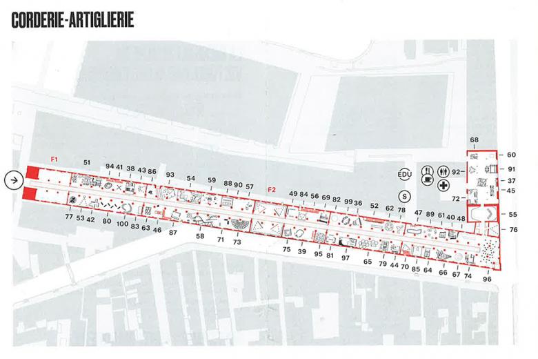
A quick glance at a plan of the Corderie and Artiglierie at the Arsenale makes it clear that a tactic like Matin's pleasing installation was preferred by the architects participating in Yvonne Farrell and Shelley McNamara's FREESPACE. The numerous contributions can be read as fine-grained objects floating within the bays on either side of the Corderie's 300-meter-long path — minus Eduardo Souto de Moura's Golden Lion winner, which is a small void about halfway along its length. The various lines and shapes hint at the constructions that architects inserted in order to gain a presence in the large space and, like Matin, create a setting for displaying their projects, most often in the form of drawings and models but sometimes photos and videos. Below are a handful of contributions that captured my attention — and evidence that not all architects have given in to the power of photography — all culled from the Arsenale and presented in order from entrance to exit: left to right in the floor plan.
Plan of 300-meter-long Corderie and perpendicular Artiglierie at the Arsenale, scanned from Biennale pamphlet. Note the granular elements floating within the spaces of the buildings, the two "Freespaces" at F1 and F2, and the void at number 90 (top-center), where Souto de Moura's photos reside.
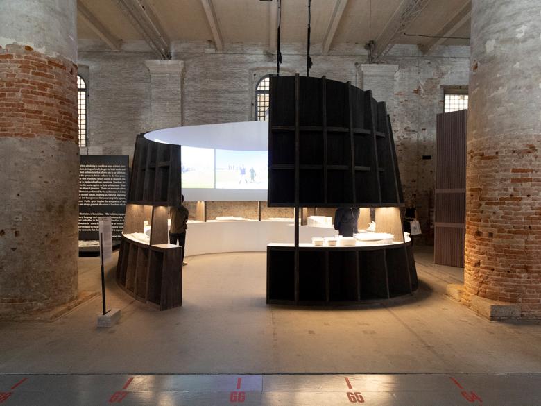
Weiss/Manfredi: "Lines of Movement" (Photo: John Hill/World-Architects)
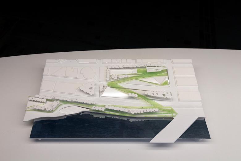
New York's Weiss/Manfredi is known for institutional projects — both buildings and landscapes — with complex circulation routes that clearly align them with the Biennale curators' FREESPACE manifesto. Their display, Lines of Movement (100 in plan), consists of a small pavilion tucked into one of the bays and opens at two points to allow access to the center. It is dark outside and white inside, with shelves cut into each of the curved walls for the display of models and the smooth white surfaces inside used for the projection of some short films. Not content to focus exclusively on their own projects, about half of the models are precedents, some ranging back centuries. Most appealing are the models — much like those on display in the Greek pavilion, where their Diana Center is part of The School of Athens exhibition — that highlight the circulation spaces in green, as in Seattle's Olympic Sculpture Park below. Here, models abstracted from their reality express ideas that could not be presented as comprehensively in photographs.
Weiss/Manfredi: "Lines of Movement" (Photo: John Hill/World-Architects)
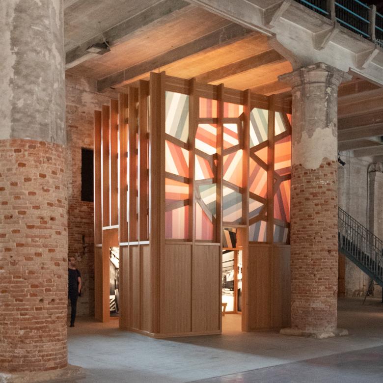
Sauerbruch Hutton: "Oxymoron" (Photo: John Hill/World-Architects)
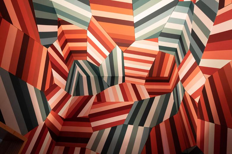
Berlin's Sauerbruch Hutton uses color more liberally than 99% of architects working today. Many of their project exploit the colorful finishes available in the manufacture of facade panels, thereby creating elevations that most people only experience from the outside. In the Corderie, they inserted a box (87 in the plan) with wood at its base but glowing like a colorful lantern above. Benches invite people to gaze at in-progress photos of their M9 museum project in Mestre, just west of Venice, but it's the immersive surfaces of color above that steal the show. Faceted in irregular shapes and with stripes going this way and that way, the panels deter a grasp of scale and therefore allow one to get lost in them, much like a James Turrell Skyspace filtered through a kaleidoscope.
Sauerbruch Hutton: "Oxymoron" (Photo: John Hill/World-Architects)
Flores & Prats: "Liquid Light" (Photo: John Hill/World-Architects)
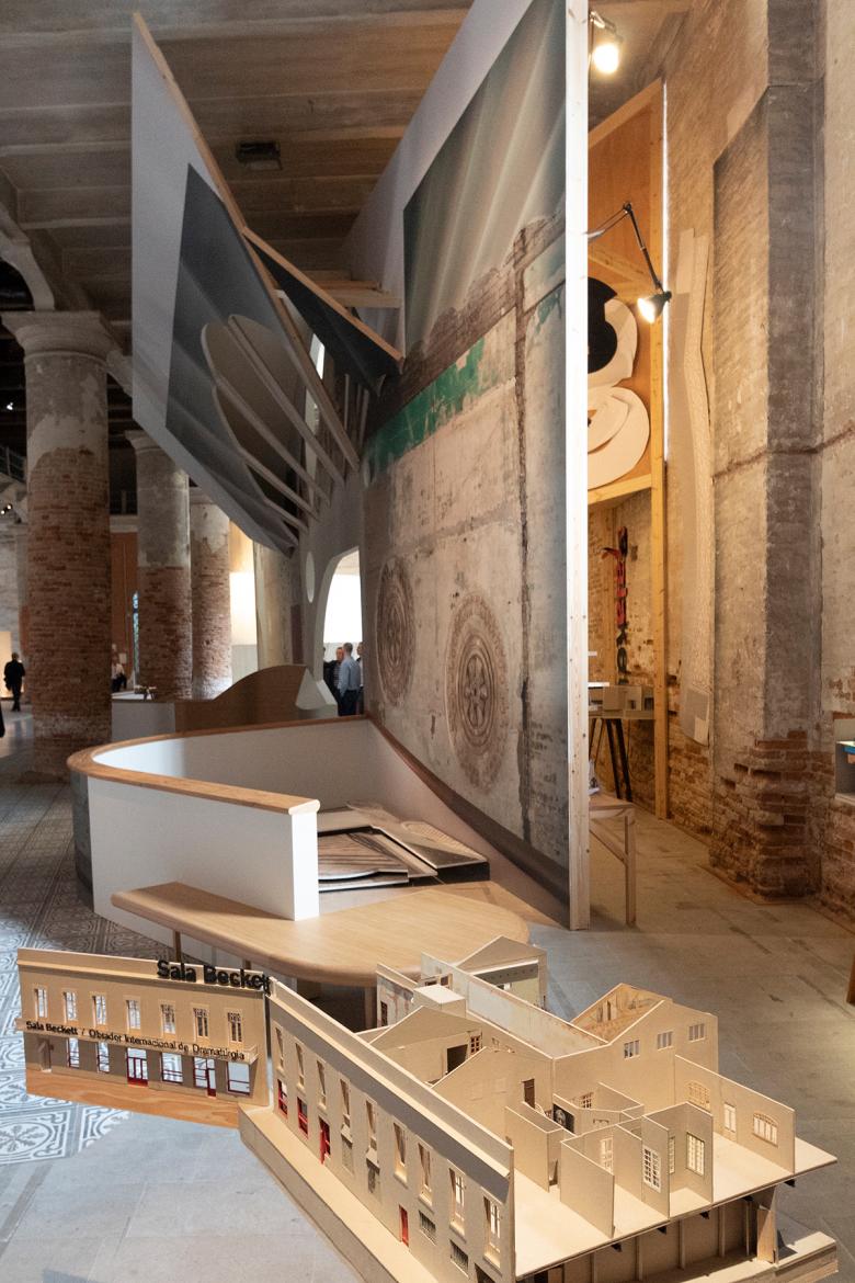
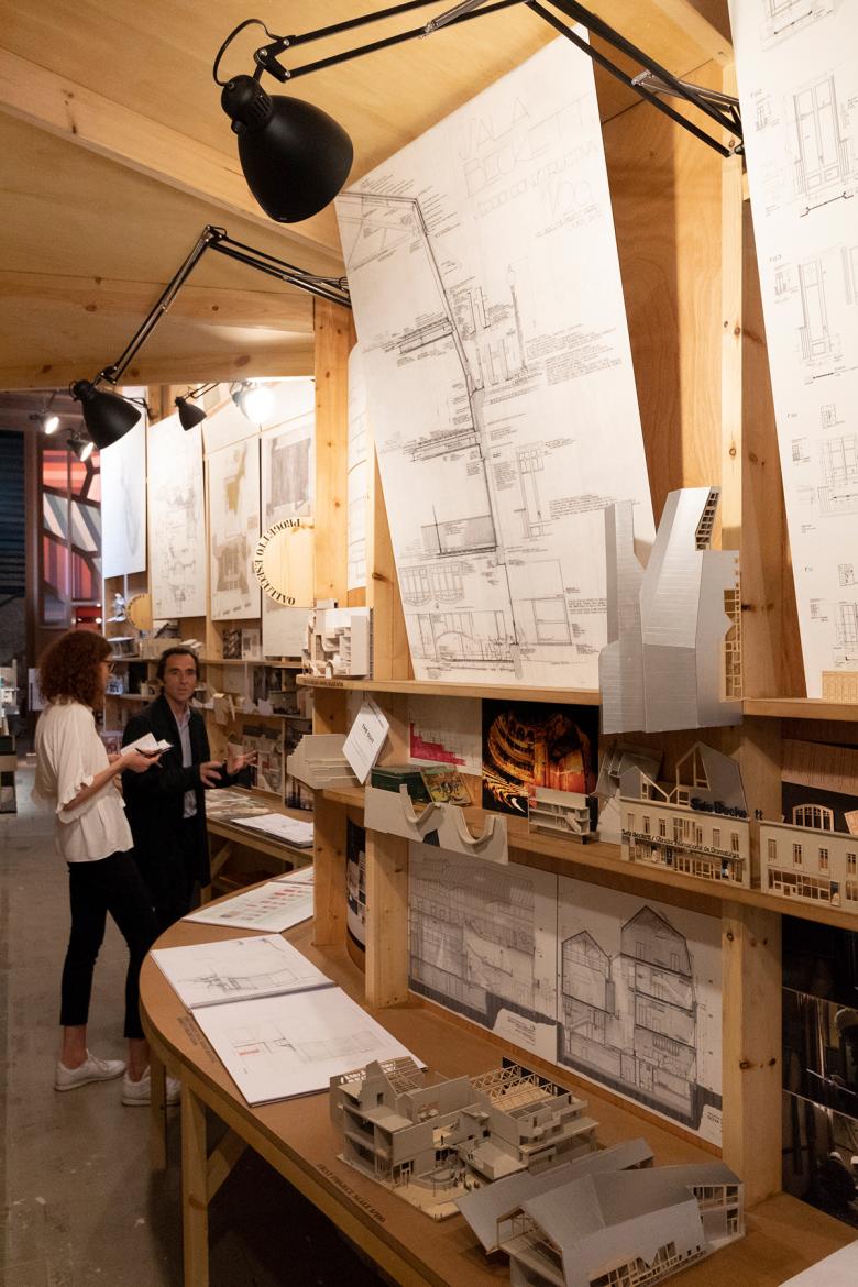
The largest piece in the Corderie comes from Barcelona's Flores & Prats. Taking up three structural bays (58 in plan), Liquid Light documents the practice's transformation of a social worker's club in Barcelona into the Sala Beckett theater. The display consists of three parts: small sectional models displayed in a fairly traditional manner; a large reconstructed fragment of the Sala Beckett that faces the long walkway down the Corderie and recalls the "Strada Novissima" from the 1980 Biennale; and behind it a "backstage" with drawings, more models, and other artifacts. The last is a phenomenal display, overwhelming in the quantity of material assembled in one place but the best expression of the numerous studies, sketches, maquettes and other bits of paper that architects draw upon and shape in their day-to-day jobs. The three parts imbue an understanding of the project second only to the Sala Beckett itself.
Flores & Prats: "Liquid Light" (Photo: John Hill/World-Architects)
John Wardle Architects: "Somewhere Other" (Photo: John Hill/World-Architects)
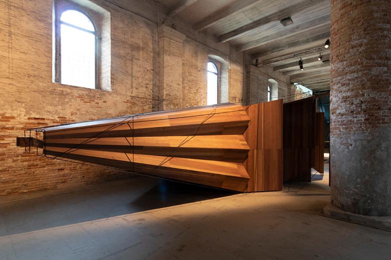
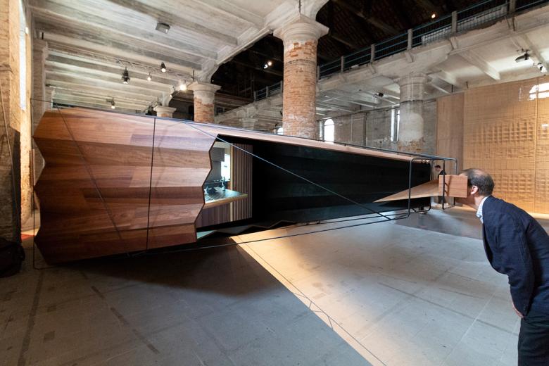
One of the most intriguing objects in the Corderie came from Melbourne's John Wardle Architects. Somehwere Other (67 in plan) is wood walls and mirrors on one end and a tapered, bellows-like snout on the other. On my visit people were drawn to it but then hesitated, wondering what exactly it was or what to do with it. Eventually, people made their way into the end with the mirrors, in essence conditioning themselves for disorienting views of the space around them. Afterwards, people ventured to the tip, where a small wood box sculpted to the human head invited people to look through it. Unfortunately, it only frames a screen with scrolling photos of JWA's projects — a bit of a letdown after the well-crafted buildup.
John Wardle Architects: "Somewhere Other" (Photo: John Hill/World-Architects)
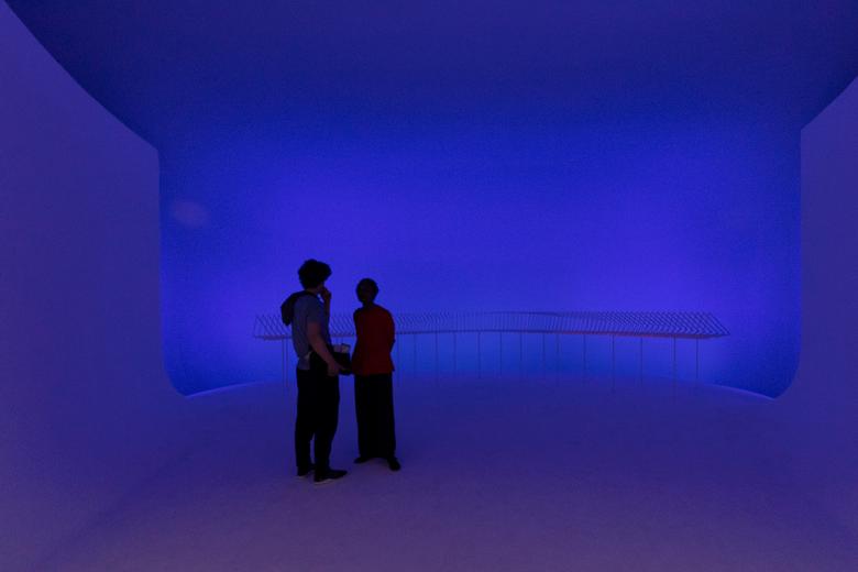
Dorte Mandrup A/S: "Conditions Icefjord Centre, Ilulissat, Greenland (Photo: John Hill/World-Architects)
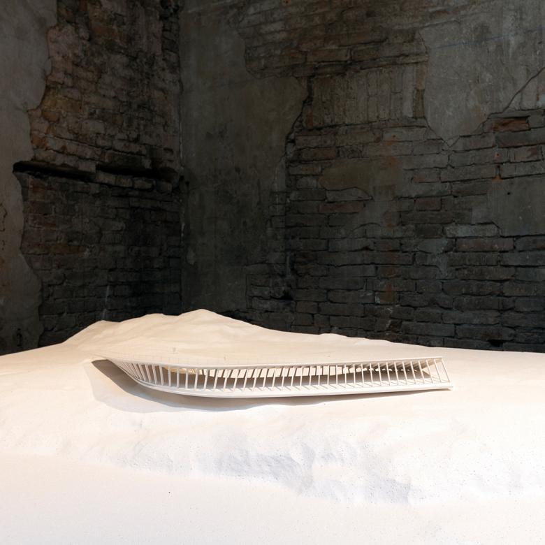
At the hinge from the Corderie to the Artiglierie sits a windowless gallery (55 in plan) occupied by Copenhagen's Dorte Mandrup A/S. In the room next to it sits a small model of the firm's visitor center in a UNESCO-protected nature reserve near Ilulissat in Greenland. Through an opening is a soft space where walls and floor converge, leading to an even larger model of the visitor center, but proppped up on stilts rather than embedded in the ground. Artificial lighting depicts the atmospheric effects of the sky and landscape around the visitor center. Model, space and light converge to elegantly create an immersive installation where architecture is a backdrop to nature.
