Nancy and Rich Kinder Building, MFAH
Houston, USA
- Architects
- Steven Holl Architects
- Localització
- 5500 Main Street, 77004 Houston, USA
- Any
- 2020
- Client
- The Museum of Fine Arts Houston
- Equip
- Steven Holl (Design Architect), Chris McVoy (Design Architect), Olaf Schmidt (Project Architect), Filipe Taboada (Project Architect)
- Associate Architect
- Kendall/Heaton Associates, Inc.
- Restaurant Architect
- Steven Harris Architects
- Landscape Design
- Deborah Nevins & Associates in collaboration with Nevins & Benito Landscape Architecture, D.P.C.
- Project Manager
- Matthew Snellgrove, Legends
- Structural Engineers
- Cardno Haynes Whaley, Guy Nordenson and Associates
- MEP Engineer
- ICOR Associates
- Civil Engineer
- Walter P. Moore & Associates
- Climate Engineers
- Transsolar
- Lighting Consultant
- L’Observatoire International
- Cost Estimator
- Venue Cost Consultants
- Façade Consultant
- Knippers Helbig
- Glass
- Gartner Permasteelisa
- LEED Commissioning
- Loring Engineers
- Water feature
- Waterscapes
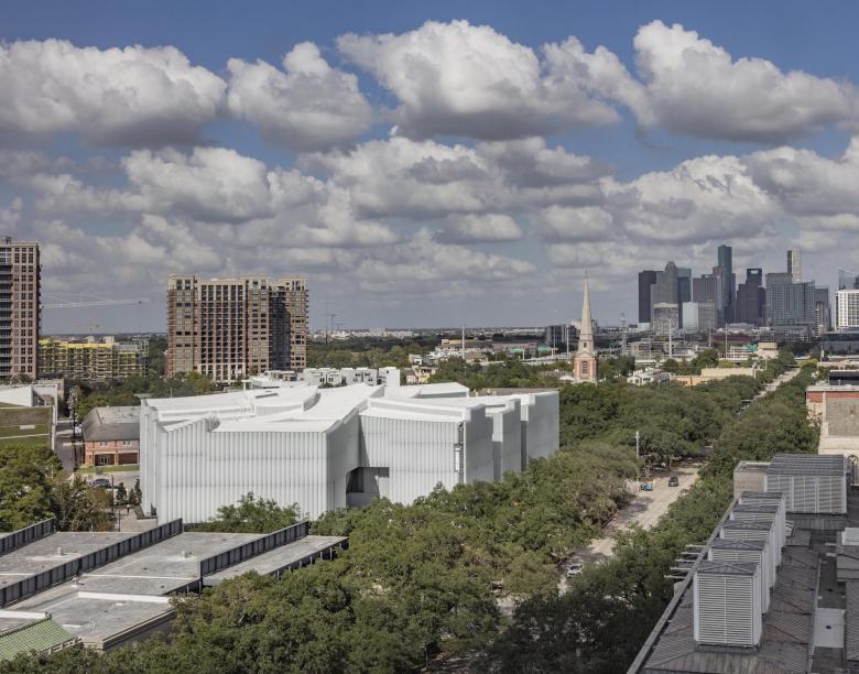
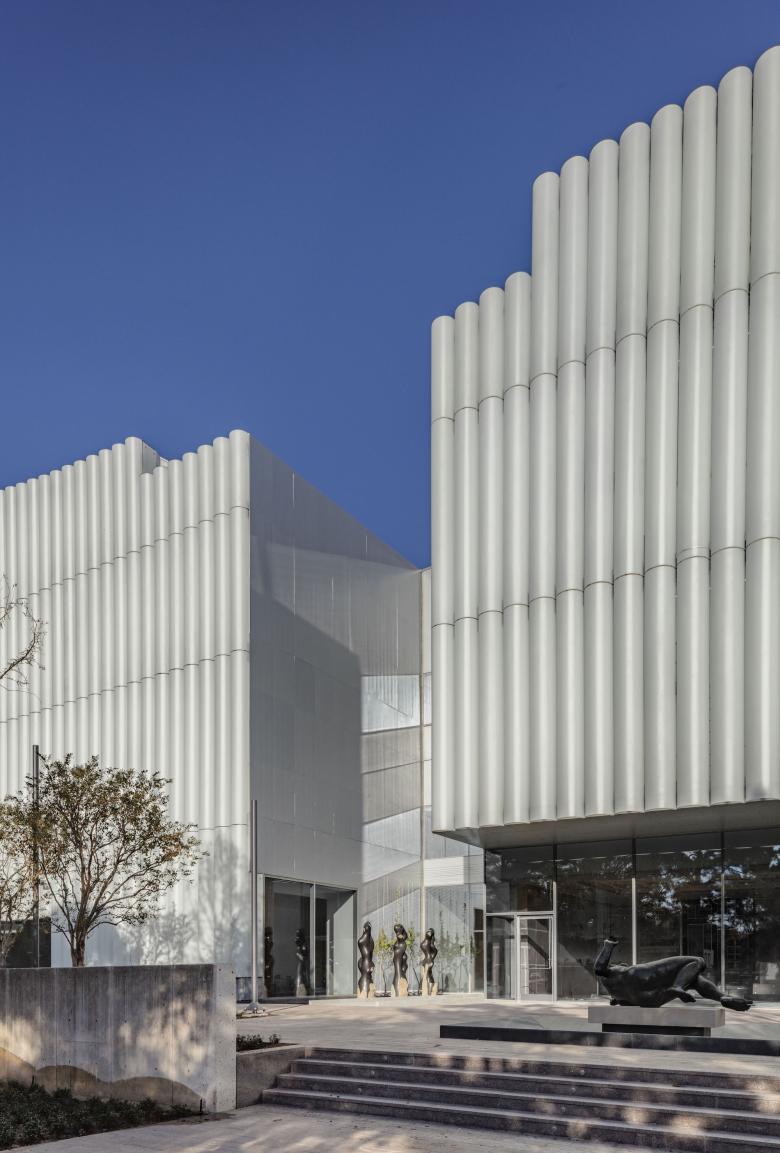
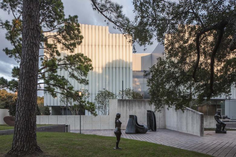
The new museum architecture of the Nancy and Rich Kinder Building is characterized by porosity, opening the ground floor at all elevations. Seven gardens slice the perimeter, marking points of entry and punctuating the elevations. The largest garden court, at the corner of Bissonnet and Main Street, marks a central entry point on the new campus. When standing in the great new entrance lobby of the Kinder Building, one can see gardens in four directions and feel the inviting energy of a new sense of openness to the community.
The new ground level is an activate social space open to the community with longer hours than the two gallery floors above. A fine restaurant opens to the Cullen Sculpture Garden, a café to Bissonnet, and galleries open to Main Street. Special performances might take place in the Brown Foundation Plaza and Glassell rooftop garden.
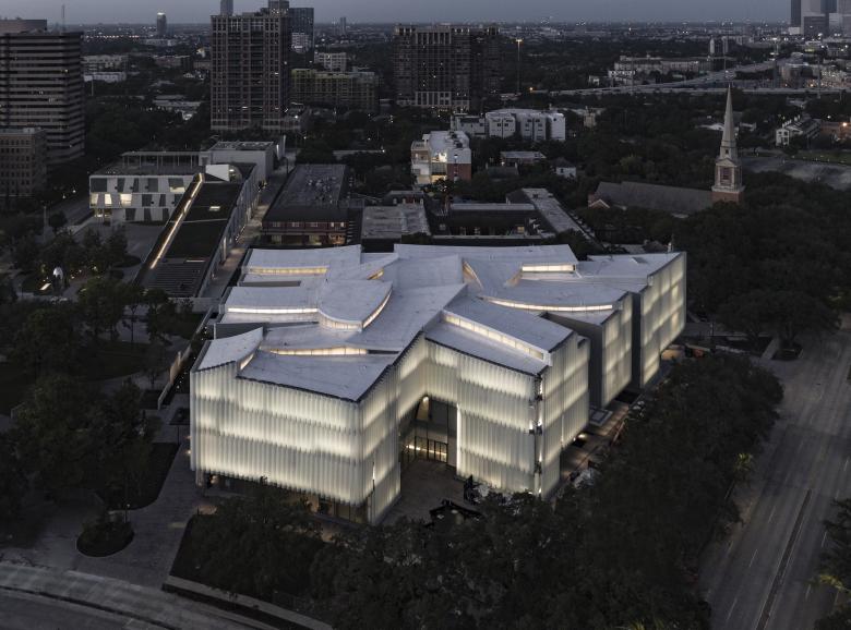
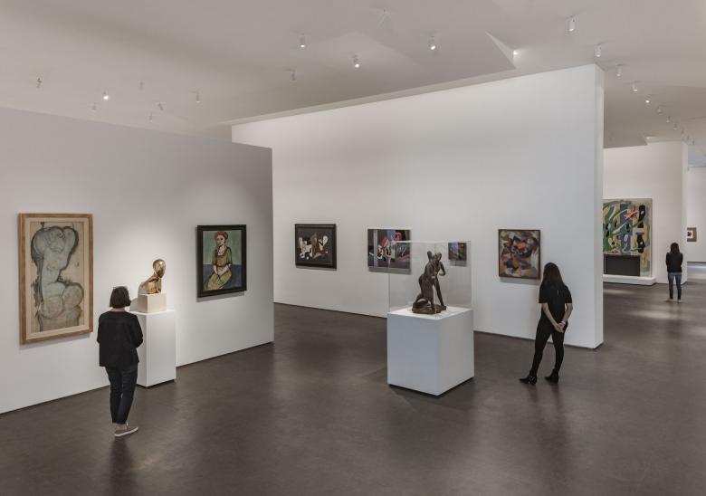
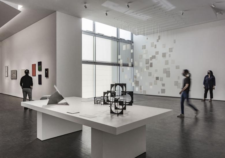
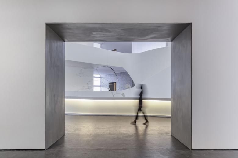
The Texas sky opens 180°overhead above a luminous canopy covering the new building. Concave curves, imagined from cloud circles, push down on the roof geometry, allowing natural light to slip in with precise measure and quality, perfect for top-lit galleries. The undersides of the curved ceiling become light reflectors, catching and sliding the light across each unique gallery experience. These curved slices of light shape the gallery spaces organically in a unique way related to the organic qualities of the lush vegetation and water characterizing the new campus. Rather than mechanical and repetitive, the light is organic and flowing echoing the movement of the galleries.
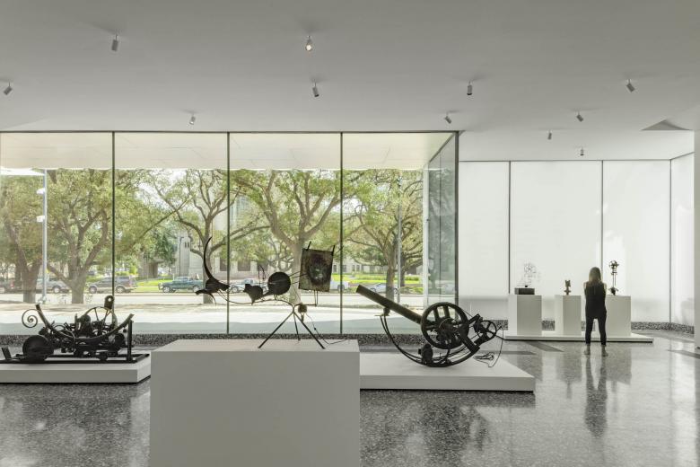
Organized horizontally on two levels, all galleries have natural light and are flexible with open flow. The gallery rooms of ideal proportions are centered around an open forum. The open flow through galleries is punctuated by views into the seven gardens with green trellises offering shade from glare. The central gallery forum provides generous spaces for the exhibition of art and vertical circulation to the upper floors. A stepped ramp and elevators link the lobby and gallery levels for direct access to all galleries.
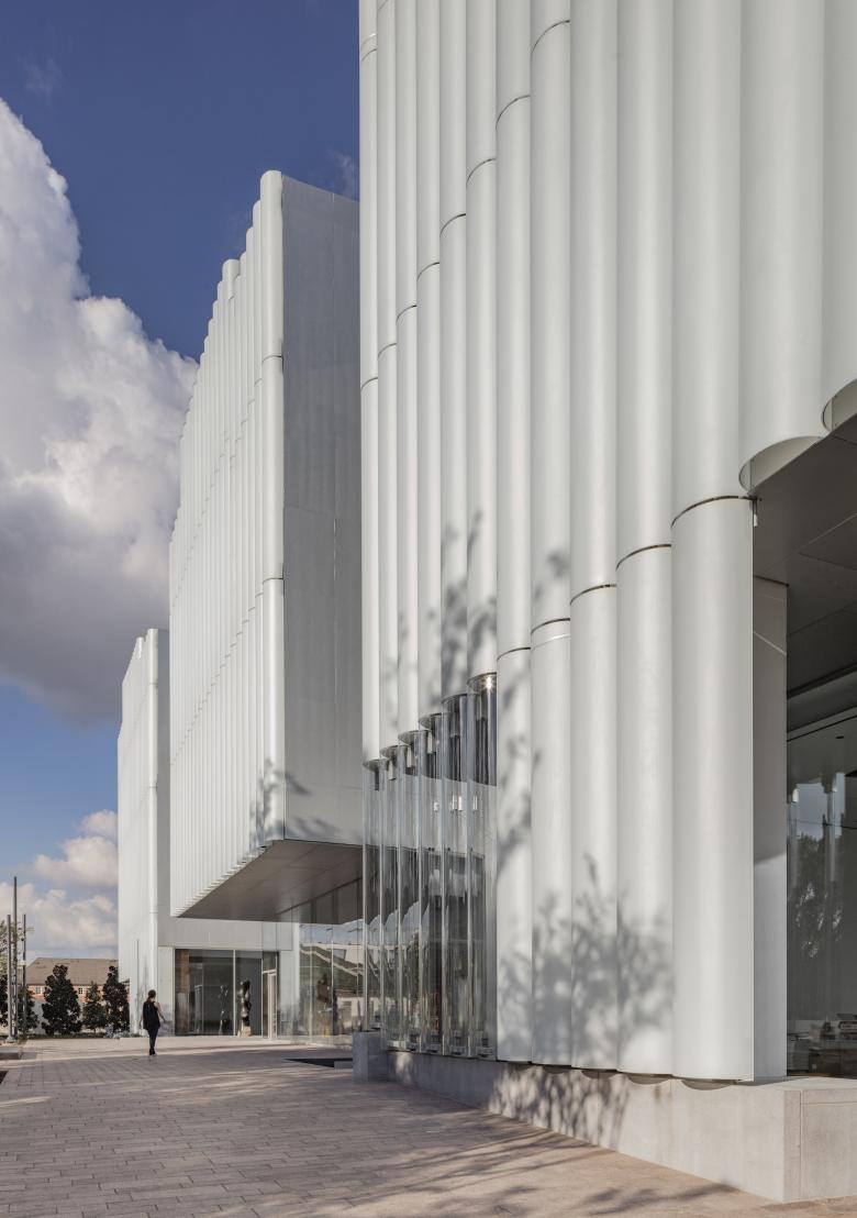
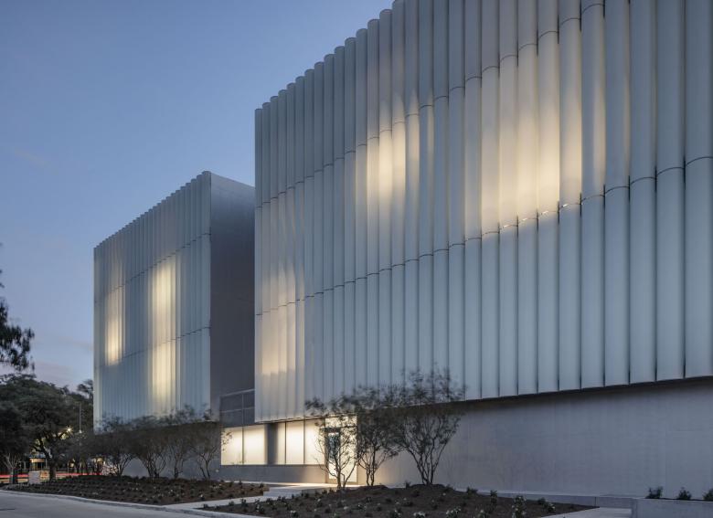
Within the horizontal collection of stone (1924), steel and glass (1958, 1974), and stone (2000), the Kinder Building adds a horizontal architecture in translucent glass. The curved glass elements have a soft texture, alabaster-like. At night the glowing translucent walls will be reflected in the water gardens and provide an open invitation to enter the museum. In complementary/contrast, the Kinder Building provides a strong contribution to the existing unique collection of the Museum of Fine Arts Houston architecture.
Projectes relacionats
Revista
-
Winners of the 5th Simon Architecture Prize
hace 4 dies
-
2024, The Year in …
hace 5 dies
-
Raising the (White) Bar
hace 6 dies
-
Architects Building Laws
hace 1 setmana
