Diller Scofidio + Renfro Takes on Pierre Chareau
John Hill
3. November 2016
All photographs by John Hill/World-Architects
Pierre Chareau: Modern Architecture and Design opens tomorrow at The Jewish Museum in New York. Billed as "the first U.S. exhibition devoted to [the] visionary French designer and architect," the show is notable as well for its technological design by the architecture studio Diller Scofidio + Renfro (DS+R).
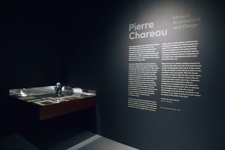
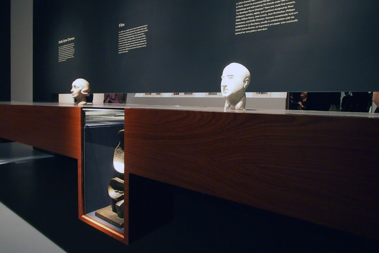
The exhibition takes over the gallery space vacated by Roberto Burle Marx: Brazilian Modernist, but this fact is not apparent after walking through a set of double doors emblazoned with a detail from Chareau's most famous project, the Maison de Verre in France. Instead of a large open space, like its predecessor, museumgoers enter a small room made to feel smaller by the dark walls. Other than the wall text (photo above), the only occupant of the room is a cantilevered vitrine in the corner.
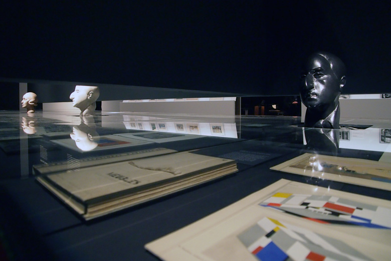
The vitrine's glass top is punctured by a bust of Chareau by artist Chana Orloff, while below the glass are Chareau's business card, a photograph of the designer, and other 2-D artifacts that start to paint a picture of him. Most interesting is that the vitrine continues through openings cut into the corner walls. This detail is reminiscent of the sink that Elizabeth Diller and her partner Ricardo Scofidio (before Charles Renfro became a partner) inserted in the Brasserie restaurant in New York: the long sink straddled the men's and women's bathrooms, such that its drain aligned with the small opening in the wall between the rooms. At the Jewish Museum, the gap gives a glimpse into later parts of the exhibition, though the opening is too small to reveal too much. Instead it piques just enough interest for moving forward with what is in effect a four-part exhibition.
Part One: Furniture
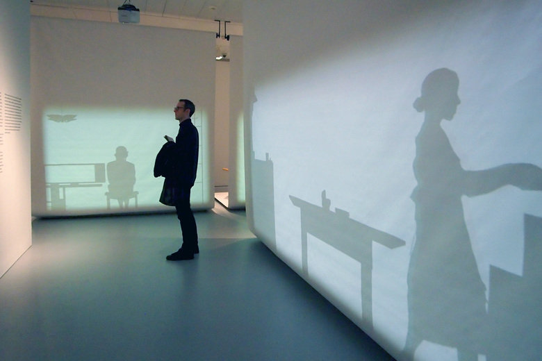
A left turn after walking through the entry doors reveals the above view: a corridor of sorts with silhouettes on screens set perpendicular to each other. The shadows show people and objects that, in the context of the show, must be Chareau's furniture designs. More than a quick glance reveals that the figures are moving – they are using the objects in some manner: preparing a table, putting on makeup, smoking a cigarette while reading a newspaper. These are mundane acts that are made fascinating through their museum context. But what about his furniture? Will people see them as more than just shadows on screens? Yes, since DS+R simply placed the furniture on the other sides of the screens.
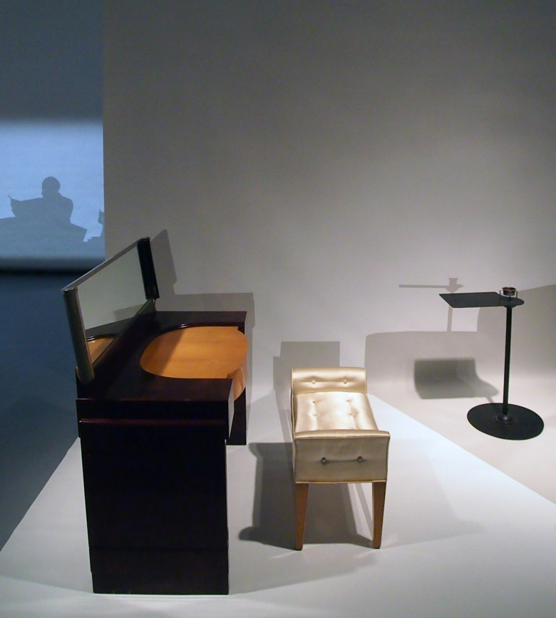
The screens are suspended from the ceiling and then curl under to serve as floors for couches, chairs, tables, and the like. The screens are the most minimal indications of rooms, a counter to period recreations in museums like the nearby Metropolitan Museum of Art. As Diller stated in a press preview earlier in the week, room recreations were impossible, so they opted for various "interpretive filters" to reunite Chareau's furniture and interiors. In this first part of the exhibition, the filter is the silhouetted figures magically interacting with the objects – subtle hints at the real things on the other side. A stool and dressing table Chareau designed for Julia Ullmann (above) comes to life through a woman seated on the bench and applying makeup (below; oddly, she uses a handheld mirror rather than the one built into the desk). It's a clever technique, but one that makes it impossible to see the actual furnishings and the related moving figures at the same time.
Part Two: Collecting
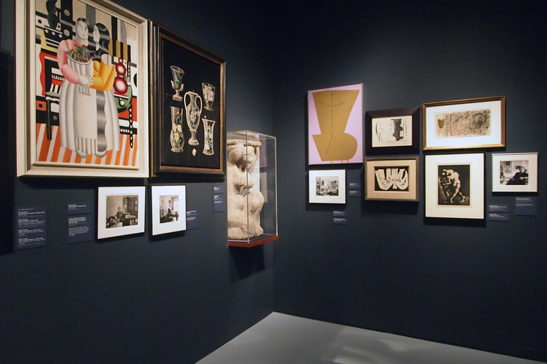
After the six "rooms" of the first part, the next part is the most traditional presentation in the whole exhibition. Here the Jewish Museum, under the show's curator Esther da Costa Meyer, strove to highlight Chareau's Jewish roots, the art that Pierre and his wife collected, his wife's role in Pierre's career, and their years of exile in the United States in the 1940s. Although the last resulted in the couple selling many of their pieces, the museum has reassembled them and displayed them on the walls and in the vitrine that museumgoers confronted upon entering the gallery. With the walls dark once again, the small space feels like a lull or pause before DS+R's surprise in the next part of the exhibition.
Part Three: Interiors
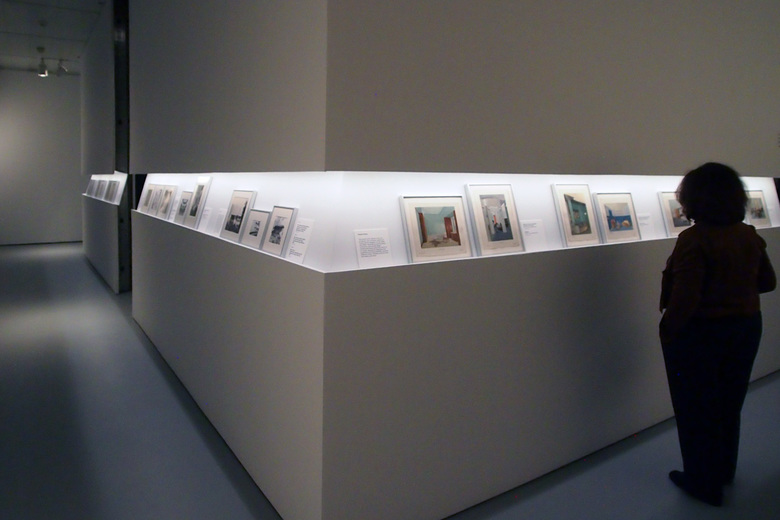
The next part of Pierre Chareau is made up of two smaller parts that, like the screens and silhouettes, are two sides of the same thing. A corridor rings the outside of a room – a white cube – whose walls are punctuated by an illuminated horizontal band with rails for the presentation of, most notably, pochoir prints (stencil prints favored by French interior designers in the 1920s and 30s). Literal cuts in the middle of each wall allow access to the dark interior of the room, where more furniture is located. Like part one, representation (drawings) is on one side, while the real thing (furniture) is on the other side – or it seems so straightforward at first glance.
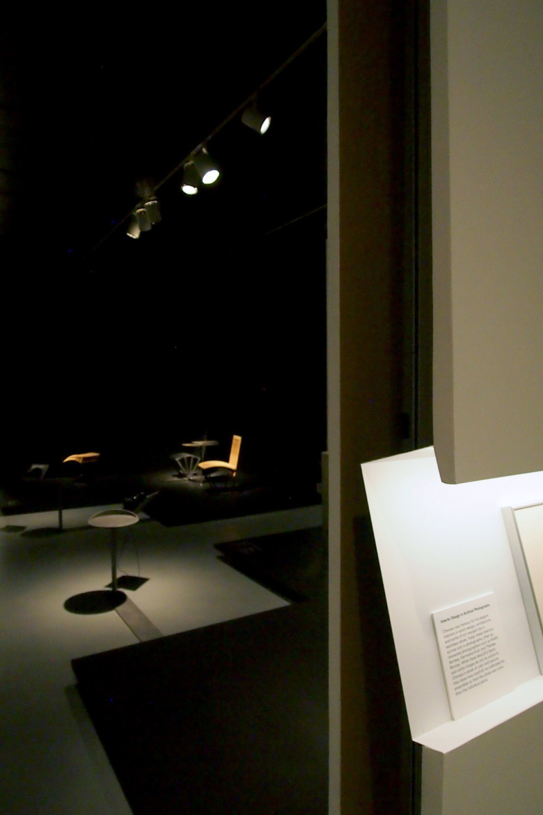
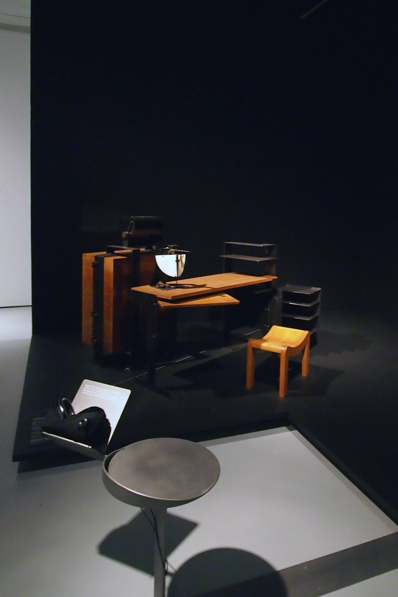
The dark interior of the white cube is split into four smaller zones, one in each corner. In front of the pieces of furniture, which are boldly lit by spotlights, are a small stool and a stand with VR goggles. People are asked to sit down, don the goggles, and then swivel about on the stool as they pan around the virtual interior of, in the instance of the photo below, the Study in the Chareau Residence at 54 Rue Nollet in Paris. Diller remarked that DS+R has never been "predisposed to VR," but this exhibition gave her the ideal opportunity, since most of Chareau's interiors have been destroyed and Maison de Verre is an ocean away. The VR technology allows museugoers to immerse themselves in one of his spaces, akin to the silhouettes "interacting" with his furniture.
Part Four: Maison de Verre
By the time people leave the virtual-reality room they might well be asking themselves, "What about Maison de Verre?" Chareau's most famous project graced the doors to the exhibition, but its presence to this point is only hinted at through some of the objects on display, a couple of the VR spaces, and some impressive ink-on-mylar plans by architectural historian Kenneth Frampton. The last are mounted on a wall besides a door that leads to the fourth and last part of the exhibition: a darkened room devoted entirely to Maison de Verre.
In her remarks, Diller described Chareau's designs (particularly the Maison de Verre, which was a big influence on her) as "clinical." This phrase is appropriate, since Chareau designed the Maison de Verre for a doctor who lived upstairs and practiced downstairs. Further, Chareau designed the interior with moving parts and custom fittings that were technologically complex and appropriate to his client's profession. In this last part of the exhibition, DS+R tried for something on par with Chareau.
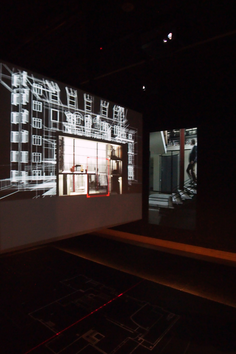
A screen suspended in the middle of the space moves slowly back and forth above a floor plan of the house that is placed, fittingly, on the floor. A building section projected on the screen changes as it moves relative to the plan. To aid in understanding what is happening inside the house, its interior spaces are rendered while those outside are wireframe. Every time the screen stops a laser line is painted across the floor (indicating the "cut" of the section), a room is framed in red, and the section "comes to life" through a film that appears on the side wall. Actors activate the framed space: walking up and down stairs (photo above), taking a bath, opening a door, even filling the bidet with water; with such a complex house the possible iterations are nearly endless.
For an architect like me, this way of analyzing the house – with its layers of drawings, representations, and moving parts and figures – is absorbing; I could have stayed to watch the methodical – even clinical – means of presentation for an hour. Yet I can imagine that this room is a letdown for non-architects, as they move from the immersive virtual-reality room to what is basically a high-tech way of presenting two-dimensional architectural drawings alongside some short video clips. Nevertheless, this 21st-century contraption is fitting for Chareau, who embraced film and technology. Further, the French designer's diverse output encouraged an exhibition that is as much an exploration as it is a presentation; most people should enjoy exploring Chareau as much as Diller Scofidio + Renfro obviously did.
Pierre Chareau: Modern Architecture and Design is on display at The Jewish Museum in New York from 4 November 2016 to 26 March 2017.
