(More Than) One Way to the Top
Ulf Meyer
6. März 2020
Photo: Ivar Kvaal
When the Munch Museum in Oslo opens to the public in the fall of 2020, it will be one of the world's largest museums dedicated to a single artist. Ulf Meyer got an early peek at the building designed by Estudio Herreros.
Norway is a very wealthy nation with basically only one modern artist of international renown: Edvard Munch. Upon his death, the famous painter of the iconic The Scream bequeathed over half of his body of work to the capital city of Oslo on the supposition that it would do a good job publicly displaying it. The collection contains more than 28,000 items and was thus a difficult gift to accept. In 1963, coinciding with the centennial of the artist’s birth, a museum was founded in the less-affluent eastern part of Oslo, off the average tourist’s track. That museum in Tøyen (designed by Einar Myklebust and Gunnar Fougner) was never too popular with curators or Munch-connoisseurs alike. An expansion and renovation of the museum in 1994 on the 50th anniversary of Munch's death did not fundamentally change things. Nor did the theft of one version of The Scream in 2004.
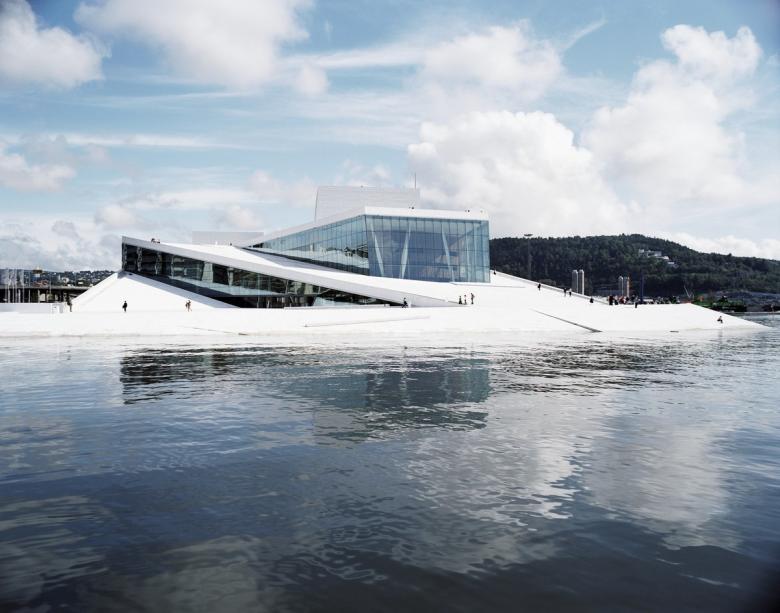
Fifty years after the museum’s inauguration, the Norwegian capital took itself and the world by surprise when it managed to score an international super-hit, at least in terms of cultural magnets, when Snøhetta’s new Norwegian National Opera and Ballet opened its doors in Bjørvika, just minutes away from the main train station. The slanted white marble building became an instant success with locals, the nation, and visitors from around the world, especially the cruise ship passengers who only have a few hours to spend in town. It gave the city a new self-confidence that it had so far lacked; in a nation known for its great outdoors but not for its urban culture, the Opera had quickly replaced the Holmenkollen ski jump as an icon for the city.
Norwegian National Opera and Ballet (Photo: Jens Passoth)
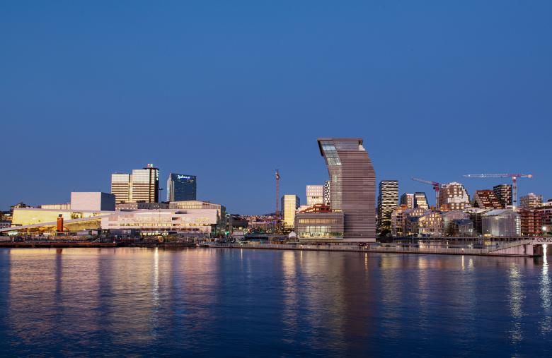
Since then Oslo has been doing its best to continue this success and exploit it, and is now trying to turn this part of Oslo into the anchor of a whole new cultural district — and turn Bjørvika into the cultural hub of Norway. The decision was made to add Norway’s most important and prestigious library, the Deichman library, in a new building next door and to also relocate the Munch Museum (Munchmuseet) into a new “palace” next door. An architectural design competition was held for the new waterfront museum, one of the world’s largest museums dedicated to a single artist. Estudio Herreros from Madrid won the first prize. That was in 2009, eleven years ago, when the office was not well known. Founder Juan Herreros’s previous firm, Ábalos & Herreros, dissolved in 2008, and on his own he had only designed the Agora Convention Center in Bogotá, Colombia, at a remove from the Western media’s attention. Jens Richter, an architect from Germany, is now an equal partner in the firm, which thus should really be called Herreros and Richter.
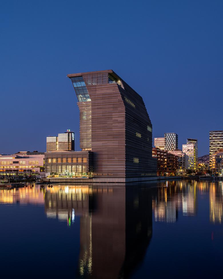
Photo: Ivar Kvaal
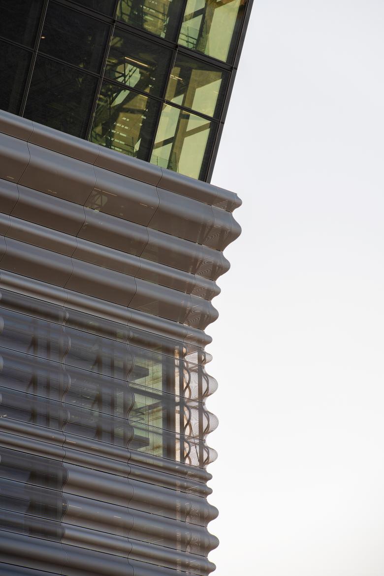
The museum is complete. Although it won’t be inaugurated until the fall, its qualities can be deciphered. The 13-story building has an odd shape and an equally odd façade. It is shaped like a long, thin skyscraper covered in a curved façade completely made of grey perforated metal panels that create an iridescent effect. At first glance, the most striking aspect is the building’s top, tilted like a lambda. It seems to bow to the nearby Opera, but the architects simply call it an “urban gesture.” Yet the form is not genuinely chosen for Oslo, as Ábalos & Herreros used the same nodding shape at their Woermann Hybrid Complex at Las Palmas de Gran Canaria, Spain. In Oslo, the building is surrounded by water on three sides but it uses this excellent position to less effect compared to the Opera. The big advantage of the tall building is that the neighboring island will remain devoid of buildings and therefore be turned into an urban square next to the Oslo fjord.
Photo: Ivar Kvaal
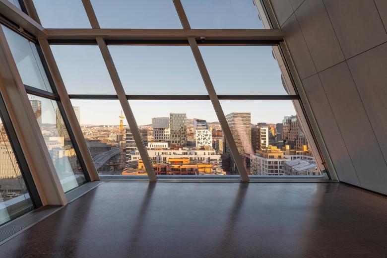
Stacking eleven exhibition halls in a building that is L-shaped in section is not an easy task for a popular museum that demands a refined circulation pattern. The views over the city and fjord from the observation platform on the top floor are spectacular, views people can enjoy without buying an entrance ticket. The layout must be able to serve thousands of people going up and down 13 floors despite the other thousands who wind their way up or down in the museum. There is no clear beginning and/or end to the voyage through Munch’s oeuvre, so visitors can start at the top and descend floor by floor just as well as they can do the opposite and move from the ground floor lobby to the top. There is a an attractively designed glass elevator that connects the lobby with the top-floor viewing platform, which people can access without buying an entrance ticket; the views over the city and fjord are spectacular and will be a magnet. But if the elevator is out of operation to undergo maintenance or needs to be fixed after a technical issue, this pattern through the building will collapse. There is an adjacent fire stair that is beautifully detailed and does not look like a mere means of egress, but few people will be in the mood to climb 13 floors — 58 meters!
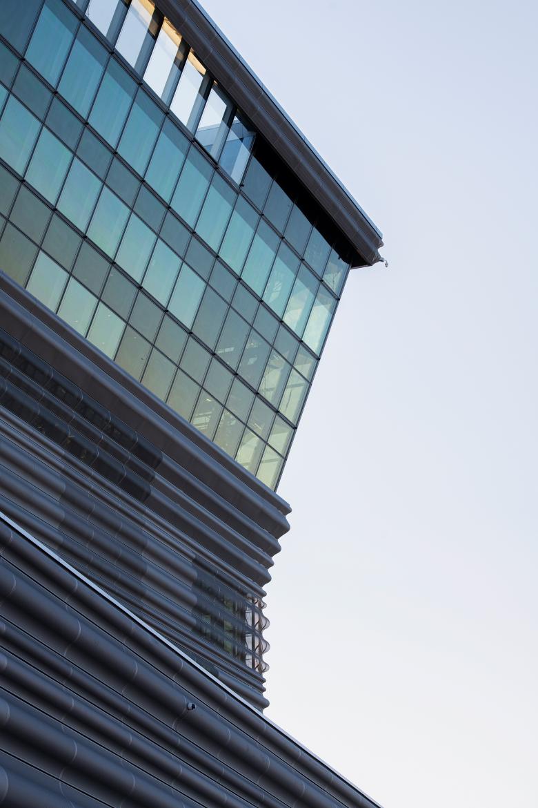
Photo: Ivar Kvaal
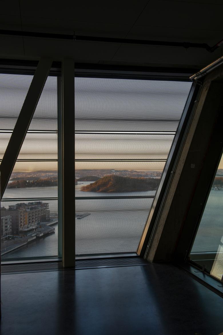
Assuming that most visitors to the building do not just rush up and down for the upstairs views, food, and drinks, but they buy a ticket and delve into Munch’s aesthetic world, they will ride a cascade of escalators up and through the museum, not unlike the Pompidou Center in Paris. This movement of people in a museum by means of escalators is architecturally celebrated: If halls are taller, the escalator will skip one floor. The architects want the building to be “living organism and not just a mega-depot.” A glass joint is reserved as an airy circulation space between the lower base containing auditoria and shop and the long, thin row of exhibition halls. None of them feature any daylight, making the façade an important and difficult part of the building. The choice of the aluminum screen unfortunately means that views out from the hallways are pixelated, even from the viewing platform, turning views into pointillist impressions. The façade is irregularly checkered with four different shades of grey – a pattern the architects use in almost all of their projects.
Photo: Ivar Kvaal
The museum is giant, with more than 26,300 m2 of floor area: five times the space of the 1963 Munch museum. It houses the largest collection of artworks by Munch, displayed in four permanent exhibition halls. Temporary exhibitions will present Norwegian and international artists and contemporary artists.
For an artist whose most famous quote is “sickness, insanity and death were the angels that surrounded my cradle and they have followed me throughout my life,” the museum seems bold — and cold. The celebration of movement might be more appropriate in an ever-changing “cultural machine” like the Pompidou than in a monographic museum dedicated to an artist of fragile, often melancholic and psycho art. The architects acknowledge that the Munch Museum is a lot to digest in one visit. “But,” they claim, “people will want to come back!”
Photo: Ivar Kvaal
Verwandte Artikel
-
Trosten, a Folly in Front of Munch
08.07.24
-
(More Than) One Way to the Top
06.03.20
