U.S. Building of the Week
50Fifty DTC
Clutch Design Studio
5. August 2019
Photo: JC BUCK
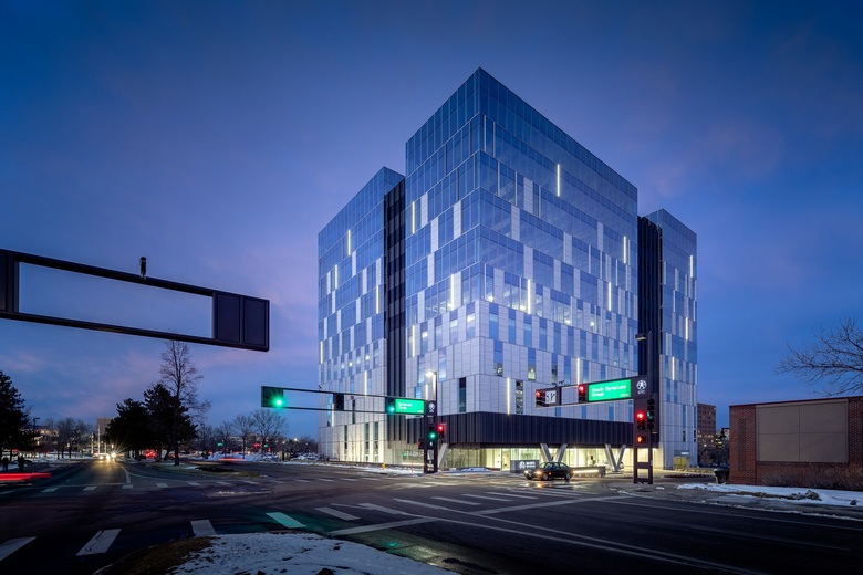
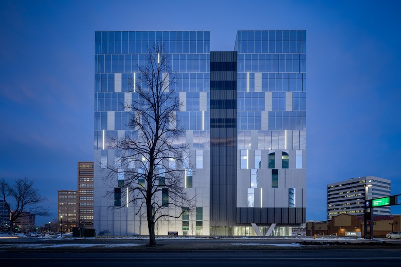
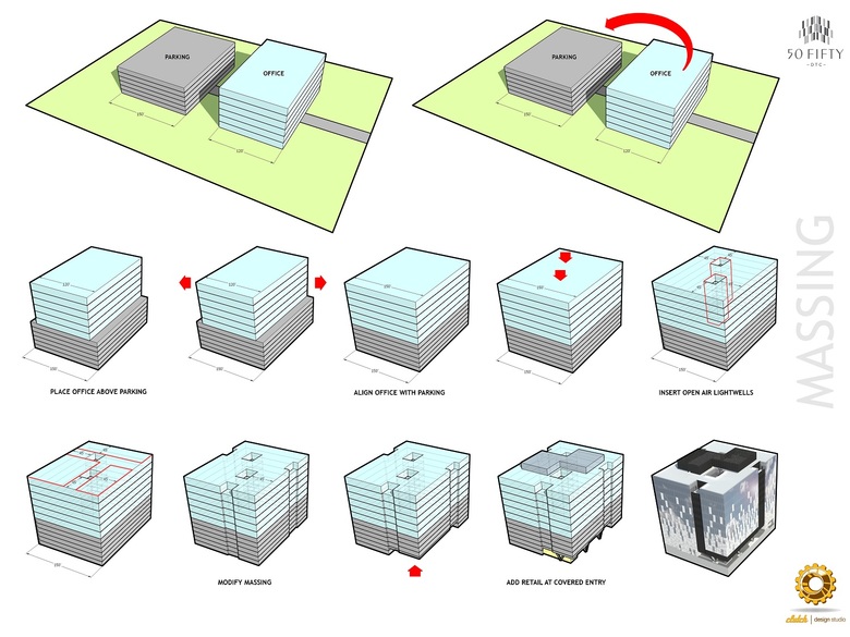
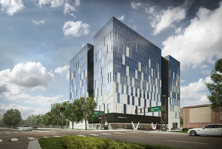
50Fifty is a new office building in the Denver Tech Center (DTC), a large commercial and residential area 12 miles southeast of Downtown Denver. Behind 50Fifty's sleek glass facade lies some creative vertical logic: the surface parking typical of the area was moved into the base of the building to lift up the offices for prized mountain views. Clutch Design Studio answered a few questions about their design of 50Fifty DTC.
Location: Denver, Colorado, USA
Client: Corum Real Estate
Architect: Clutch Design Studio
- Design Principal: Robin Ault (Principal)
- Project Architect: Mark Bourne (Principal)
- Project Manager: Christopher Campbell (Principal)
- Project Team: Matt Robertson (President), Kristen Tonsager (Head of Interiors)
MEP/FP Engineer: Mtech Mechanical, Hunt Electric
Landscape Architect: Civitas
Lighting Designer: Hunt Electric
Contractor: Hensel Phelps
Construction Manager: Corum Real Estate
Site Area: 55,000 sf
Building Area: 400,000 sf
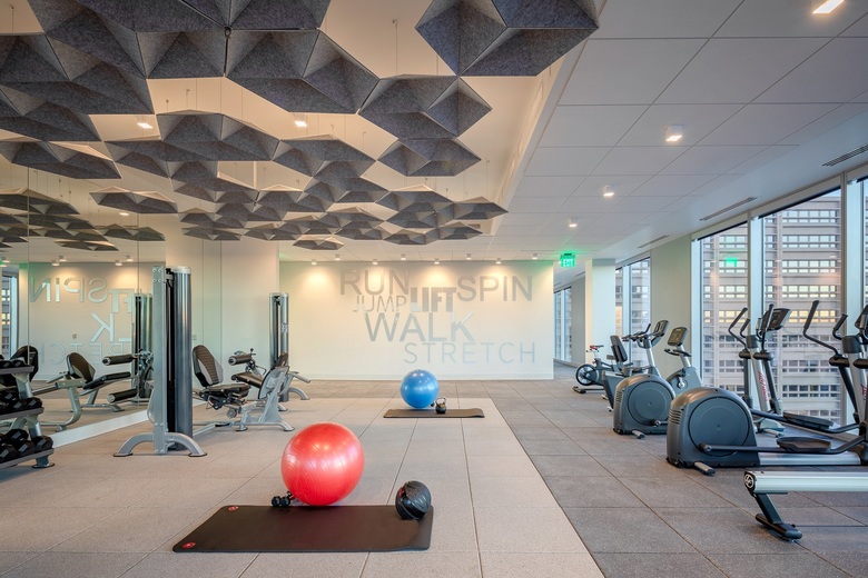
Photo: JC BUCK
What were the circumstances of receiving the commission for this project?An existing client came to us and said, "I'm not interested in designing 'just another building'." It was at that point that we realized this would be a special project.
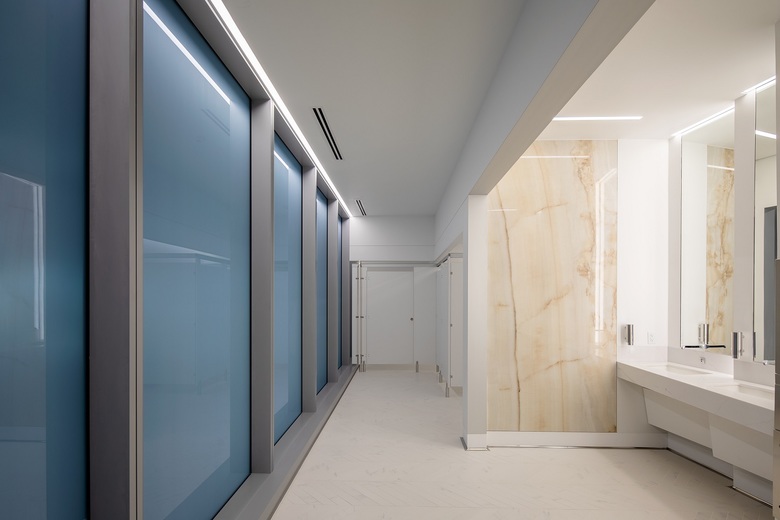
Photo: JC BUCK
Please provide an overview of the project.50 Fifty tower is a six-story office building above six levels of parking located in the Denver Tech Center. The area is historically a typical suburban office park featuring buildings set among a sea of asphalt parking lots and expansive lawns. The thriving Denver market, coupled with the site’s close proximity to the highway and light rail, has spawned a densification of the area.
Photo: JC BUCK
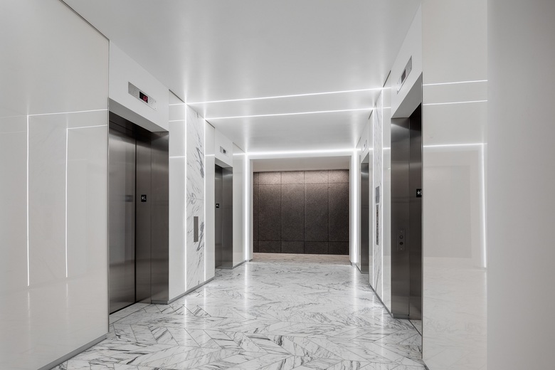
What are the main ideas and inspirations influencing the design of the building?Inspired by the client's love of sailing, the exterior evokes a feeling of looking over the edge of a ship to see the wake dissipate into the horizon. Inside, the design brings visitors "onto the ship," recreating the experience with a variety of marine-inspired materials, patterns, and finishes throughout.
Photo: JC BUCK
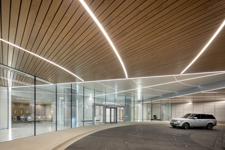
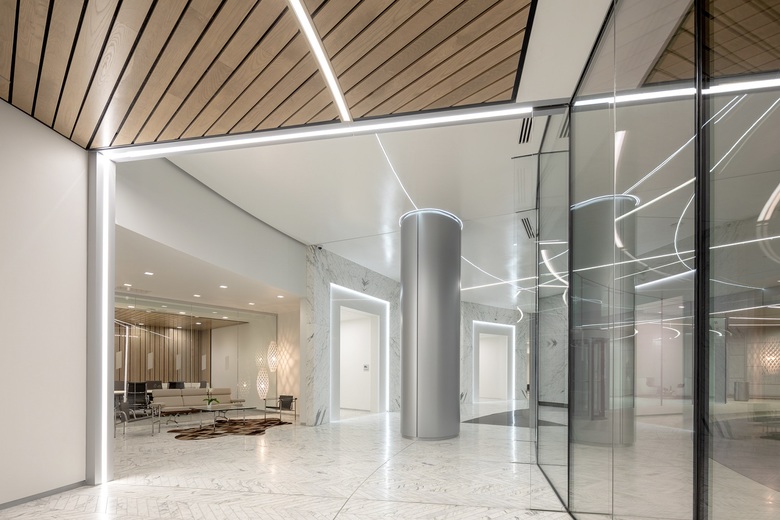
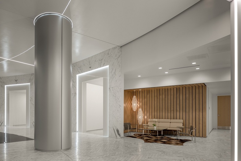
How does the design respond to the unique qualities of the site?Just as every project has its challenges, 50 Fifty was no exception. Our biggest hurdle was creating a remarkable lobby within a small footprint. The building is at its absolute maximum length, width, and height. Even so, the space wasn’t large enough for ample seating or restaurant, so we carved out purposeful areas to create a sense of place for those waiting for clients or an Uber. Throughout the design process, we designed several iterations of the lobby, and the final design and materials create a dynamic experience, utilizing a minimal palette that makes a big impression.
Photo: JC BUCK
How did the project change between the initial design stage and the completion of the building?Virtually no changes, a hallmark of our work. We pride ourselves on selling a design vision to the client during the conceptual design stage, which we then bring to fruition throughout the subsequent phases with little variation. This job was no exception. On time and on budget, with the design vision fully maintained. This is evident in the conceptual renders and final photographs of the building.
Photo: JC BUCK
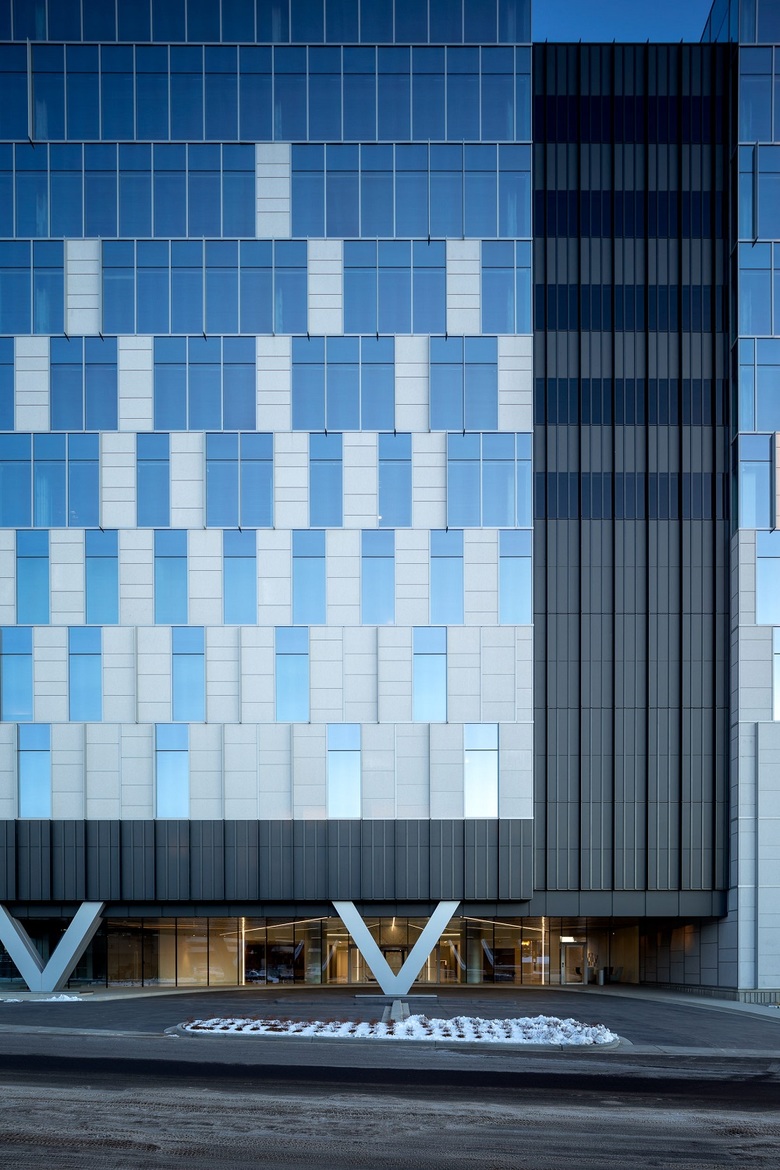
What products or materials have contributed to the success of the completed building?The shifting/alternating vertical mullion system that we devised with our partners at Harmon, combined with the Sierra White Granite panels, give the building its signature look. Hunt Electric then placed lights on the exterior, at the very tip of Harmons random projected mullion caps, to further differentiate the building at night.
Email interview conducted by John Hill.
Photo: JC BUCK
Photo: JC BUCK
Photo: JC BUCK
Photo: JC BUCK
Massing Diagram (Drawing: Clutch Design Studio)
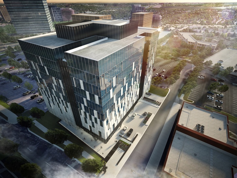
Birds-eye rendering (Visualization: Seven G)
Exterior rendering (Visualization: Seven G)
Verwandte Artikel
-
50Fifty DTC
05.08.19
