U.S. Building of the Week
Tre Søstre
Salmela Architect
16. September 2019
Photo: Corey Gaffer
The name of this project translates from Danish as "Three Sisters." It's an apt name, given how the three vacation houses in the northeast corner of Minnesota were designed by Salmela Architect with similar attributes yet unique plans and other features — like siblings. The architects answered a few questions about the project.
Location: Grand Marais, Minnesota
Client: Todd Miller
Architect: Salmela Architect
- Design Principal: David Salmela, FAIA
- Project Architect: Darin Duch
Construction Manager: Anton Moody
Site Area: 12,632 sf
Building Area: 5,088sf
Photo: Corey Gaffer
What were the circumstances of receiving the commission for this project?The clients were familiar with our work and had us specifically in-mind for this project. They were drawn to our work for both its Scandinavian influence and our willingness to propose unconventional solutions to unique circumstances
Photo: Corey Gaffer
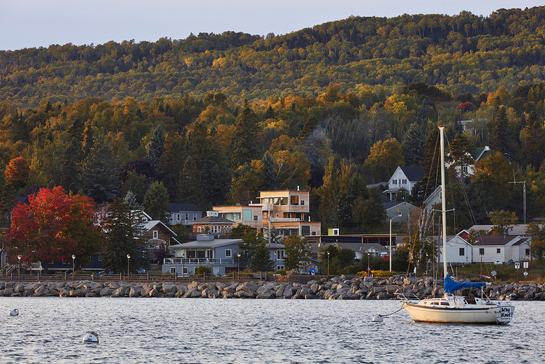
Please provide an overview of the project.The project in located in the former fishing village of Grand Marais, Minnesota. The setting is defined by the rugged shore of Lake Superior to the south, a steep hillside sloping up to a prominent ridge line, with a vast boreal forest stretching north to the arctic beyond. The town’s economy depends on the natural resources that surround it, namely environmental tourism.
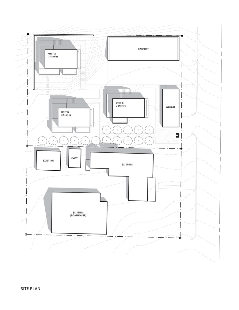
The clients purchased an abandoned property twenty years ago and restored three severely damaged cabins into vacation rental units. They also built a heavy timber “boathouse” as a live-work space for themselves. More recently they bought the adjacent vacant lot and hired us to design three new units. The goal was to prioritize views while remaining sensitive to the neighborhood context. More importantly, they were looking for a bold architectural statement that departed from the traditionalism of the rustic vernacular of the town.
Photo: Corey Gaffer
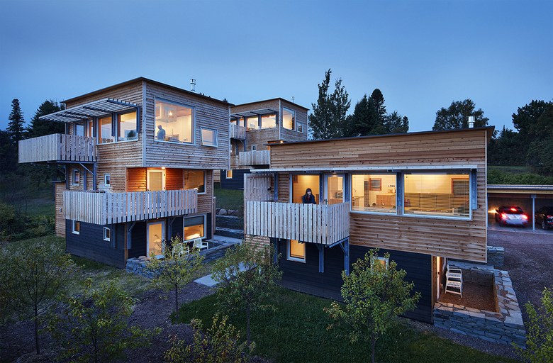
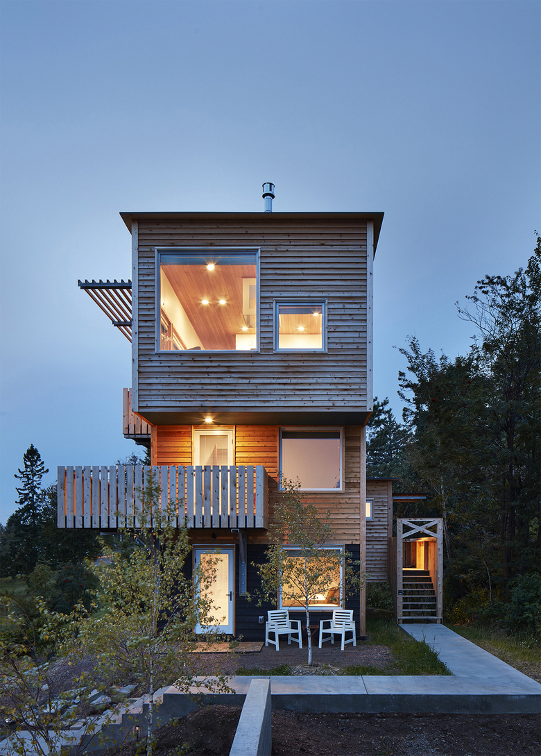
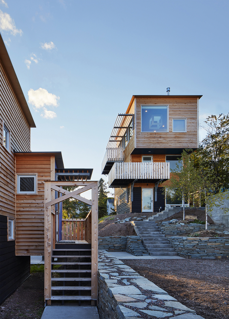
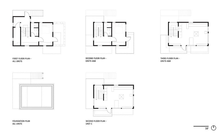
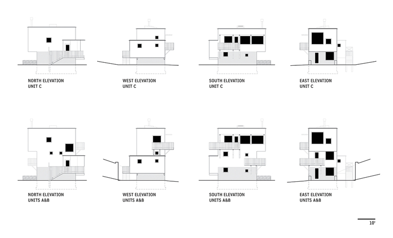
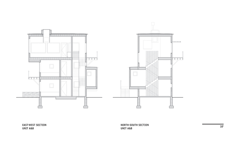
What are the main ideas and inspirations influencing the design of the building?The three new units are located up-slope from the existing structures, thus requiring height in order to access views of the lake, harbor, and town. We were inspired by the Scandinavian “stabbur” building typology—grain storage structures with small first floors and larger cantilevered second floors. Each unit has a modest 16' x 22' ground level which supports multiple cantilevered volumes and exterior decks above.
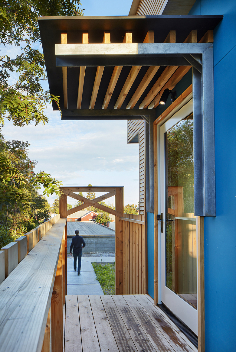
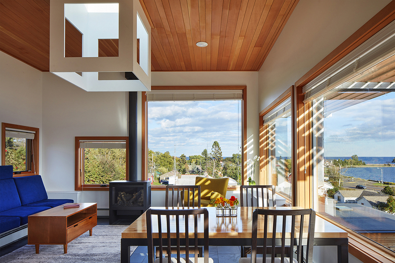
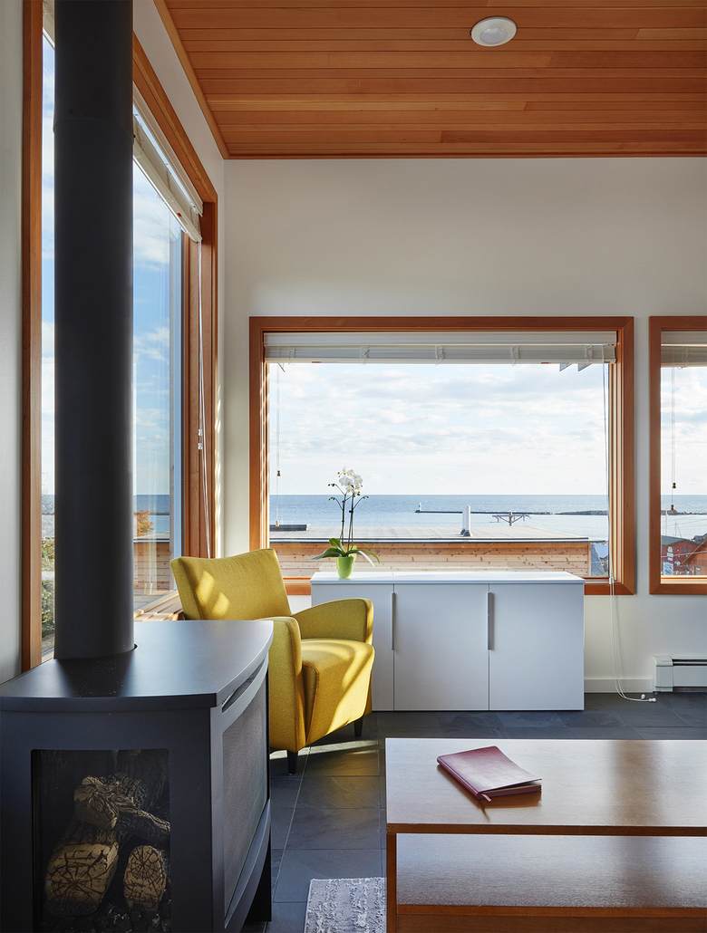
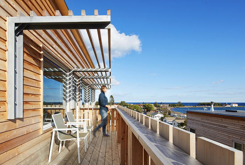
Each unit has a covered entry deck located a half-story above grade. Interior stairs lead down to ground level and up to second-floor bedrooms. The top floors cantilever to the east, creating open living spaces with unobstructed views while providing overhead cover for the private patios and decks off of each bedroom below. A south-facing deck extends the living space to the exterior, providing a dramatic perch reminiscent of a crow’s nest. Spatial adjacencies were carefully considered to provide areas of protected privacy and open gathering within a relatively dense cluster of rooms and units.
Photo: Corey Gaffer
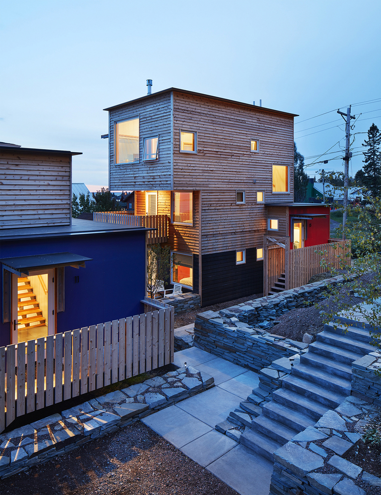
How does the design respond to the unique qualities of the site?The sloping site was both a challenge and an opportunity. It allowed us to stagger the units up the hillside to create unique views from each living space while also maintaining views for neighbors to the north. The vertical nature of the buildings also freed up more space for the landscape design. A series of dry-laid stone walls articulate a dynamic sequence of paths, patios, and softscapes. The slightly informal and slightly compressed arrangement of vertical structures within a terraced landscape creates a very comfortable and friendly spatial quality reminiscent of old hillside towns.
Photo: Corey Gaffer
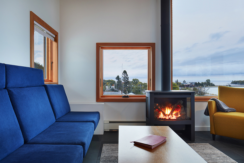
How did the project change between the initial design stage and the completion of the building?The design evolved naturally due to the constraints and challenges of the site. In particular the realization that the living spaces should be elevated to the top floors with bedrooms located below, which isn’t a typical residential configuration.
Photo: Corey Gaffer
Was the project influenced by any trends in energy-conservation, construction, or design?The client had a very tight construction schedule, which was compounded by the short supply of construction labor in this remote location. We addressed both issues by using panelized SIP panels.
Photo: Corey Gaffer
What products or materials have contributed to the success of the completed building?The SIP panels were critical to the success of the completed building, as they addressed both the tight construction schedule and limited availability of labor. The material selection is a traditional lap wood siding that is common to the region. It is left to age without the need for maintenance except for several feet of painted siding at the ground to protect from rain and snow.
Email interview conducted by John Hill.
