Pavilions in Lake Yangcheng Park
Kunshan, China
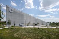
In the last two decades, Kunshan, Jiangsu Province, China has transformed itself from an ancient canal town to a modern industrial city. The west edge of its built-up area is reaching Lake Yangcheng. As the only public space on the lake shore, a park has been constructed. Three pavilions (Buildings B,C,D) were planned in the east area of the park. The landscape form designed by others already contained many contrasting motifs. To avoid making the environmental form too noisy, we proposed that the three pavilions share one prototypal form and structural system, while the non-structural elements of each building could be adjusted according to the particular location and views. With their identical functions, the similar appearance of the pavilions will help visitors to quickly locate needed service, but they will eventually find that each building is different. Building D has been constructed.
Integration between Indoor and Outdoor Spaces
Containing mostly indoor spaces, park buildings in the Western tradition tended to be solid objects surrounded by green space. The temples in the 18th-century English Landscape Gardens are examples. In contrast, Chinese traditional garden buildings took the form of courtyards which combine both interior and exterior spaces. We have observed that today’s Chinese people still enjoy the courtyard that, within a short distance, provides users both the comfort and convenience in a room and the refreshment of nature. Therefore, we attempt to create a modern version of such an integrated space in this project.
We intentionally avoided the stereotyped approach that treats indoor and outdoor spaces as separated systems, such as placing a patio “outside of” a room. The three 36-by-14 meters building plans seem to be composed of conventional rooms and corridors. But the “rooms” include indoor spaces, semi-outdoor (having a roof but no walls) spaces, and outdoor spaces under trellises. The three indoor spaces (rental, snack shop and public restrooms) were not grouped into one chunk, but rather mingled with the outdoor spaces to allow visitors use them conveniently. We selected long-span rigid frame for the building structure to eliminate any columns inside the building, permitting us to place non-bearing walls and roofs freely so that indoor and outdoor spaces could be better integrated.
Multi-functional Facades
The south and north elevations of each building are made of a 36-by-3.34 meter double-skin glass facade. The chords of the trussed rigid frame are 500mm apart from each other, which becomes the cavity space between the double skins. Modern double-skin glass façade has been used extensively since the 1990’s. However, its use have been limited within high-rise office buildings and mainly for the purpose of energy saving. Our design tries to add a few new functions into it.
First, we added two tiers of shelves in the cavity to allow potted plants to grow there. The “green” walls will resonate with the greenery outside, relating the building to the park. The café or gift shop which will occupy the rental space can also use part of the walls to display their merchandize or decorations. Secondly, the glass skins are made of sand-blasted glass with small transparent areas. The locations of the transparent areas in the two skins are overlapped. People will see at least three kinds of depths, the frosted front layer, the cavity with the frosted back layer, and a complete transparent opening. These “windows” will form varied overlapping effects when the viewer moves. Each building has a different frosting pattern to form its own identity.
Meanwhile, the walls also perform its energy saving functions. The top portion of the exterior skin and the entire interior skin are openable. Kunshan has a mild climate with clear seasonal differences. In spring and autumn, windows on both skins can be opened to afford natural ventilation. In winter, the static air in the cavity reduces heat loss when all windows are closed. In summer, only the windows in the outer skin are opened to discharge the upward flow of cavity air, reducing heat gain in the rooms. The shelves only cover two thirds of the cavity space to make room for the ventilation. For Buildings B and C, the southern sides of the air-conditioned rooms are shaded by trellises. For Building D, the shelves in the cavity are changed to wood panels to shade the sun.
Upon completion, we find an unexpected visual effect: the plants behind the frosted and transparent glasses resemble a Chinese water color painting of varied shades. This will become more obvious when the plants (pothos) climb cross the entire glass wall.
Publication
Green,a special volume of Domus(Italy, Chinese Edition,10/2011), Atlas of Contemporary Chinese Architecture (2014)
- Architekten
- Pu Miao 缪朴
- Standort
- West Ma-an-shan Road (between West Huan-cheng Road and Hu-bin Road),, Kunshan, China
- Jahr
- 2010
- Bauherrschaft
- Kunshan City Construction Investment and Development Co. Ltd.
- Team
- Pu Miao
- Structure
- Shanghai Yuangui Structural Design Inc.
- Plumbing, HVAC, and electrical engineering
- Hanjia Design Group


