Tea House in Li Garden
Shanghai, China
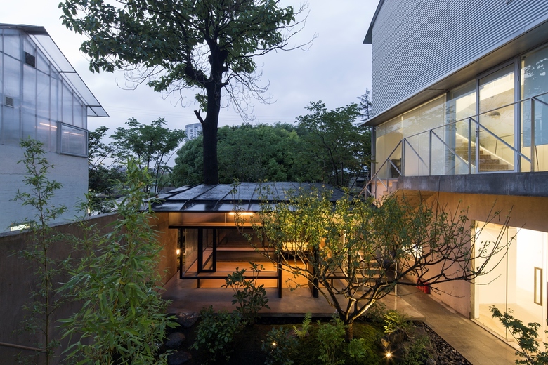
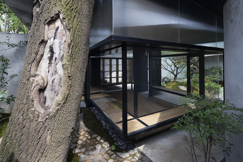
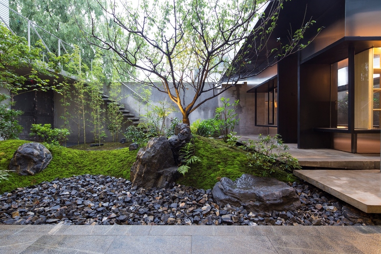
Our design for the Exception Clothing is a teahouse in a small courtyard (around 100 square meters) where a tall paulownia grows. The courtyard, enclosed by walls on its north and west side, has a small corridor and a staircase leading to the adjacent office building on the east and south. Due to the small size of the courtyard, our priority was to create a teahouse that would occupy the minimum space.
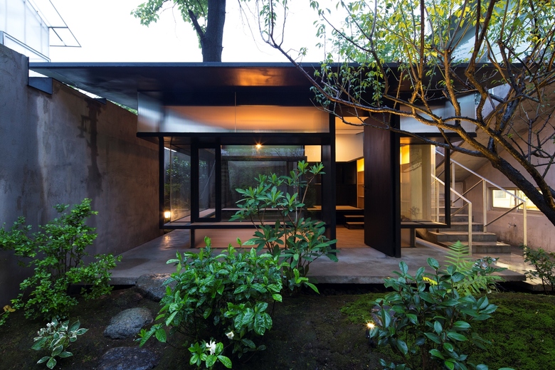
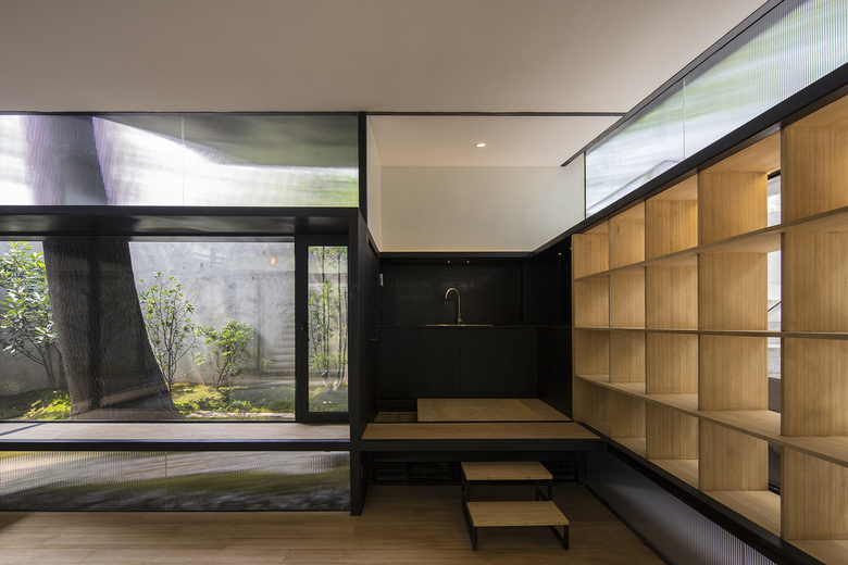
We began our analysis with an investigation of the site. After a thorough examination, we decided to locate the teahouse as close to the paulownia tree as possible. Taking advantage of the nearby rear wall, the tiny space between the wall and the teahouse becomes part of the teahouse’s interior space. This activated the tree whose diameter is around 90 centimeters, transforming it into a crucial spatial component for the teahouse. We also attempted to reduce the teahouse’s actual footprint without making it perceptually too narrow. Our proposal created a concrete base above the ground to define the teahouse’s realm while allowing the building footprint to shrink so as to extend the courtyard space. We also noticed that we could extend the upper part of the building beyond the footprint to emphasize the scale of certain behaviors such as standing, sitting, seeing, focusing, and contemplating to arise the awareness of the position of the human body.
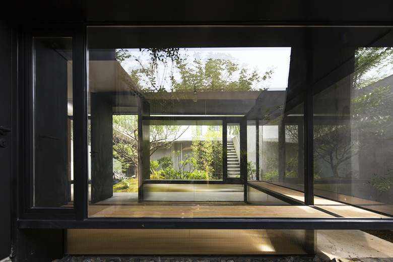
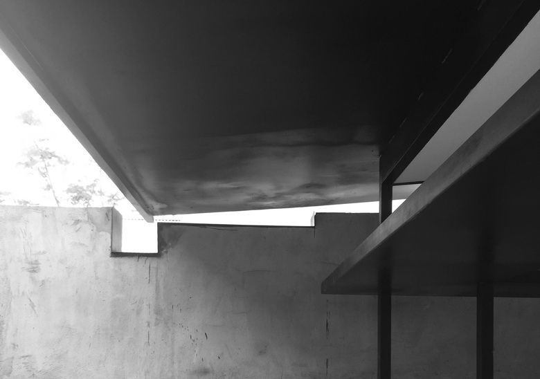
The spatial relationship between the human body, the teahouse, and the courtyard are expressed through three layers of cantilevers. The first layer happens at the height of 45 centimeters from the ground. A horizontal plane for sitting implies the boundary between the interior / exterior as it faces toward the interior space. In order to create more active interactions between the teahouse and the courtyard, this plane on the south side is faced to the courtyard, giving the space above it back to the courtyard. The second cantilever is located about 1.8 meters above the ground and enlarges the perceptional scale of the interior space, resembling a standing person with his arms opened. This cantilever would not interfere with the activities under the teahouse eaves. People taller than 1.8 meters would naturally bend slightly to adapt to this space without discomfort. The third cantilever layer is the covering roof, which defines multiple spaces under its eaves. While the teahouse only occupies 19 square meters, the roof covers an area of 40 square meters, highlighting the spatial relationship between the teahouse and the courtyard in different directions. As the roof bends down toward the main courtyard, it establishes the teahouse’s directionality and frontality.
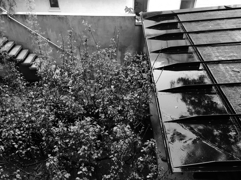
We chose to use slender structural beams with a 60mm by 60mm square section for both horizontal and vertical structural components. These dimensions not only suit the scale of the teahouse, but also reduce the structural impact on the space. As all horizontal supporting components are of the same dimension, their abstract linear forms function as more than load bearing elements; the design allows them to play a formal, spatial role in the building. The dimensions of these structural elements also respond to the dimensions of furniture, creating a more intimate relationship with human bodies. An 8mm thick thin steel plate constitutes the roof, and a layer of insulation sits above it, anchored by steel reversed-ribs that keep the roof flat. These reversed-ribs not only eliminate the sense of modesty and temporality produced by the fact that the roof is covered with black waterproof membrane, but also generate a sense of lightness and precision for the teahouse by creating an extra-thin roof edge.
- Architekten
- Atelier Deshaus
- Standort
- Longteng Avenue, Shanghai, China
- Jahr
- 2016
- Bauherrschaft
- Exception Ltd.
