A Frieze of Light in Basel
John Hill, Thomas Geuder
30. June 2016
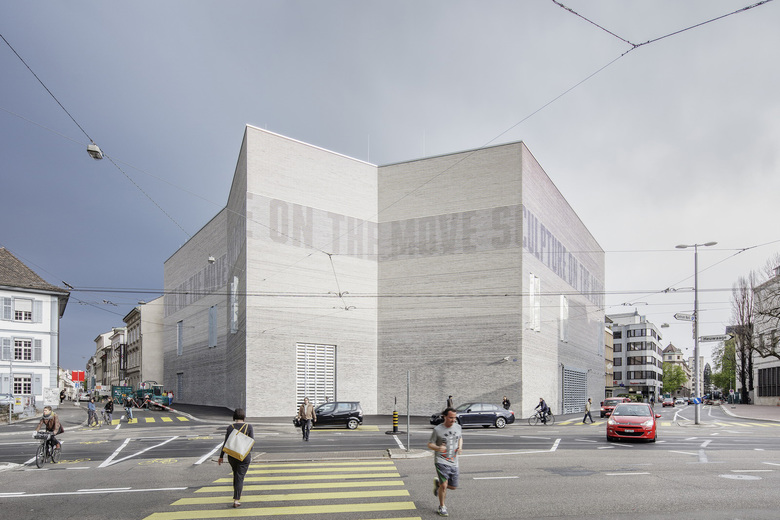
The extension to the Kunstmuseum Basel occupies a prominent place in the city center. (Photo: Derek Li Wan Po)
The much anticipated extension of the Kunstmuseum Basel opened to the public in April. Architects Emanuel Christ and Chrisoph Gantenbein have crafted a building that interprets the classical elements of architecture found in the museum's main building. A dynamic Light Frieze across the facade is an intergral part of their approach.
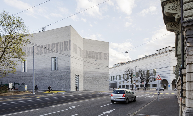
The expansion in the foreground and the main building in the background form an urban ensemble (Photo: Derek Li Wan Po)
The Kunstmuseum Basel has a long history, with its origins extending back to 1671 when the city first publicly displayed the Amerbach Cabinet. The municipal collection grew considerably in the subsequent centuries, yet it was not until 1936, and the construction of the museum's present-day main building on St. Alban-Graben, that the collection found a permanent home. The building was designed by architects Rudolf Christ and Paul Bonatz in a neoclassical style with axial symmetry and monumentality, the antithesis of the modern architecture epitomized at the time by the Bauhaus. Although built to display the museum permanent collection, the building was used for special exhibitions starting in the 1980s, meaning much of the collection was kept in storage. Refurbishments and renovations in the 1990s and 2000s helped the situation, but they were not sufficient to address the museum's shortage of space.
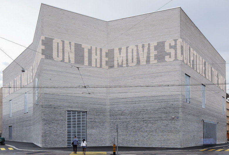
The Light Frieze takes a classical element of architecture and moves it into the digital age. (Photo: Derek Li Wan Po)
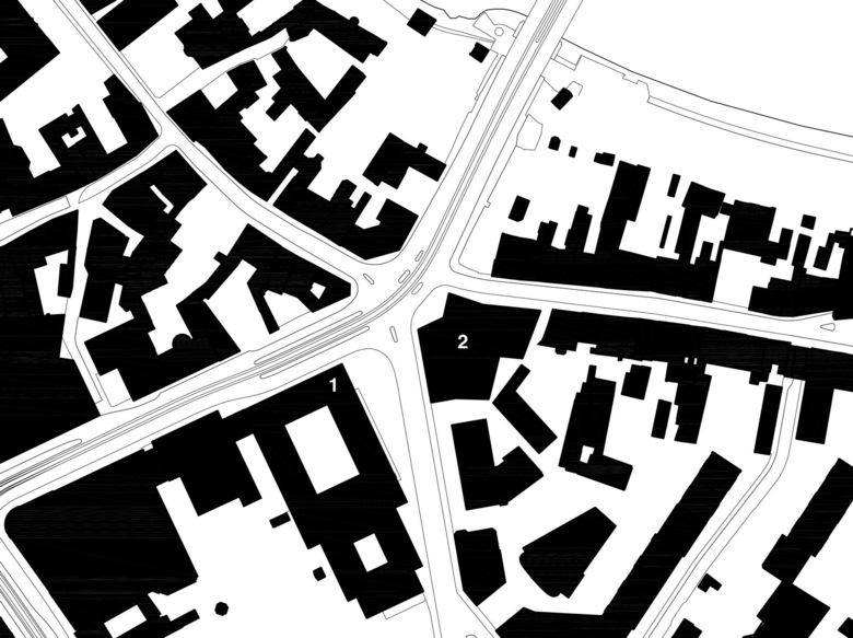
So it was finally decided in January 2009 to erect a new building to complement the existing. Basel's Christ & Gantenbein won the competition in March 2010 with a scheme that looked to the future and the past at the same time. Rather than juxtaposing two completely different buildings across Dufourstrasse, the duo considered the old and new buildings together in terms of shaping urban space. Therefore the eaves of the buildings align, the materials match, and the front of the new building kinks to align with the old building on one side and the bend of St. Alban-Graben on the other. In appearance the extension is a forward-looking, contemporary building, but one that speaks the same language as the main building.
Context Plan. 1: Main Building; 2: New Building (Drawing: Christ & Gantenbein)
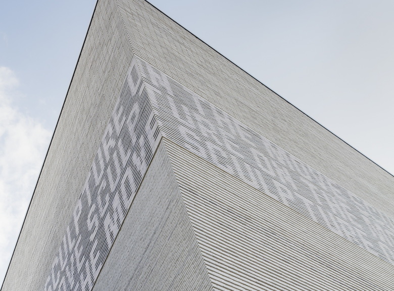
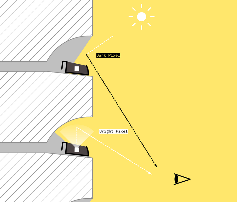
Similar to the facade of the main building, the new building's facade suggests a classical tripartite division of base, middle and top, an effect expressed through different gray bricks: darker at the base and lighter above. A horizontal emphasis is made by alternatively projecting and receding each course of the narrow, 4cm-high bricks. The expanse above the dark base is split into two (middle and top) by the introduction of a 3-meter-high frieze starting at a height of 12 meters. But this is no ordinary frieze: Sunk into the joints between the bricks – not visible from the street – are white LEDs that illuminate the hollows between the bricks.
According to iart, "During the day, the brightness of the illuminated joints corresponds to that of the ambient light outside." (Photo: Derek Li Wan Po)
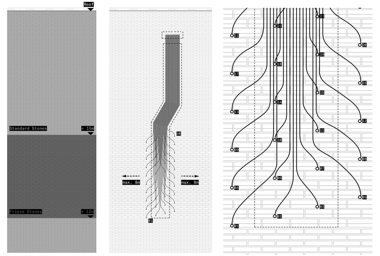
This Light Frieze is spread across seven facade segments with a total length of 115 meters. It consists of 40 horizontal joints with 1,306 pixels each, where four adjacent LEDs define each pixel. The brightness of the LEDs is controlled by sensors on the roof that determine how much light is hitting each segment. As the video at bottom reveals, the Light Frieze can be used to display text – as a notice board for events and exhibitions, for instance – or as a means of artistic expression. Unlike most new media facades, though, the moving words and images are a subtle effect that integrate seamlessly with the architecture – something new hidden in something seemingly monolithic.
Light Frieze detail (Drawing: iart)
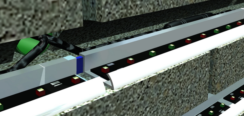
LEDs are spaced every 22 mm. (Image: Multivision)
Detailed wiring diagram (Drawing: iart)
A 3-minute film from iart on the Light Frieze:
A version of this story originally appeared as "Zeitlos zeitgenössisch" on German-Architects.
PROJECT DETAILS
Project
Kunstmuseum Basel, Switzerland
Architects
Christ & Gantenbein
Light Frieze Development
Christ & Gantenbein with iart ag
Manufacturer
Multivision LED-Systeme GmbH
Client
Construction and Transport Department of the Canton of Basel-Stadt, Städtebau & Architektur, Hochbauamt
Construction Management
FS Architekten GmbH
Engineer
PF Ingenieure AG
Typography
Ludovic Balland
Floor Area
11,481 m²
Competition
2010
Construction Start
October 2012
Completion
April 2016
