Temporary Site of Shengli Market — Creation of Spatial Order
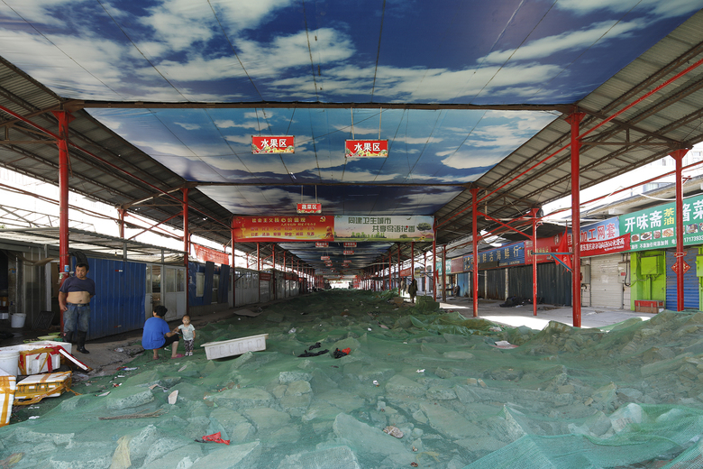
The project is the temporary site of an old market, located in Puyang City, China. The original market was situated at an old urban area. After having served for the citizens for several decades, it became dirty and messy, and was subject to intense traffic. For the sake of urban renewal, the market and the old quarter where it was located urgently needed to be transformed or reconstructed. However, the whole process of demolishing, transformation and reconstruction takes time, but a market that meets people's basic living needs is indispensible. Therefore, it was imperative to build a temporary market to substitute the old one in a period of time.
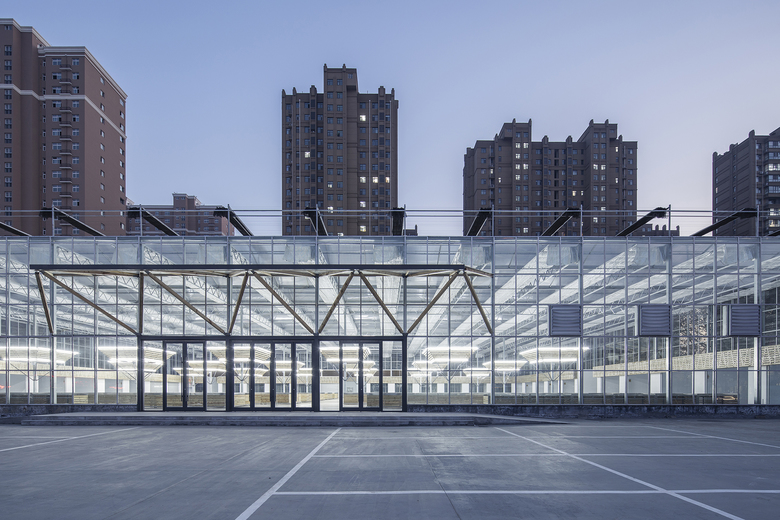
On the opposite side of the old market, there was an unused plot of land, which was available for short-term rental. It's very close to the original market, making it convenient for vendors to move and citizens to shop. Next to an urban arterial road, the old market often suffered from traffic jam outside it, because the rapid popularization of automobiles hadn't been taken into account during its construction several decades ago. The plot is set back from the main road, leaving a parking area and forming a square plane. Since it's far smaller than the old market, the new construction fully occupies it.
Temporary architecture & sustainability
The client requested a rapid construction process and low cost, while as designers we attached great importance to sustainability, hoping the architecture can be used for other purposes or recycled and reused after it completes its role as a temporary market. Taking those into consideration, we tried to figure out a solution to create a low-cost, multifunctional and sustainable architecture on the square plane in a short term. Eventually, we decided to adopt a fully industrialized vegetable shed-like architectural structure, built with standardized component sets. All the components are lightweight, modular and prefabricated, which ensured rapid construction, reduced cost and obtained a relatively expansive architectural space. Those construction elements including standardized rods can be dismantled, recycled, or reused for other constructions.
From disorder to order
Space of standard industrialized sheds is usually homogeneous and disorderly, and most traditional food markets have a common problem — chaotic visual identity. Therefore, after deciding to adopt an architectural structure resembling industrialized vegetable sheds, the next important step was to create order in the disorderly space by adding some necessary "extensions", so as to facilitate the management of selling activities and improve citizen's shopping experiences. On the one hand, the added extensions must respect and take advantage of the standard modular sizes of existing structures as well as rods. On the other hand, built with non-standard components (less reusable), the extensions' cost must be minimized.
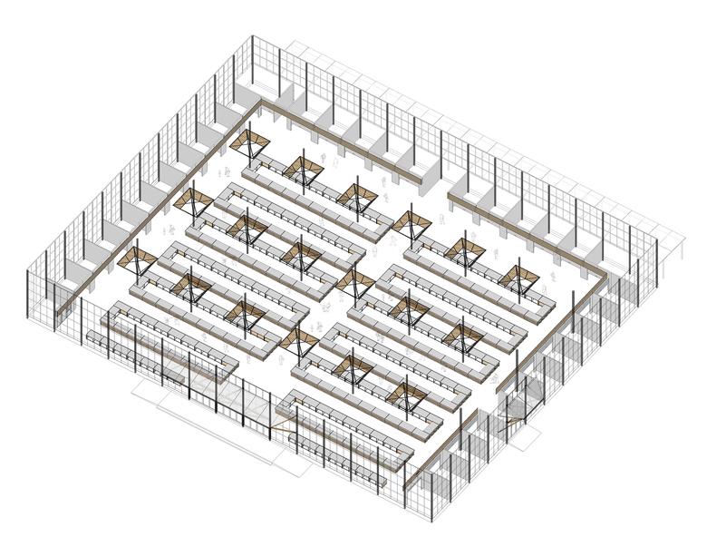
Based on thorough analysis, we added enclosed shops and open shelves to the space, and built an entrance canopy.
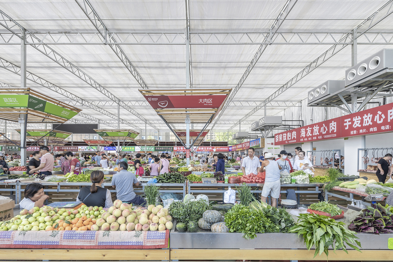
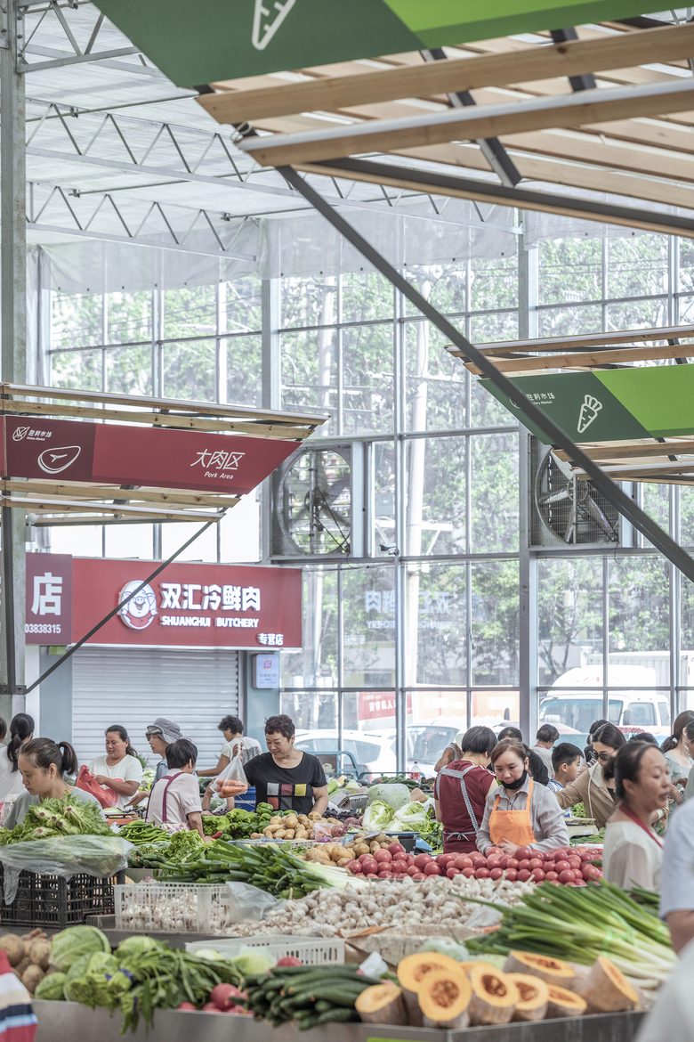
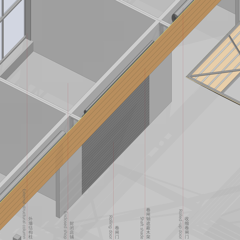
We arranged multiple connected shops on the edge areas of the space. Each shop is enclosed on three sides, and has an equal width and length of 4 meters, which is coordinated with the sizes of the external walls' structural rods. Those shops have a relatively large scale and independent names, mainly selling dried food, cooked food and seasonings. Besides, every shop has a rolling door, and on the door's top is a protruded shaft. The shafts were covered and protected by steel angles and wooden grilles, on which shop signboards of uniform size were installed at the same height.
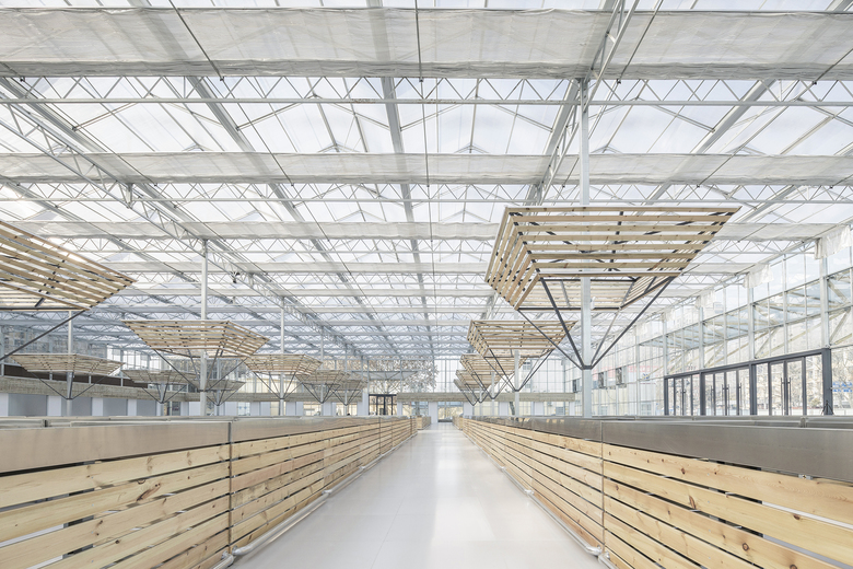
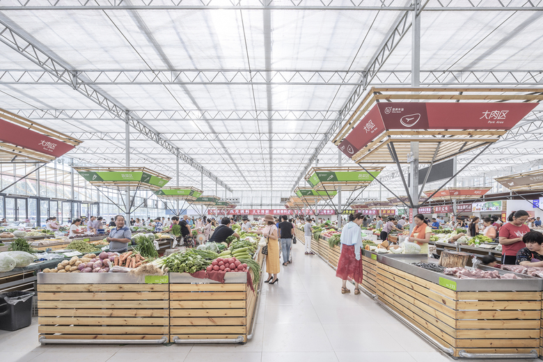
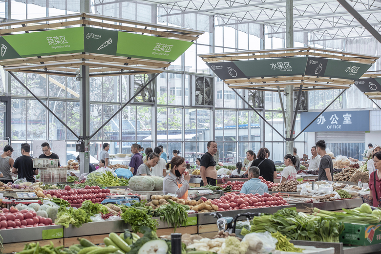
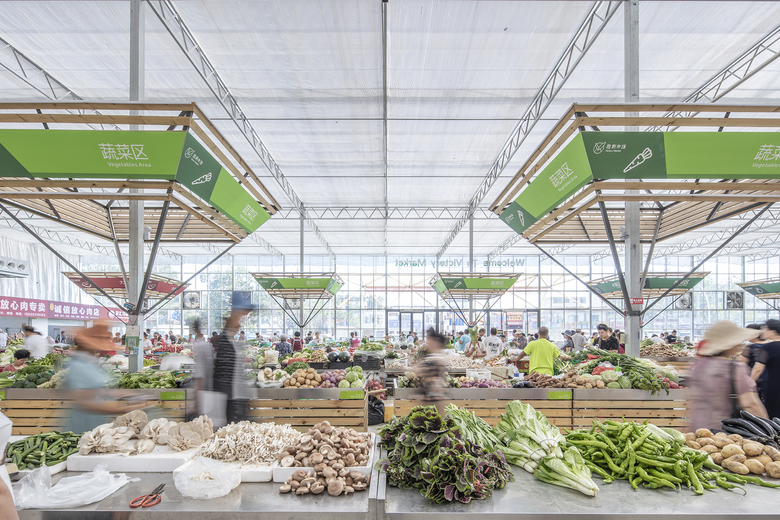
The shelf area is open, and the average space for each booth is relatively limited. Each single shelf has a total length of 2 meters, and generally one booth occupies two shelves. Considering the visual height and length, it was unfeasible to set the signs on the shelves. Therefore, based on the structural columns in the open space, we utilized steel and timber to create inverted rectangular pyramid structures, which look like umbrellas. Those structures not only serve for putting signs to indicate the market's different areas, but also are convenient for lighting fixture installation.
We added a canopy to the entrance. In order to ensure the steadiness of the protruded canopy, we also chose rectangular pyramid structures, which are material-saving as well.
All the extensions were built with cheap and easily accessible materials including ordinary timber, lightweight steel panels, cement slabs, steel angles and polycarbonate sheets, which were easy for installation and construction. Natural and warm-colored timber can be widely seen within the entire space, which was applied to the open shelves, cornices of the enclosed shops and umbrella-shaped structural columns, thereby resulting in a clear visual identity of the space and creating a sense of order in it.
Design team: LUO studio (http://www.luostudio.cn/)
Chief architect: Luo Yujie
Participating designer: Wei Wenjing
Coordinating design firm: Shanghai QIWU Architectural Design & Consultation Co., Ltd.
Client: Shengli Sub-district Office, Hualong District, Puyang, Henan, China
Location: Southeast of the intersection of Shengli Road and Changqing Road, Puyang City, Henan Province, China
Construction firm: Puyang JINGYI Architectural Decoration Design and Engineering Co., Ltd.
Area: 2,902 sqm
Photography: Jin Weiqi
Start time: December 2018
Completion time: April 2019
Temporary Site of Shengli Market — Creation of Spatial Order
Back to Projects list- Location
- Puyang, China
- Year
- 2019


