Foshan Shunde Duende Art Museum|Decode Urbanism Office (DUO)
Shunde, China
The Shunde city, where the Duende Gallery is located, is famous for the commercial culture and local cuisine. But art is a rare topic here. Local citizens have a low awareness of art and lack the initiative to visit gallery. Therefore, compared with galleries in other Cantonese cities like Guangzhou or Shenzhen, the mission of spreading art to the local society is more urgent here for the Duende Gallery. And to achieve this daunting task, we must take a more proactive design strategy.
The building, where the Duende Gallery is located, was designed for commercial functions. Both the external facade or interior space are not suitable for art institutes. Therefore, the entire structure of the interior space must be reconfigured. Moreover, creating an exterior presentation for the art institute under the existing conditions of the commercial facade is another daunting task.
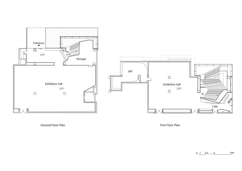
To solve the above problems, Duende Gallery creatively exposes the entire sequence of core spaces, which is mainly composed of entrance lobby and skylight atrium, to the urban area. This concept is totally different from the traditional museum design strategy.
This creative design strategy has produced two outstanding results: creating an interesting experience within a very short path by arranging different scenarios based on the relevant psychological responds of visitors, and, more importantly, exerting a strong influence on the commercial plaza in front of the gallery。
The space sequence of the Duende Gallery mainly consists of a tiny entrance, which is deliberately compressed by the architect, and the skylight atrium. The space difference between each part of the sequence has been enlarged, making a striking contrast. Transitions from darkness to brightness, from narrowness to wideness, from low space to high space, generate the fantastic experience for the visitors consequently.
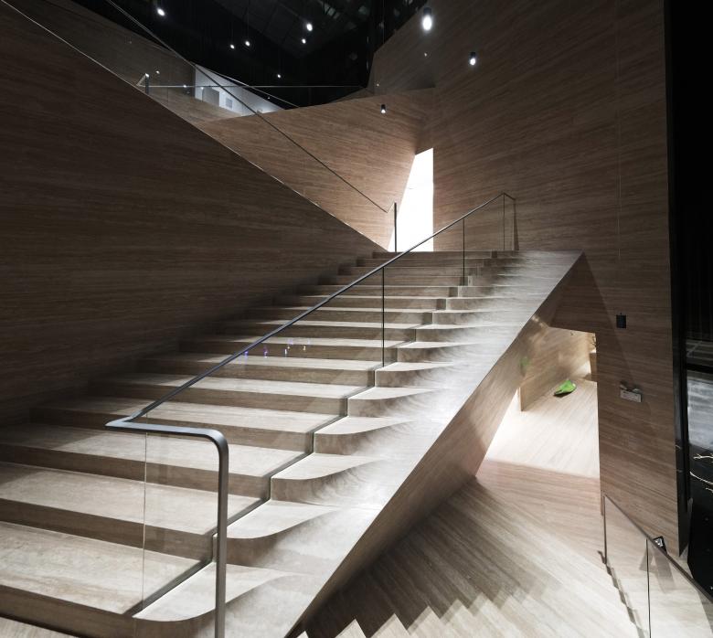
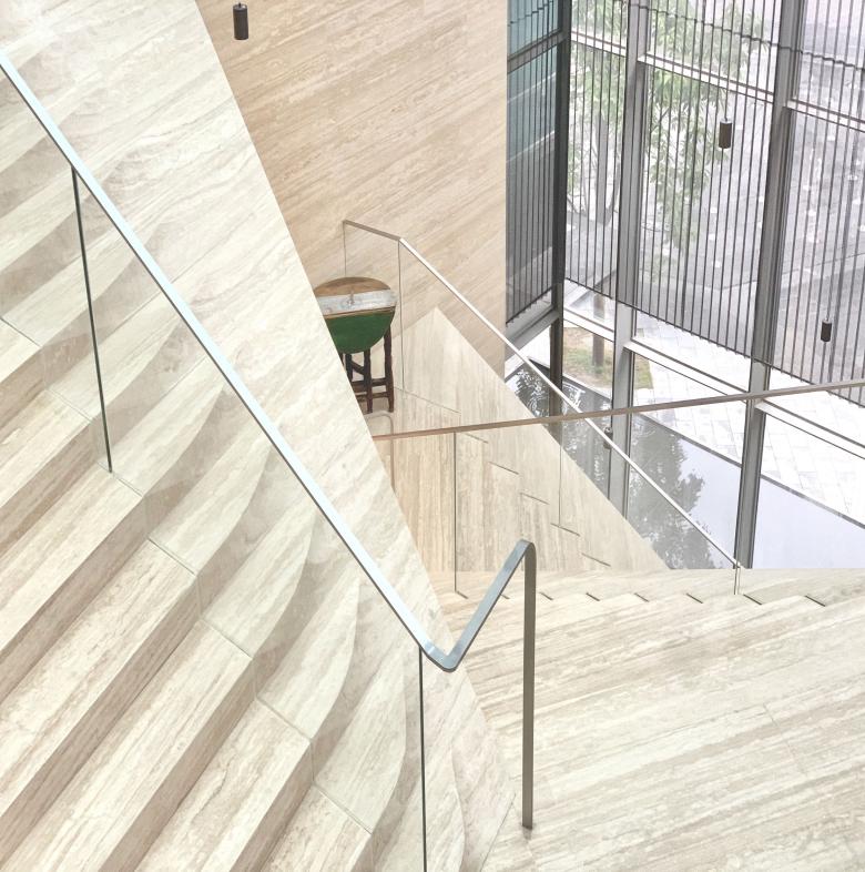
The skylight atrium itself is both a circulation route and a display platform, generated from a folding system, by which, a dynamic space is created. The folding system produces a unique vertical exhibition platform. Different from the tradition horizontal ones, this vertical exhibition platform could give visitors a general idea of all art works. Furthermore, art works arranged vertically could be perceived by the people on the external plaza.
With the unique detail design and the careful raw materials selection made by the design team who traveled to Quanzhou, which is China’s most important stone trading city, the interior skin made of stone miraculously presents a soft visual character. It has successfully triggered the touching behavior of a large number of visitors, who perceive the architecture by touch sense.
Thanks to the exposed strategy, both the entire core space sequence and the art works exhibited in the skylight exhibition hall are visible to a huge number of people who pass through the external commercial plaza, which is the main entrance toward the OCT Plus. As a result, the public influence of art can be maximized, so as to achieve the goal of spreading art in a city where the lack of art is inhibiting the development.
- Architects
- Decode Urbanism Office (DUO)
- Location
- 欢乐大道华侨城欢乐海岸1栋105号, 528300 Shunde, China
- Year
- 2020
- Client
- 广东巽美艺术文化有限公司
- Team
- 简俊凯, 刘洪元, 赖冰强, 李雅帅, 倪明, 邓国超, 常飞, 李东胜, 陈思


