Kanda Terrace
Tokyo, Japan
Located in a central Tokyo neighborhood with many low and mid-rise office buildings, this rental building for restaurants stands on a long, narrow lot, surrounded on three sides by streets.
Key considerations when designing a building of this type are how to create a group identity for the tenants and how to relate the units to the cityscape.
Because of its city-center location, this mid-rise building needed to be commercially efficient, occupying the entire permissible floor area ratio and filling that space with restaurant tenants on every floor.
It was therefore essential to create the image of a building full of restaurants, to set up a bright and welcoming environment for visitors, and an attractive building for the passerby.
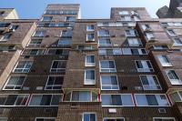
The new building has a recessed façade with three-dimensional stacked terraces, protruding into this space on each floor. The size and shape of these terraces vary by floor, creating a layered form that changes as it moves upward.
Furthermore, this dynamic façade is entirely made of glass, allowing people outside to look into the restaurants. These excrescences are real outside extensions to the restaurants space, and appear to the facing street like a lively theater scene.
The sheltered terraces are connected with a strategically placed yet continuous gap link the terraces with above and below, allowing even diners on the higher floors to sense the people and cars passing on the street below and enjoy eating in a dynamic urban atmosphere.
In typical multi-story restaurant buildings, tenants are completely independent of one another, but this building, they interact through terraces, creating opportunities for customers at each restaurant to visit the others.
Regarding the materiality of the building, the black joinery work and frames, while avoiding an office-like exterior appearance, give to the building an entity, and allow each restaurant unit to stand out clearly from each other. For the interior spaces, the black window sashes, neutral and basic, allows the users to appropriate the space easily.
In response to its context, the building, alike a porous volume, encourages the terraces on each floor to connect to the street and the larger neighborhood. In doing so, it aims to a new type of public character.
- Architects
- Akira Koyama / Key Operation Inc.
- Location
- Tokyo, Japan
- Year
- 2017


