Kubomi Apartment
Saitama, Japan
- Architects
- Organic Design Inc.
- Location
- Saitama, Japan
- Year
- 2023
A Niche in the City
The site for this urban apartment project was located about 12 minutes on foot from the nearest station. It was surrounded by houses and residential complexes except to the north, which borders a street. Large hospitals and nursing schools in the area made us imagine that local staff and students commuting to Tokyo universities probably drive demand for studio apartments here, but many such apartments made by larger builders already existed around the neighborhood, and some had high vacancy rates.
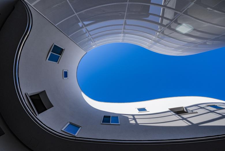
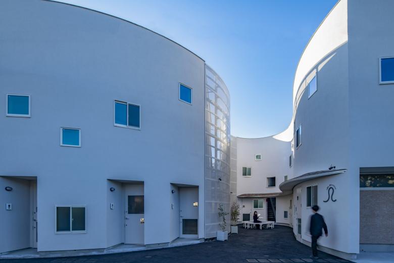
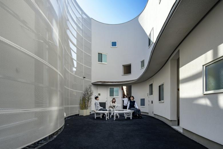
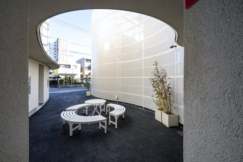
That's why the architecture had to stand out and offer tenants something special, within budget, to keep the vacancy rate steady over the medium to long term as requested by the client. In design, we would be encouraging tenants to be considerate neighbors, as single people living under the same roof – a friendly place, with communication preventing isolation. This inspired the idea of a central courtyard, which is not necessarily unusual but still provides a place for residents to linger for a chat. Kubomi means "pocket," among other things, so it's a fitting description for this gathering place. Besides fostering these ties, the courtyard also links the apartments to the neighborhood, forming a space that can replace the isolation of solitary tenants with a sense of being part of a community.
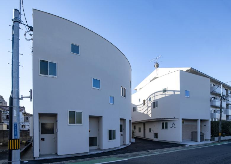
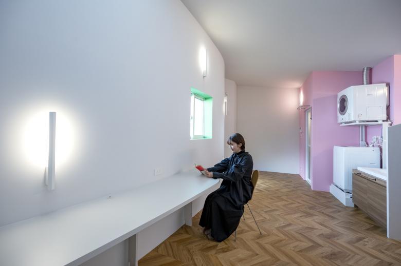
The project start date in August 2020 during the pandemic meant that we paid closer attention to certain topical issues: ideal lives/lifestyles for single people, how people share things with each other, and how to support this sharing. The decision to build studio apartments responded to the neighborhood's high concentration of medical professionals and the fact that the pandemic was spreading. A two-story structure here would suit the lot shape and size, our preference for wooden construction, and the need to meet building codes. Quiet units are an advantage when tenants include medical professionals and workers with irregular hours, so this was a priority in planning and construction of the floors, walls, and ceilings, while forgoing balconies, electric clothes dryers, and modular bathrooms (in favor of modular showers with benches) ensured maximum space inside and room for other fixtures, such as hygienic washbasins. To add variety and endear tenants to the units, we also suggested accentuating some sink areas with a dash of color.
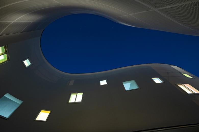
Setting the scene not only for tenant interaction but also community communication is the carefully designed shape of the inviting, accessible courtyard. Formed by dividing the building into two separate structures with curved walls, it creates an inlet from the street that tempts people to approach and slip in. Another touch that draws people in is the seamless merging of the road with the asphalt of the courtyard.
In consideration of the pandemic, ease of expanding shared spaces was not addressed in the design of the apartments, but we did seek to avoid people feeling isolated – another significant social issue for some time – by planning a sense of privacy that also allows tenants to be mindful of each other. We hope that in some way, the apartments help break down excessive uniformity in society and indifference to one's neighbors.
Related Projects
Magazine
-
Winners of the 5th Simon Architecture Prize
1 week ago
-
2024, The Year in …
2 weeks ago
-
Raising the (White) Bar
2 weeks ago
-
Architects Building Laws
2 weeks ago
