Living in a historical office ambience
Cologne, Germany
- Interior Designers
- brandherm + krumrey interior architecture
- Location
- Gerling Quartier, Cologne, Germany
- Year
- 2022
- Client
- Privat
- Team
- Susanne Brandherm, Martin Dierolf
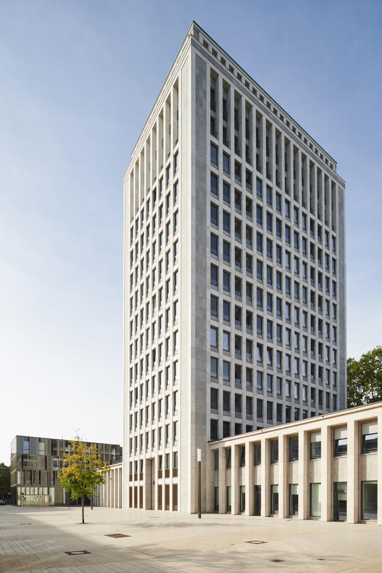
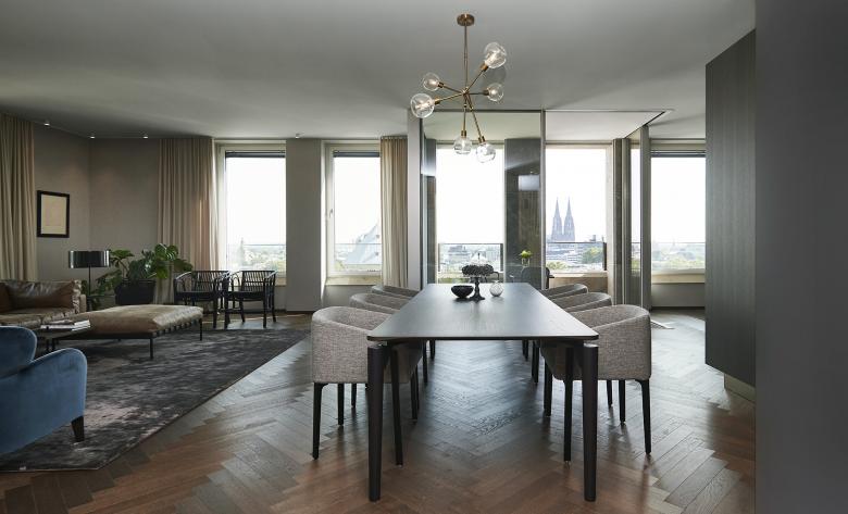
When the Gerling Tower was built between 1950 and 1953 in the centre of Cologne, it was soon considered a sensation. No other building was higher. Only the nearby Cologne Cathedral could rival it. The entire ensemble, which the Gerling Group, a multi-line insurance company, had built as its headquarters over decades, was designed in a classicist style – with a square culminating in the 17-storey high-rise. The filigree, 56-metre-tall steel skeleton structure tapers slightly towards the top and has a grid-like façade with a shell limestone cladding. Offices and flats have been realised in this historical ambience from 2007 onwards. Since the façades and parts of the interiors are under a preservation order, the buildings were carefully – and where possible – gutted and the majority of the interior spaces were redesigned.
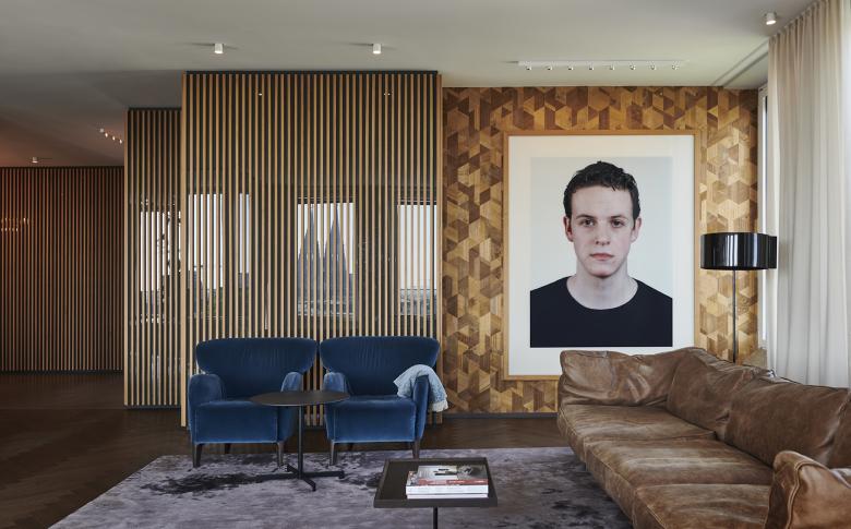
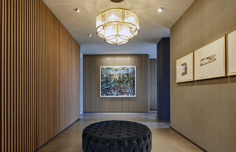
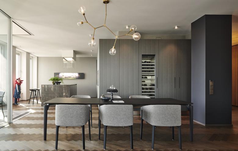
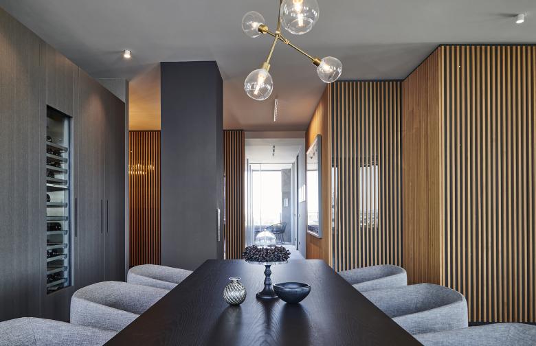
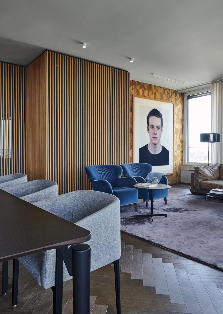
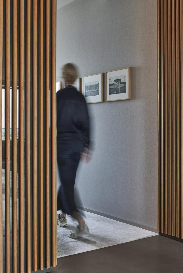
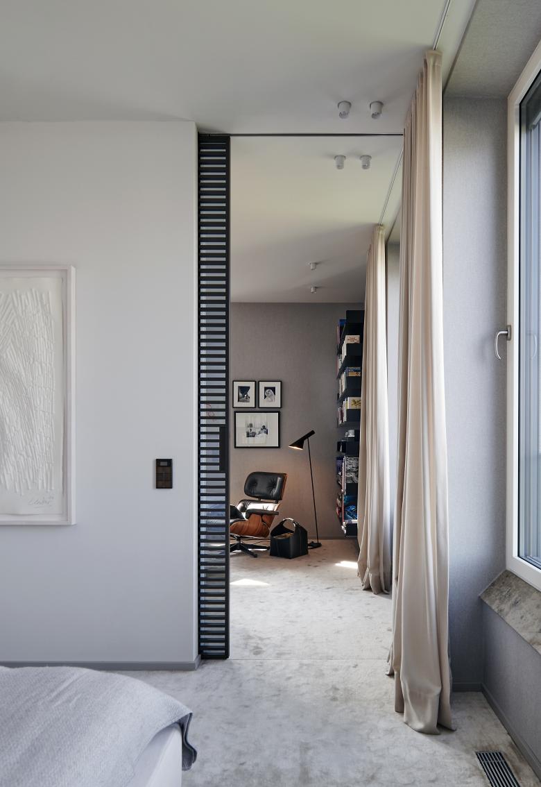
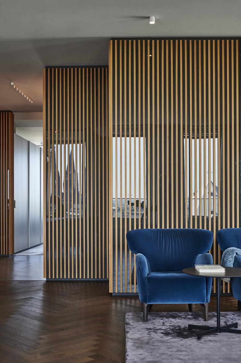
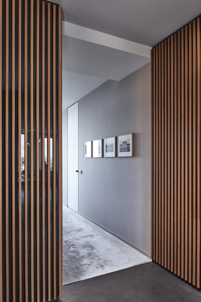
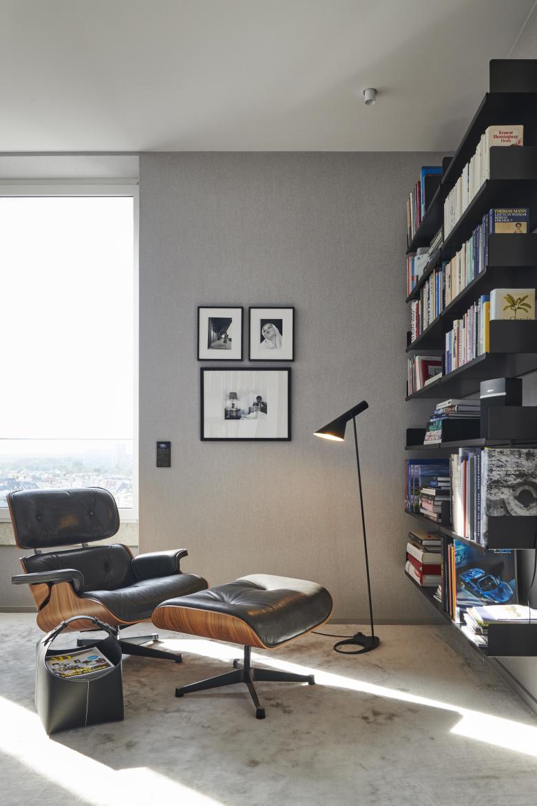
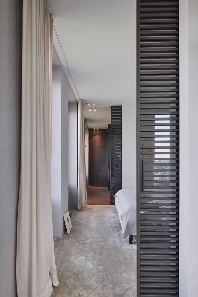
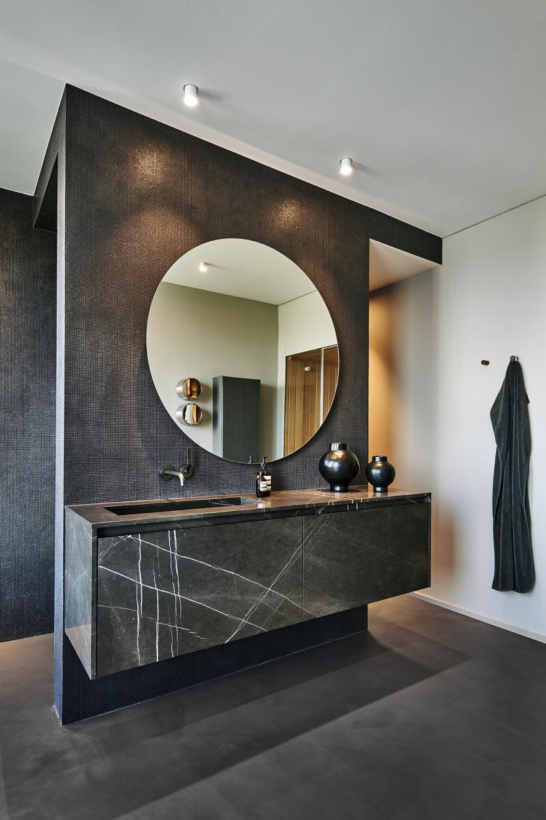
When brandherm + krumrey was commissioned with the interior design of the condominium in the Gerling Tower, the interior architects began by rearranging the room layout. The challenge here: on the one hand, she had to follow the very strictly structured external façade with its grid, axes and a circumferential window front. On the other hand, a homely cosiness was to be created in the newly laid out rooms. Since balconies were of course not considered for the high-rise building, which was originally designed as an office complex, two interior loggias now provide airy open spaces. The second challenge the interior designers had to solve: the 180-square-metre condominium was to be designed as a stage for the collected works of art. And the third challenge: the furnishings had to take up the design and material vocabulary of the 1950s and translate it into modern times. brandherm + krumrey used plenty of natural stone and wood in combination with muted colours. This results in an elegance that reflects both the aesthetics of the historical building and the attitude of the residents.
Related Projects
Magazine
-
Winners of the 5th Simon Architecture Prize
4 days ago
-
2024, The Year in …
5 days ago
-
Raising the (White) Bar
6 days ago
-
Architects Building Laws
1 week ago
