Revitalisation „Bikini“
Berlin, Germany
Rediscovering the Lightness of Being – In 2012, Hild und K Architects’ Berlin office took over the task of bringing BIKINI BERLIN back to life, with Dionys Ottl in charge. The construction site of Bayerische Hausbau had been there for over a year at that stage. The architects were asked to rework the plans of SAQ architects (B), to make them practicable and especially to make sure that the regulations for listed buildings were adhered to. Partners Dionys Ottl, Andreas Hild and Matthias Haber call this unusual task “conversion of an un-built house”. Needless to say the architects left their own distinctive signature on large parts of this project.
The listed group of buildings consisting of the Bikinihaus, opposite the Memorial Church (Gedächniskirche), the “large skyscraper” (Großes Hochhaus) at Hardenberg Square, the cinema Zoopalast, the “small skyscraper” (Kleines Hochhaus) and the multi-storey car park at Elefantentor was designed in the 1950s by Paul Schwebes and Hans Schozsberger. The Bikinihaus in particular has come to symbolise the post-war reconstruction era. It has bestowed the ensemble with its name and has become its centrepiece, albeit over the years, the building had largely deteriorated. This memorial building was also to become the focus of architectural continuity, which shaped how Hild und K conceptualised this reconstruction project. The objective was to make the lightness of the period it was built in palpable again, in the middle of the colourful international metropolis Berlin of the 2010s.
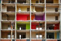
Meticulous care was taken to reconstruct the original façades: The Bikinihaus is characterised by its vibrancy, which after reconstruction offers space for restaurants, shops and offices. The façade has projections and recesses of reinforced concrete and bands of ornamented windows and glass balustrades giving it a light woven structure. The delicate elegance typical of the 1950s of profiles and original colours weren’t that easy to recreate in the new construction, due mainly to today’s strict energy-saving regulations. Similarly, the southern facing façade of the small skyscraper was carefully reconstructed. This building today houses a design hotel. Searching for suitable rendering systems was not an easy task as the face concrete at the narrow sides of the building was to keep its lively and hand-made character.
The history of the existing buildings continues up into the materials of the facades of the new buildings: The reconstruction required replacing a number of historical constructs and materials, like for example the coloured glass panels on the old facades. To save some of the old substance into the new construction and create continuity, the original glass surfaces of the building were shredded and used in the rendering of new insulated building parts. In a rending recreating the plasticity of folded material, like the pleats in a summer dress, the old building materials have come to life again. The existing facades are continued materially, in their textility and formally. They have given rise to associations, a dialogue between the new usage and the history of the building complex.
The impression of lightness and transparency also characterises the interior of the annexed building, the newly established Concept Mall. The leading metaphor for this building, which reaches up to three stories and is built over the former delivery yard, is that of a great bridge. This association is underlined through the carrying beams of uncovered steel, which dominate the large three-part hall on the ground floor. The hall opens up through a 4 x 14 meter large window on to the neighbouring zoo, where baboons squat on their “ape rock”. The interior is kept in shades of green making direct reference to the zoo. Large oak slabs and wooden parquet with raw reinforced concrete and simply waxed steel follow the idea of authenticity.
As a continuation of the square at Breitscheidplatz, the surfaces of the square and pavements reach into the building. And here again the old flagstones were used as additional material for the “pleated” bands of rendering, which were taken up again here. Like the interior, the roof of the Concept Mall has become the connecting element between Breitscheidplatz and the zoo. It is a publicly accessible terrace covering 7,700 sqm and is accessible via a stadium-like flight of stairs on the inside and a large open flight of stairs from the forecourt at Budapester Strasse. Nearly 10 metres up in the air, visitors can enjoy the unique views over the gardens of the neighbouring animals.
With the reopening of BIKINI BERLIN on 3rd April 2014, the western part of Berlin (City West) will have retrieved one of its landmarks.
- Architects
- Hild und K
- Location
- Budapester Straße, Berlin, Germany
- Year
- 2014
- Client
- Bayerische Hausbau GmbH
- Team
- Andreas Hild, Dionys Ottl, Matthias Haber, Project Management: BT B („Zoopalast“): Philip Argyrakis BT C („Bikinihaus“): Ulrike Muckermann, Jan Schneidewind, Susanne Welcker BT D („Kleines Hochhaus“) und BT E (Parkhaus): Julia Otte


