Stay Dream·Huaxi B&B
Shanghai, China
Stay dream·Huaxi is located near Shanghai Disney Resort. It is a B&B project based on the original two side-by-side rural self-built houses. The plan adheres to the concept of Stay dream brand, and wants to be a B&B with warmth, which can accommodate the romantic stories of every guest during their journey. Based on the advantages of the two design studios, the building facade renovation and garden design in the project were mainly completed by Parallect Design, and the interior design and soft decoration were completed by The One.
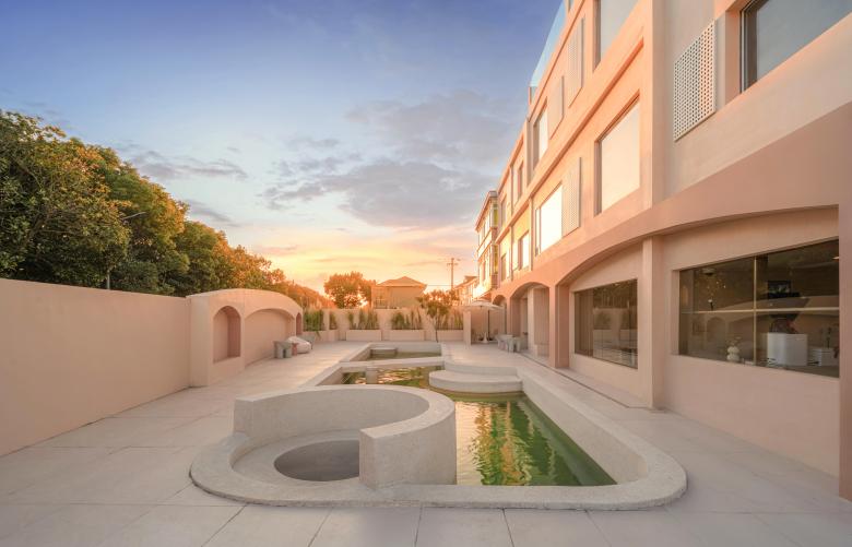
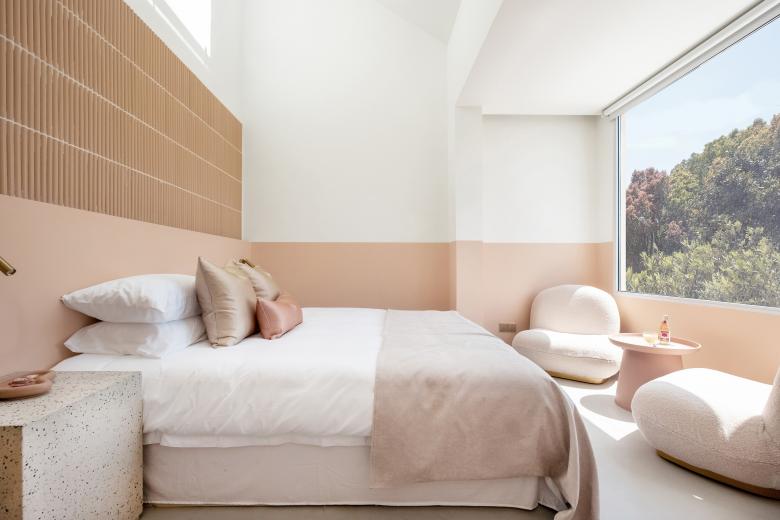
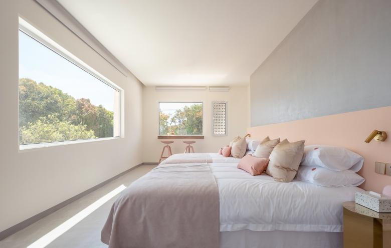
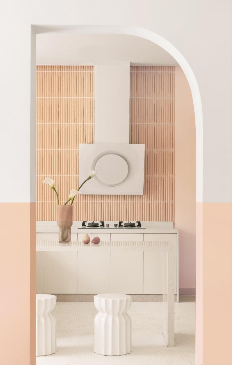
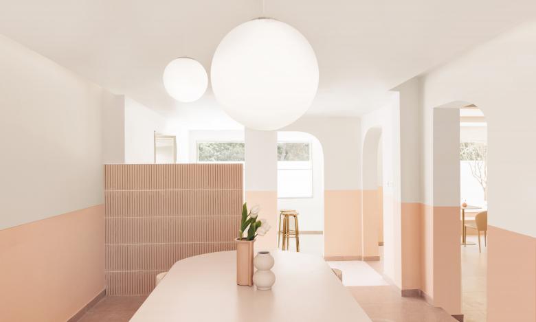
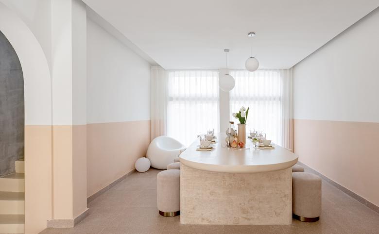
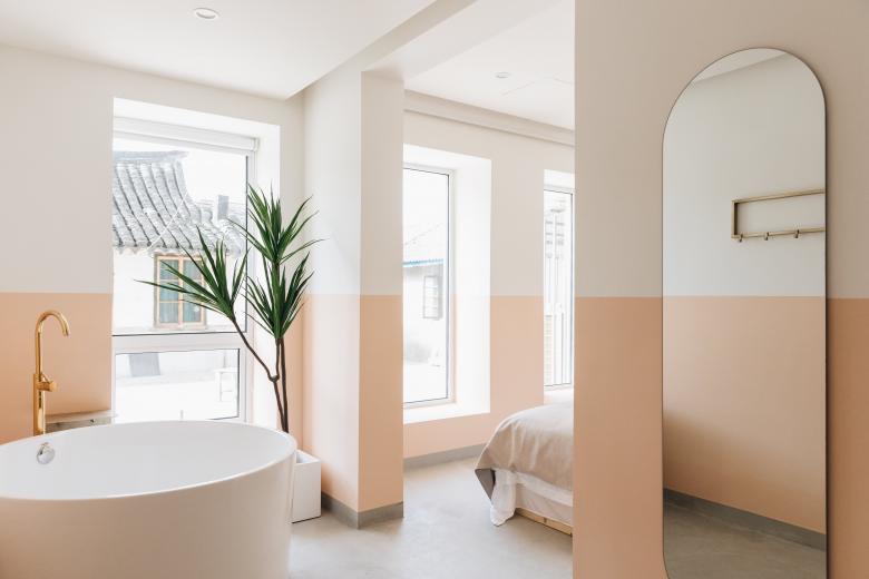
Stay dream is a B&B brand that focuses on creating a "girly style". The theme color selection of the project continues the usual style of Stay dream, with pink as the main color, and neutralizes the sweetness of pink through tough materials and bulky shapes. Just like every girl who works hard in this city has a strong side, but they are also gentle and delicate.
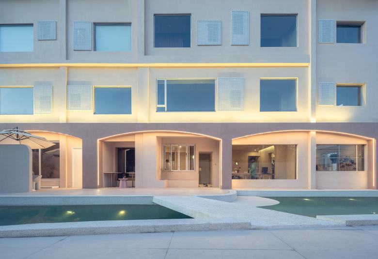
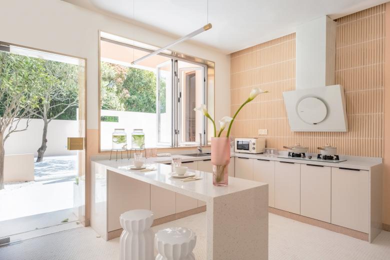
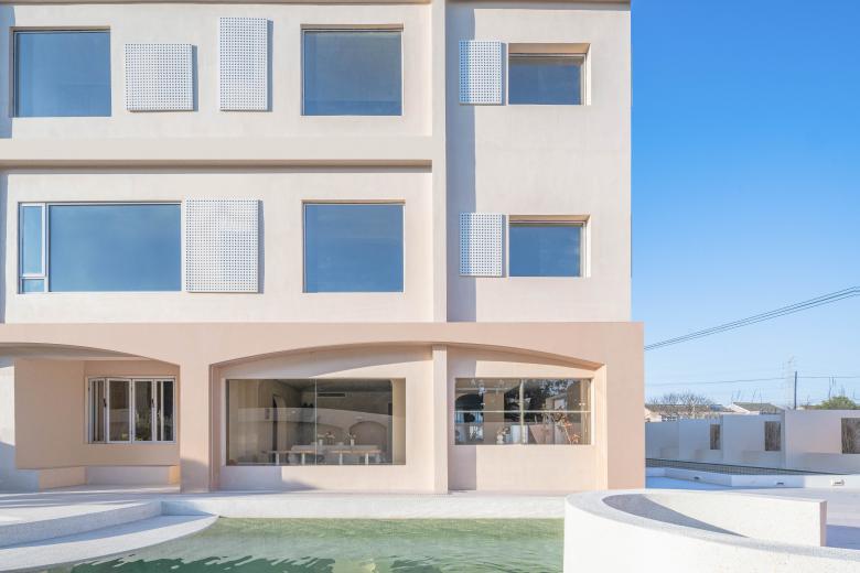
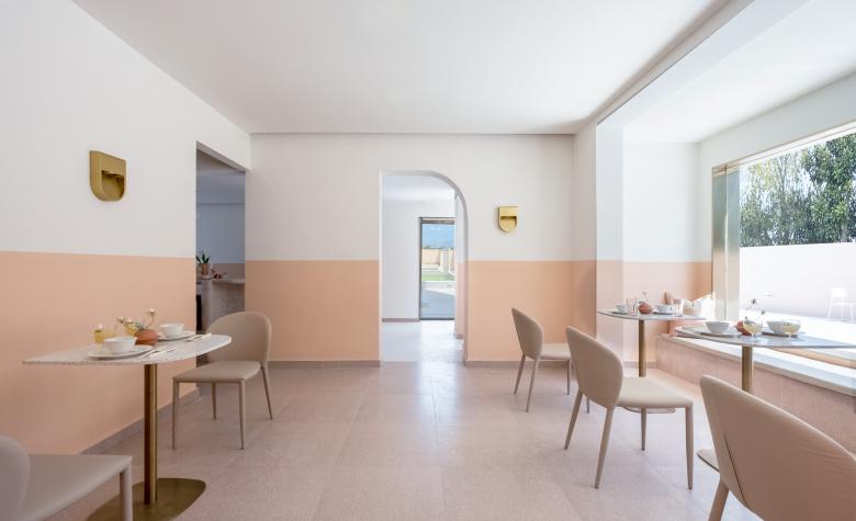
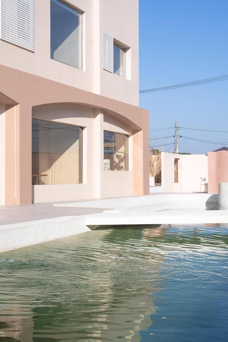
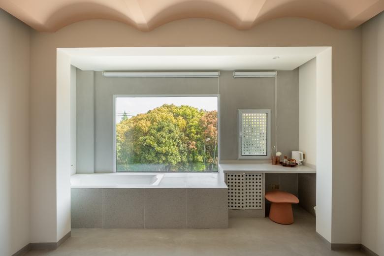
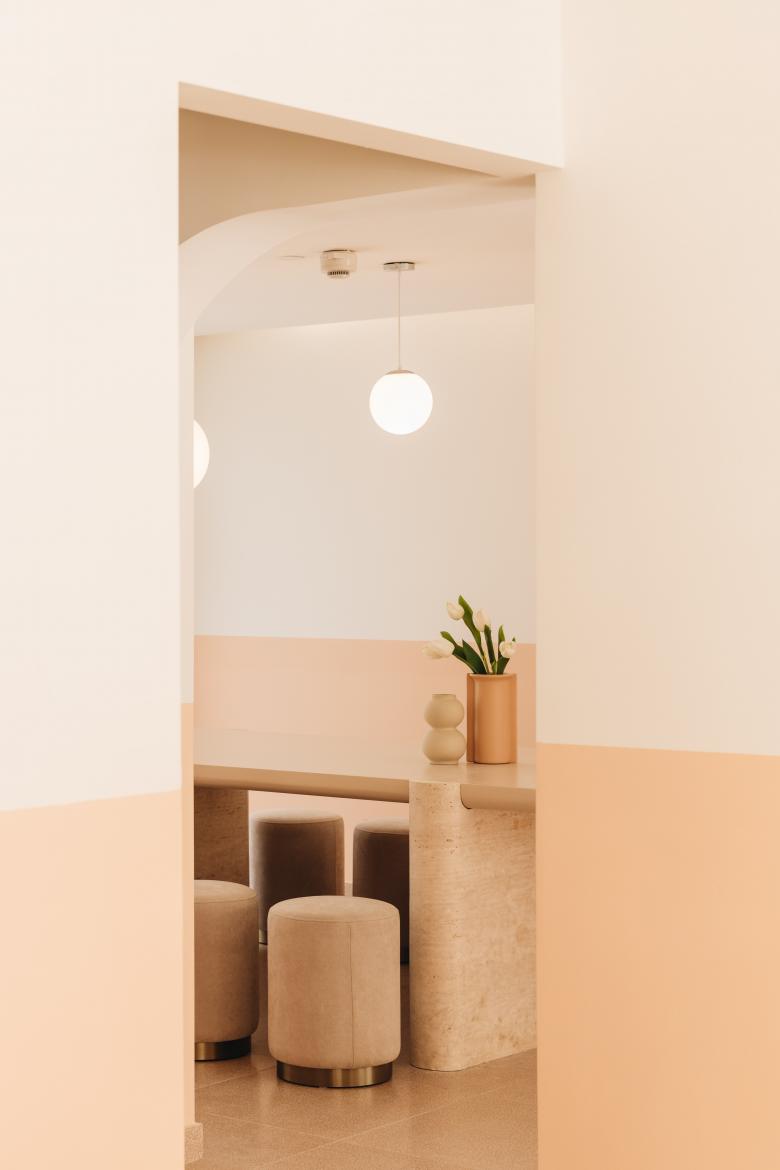
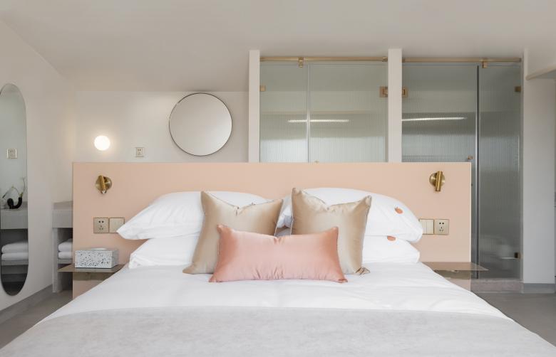
The overall appearance of Stay dream·Huaxi is pink, using calm neutral gray as a blend, and the proportion of carefully adjusted color blocks is embellished with golden materials. At the same time, the choice of hard decoration materials is mainly based on hard materials, including glass, metal, acrylic, supplemented by perforated panels, terrazzo and microcement, etc. Then use fabric soft decoration as an auxiliary to form a delicate and rigid organic combination. Under the hard material, gentleness is everywhere. It not only constructs a dreamlike architectural space, but also shows the characteristics of combining rigidity and softness.
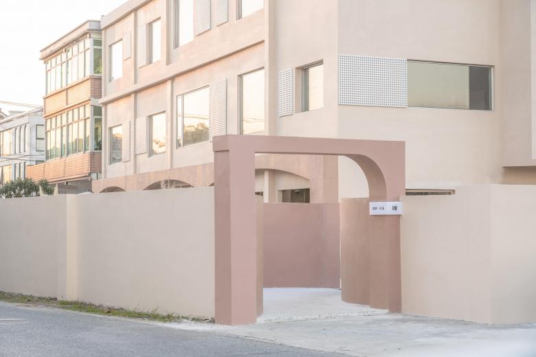
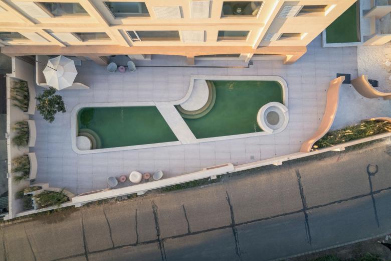
At first, the courtyard of the B&B was divided into two by a road, which could not guarantee the privacy and integrity of the private space. After negotiating with the owner, we reorganized the traffic flow of the courtyard, moved the road to another place, and changed the entrance to the side to create a sense of privacy. Different from the spacious gate of the courtyard, a landscape wall is added to the renovated entrance to prevent guests from seeing the landscape in the courtyard. After the guests pass through the landscape wall and enter the courtyard, they feel suddenly enlightened and feel like visiting the garden.
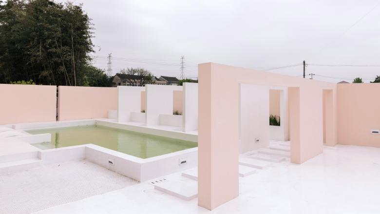
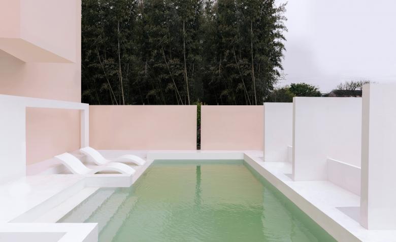
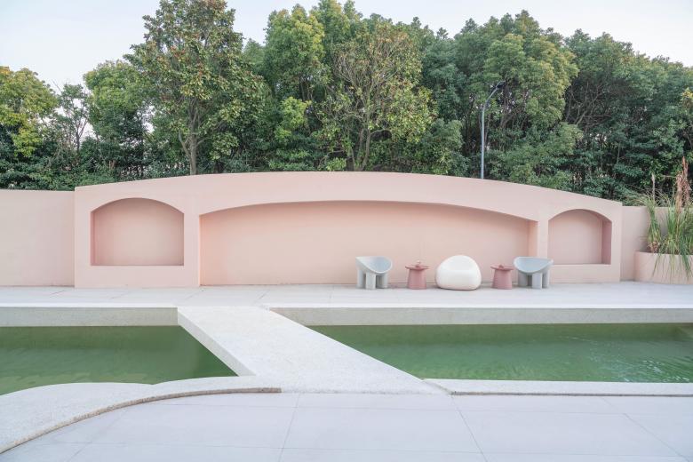
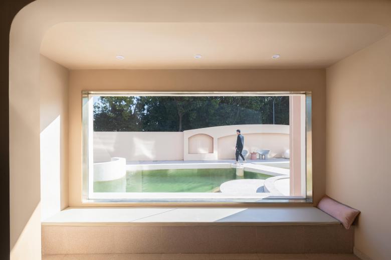
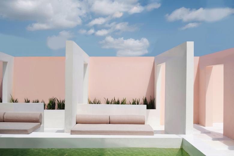
The renovation of the interior of the courtyard is designed around the two swimming pools. At the same time, the landscaping is carried out according to the interior. Water is the source of all things. Where there is water, there is life. The sweet and clear pool water endows the courtyard with spirituality. Its flowing dynamic characteristics and the surrounding static environment form an organic unity, making mystery and fantasy intertwined here. The swimming pool is interspersed with steps and sunken rest areas, forming a variety of interesting spaces, so that everyone can find their own quiet corner.
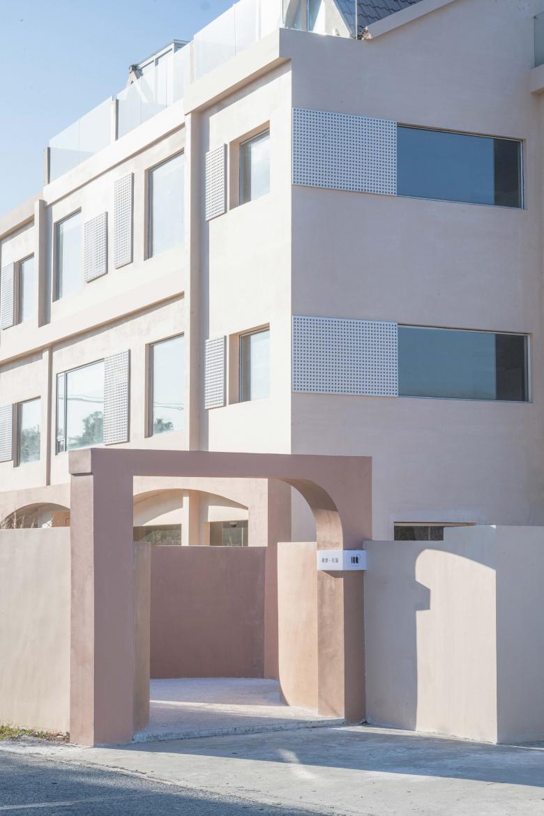
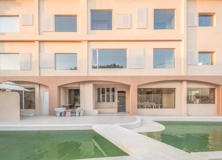
Light is to space, just like air is to life. Our design pays special attention to the creation of light and shadow. When renovating the outdoor space, we first reinstalled the doors and windows. Considering the cost, we did not make major modifications to the building’s facade, but only demolished and painted, and established the visual characteristics of the entire B&B with a large area of pink. When selecting the facade decoration, we paid great attention to the principle of "natural lighting", using perforated panels to form a blocky feeling, cleverly using natural light to highlight the layers of the indoor environment, and creating a visual effect of mottled, bright and dark.
The glass floor-to-ceiling windows are transparent and bright. Since we don’t want to open windows directly on the windows like the conventional method, and we don’t want to affect the ventilation in the room just because of the appearance, we use the large windows as landscape windows and the small windows for ventilation. The ventilation windows are blocked with perforated panels to ensure the consistency of the facade and achieve visual harmony and unity.
The owner and we both pay great attention to the interactive function of the B&B. The ground floor space of the main building was originally divided into systems, but all of them have been opened up as public spaces now, where residents can read, view and interact. Bar counters, dining tables are all available, and simple appliances such as bread machines meet the needs of some residents who want to make breakfast by themselves.
The design of the guest rooms follows the practice of facing the landscape. As a rest area, the theme is relatively weakened and the comfort is enhanced.
Looking back on the entire project history, the project has various imperfections in many aspects (facade renovation, material selection, etc.) due to factors such as the epidemic, construction period, cost, and collaboration, but it also realized the idea of the initial conceptual scheme to a certain extent, and allowed us to accumulated indispensable experience in the renovation and design of B&B. As a growing studio, we would like to thank such a project for helping us learn how to more comprehensively coordinate progress planning, construction drawing design and construction cooperation. We are also very grateful to the owner for their trust and cooperation.
- Architects
- Parallect Design
- Location
- 上海·迪士尼度假区·浦东新区南六公路岭南路孟冯家宅1号, Shanghai, China
- Year
- 2022
