Terzo Piano
Chicago, USA
Terzo Piano Restaurant is situated in one of the most prominent new works of architecture in Chicago – on the 3rd floor of the new Modern Wing at the Art Institute of Chicago. The challenge of the 250-seat lunch restaurant was to establish a contemporary space which would provide a complementary atmosphere to the Modern Wing yet did not ignore its setting.
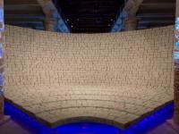
We established that the design of the restaurant would continue the experience of the museum into the dining area. To achieve this we added a series of fixed elements, organized as nodes of activity, which stand free from the walls and ceiling of the 8500sf space. Display vitrines house rotating pieces from the Museum’s collection and bring character to the various dining areas, providing loose edges of boundary. The lunch-only schedule of the restaurant and large areas of window also drove the undeniable presence of natural light in the space. The choice of a predominantly white palette, including resin tabletops which glow when shot with light, was a direct effort to capture the radiance and shadows of the changing presence of sunlight over the course of each day.
Guests navigate through an entry “buffer zone” between the public terrace and the restaurant. Key operational elements are collected here: a calm and modern lounge area with a display vitrine, a curved garde manger floating beyond, and further, a tightly-programmed volume containing the bar, custom wine and cheese display, beverage service and wine room. These volumetric elements are all dressed in a crisp, light palette and are of varied heights, though none touches the ceiling. The location and design of the garde manger were particularly informative in this project – as there were restrictions for building above the second floor galleries below, which meant an extended distance between the kitchen on the far south end of the space and the dining areas on the north end. To bridge this, the Chef and operators asked for a satellite garde manger in the public area of the restaurant. We embraced this as an “open kitchen” allowing the food and service to be on display and the gentle curve of the painted metal shape is employed to highlight its presence.
A critical aspect of the design was the concept of changeability. The restaurant is lunch-only, but the space doubles as a sophisticated banquet space, available for private evening events. This meant a fluctuating capacity and shifts in décor and character. We designed a series of movable furniture pieces, which can be reconfigured to define and redefine the overall space. Each element is a run of banquette seating backed by a credenza, suspended on steel frame on casters – and five units also have a removable upper fabric panel which can be grouped to establish a dividing “wall.” The neutral fabric wall finish (installed over sound attenuating material) and predominance of white allow guests to dress the room they see fit.


