With Reverence and Healthy Self-Assurance
Jenny Keller
3. febrero 2016
Photo: Roman Keller
The extension to the Swiss National Museum in Zurich has been completed. At the end of last month the new wing, of exposed concrete, was opened for viewing for the first time.
In terms of volume, it is the Swiss Federation's largest civil construction project. It has cost 111 million Swiss Francs and is almost as old as the architectural practice formed by its designers, Emanuel Christ and Christoph Gantenbein. This total includes the estimated costs of renovating the old building and strengthening it structurally; some of these measures have been completed, while others, such as the refurbishment of the west wing and the tower (from 2017 to 2019), are still to come.
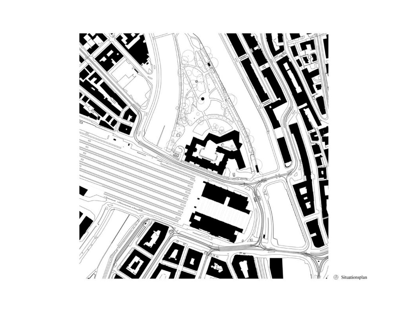
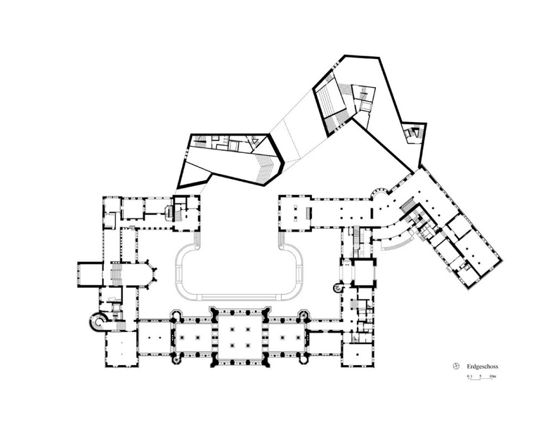
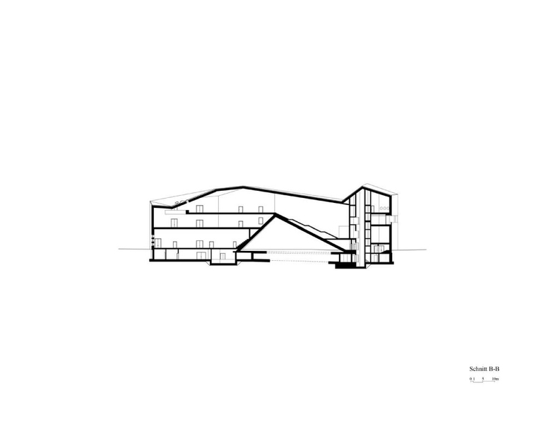
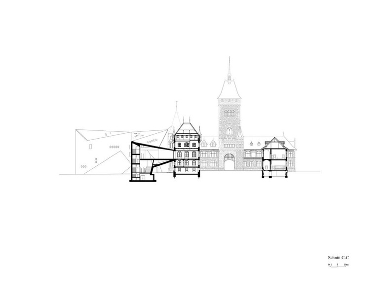
Christ and Gantenbein Architects won the international competition to renovate and extend the National Museum in 2002 with an expressive angular extension at the rear of the historicist ‘chateau’ designed by Gustav Gull in 1898. It subsequently became "a very public project," as Christ tells us during a guided tour of the new building, alluding to two referenda and three federal court decisions. The dynamic, concrete structure that stands before us now may not look quite the same as the original design, he says, but the architectural concept has remained unchanged. Its three main features are the view from the courtyard through to the park, the bridge-like connecting section, and the roofscape.
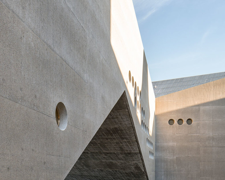
The sculptural addition (Photo: Roman Keller)
Ensemble of old and new seen from the park (Photo: Roman Keller)
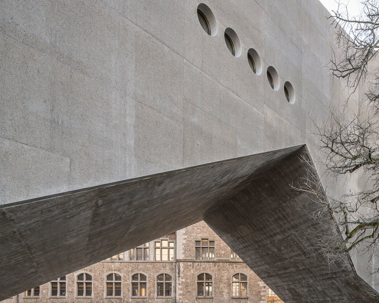
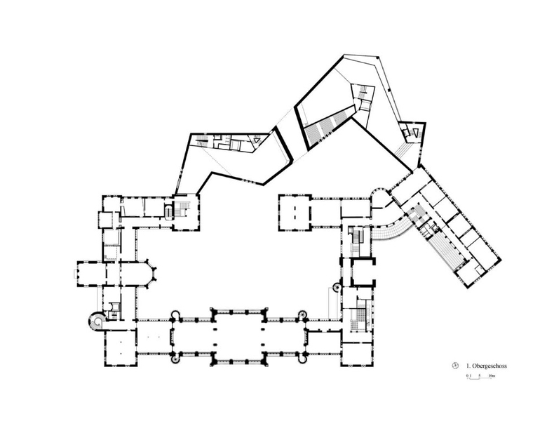
The main element informing the design is the meandering ‘bridge’ that connects the rear wings of the old building and makes ‘old’ and ‘new’ into a self-contained entity. This helps to keep the extension's footprint as small as possible, in consideration of the park and its trees, while the expressive form creates new outdoor spaces that the architects describe as having an "almost urban character." Work on the external facilities and landscaping is due to start in the spring, so that the National Museum will be ready to reopen to the public on August 1, 2016. Then the exhibitions will move in.
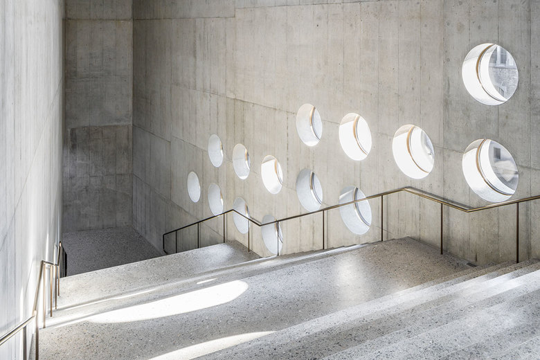
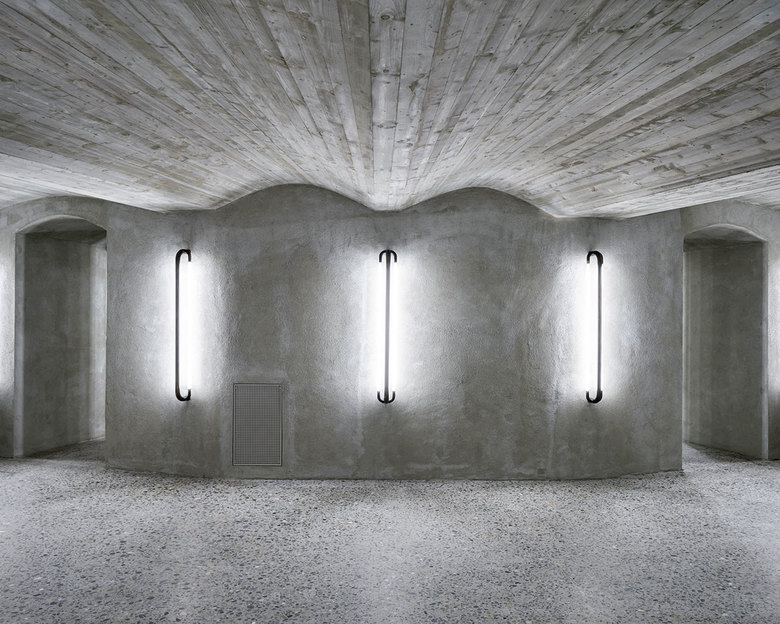
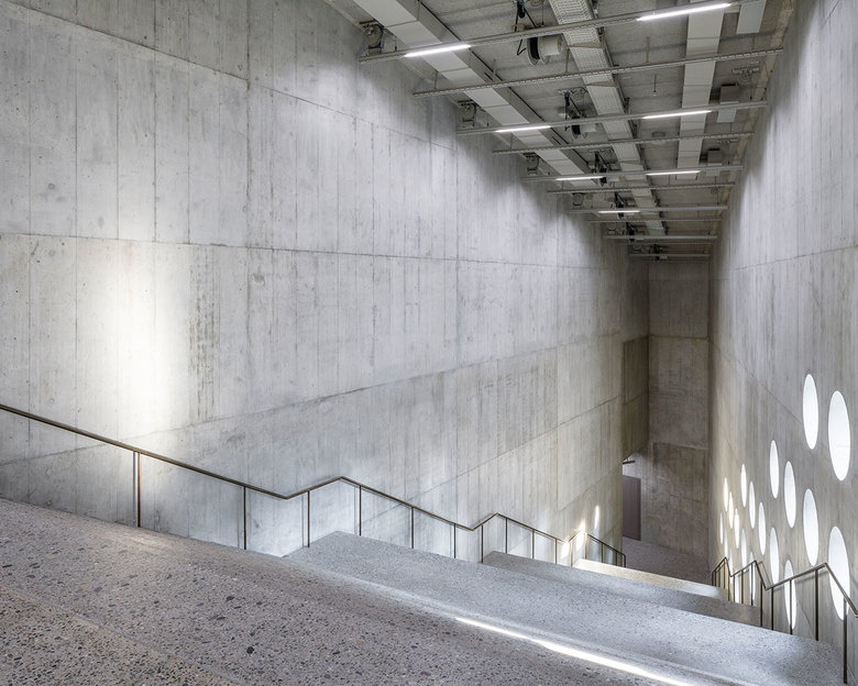
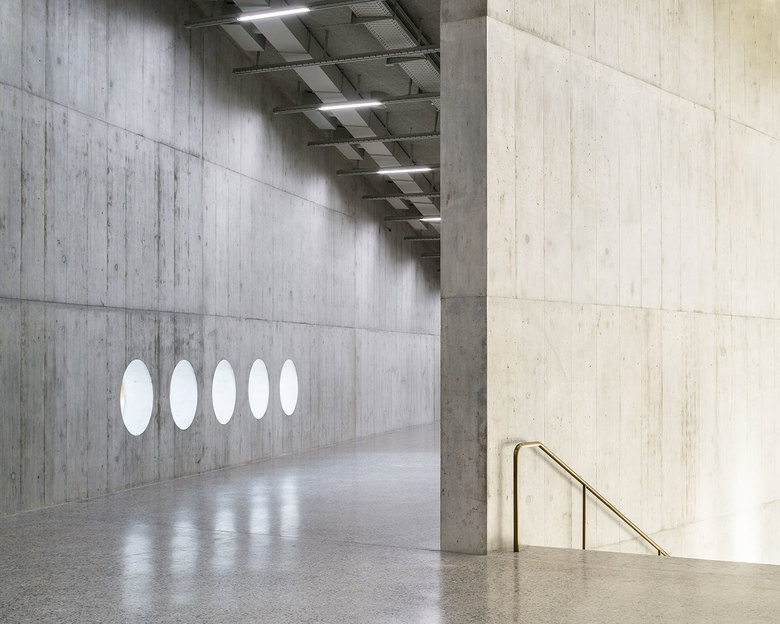
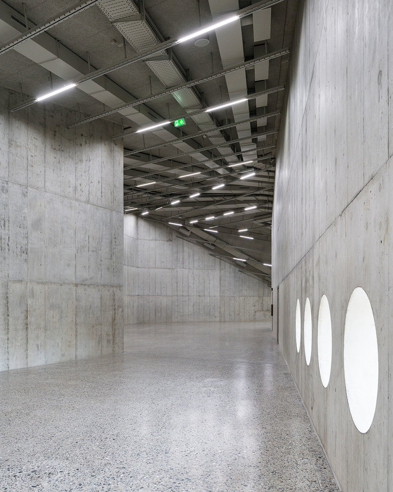
At the moment, the architectural effect of the new building can still be experienced 'pure', without any contents. The results of the architects’ labors are impressive: smoothly finished exposed concrete walls that reveal painstaking attention to surface quality and detail (the formwork plans apparently took one and a half years to produce), a powerfully geometrical roofscape, and modern terrazzo flooring that flows from room to room. Architectural bronze has been used generously for handrails and lighting fixtures, some of which develop from the railings, while others are wall-mounted separately, with a sculptural aura. Round openings cut into the concrete and framed with architectural bronze admit low levels of daylight into the interior, while offering its visitors carefully framed views of the city, the park and the older building, which the architects have reinterpreted in several aspects of their own design. "The old building is actually the prime exhibit in the National Museum," said Christ on our tour. This is meant with a degree of self-confident understatement, of course, because the really valuable exhibit – as is evident in its meticulous form-giving – is the new building, which can at last be entered and contemplated at leisure. One can only regret that it will never be experienced in such an uncompromised state again.
The new wing seen from the park (Photo: Roman Keller)
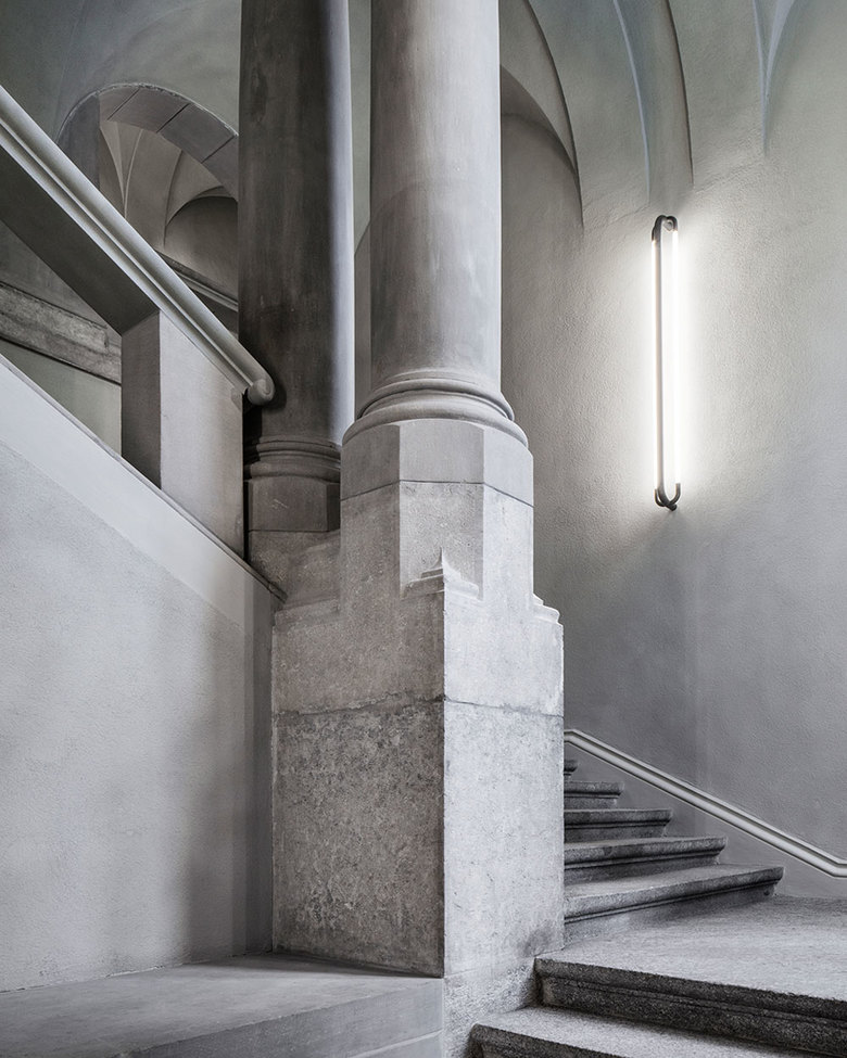
The circulation spaces and the transition from large to small rooms were inspired by Gull's design, says Christ, but with variations on the theme. The staircase in the extension, for example, is meant to have a somewhat monumental character as a counterpart to the Hall of Fame in the old museum building. Christ and Gantenbein approached Gull's building with a mixture of respect and healthy self-assurance, he adds, since their approach to architecture is to work with the existing substance and create something new from it. One new, unfamiliar aspect is the exposed treatment of the ceilings, leaving technical infrastructure such as ventilation, lighting and media lines unconcealed. This supports their idea of the museum as a factory and a place for experimentation, which can change its appearance according to the subject of an exhibition. Another obvious contrast is the use of concrete, but its use of tuff as an aggregate, as in the original, establishes a further relationship to the old building. The museum entrance itself, once completed, will also be new: located in the angle where the old museum adjoins the wing towards the River Limmat, the decorative arts wing. A museum shop and a restaurant with a bar will likewise help to bring life into an area that was once neglected.
The real achievement at Zurich’s Platzspitz (the spit of land where its two rivers meet) is one not only of architecture and building conservation, but also of social planning: The rehabilitated park, which until fifteen years ago was a hang-out for drug addicts, can now be accessed more easily from the museum, while the new extension integrates it functionally with minimal impact on the greenery.
Original article, "Mit Ehrfurcht und gesundem Selbstbewusstsein" on Swiss-Architects, translated by Richard Toovey.
