Edward Ogosta Architecture
Rear Window House
Edward Ogosta Architecture
18. junio 2018
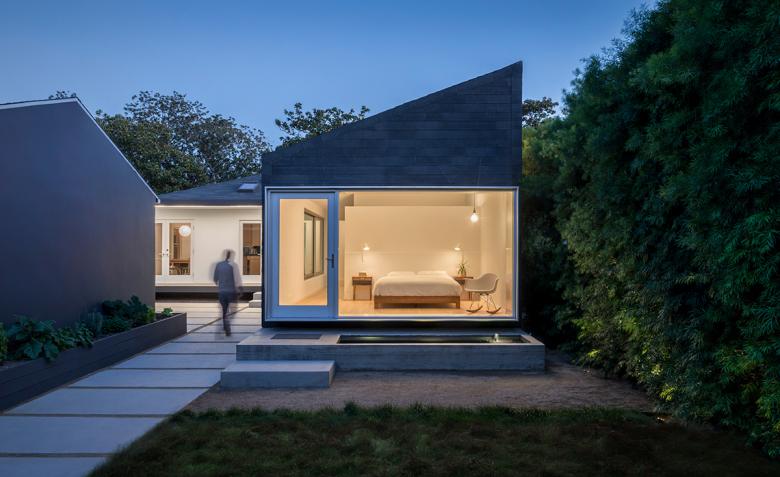
Exterior bedroom (Photo: Steve King)
Earlier this month the American Institute of Architects awarded eleven winners of its 2018 Small Project Awards. One of them is the Rear Window House by Edward Ogosta Architecture, a small residential addition in Culver City next to Los Angeles. As the name of the house implies, windows in the addition are particularly important features, framing nature while maintaining privacy. Edward Ogosta answered a few questions about the award-winning project.
Project: Rear Window House, 2017
Location: Culver City, California, USA
Architect: Edward Ogosta Architecture, Los Angeles
Design Principal: Ed Ogosta, AIA, NCARB, LEED AP
Structural Engineer: Reiss Brown Ekmekji
Contractor: Silverleaf Construction
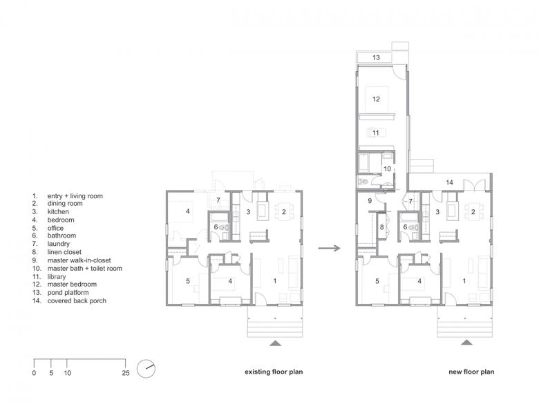
Building Area: 1,450 sf (1,000-sf renovation and 450-sf addition)
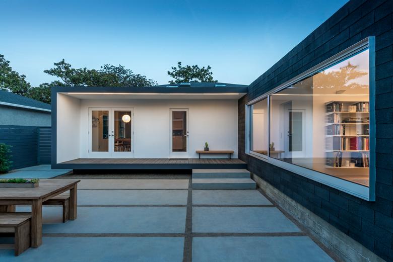
Back porch (Photo: Steve King)
Please provide an overview of the project.
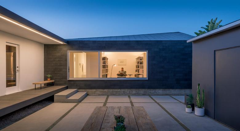
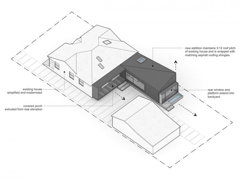
Rear Window House is a discreet yet decidedly modern addition and remodel to a 1944 bungalow in an area abundant with intact dwellings of the same era. Through careful sequencing of new spaces, and strategically located apertures, the home opens itself up to become deeply integrated with the rear garden. All exterior and interior finishes are unified to create a seamless architectural experience using a restricted material palette of glass, aluminum, wood, asphalt shingles, and concrete. Existing interiors were updated to be simple and bright, via new skylights, bleached oak floors, and white walls. The project culminates in the master bedroom’s expansive rear window, which is framed by aluminum-clad plate steel and cantilevers above a small pond. The design demonstrates how a thoughtful, strategic intervention can breathe new life into an older home, serve the needs of the contemporary family, and maintain neighborhood scale.
Exterior library (Photo: Steve King)
What are the main ideas and inspirations influencing the design of the building?
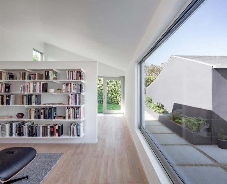
Drawing inspiration from the California minimalism practiced by the Light and Space movement of the 1960s, we sought to create moments of clarity that conjure a serene, meditative experience. The end of a hallway is intentionally kept pure of furnishings or artwork to draw focus on the natural light coming in from the skylight above. Strategically placed apertures and skylights bathe the home in intersecting light of varying temperatures, creating a subtle drama and interplay between warm and cool gradients, recalling the experience of a James Turrell Skyspace.
Exterior pond (Photo: Steve King)
How does the design respond to the unique qualities of the site?
While the existing house served admirably as a compact starter home for decades, our growing family necessitated building a master suite extension into the backyard. Guided by a philosophy of making the most impact with the least number of moves, we started with the removal of a large, centrally located tree to liberate space for the simple rectangular volume. To strengthen the connection between old and new, the addition maintains the traditional pitched roof slope prevailing in the original home and throughout the neighborhood, but with a geometric twist to create a more open, airy feeling inside. The new volume is entirely skinned with asphalt roofing shingles, anchoring the building to the vernacular materiality of the area. An exposed concrete base, rough in texture and appearance, harkens back to 1940s construction techniques, while the rest of the site’s hardscape consists of smooth concrete surfaces.
Interior library (Photo: Steve King)
Was the project influenced by any trends in energy-conservation, construction, or design?
The design successfully preserves 97% of the original building, while carefully integrating passive strategies and low-impact systems into the new addition, all within a modest budget. New double-glazed windows and skylights provide abundant daylight to the all-white interiors, effectively abolishing the need for electric daytime lighting. A seven-inch layer of spray polyurethane foam creates a thick, insulated building envelope and offsets energy losses from the glazing. Large glass doors and operable skylights naturally ventilate the home, and the small pond provides evaporative cooling. A pattern of spaced concrete pavers for the new driveway and hardscape permits rainwater to percolate directly into the ground instead of into the stormwater system. To save potable water, irrigated lawn area was reduced by 50%, plus new plumbing fixtures and appliances are water efficient.
Rear window (Photo: Steve King)
What products or materials have contributed to the success of the completed building?
To create the home’s signature rear window, we integrated plate steel and moment frames for the extruded aluminum-wrapped viewport that cantilevers out two feet from the building face. The glass wall features a built-in door that leads to the backyard pond and garden via a stepped concrete plinth. The window offers the intensely private experience of being surrounded by nature, and at times the home feels far from the city. Tall hedges planted around the property reduce noise pollution from the nearby 405 Freeway and provide added privacy, aiding in the quiet atmosphere we desired.
Email interview conducted by John Hill.
