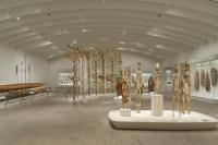
TBWA Office Building
Zürich, Switzerland
miami in zurich _ a low budget urban office layout
when I was asked to design the new offices for the tbwa switzerland (advertising agency), there were of course many parameters that had to be taken in consideration. the tough one was the tight budget and the spatial context of a rather ordinary office building of the 60’s. the task was high: when I met Markus Pekeler, the ceo of the agency, we had a casual meeting for two hours and he gave me the following inputs: ‘you have to create a cool environment for creative people in an extraordinary environment, no office groove, flexible and free, urban life style, you know, something like the atmosphere in miami beach...
I went back to our office and started to think about what could be the atmosphere of miami in an old office building in zurich, without spending any money. when I looked at photos of the city of miami, it struck me how the place was structured in stripes, there was the sea, the beach, the concrete stripe of the city and so on. It made me think of applying the city structure of miami as the spatial concept of our project. therefore I divided the two floors into blocks/stripes of city areas: there it was, the concept to organize an office like an urban environment, open to change and super flexible and not like an office, according the model of miami.
the urban blocks
to free ourselves of the frame or context of the building, we ignored the actual structure of the space like walls, facade and staircases and just defined various urban blocks, each block materialized according to its character:
sand – the beach / public chill
concrete – the city / public busy
white block – the creative office spaces
black concrete (street) – the consultants office spaces
as the budget was very tight we created a raw and second hand esthetic (urban): to begin with, we sanded both two floors in the city block area off all the materials, so in the end we had the raw 60’s ‘ugly’ concrete. in the other areas we didn’t touch the sealing to save money.
so the old sound insulation panels were just repainted white. in general we only use raw materials to save money and to get the urban look:
concrete, concrete raw panels (h2o), polycarbonate, sand floor, concrete floor, raw iron (doors etc)...
the beach
the reception and chill out area are the beach, situated at the south facade with the most amount of sunlight and views to the city of Zurich. the floor is made out of real sand, which we covered in a layer of transparent epoxy. so the surface is super slick, but you can see real sand as you walk on it, just like a beach. the radiators along side the inner facade we covered with polycarbonate and light it up to create a horizon (some blue light suggests the blue water of the sea).
the reception itself is like a vlolume cut out of the sand, therefore its ][top surface is sand sealed in transparent epoxy, the sides are out of raw iron.
the city block
the city block is the public, urban zone, we built everything in raw concrete (existing) or with raw concrete panels (h2o) just like buildings in a city. in this block there are all the public facilities like:
circulation (stairs and escalators), meeting rooms , office kitchens and toilets. you enter the agency by the escalator which is part of the concrete city block. so when you step out of the lift you are in the agency and not in a staircase. to make that spatially possible we set a big metal fire proof sliding door ( 3 x 3m) as the invisible separation of the old staircase and the agency.
miami white
right behind the city, there is miami white, a white and shiny block working as a platform for all the creative people of the agency, it’s the total contrast of the raw concrete and puts each material in very high contrast and context, but there is no hirarchy. the white floor together with the white walls gives yet again the feeling it being part of an (urban) volume, rather than just walls and a floor.
as everything is raw and visible we packed the existing installations into polycarbonate panels and put lights in them, so there are light beams playing along concrete beams and two L – shaped light walls that, once sliding open, create offices.
the sand winds down to the street- the inner stairs
instead to design a staircase we let two areas of the city meet, the beach’s sand (sand and epoxy) is being winded down onto the street (black concrete), to dematerialize the stairs and to solve the need of a banister we packed the whole staircase in a transluscent and light up volume of polycarbonate. from downstairs it looks like a light volume of an ufo opening itself and touching the ground. above the stairs there is an opening in the ceiling of concrete panels, where you see the real old concrete, light up. it’s like a skylight and the concrete is the sky.
the bathrooms
the owner of the building had his own architect who took care of the realization of the toilets. as he didn’t like our concept of space and materials he tried to boycott it by saying: the toilets are going to be real toilets like in the offices above, we will install it that way and you then can choose the last coat. no problem, we let them install the toilets, put lights alongside the installatoins and finished it with polycarbonate panels, a beautiful city facade emerged...
- Arquitectos
- gus wüstemann architects AG
- Ubicación
- Zürich, Switzerland
- Año
- 2014


