U.S. Building of the Week
Idlewild Education Building Renovation
brg3s architects
23. septembre 2019
Photo: Chad Mellon
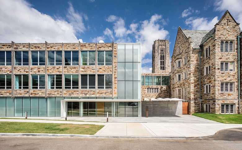
What looks like a new building attached to, and referencing, the original, neo-Gothic neighbor is in fact the renovation of a 1960s building. The renovated building updates systems, improves accessibility, and gives the institution a unified appearance. The architects at brg3s answered a few questions about the project.
Location: Memphis, Tennessee, USA
Client: Idlewild Presbyterian Church
Architect: brg3s architects
- Principal in Charge: Steve Berger
- Project Architect/Manager: Kate Haywood
- Lead Designer: Jason Jackson
- Specifications Writer: Jay Sweeney
MEP/FP Engineer: Thompson Engineering
Civil Engineer: McCaskill & Associates
Interior Designer: brg3s Architects / Idlewild Presbyterian
Contractor: Linkous Construction Co.
Food Service Planner: Fisher & Associates
Building Area: 70,000 sf
Photo: Chad Mellon
What were the circumstances of receiving the commission for this project?The client and the architect had a previously established relationship through principal Steve Berger’s membership at Idlewild. Because of this, the client approached brg3s with the opportunity to lead the design of the renovation.
Photo: Chad Mellon
Please provide an overview of the project.In 1928 an iconic collegiate Gothic church was built in mid-town Memphis, Tennessee, and in 1960 a 70,000 square foot, mid-century modern education building was added to the church campus. Over the next fifty years there were a few renovations made to these structures but in 2015, the church undertook a capital campaign to fund a major modernization of its 1960s building.
Limited accessibility, life safety concerns and energy improvements had to be addressed. Classroom and meeting spaces were outdated. A clearly defined drop-off and entry point were needed.
The challenge for the architect in 2015 was how to renovate a mid-century modern building to meet the standards of today, make a visible statement that this is a forward looking 21st century congregation yet respecting and preserving the architecture of both existing buildings.
Photo: Chad Mellon
What are the main ideas and inspirations influencing the design of the building?The focus of this renovation revolved around creating a space that was more accessible and functional for the user, that also complemented the existing architectural elements from the early to mid century.
Complicating the design solution was the 1960s architect’s decision to bury half of the first floor behind a berm so that the three-story building appeared to be less dominant on the campus. As a result, entrances were at mid-level. Upon entering the building, one was confronted with a half flight of stairs up or down to reach a main floor. There were no accessible points of entry. (An accessible but remote ramp was added in the 1980s from an alley to the lowest floor.)
Photo: Chad Mellon
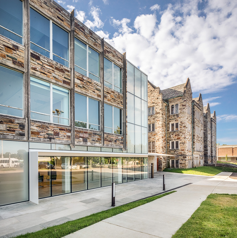
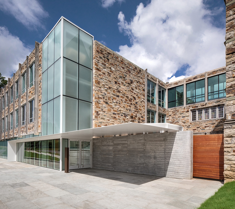
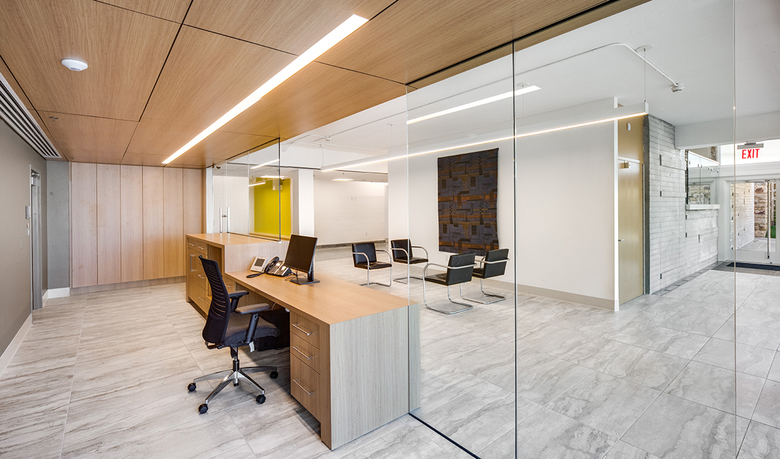
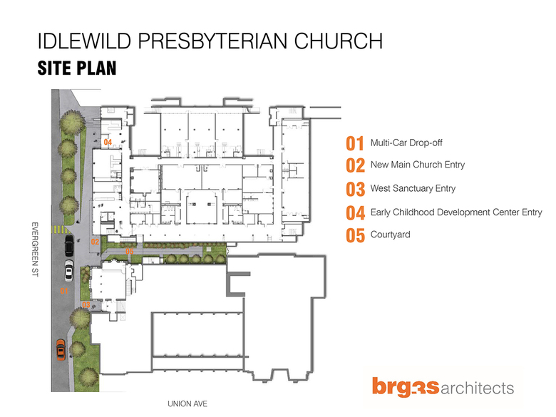
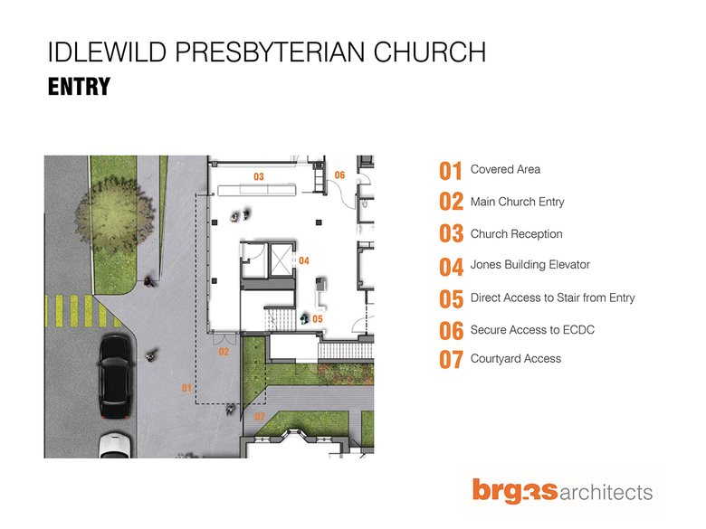
How does the design respond to the unique qualities of the site?The new entry needed to be at grade so the berm was removed exposing a concrete foundation wall. The exterior wall would have to be modified. The architect’s solution was a new floor-to-ceiling storefront and curtainwall at this first-floor level which continued across the west façade to the new drop-off and entry. This horizontal band continued on as a cast-in-place, board-formed concrete wall capped with a thin, cantilevered, steel plate. The composition is 21st century in design and a clear differentiation from the mid-century architecture but reflects in scale and modularity the original building. A rolling, Ipe gate closes the opening between the concrete wall and the 1928 structure and forms a transition from the stone exterior of the Gothic church to the new concrete, glass and steel architecture.
Rising three stories from the new entry is a new structurally glazed curtainwall with frosted glass which surrounds an existing stair tower. Lighted from within this tower along with the horizontal storefront creates a subtle “cross-like” image that is visible as people approach the church campus. With this new, at-grade entrance to the education building, the alley ramp was made obsolete. A new elevator provides accessibility to all three levels of the education building and bridges that connect to the 1928 building at the second and third floors now provide handicapped access to all floors of both buildings.
Photo: Chad Mellon
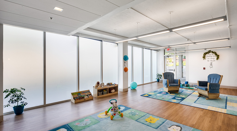
As part of the renovations, the project added a 20,000 square foot early childhood center. A smaller preschool had been in the building prior to the renovation but had been located on an upper floor of the building. Though allowed to continue in operation, many current life safety codes were not being met. The renovation expanded the preschool and relocated it to the ground floor or level of exit discharge.
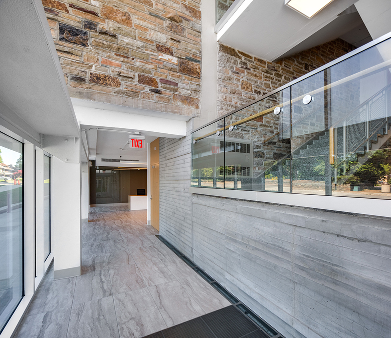
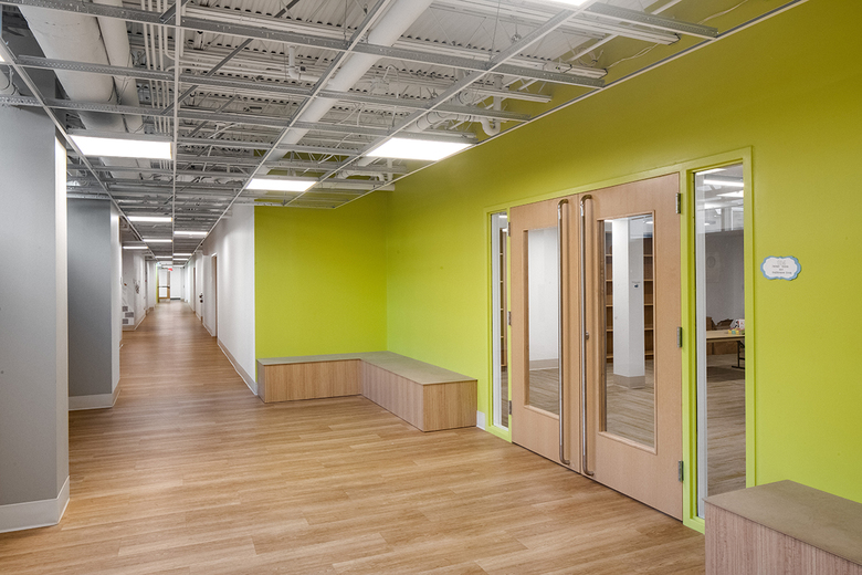
The building’s low floor-to-floor height of 10’-6” created challenges for utility and building system distribution. Ducts, piping and conduit were carefully placed so that dropped acoustical ceilings were minimized and floor slabs exposed to provide a sense of height throughout the spaces. An 8’-0” high “floating” acoustical ceiling in corridors was held away from adjacent walls giving the sense of a much higher space. Large 2’ x 6’ acoustical tile panels reduced the complexity of the ceiling surface adding to the sense of a higher ceiling.
Photo: Chad Mellon
Was the project influenced by any trends in energy-conservation, construction, or design?Memphis is characterized by its historic buildings, especially in the midtown and downtown districts. To maintain this distinction of character, most organizations place a greater importance on renovating spaces that already exist in contrast to demolition for new buildings. This process alone is known to save on construction costs and reduce carbon emissions produced by demolition and the manufacturing of new products.
Other required upgrades included an emergency voice / fire alarm system which has made the building safer for all occupants. HVAC systems which had used exit corridors for return air plenums were replaced with new efficient water-source heat pumps, saving energy and protecting exit corridors from smoke migration in the event of a fire.
Email interview conducted by John Hill.
