US Building of the Week
Pacifica Residence
Malcolm Davis Architecture
12. juillet 2021
Photo: Joe Fletcher Photography
Inspired by fishing shacks found in Scandinavian coastal villages, architect Malcolm Davis renovated an old, dilapidated residence into a contemporary beach house with a home studio. The architect answered a few questions about the house located in Pacifica, south of San Francisco.
Location: Pacifica, California, USA
Client: Private
Architect: Malcolm Davis Architecture
- Design Principal: Malcolm Davis
- Project Manager: Dinesh Perera
Landscape Architect: Jay Thayer Landscape Architect
Contractor: Vonnegut Thoreau Construction
Custom Cabinets: Brimer Workshop
Site Area: +/- 4,300 sf
Building Area: 2,281 sf (originally 998 sf)
Photo: Joe Fletcher Photography
What were the circumstances of receiving the commission for this project?The client saw a house that I had done in the city that was for sale. Originally, he thought it might work because he was looking for a space that would offer a home studio and residence all in one and the property was made up of two little one-bedroom cottages. However, then the house in Pacifica became available and he decided to purchase that instead. It was a mess, but the potential was endless.
Photo: Joe Fletcher Photography
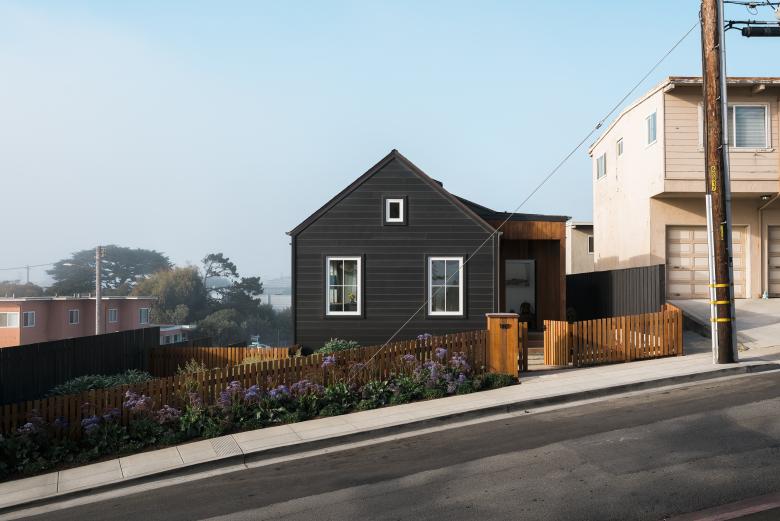
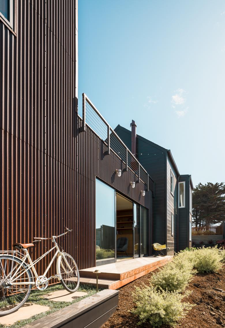
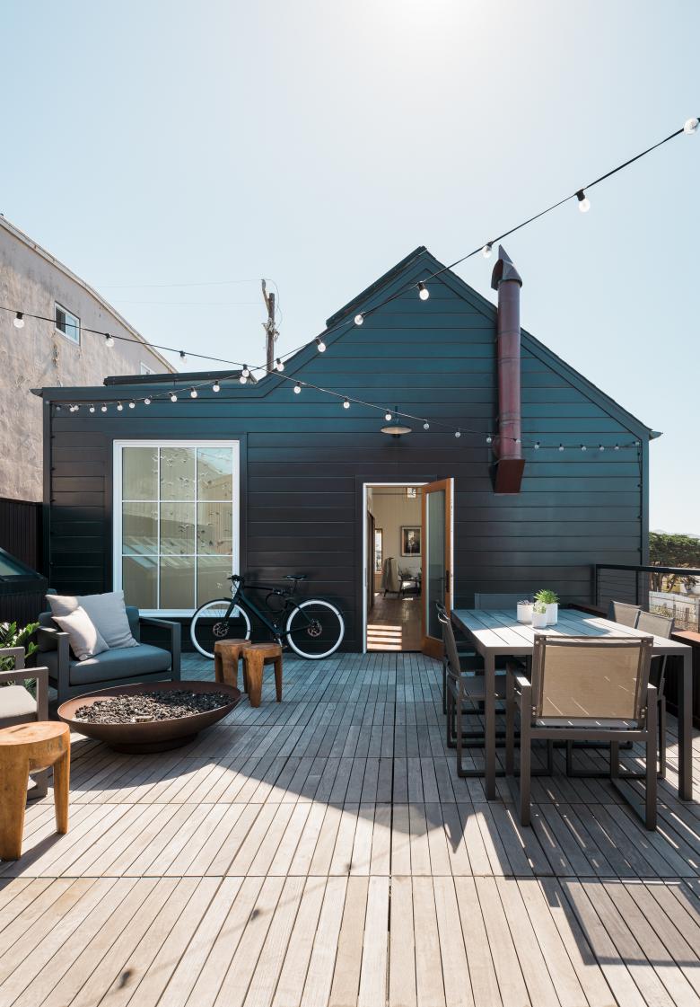
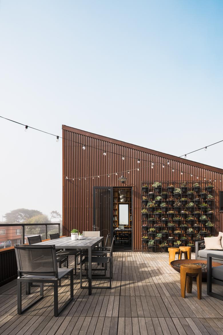
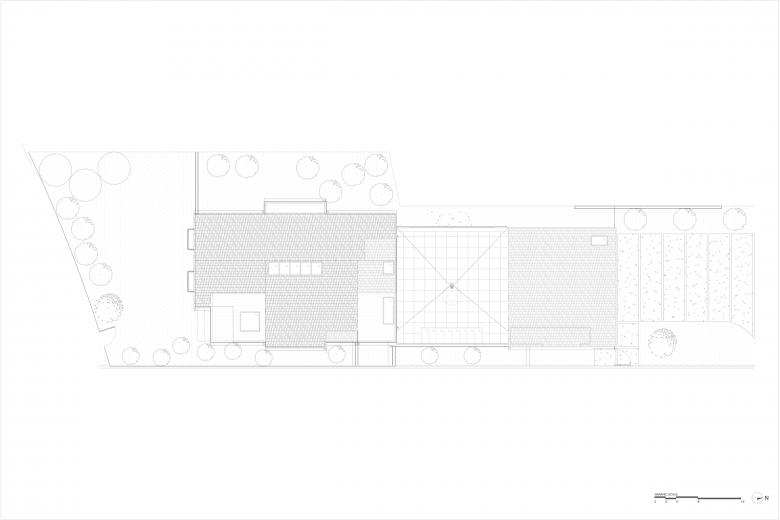
Please provide an overview of the project.Purchased as a “distress sale,” this formerly dilapidated residence was transformed into a contemporary yet casual beach house. Modest and contextual, the new home slips into the neighborhood as though it were always there. Inspired by the gabled fishing shacks found in Scandinavian coastal villages, we preserved the existing home, to the greatest extent possible, while surgically editing to modernize and expand the square footage required for the homeowners’ growing family. In doing so, we created a complementary program that allowed the clients to work and live in the same space, while also providing emotional and mental separation of domestic and professional activities. The result is two structures connected by an outdoor “bridge,” or roof deck, that serves as outdoor dining or lounging for either structure.
Photo: Joe Fletcher Photography
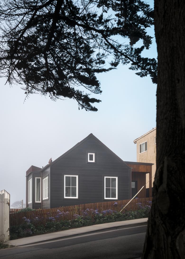
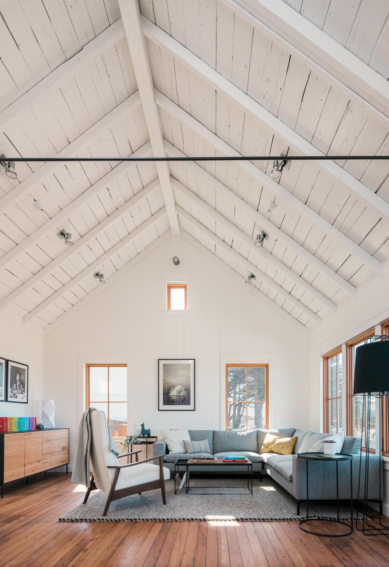
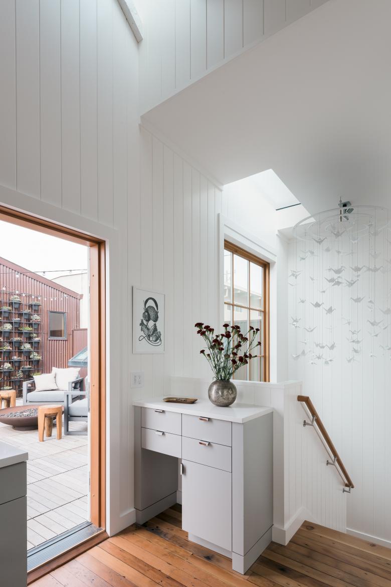
Inside, the original tongue-and-groove Douglas fir floors were sanded down and patched with reclaimed material. Outside, the exterior was re-sided, painted black, and new thermally broken windows with white frames were installed. The roof was structurally upgraded and insulated from above then tied together with tensioned steel pipes. Taken as a whole, both structures evoke the sense of simplicity as originally intended. The material palette and facade duality effortlessly defines the character and nature of the contrasting functions within each distinctive space.
Photo: Joe Fletcher Photography
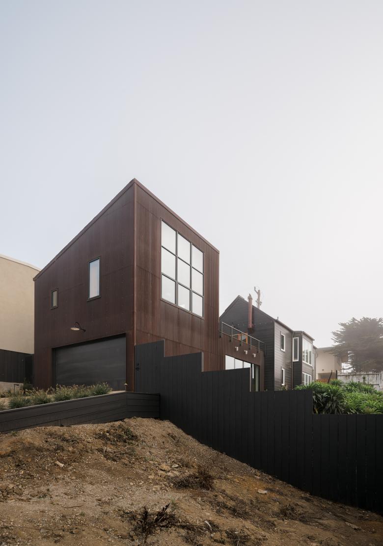
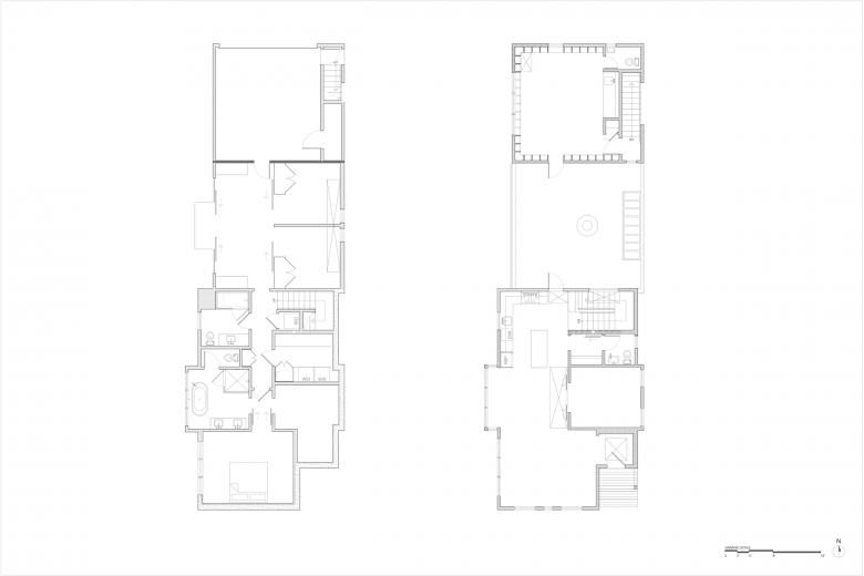
What are the main ideas and inspirations influencing the design of the project?The project site is a through lot with two distinct street faces, which lent itself to a home designed with two contrasting facades to match the project’s functional duality. The existing simple gabled structure on Palmetto Avenue was designated for family life functions and outfitted to read as a “classic” family residence, with black horizontal fiber cement siding and white window frames. An added shed roof massing on Hilton Way houses the new studio and is clad in corrugated Corten to indicate the less-standard program within. The two structures are connected by an outdoor “bridge,” a roof deck that serves as outdoor dining or lounging for either structure. The only other connection to the upper level studio is through a sheltered external staircase. Both transitions from home to studio are through external connections, creating a sense of separation between domestic and professional spaces.
Both structures evoke the sense of simplicity as originally intended. However, the evolution of the program requirements and the combined efforts of the clients and design professionals created a unique procession, material palette and facade duality that defines the character and nature of the contrasting functions within the spaces.
Photo: Joe Fletcher Photography
How does the design respond to the unique qualities of the existing building?The couple presented early inspiration images from past travels, some of the most memorable featured gabled Scandinavian fishing shacks with white framed windows set against a simple contrasting all-black form. The existing structure, set in a fishing town context, lent itself to be rendered with modern materials resembling the style and feeling of the Scandinavian coastal village structures.
We also excavated under the existing house and had to hold the original building up in the air in order to do so. This process, which allowed us to increase the size of the home without impacting the neighbors’ views, included digging down into the basement and creating a whole lower level. This allowed us to increase square footage, without creating a larger street presence.
Photo: Joe Fletcher Photography
How did the project change between the initial design stage and its completion?At the onset of the project the client was a single UX designer-turned-investor who grew up in Florida and is a surfer. The home started out as a bachelor weekend escape. He wanted a cool studio space and an outdoor deck where he could see the ocean. Over the course of the schematic design process the clients realized that the final product might not satisfy the entirety of their needs by the time their vision is realized. For that reason, the studio component became supplemental to a fully formed three bedroom home, allowing the clients room to expand their family while still providing the original much-needed working studio element. From this point forward the challenge was to create a structure that allows the clients to work and live in the same space, while also providing the required emotional and mental separation of domestic and professional activities.
Photo: Joe Fletcher Photography
The home’s expanded studio allows him to meet with clients, while also having a separate and distinctive work space from the residence.
The client had never lived in a home where you just open up the windows. He has actually said of the finished project that it is “a house that breathes and that the way light moves through the house is wonderful.” He left San Francisco to live in the house full time because he can hear the waves at night from his bedroom window.
Photo: Joe Fletcher Photography
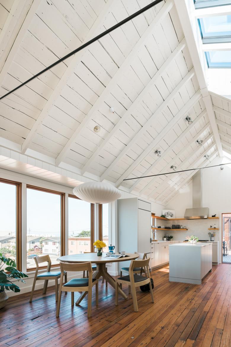
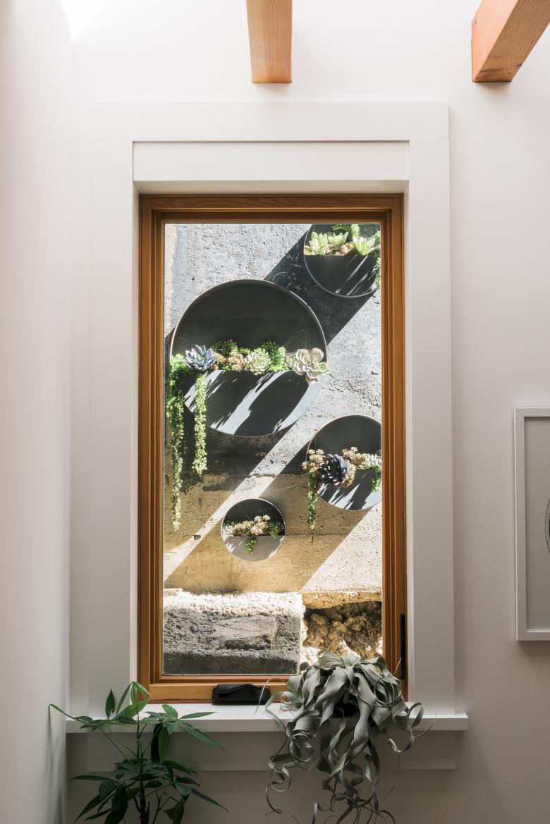
Was the project influenced by any trends in energy-conservation, construction, or design?When working with something existing, we try to play up its strengths and keep as many of the existing building elements as possible. The home was barely inhabitable when our client first bought it, but we saw the potential. When we removed the dropped ceiling to expose the sloped framing, in conjunction with refinishing the distressed Douglas fir subfloors, made a major overhaul and visual transformation. Punctuating the space with skylights to bring sunlight over the staircase, entryway, studio, dining room and bath was also a priority given that Pacifica is so foggy. In this manner we were able to keep materials out of the landfill and improve what was already there.
Photo: Joe Fletcher Photography
What products or materials have contributed to the success of the completed project?The existing structure, designated for the three bedroom home, was preserved to the greatest extent possible, surgically editing to modernize and expand the square footage required for a growing family. The original Douglas Fir T+G floor was sanded down and patched with reclaimed material. The existing roof structure was exposed and painted. The roof was structurally upgraded and insulated from above then tied together with tensioned steel pipes. The exterior was re-sided, painted black, and new thermally broken windows with white frames were installed. Motorized shades are hidden in the existing wall framing and controlled with a lighting control system programmed to move with the sun to further reduce heat-gain.
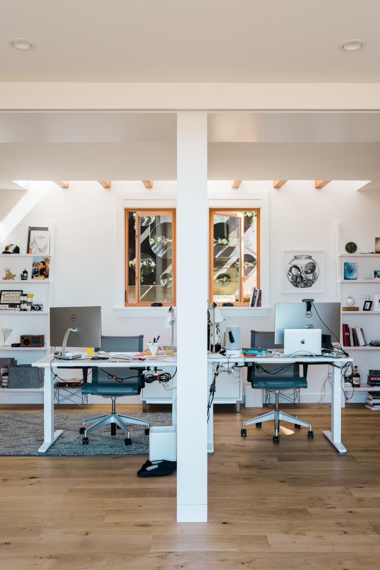
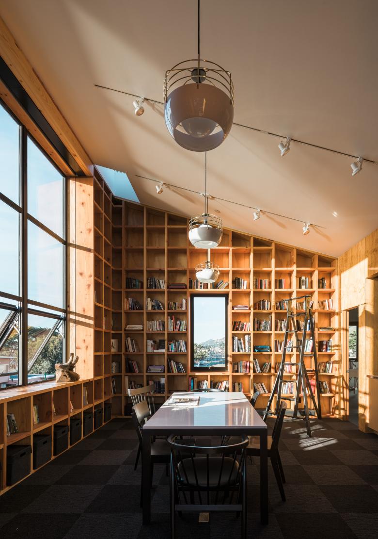
The new studio is rendered in contrast to the home, but with a similar simplicity. The studio shelving is made of framing lumber in the common framing dimension of 16” on center x 16” on center. The windows were ordered to fit in this same module. The powder room is all galvanized sheet metal, a common flashing material, and the exterior is clad in corrugated Cor-ten, a siding material which does not require a finish.
Photo: Joe Fletcher Photography
The new studio is rendered in contrast to the home, but with a similar simplicity. The studio shelving is made of framing lumber in the common framing dimension of 16” on center x 16” on center. The windows were ordered to fit in this same module. The powder room is all galvanized sheet metal, a common flashing material, and the exterior is clad in corrugated Cor-ten, a siding material which does not require a finish.
Email interview conducted by John Hill.
Photo: Joe Fletcher Photography
Drawing: Malcolm Davis Architecture
Drawing: Malcolm Davis Architecture
Articles liés
-
Castle Black at Sea Ranch
on 31/01/2022
-
Corten Ribbon
on 19/07/2021
-
Pacifica Residence
on 12/07/2021
-
Community Information Center
on 05/04/2021
-
Ashes & Diamonds
on 26/08/2019
