Revolución Unit Master Plan
Guadalajara, Mexico
- Architetti
- BNKR Arquitectura
- Sede
- Guadalajara, Mexico
- Anno
- 2008
Guadalajara, the second-ranking city in importance in Mexico, was chosen to host the XVI Pan-American Games in 2011.
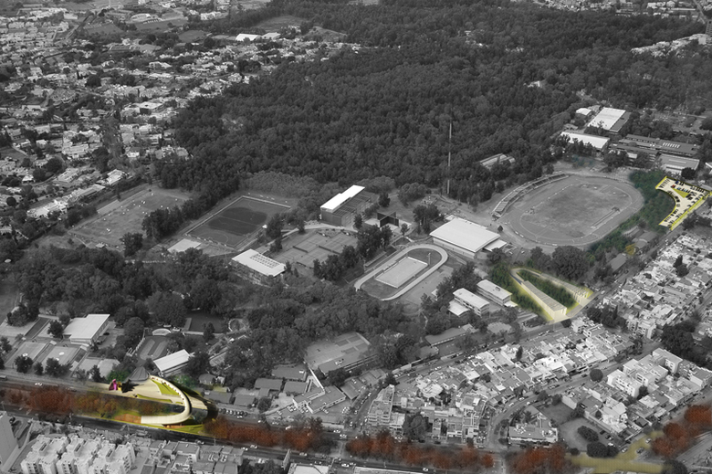
Like all major sporting events, they become the perfect excuse for the government to inject money into the city through the creation of new sporting facilities and urban revitalization. Such was the case with Unidad Revolución, the official venue for Field Hockey, Wrestling, Archery, Speed Skating, Basketball and Athletic Sports. We were commissioned with the design of specific interventions in the site as well as the master plan of the surrounding area.
The first thing that sprung up in the initial land use analysis of the neighborhood of Providencia was the transformation of residential plots into commercial and office spaces. To prevent the whole area from metamorphosing into a commercial area, our land use master plan allowed commerce and office spaces to develop along its two main avenues, Pablo Neruda and Montevideo, but restricted it in the inner blocks between them. It also promoted tall buildings along these avenues and limited new constructions in the inner blocks to two stories. Further vegetation, civil protection, façades, street furniture, traffic, pollution, parking, and street analysis and proposals complemented the master plan.
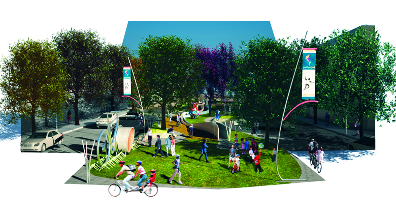
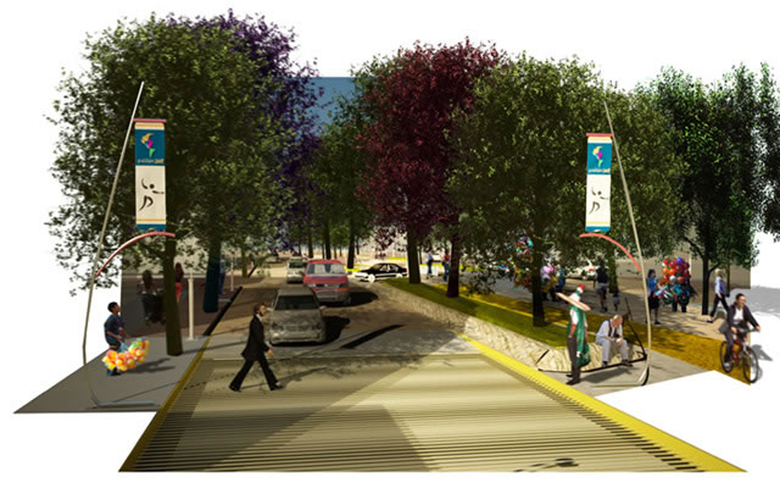
The master plan focused on revitalizing the neighborhood’s two main avenues and promoting their pedestrian footpaths. New vegetation, street furniture, lighting, and pavement design were proposed to incentivize social interaction and eventually become the main attraction of the area. A bicycle rental program was designed to discourage the use of cars.
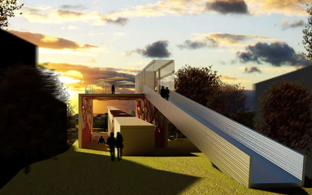
The program required specific interventions in the venue and the urban fabric: a pedestrian bridge for the main public access, a special access for athletes, a parking structure, an open air auditorium and the regeneration of a residual area alongside a historic aqueduct connecting the two avenues.
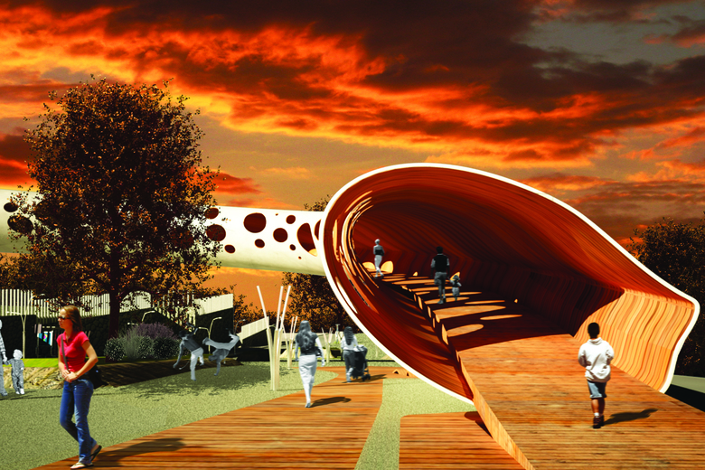
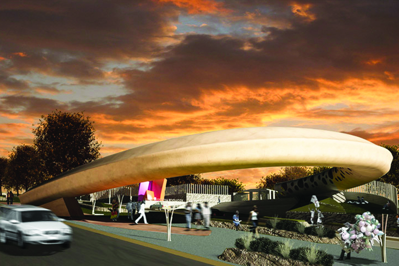
The fundamental premise in the design of the bridge was to cross over the avenue without the need for stairs. We took advantage of the natural slope of the street to accomplish this. By devising a gradually-rising curved path, instead of a traditional straightforward approach, we achieved an organic and fluid transition for pedestrians.
Curiously enough, the end result was so appealing to the authorities that the project was awarded the unofficial title of “Symbol of the Pan-American Games”.
Besides its obvious function, this aqueduct from the early 1900s has a pedestrian passageway alongside its columns that serves as a connection between the two avenues. Due to safety issues, trash, graffiti and lighting problems at night, it is not commonly used and has become a residual space of the city. Its apparent beauty and evident potential demanded a programmatic make-over.
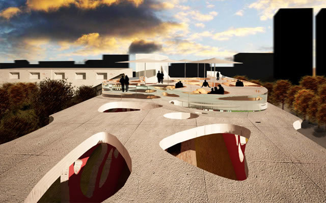
To avoid the confrontation of the past and present our intervention did not intend to “touch” the existing architecture. We conceived a folded surface in the manner of a staple that straddles the aqueduct and creates an elevated terrace on its top taking advantage of the views over the small valley it goes through. Random “organic” perforations reduce its mass and let light into the interior creating interesting shadow patterns that enrich the crossing experience.
Triumph Motorcycles, the largest surviving British motorcycle manufacturer, were very popular in Mexico in the first half of the 20th century although they never had a proper retail shop. In the 1960s Triumph motorcycles became scarce until eventually by 1967 distribution in Mexico and America had stopped and they became unavailable.
By the early 2000s, Triumph decided to recover lost ground and return to Mexico now with its own retail shop in Polanco. Since no empty plots were available for a new motorcycle agency, they had to settle for a 1930s California Colonial-style mansion that was previously used as offices and before that as the Spanish Embassy. The house had a mixed use permit but federal law forbids alteration of the original floor plans and façade.
So the question was how to transform this old building into a motorcycle agency in a non-invasive and respectful manner? How to minimize the confrontation of the old and the new?
Two steel and glass showcase boxes for the motorcycles frame the ornamented windows and flank the main entrance to the agency.
The height of the new volumes was defined by the desire to fully clear and respect the carved stone window moldings. A wooden deck raised the entrance level and with a subtle ramp, the use of stairs was avoided. This platform ties the boxes together and stresses the floating quality of the project. Inside the house the intervention was reduced to painting walls, restoring original wooden floors and new lighting issues.
When the UK Central Branch CEOs visited the agency, they agreed that of all the Triumph Stores around the world this was the one they found the most original and liked best. Our local clients were more than happy with this praise.
Two years after the opening of the store the landlords concluded the Triumph business was doing too well so they doubled the rent. This unfortunately forced our clients to relocate and our intervention to be dismantled. Today the house stands exactly as it was and the only trace of our architecture is to be found in photographs. The “ephemeral” acquired a new meaning in our office after this project.
Progetti collegati
Rivista
-
Winners of the 5th Simon Architecture Prize
4 days ago
-
2024, The Year in …
5 days ago
-
Raising the (White) Bar
6 days ago
-
Architects Building Laws
1 week ago
