Filigree Facade
John Hill, Thomas Geuder
11. 5月 2018
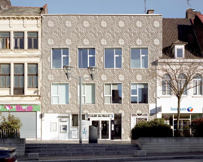
The facade of the new Crédit du Nord in northern Tourcoing, France, is clad in a filigree pattern. (Photo: Maxime Delvaux)
Buildings for banks often express their brand rather than anything of architectural interest. An exception is found in Tourcoing in northern France, where architects D’Houndt + Bajart have created a facade whose design was inspired by a material integral to the bankers' core business.
Project: Le Filigrane
Location: Tourcoing, France
Client: SEM Ville Renouvelée and Crédit du Nord
Architect: D’HOUNDT+BAJART architectes & associés, Tourcoing
Manufacturer: Betsinor
Product/Expertise: Facade Elements
Contractor: Rabot Dutilleul
Floor Area: 1,352 m²
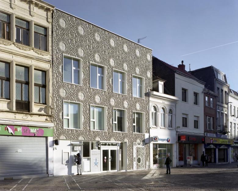
"Le Filigrane" (as the architects call their project) stands in the midst of a rather heterogeneous environment. (Photo: Maxime Delvaux)
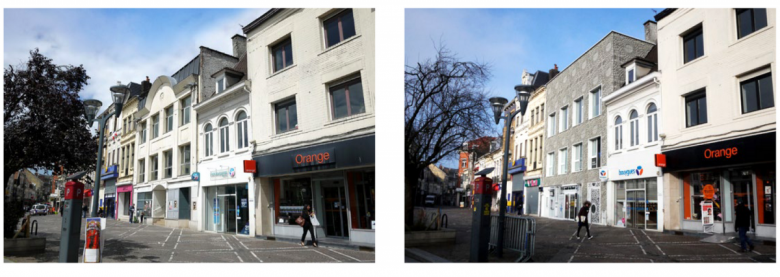
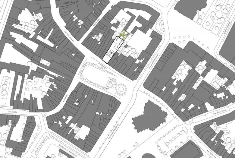
Like a book, a building should not be judged by its cover, its facade. For banks, however, we have gotten used to so many specialty, branded designs in recent years that our expectations are low. All the more reason to celebrate such striking projects as the conversion of a three-story building for the French bank Crédit du Nord in Tourcoing, in Northern France on the Belgian border. Here, the market square is surrounded on three sides by buildings up to four stories tall and defined on its fourth side by the neo-Gothic Saint-Christophe church. The neighboring buildings have rather heterogeneous facades, with shops on the ground floor, a variety of facade materials and windows above, and quite high eaves — an organic structure, one might say. The building recently reconfigured by D'Houndt + Bajart architectes & associés (also from Tourcoing) is located on the north side of the market square. Its predecessor was a postmodern-looking facade with large windows and a central, arc-shaped gable in front of a sheet-metal roof.
Before and after: D'Houndt + Bajart have given the parcel a contemporary look. (Photo: Maxime Delvaux)
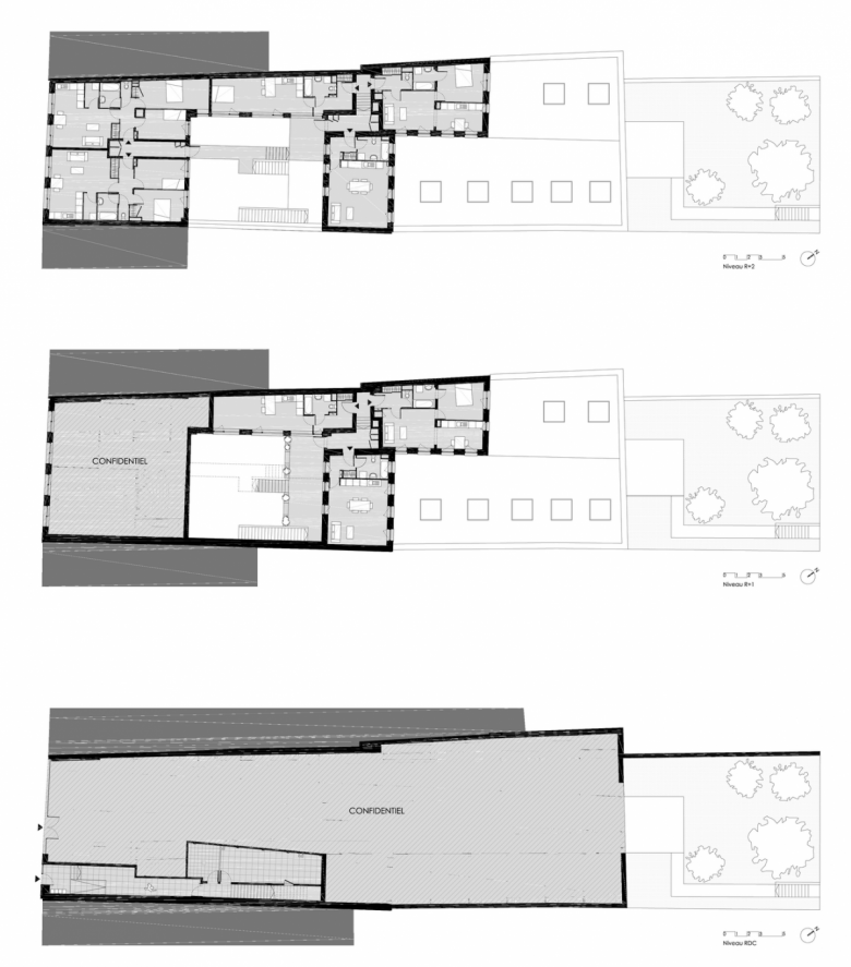
The building was adapted in its entirety to the needs of the new operator, the Crédit du Nord bank. The structure of the building has been completely changed — but without (the remarkable thing in our modern world) being rebuilt. This was a challenge for the planners, because the building on the narrow, deep property had already undergone many changes in its life. Gutted and repartitioned, the eight apartments — two two-room apartments, two three-room apartments, and four one-room apartment — are located on the upper floors and at the rear of the lot and are given a separate access at the front that leads to a central raised courtyard via a long corridor and stair.
The filigree facade was developed from the patterns found as security features on banknotes. (Photo: Maxime Delvaux)
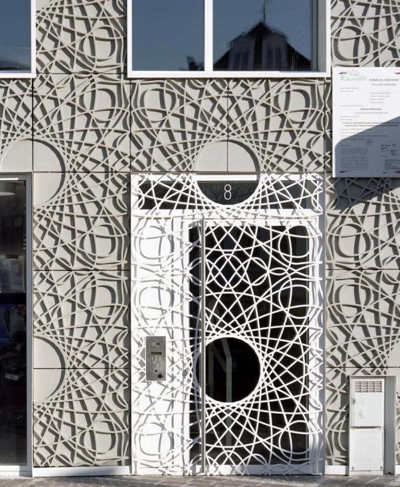
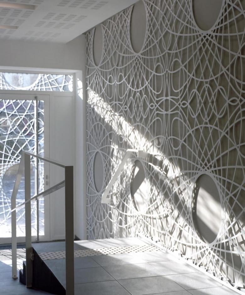
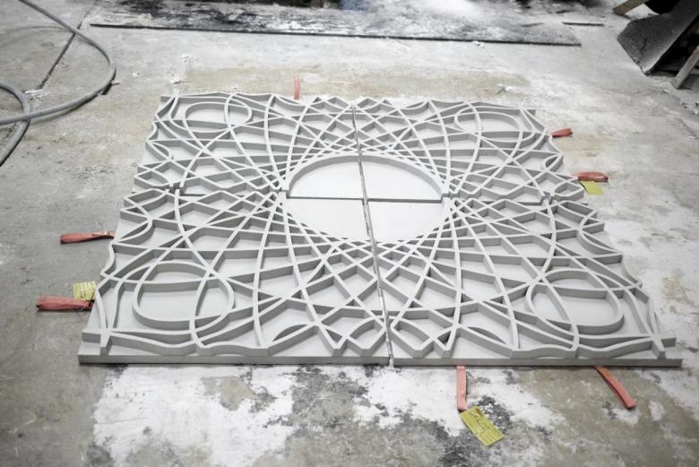
The facade is the most overt signal of the building's conversion. It is "defined by a mixture of regularity and fantasy: rigor in rhythm, fantasy in pattern," in the architects' words. It was inspired by guilloche patterns: ornamental patterns of interwoven, overlapping and string-like lines often found on identity documents and as a security feature on banknotes. In built form, the guilloche lines translate into concrete reliefs that cover almost the entire facade. The repeating pattern consists of four square panels each with an edge length of 90 cm (3 ft).
The facade pattern is carried into the apartment lobby, marking the elongated corridor as a semi-public space. (Photo: Maxime Delvaux)
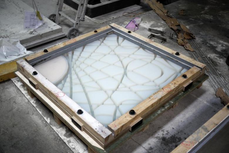
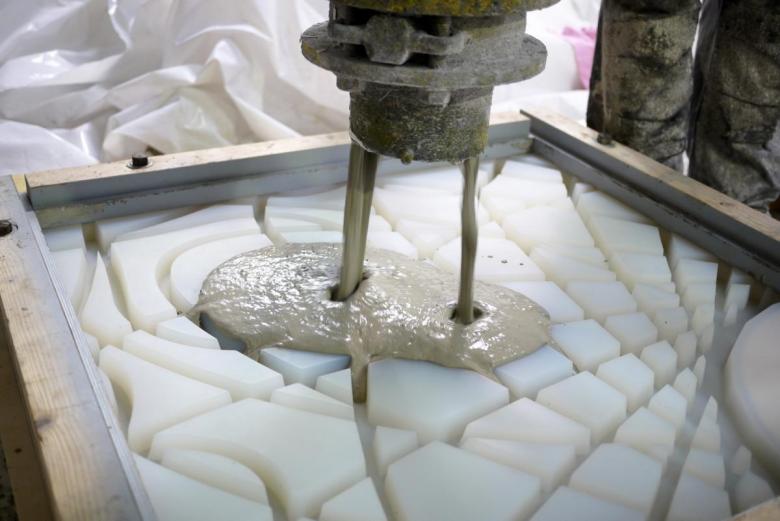
The ornamented panels were created from a special cement-glass fiber composite material, which made the delicate dimensions (hence the "Le Filigrane" name) possible in the first place. To keep the fasteners invisible, mounting belt straps were inserted into the negative molds during fabrication, from which the panels were hung. D'Houndt + Bajart have given the bank a skin whose graphic, three-dimensional relief texture produces exciting effects — a standout building in the market's colorful surroundings.
Facade design principles (Drawing: D'Houndt + Bajart)
The repeating pattern is made from negative molds. (Photo: Maxime Delvaux)
A special cement-glass fiber composite material was used. (Photo: Maxime Delvaux)
Each plate is a quarter of the total pattern, which theoretically can be multiplied to infinity. (Photo: Maxime Delvaux)
Site Plan (Drawing: D'Houndt + Bajart)
Floor Plans (Source: D'Houndt + Bajart)
A version of this article originally appeared as "Filigranfassade" on German-Architects.
