U.S. Building of the Week
Granny Pad
Best Practice Architecture
28. 10月 2019
Photo: Ed Sozinho
With an urban landscape full of single-family houses and with baby boomers reaching retirement age, the United States is seeing a boom in accessory dwelling units, commonly known as granny flats. Best Practice Architecture's Granny Pad can be seen as a precedent for future ADUs, especially given its sustainable reuse of an old garage and flexible interior. The architects sent us some text and images on the project.
Location: Seattle, Washington, USA
Architect: Best Practice Architecture
Contractor: Kable Design Build
Building Area: 571 sf
Photo: Ed Sozinho
Across the country, many families are struggling with the same difficult question: How can you best support aging family members when you live in a city with minimal housing options? Best Practice Architecture has offered a brilliant solution to issues around multigenerational living and urban density with their latest Seattle project.
Photo: Ed Sozinho
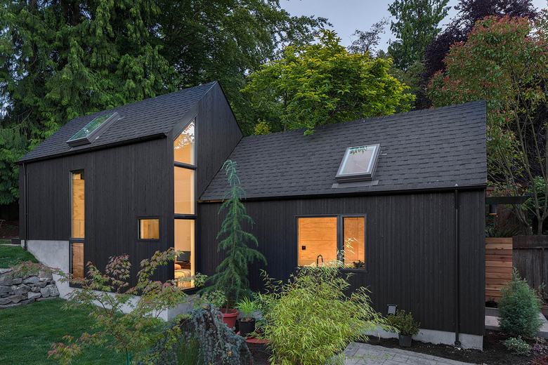
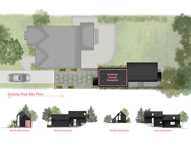
The firm was hired by a Seattle homeowner to create Granny Pad, a spacious living quarters converted from a backyard garage. The residential addition was built to give the aging family member a safe and well-designed home, bring childcare to the growing family, and to maintain privacy for everyone involved.
Photo: Ed Sozinho
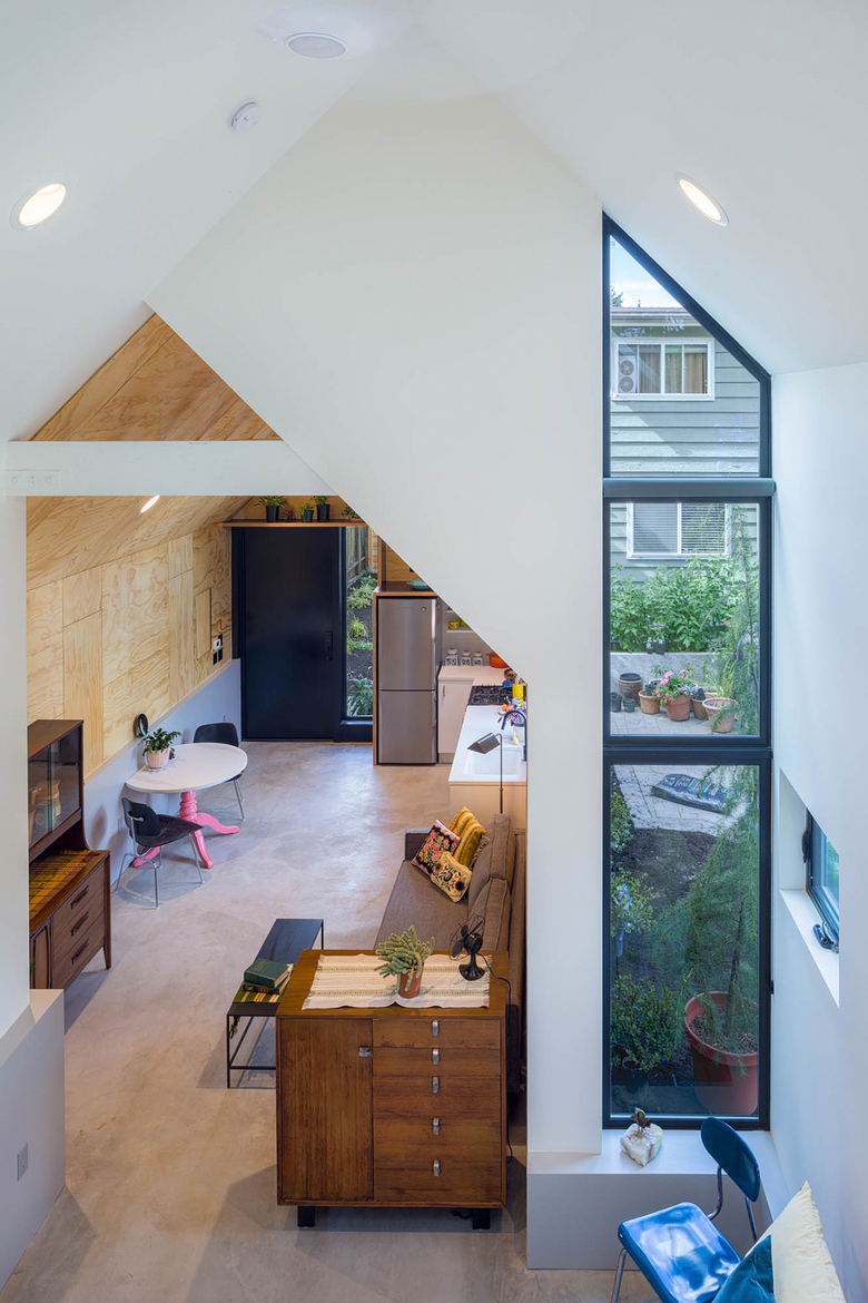
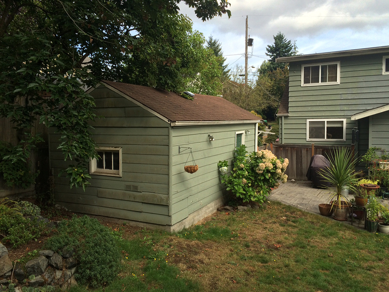
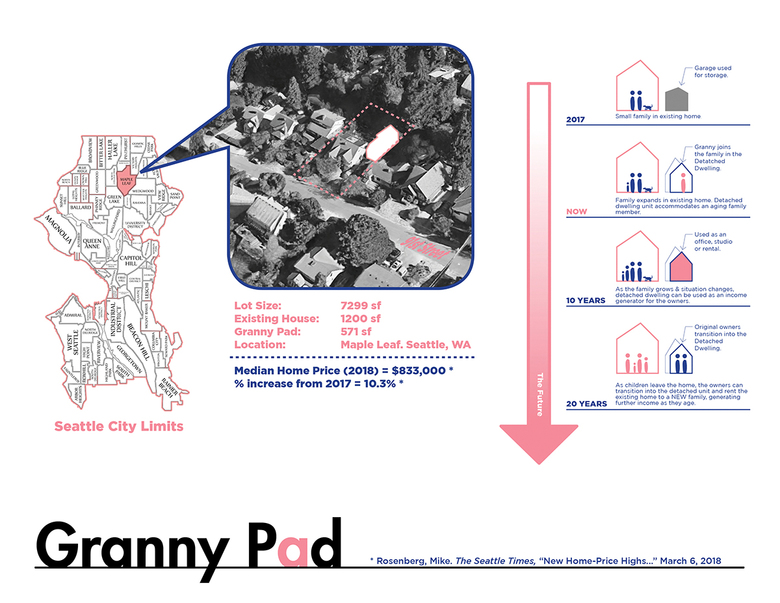
Located just north of Seattle’s University District, Granny Pad is a 571 square foot detached dwelling transformed from an existing garage into a lofty, open living space. The project began when the client couldn’t find appropriate housing for "Granny" in their neighborhood. With a growing family, they didn’t have enough space in their house to accommodate her needs and maintain the privacy everyone in the family wanted. And with a shortage of affordable housing in Seattle, the option of moving to a larger house in the city was out of reach.
Photo: Ed Sozinho
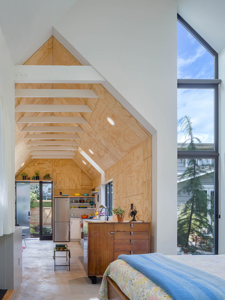
That’s when Best Practice stepped in. The firm saw converting the client’s existing garage (previously used as storage) as the perfect solution. Design considerations included looking at the project on both a short-term and long-term timeline. First, Best Practice needed to address the immediate needs of the client. They also considered future uses of the space as a possible rental unit, studio, office or other income generating project for the family. And they needed to do all of that using just 571 square feet.
Photo: Ed Sozinho
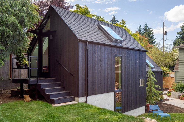
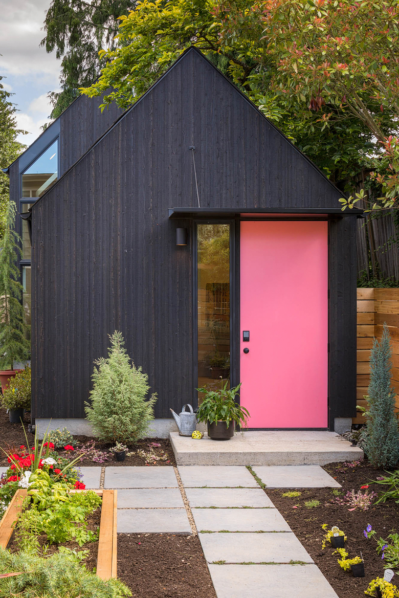
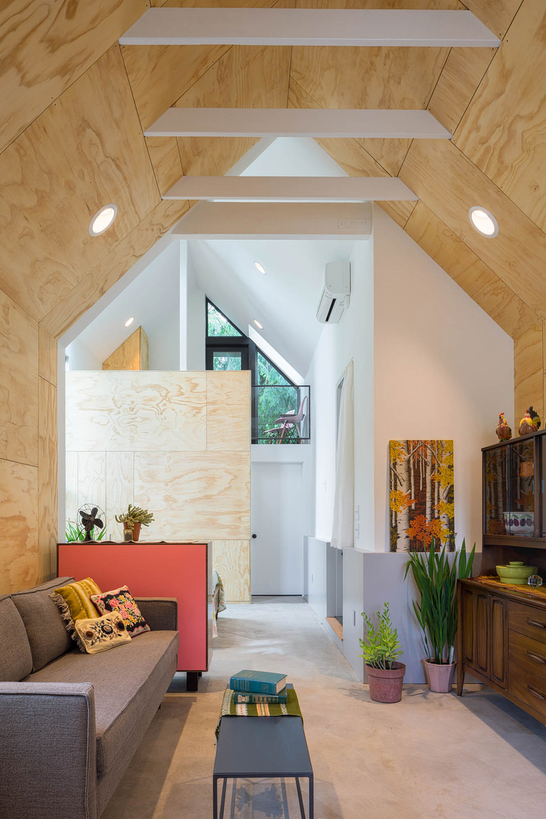
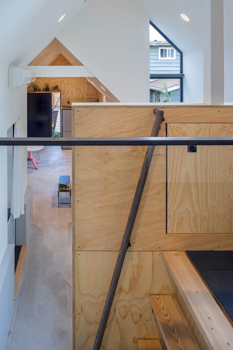
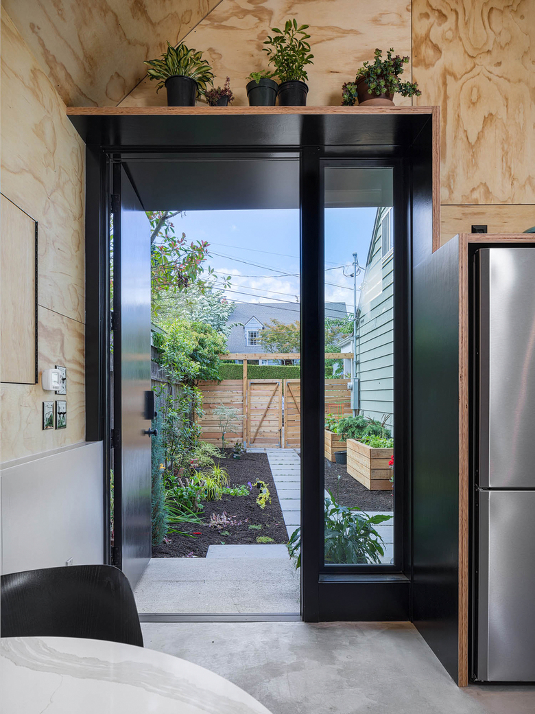
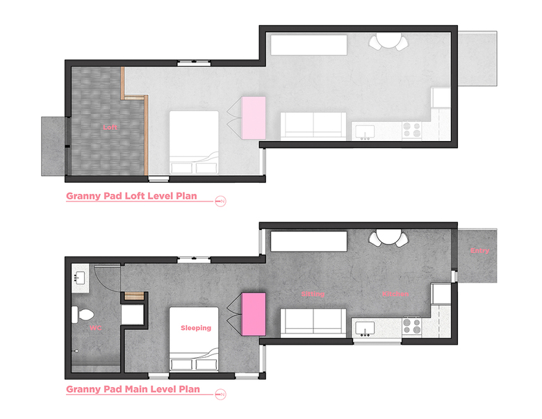
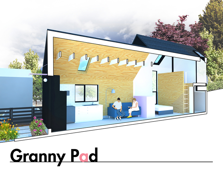
To accommodate the decreased mobility associated with aging, the living area needed to be one level. Rather than make several small rooms, the team opted to create open, central spaces that can be easily adapted to changing mobility issues. Carefully placed windows and skylights provide lots of daylight. Rafters were left exposed in the ceiling. The existing garage door was removed, and the old structure became the entry, kitchen and sitting room. A short walk through the entryway reveals the bedroom, closet with laundry and bathroom. A lofted space above the bathroom (accessed by a ladder) will be used as storage for the time being, but can easily be transformed into an office or sleeping loft in the future. All of these details come together to create a soaring, open feeling that makes the relatively small footprint of Granny Pad feel much larger.
Photo: Ed Sozinho
Behind the structure sits a private back deck which connects to the loft space. The yard itself had a natural six-foot elevation change when Best Practice began the project, which inspired the firm to build Granny Pad into the hill itself. And the bunkering made the loft an easy — and natural — addition.
With unique and forward-thinking design, Best Practice was able to provide their client with the perfect solution for their current housing needs and a world of possibilities for their future.
Photo: Ed Sozinho
Before (Photo courtesy of Best Practice)
Drawing: Best Practice
Drawing: Best Practice
Drawing: Best Practice
Drawing: Best Practice
関連した記事
-
Mini Mart City Park
on 2023/04/10
-
Columbia City Abbey Apartments
on 2021/11/08
-
Civic Hotel
on 2021/09/20
-
Granny Pad
on 2019/10/28
-
Klotski Building
on 2019/08/19
