LMN Architects
Voxman Music Building
LMN Architects
19. 3月 2018
Photo: Tim Griffith
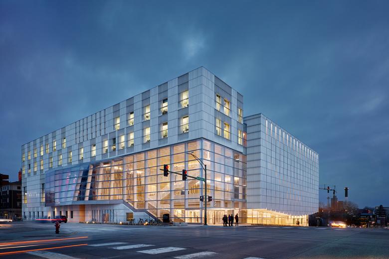
The Voxman Music Building is one of three recently completed arts buildings at the University of Iowa in Iowa City. Of the three, it is the only one situated downtown rather than on campus. This situation gives the building a public face, and the architects responded with a design that links the building's performance and circulation spaces to the city. World-Architects spoke with Stephen Van Dyck, partner at LMN Architects, about the project.
Project: Voxman Music Building, 2017
Location: Iowa City, Iowa, USA
Client: University of Iowa
Design Architect: LMN Architects, Seattle
Associate Architect: Neumann Monson Architects
Construction Management: Mortenson
Acoustic + A/V Design: Jaffe Holden
Theater Planning: Fisher Dachs Associates
Lighting Design: Horton Lees Brogden
Structural Engineer: Magnusson Klemencic Associates
MEP Engineer: Design Engineers
Energy Analysis: The Weidt Group
Civil Engineer: Shive-Hattery
Landscape Architect: Confluence
Graphics: Pentagram
Vertical Transportation: Lerch Bates
Life Safety/Code: T.A. Kinsman
Cost Estimating: Rider Levett Bucknall
Building Area: 184,000 sf
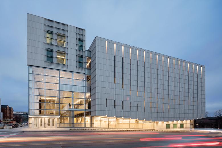
East Elevation (Photo: Tim Griffith)
What were the circumstances of receiving the commission for this project?
In 2011, LMN Architects responded to an RFP (Request for Proposals) from the University of Iowa searching for a design architect. The University had already selected a local architect (NMA), and following interviews LMN Architects was selected in early 2012.
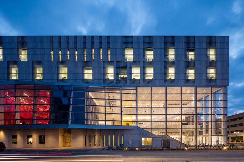
North Elevation (Photo: Tim Griffith)
How does it compare to the other Performing Arts projects LMN has executed?
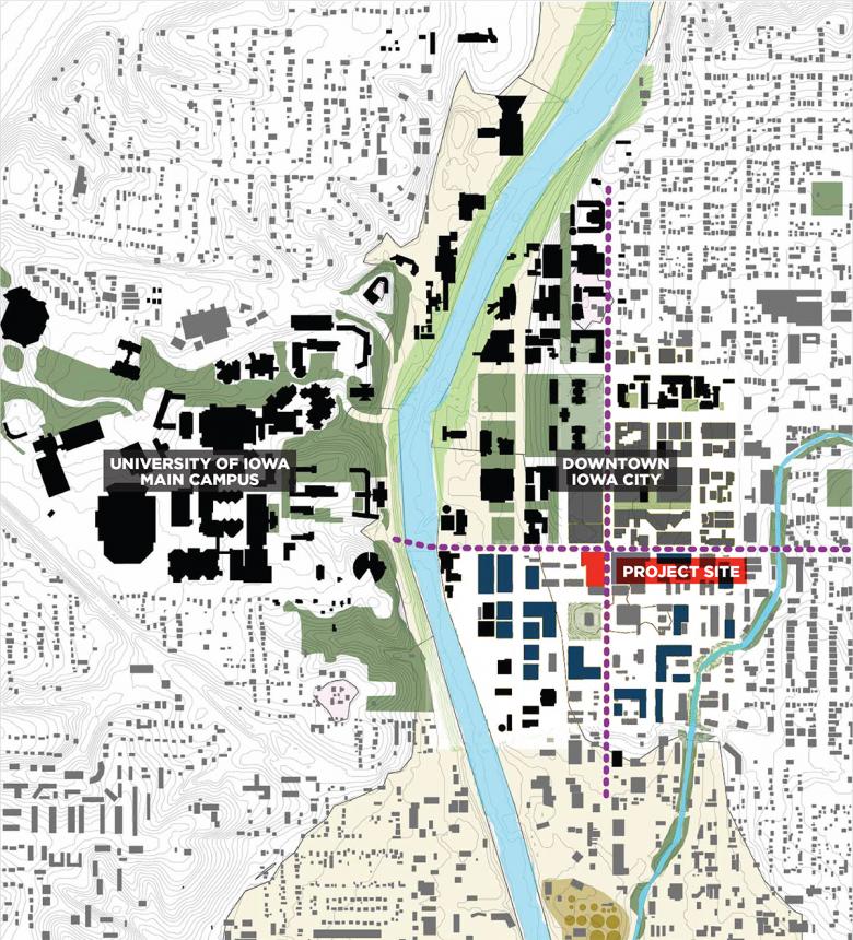
This is a unique facility, unlike anything most firms have done. It is a music school with performance spaces. It is rare to have funding for a full music school and for the school and performance spaces to be built in their entirety; often they are smaller or are renovations. The funding was there because of a disastrous flood that hit Iowa City in 2008. The original Voxman building (from the early 1960s) sat within 100-year floodplain. It, the art school, and a performing arts center were destroyed, and the University was given money by FEMA to rebuild. The other two buildings — both located west of the Iowa River above the floodplain — were designed in parallel with Voxman: Cesar Pelli for the Hancher auditorium and Steven Holl for the Visual Arts Building. The music department wanted to be connected to the city, so it was built on a hill at a main intersection in downtown Iowa City, east of the river. With this, the project is the convergence of two things — the performing arts and building in cities — butu our primary charge was to built highly functional music school.
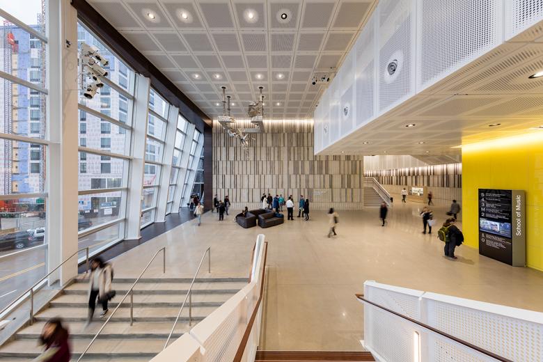
Entry Atrium (Photo: Tim Griffith)
How does the design respond to the unique qualities of the site?
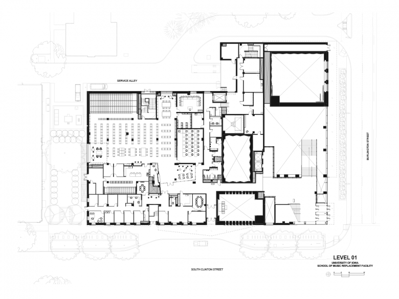
The building is located at the busy intersection of Burlington (a major five-lane state road running through the heart of Iowa City) and Clinton, which connects to campus. The brownfield site, formerly an old drive-thru bank, was tight. With a 30,000-square-foot site and 186,000 sf of program, it dictated a tall building. Acoustically sensitive spaces are best positioned low, so stacking them is not ideal and made for a difficult task. One of the project's big achievements was to build tall.
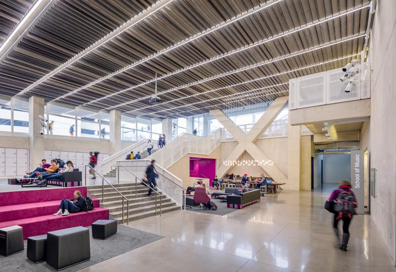
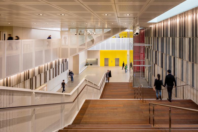
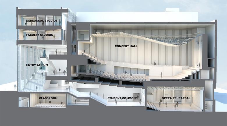
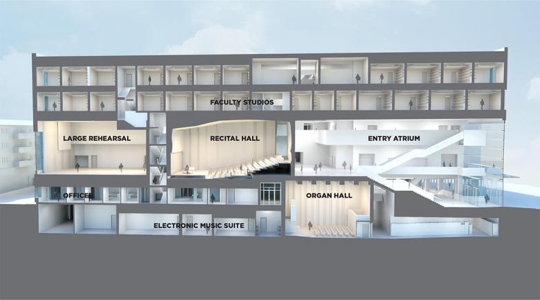
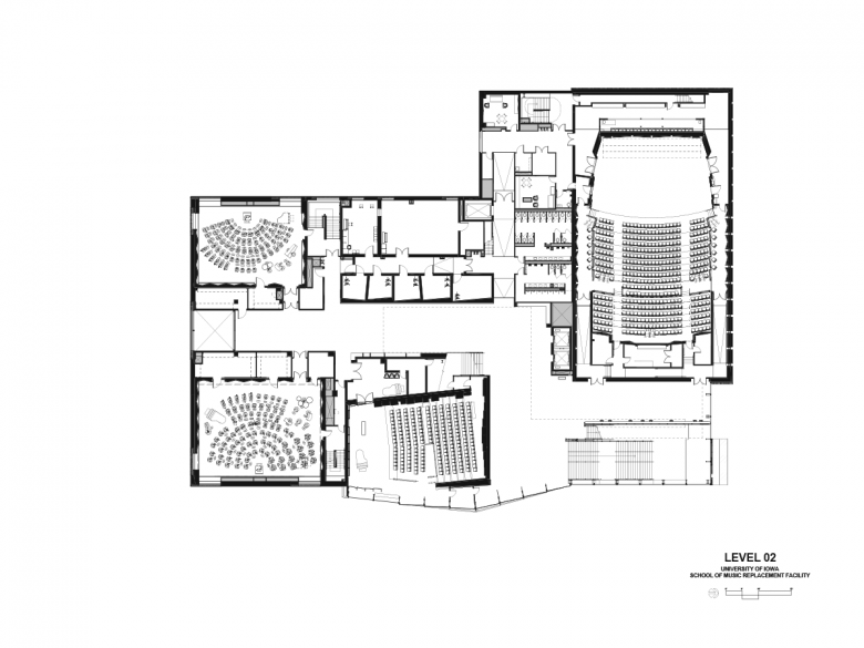
It's important to note that the pedagogy of program is built on the idea of performance, of teaching the art of performance. So there was a big charge to expose the school to the city, to visually connect the interior to the city and bring people to concerts. The Student Commons, for instance, which is located below grade and beneath the Concert Hall, is visible along the sidewalk of Burlington. From inside, you can see people on the sidewalk and cars and trucks go by; it's the idea of being embedded in the life of the city. Further, the second floor has a series of lobby spaces that visually connect to city. Wherever you are there is a visual connection to the city.
Student Commons (Photo: Tim Griffith)
We spent a lot of time refining the sizes of the lobbies so they could be used for serendipitous performances. The music school places a huge emphasis on formal performances. While there are spaces set up for that, we also wanted to bring the quality of those spaces to the circulation.
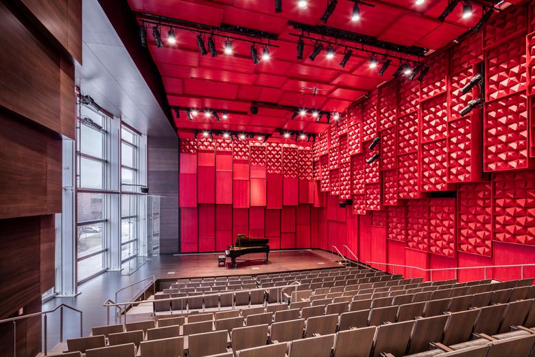
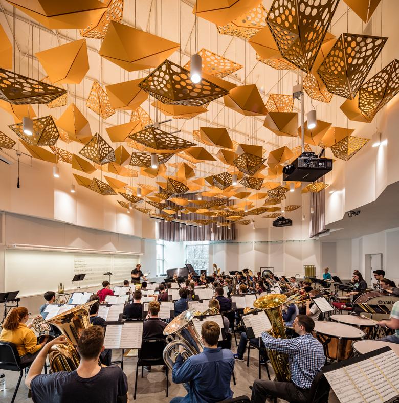
Even the formal performance spaces have a sense of informality to them. The Recital Hall, where students first learn the art of performance, has a 30-foot-tall glass wall so the stage has a public view. This provides a connection to the city and natural light — if people are spending four hours in the Recital Hall, they still know what time it is outside.
Circulation/Common Spaces (Photo: Tim Griffith)
How did the project change between the initial design stage and the completion of the building?
There was a significant reshuffling of some major parts of the building at end of Schematic Design. We were invested in a robust collaboration process through digital design tools; we had study models in various platforms plus a central BIM model. So at end of SD we were able to retool the configuration of the building in one weekend — and at cost, with estimating tools linked into the BIM model.
Recital Hall (Photo: Tim Griffith)
One component of LMN Architects is LMN Tech Studio, "a pioneering initiative in design technology research and development." How were they involved in the design?
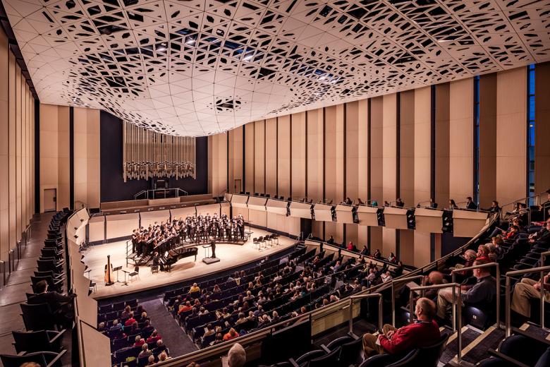
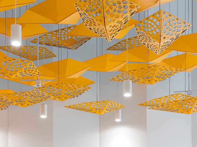
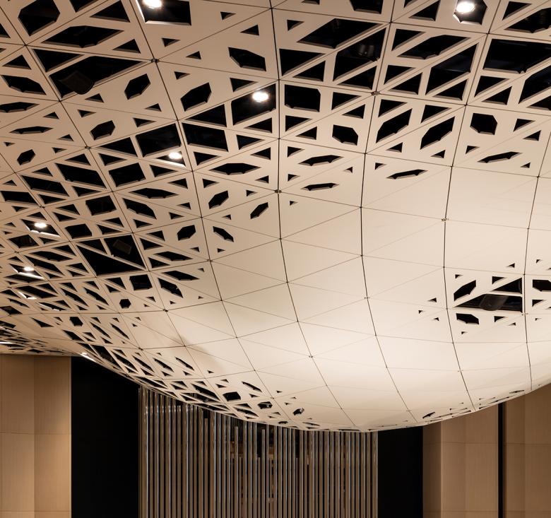
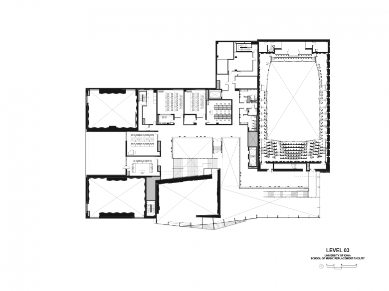
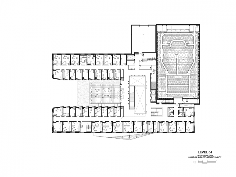
One example is the Concert Hall, the main ensemble performance space for building. There are two ways of designing concert halls: the rectangular shoebox or circular, like the Berlin Philharmonic. We wanted the shoebox since it's flexible and traditionally it achieves tremendous acoustic results. Tall, slender windows were added on the north to bring in light and create a rhythm of reveals. For the ceiling, with the coordination of life safety, lighting, sprinklers, catwalks, speakers, etc., we locked into the concept of using a parametric model. The design was the result of different, performance-driven inputs and a little bit of the architect's hand. It became the main sculptural feature of room, an element that brings a bit of the sublime to the musical setting. It's the contemporary equivalent of Gothic vaults or Romanesque arches.
Concert Hall (Photo: Tim Griffith)
What products or materials have contributed to the success of the completed building?
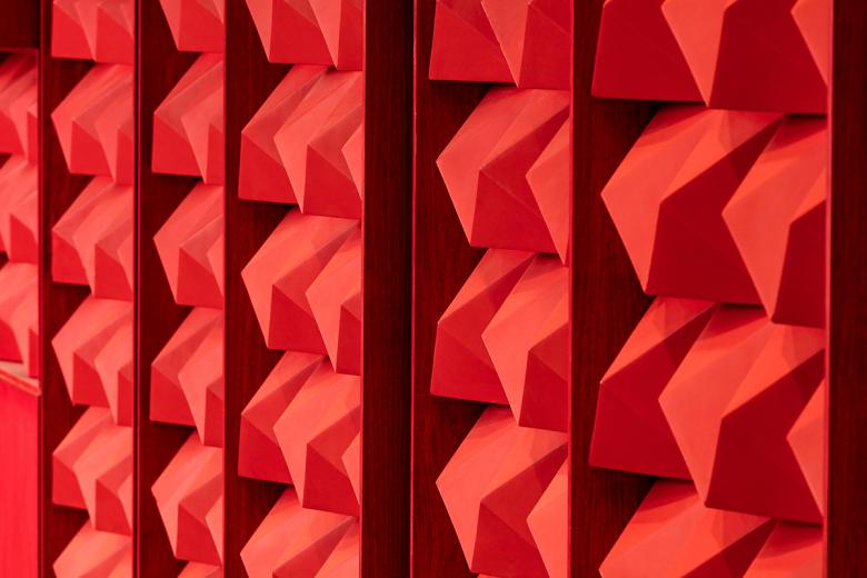
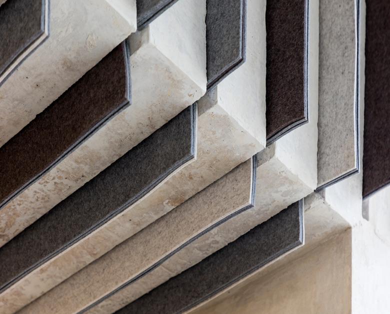
Many, but one example is the felt panels used in the ceiling of the Student Commons, an instance of economy and performance driving a new solution. Cast in place concrete can become acoustic barrier if sized right, but we didn't want the public spaces to reverberate; we wanted them quiet. So to do double duty (finish and acoustic barrier), we came to the idea of inserting pieces of felt to absorb sound. Secondarily, it adds visual texture, gives the building a softness, and makes it more playful.
