Dutch House
Team Paul de Vroom + Sputnik
12. 3月 2019
Photo: Ilya Ivanov
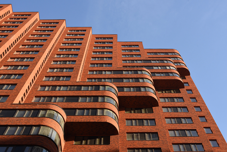
In Wellton Park, a district in Moscow with a very high building density, the Dutch architecture firm Team Paul de Vroom + Sputnik has completed two apartment buildings with outspoken brick facades. When the client requested “Dutch” architecture, the architects let themselves be inspired by the Amsterdam School style of the early 1900s and reinvent it for a contemporary high-rise design.
Location: Marshal Zhukov Ave., Wellton Park, Moscow
Client: Krost, Moscow
Design Office: Team Paul de Vroom + Sputnik, Rotterdam
Designers: Paul de Vroom, Henk Bultstra, Bert Karel Deuten
Project Team: Rik de Ruiter, Oksana Savchuk, Danuta Kiedrowska, Nicolette Jongebreur
Co-Architect: A-Project, Moscow
Landscape Design: SIA Florius, Riga
General Contractor: Krost, Moscow
Photo: Ilya Ivanov
Dutch House is part of the redevelopment of District 75, situated in the western part of Moscow. Renamed Wellton Park, the district has been transformed by Russian construction-industrial company KROST, over a period of 20 years, into a luxury residential area with a very high density and a carefully landscaped ground level. Amidst the white and light grey apartment buildings, Dutch House catches the eye with its outstanding red brick color. The two buildings with a height of 75 and 65 meters contain 360 apartments on top of two layers of underground parking.
Photo: Ilya Ivanov
The conditions of the project Dutch House are exceptional. The rectangular building plot is enclosed on all four sides by residential slabs that are mostly higher than the two new blocks. Because of this the site acts as a large confined room with only a few openings through which views are possible. What was therefore needed was a strong concept to make living in the new apartments a pleasant experience.
Photo: Ilya Ivanov
In the design for Dutch House the enclosed site is considered as a stage on which the two new buildings are the actors. In order for these actors to perform well they need to have a specific identity and moreover to be in harmony with each other and with the ‘theatre’ around them. Therefore, on this location the buildings and the public space needed to be designed in close coherence. Connection is the key word for the design of the public space. The positions of both buildings seem to be at random, but in fact they are derived from the strict Russian rules regarding the entrance of sunlight. By introducing a ‘connecting carpet’, it was possible to interrelate all divergent directions, between both buildings and all outside activities.
Drawing: Team Paul de Vroom + Sputnik
Photo: Ilya Ivanov
The brief of the project expressly asked for architecture from Holland. Mindful of the need for identity and cohesion, a modern architecture was developed based on the idiom of the Amsterdam School: explicit plasticity with preferably rounded forms, rhythmic repetition of volumes, vertical articulation, and repetitive square windows. Subsequently the Amsterdam School stands out by its balanced use of materials like brick, wood, glass, natural stone, concrete and metal, in combination with monumental wooden entrances and exceptional details.
Photo: Ilya Ivanov
The features of the Amsterdam School are transformed into contemporary design instruments. With this strategy it was possible to give the ensemble of Dutch House its spectacular architectural image. Because of the play of light and shadow the appearance of the two buildings together changes from every angle. In Dutch House the buildings are different in some aspects and in some alike. The materials and details of Dutch House follow the same principles: authentic Dutch, orange brickwork, rounded bay windows with curved glass and monumental wooden entrance doors are all incorporated in the design, be it in their modern-day versions.
Photo: Ilya Ivanov
The communal areas within the buildings have rich use of materials and refined details. The sawtooth structure also prevails here. By emphasizing the vertical lines, a pleasant atmosphere is created; light fixtures on ceilings in the corridors have been replaced by vertical lines that light the walls. In the entrance halls and corridors the application of Amsterdam School related materials such as bronze, dark brown wood, natural stone can be seen in combination with modern-day elements like abstract, three dimensional tulip patterns and light ceilings.


