"Cube" Art Museum
Beijing, China
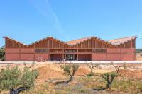
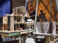
The project is located in the 798 Art District. The reconstruction of the project consists of three sloping roofed brick houses (previously for gallery and pavilion) and the south side courtyard. Based on this, two new buildings were built on the north side, one for exhibitions and the other for children's art education.
The overall architecture continues the artistic character of 798. It takes 798 courtyard as a starting space from the whole 798 art zone. The design part emphasizes that the industrial sense and the mechanical sense form a flexible and versatile space form.
When integrating the old and new architectural planes, simple geometric figures such as squares, rectangles, and thick solid lines are used as the basic elements of the architectural plane, and a style painting style and supremacist style are used to integrate and stitch together. A 90-degree rotating wall was set up in the eastern theme restaurant to complete the conversion from the second dimension to the third dimension.
In order to respect the simple and authentic characteristics of industrial buildings, the main body of the building adopts the combination of red brick walls and clear water concrete, and the structure is the finish. The light is gently shed from the various exhibition halls into the interior space. Through careful consideration of how light enters each room, artificial light sources are reduced as much as possible during the day. Using light and shadow as a component of a “masonry” building, subtle changes occur over time, giving different qualities to the red brick and the clear water wall surface. Light enters the space and adjusts the space.
According to functional requirements to adjust the spatial form, considering the primary and secondary division and sequence of the new part and the original building, organically organize them in a multivariate outdoor square space full of tension, forming a set of spatial groups with different scales and shapes. The use of architectural space and courtyard space of different sizes and different levels to meet the needs of different art forms. The use of ramps and stairs or specially designed wall-washed lamps illuminates the wall, suggesting the existence of another space. Let people inadvertently move from one space to another along a certain direction or route.
- 建築家
- Studio Zhu-Pei
- 場所
- Beijing, China
- 年
- 2016
- クライエント
- 北京七星华电科技集团责任有限公司
- チーム
- You Changchen, Liu Ling, Zhang Shun, Wang Liyan, Jia Bin, Ding Xinyue, Chang Jiang
- Structural Consultant, MEP Consultant
- The Design Institute of Landscape & Architecture China Academy of Art CO., LTD.
- Facade Consultant
- Tianjin Huafang Curtain Wall Decoration Engineering CO., LTD.
- Lighting Consultant
- Ning Field Lighting Design CO., LTD.


