US Building of the Week
Whitney M. Young, Jr. Branch, Chicago Public Library
bKL Architecture
21. december 2020
Photo courtesy of bKL Architecture
As part of its "Branching Out: Building Libraries, Building Communities" initiative, the Chicago Public Library has built and renovated dozens of libraries, including a modernization and expansion of the Whitney M. Young, Jr. Branch Library. The design by bKL Architecture builds upon the "good bones" of the 1979 original. The architects answered a few questions about the project.
Location: 415 East 79th Street, Chicago, Illinois, USA
Client: Public Building Commission of Chicago
Design Architect: bKL Architecture LLC
Architect of Record: Johnson & Lee, Ltd.
Structural Engineer: Larson Engineering
MEP/FP Engineer: dbHMS
Landscape Architect: Terra Engineering
Contractor: F.H. Paschen
Building Area: 11,000 sf renovation; 2,500 sf addition
Photo courtesy of bKL Architecture
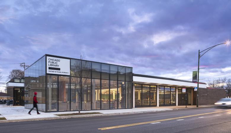
Please provide an overview of the project.Located in the historic Chatham neighborhood of Chicago, the existing Whitney M. Young, Jr. Branch Library held prominence, not only as a library but also as a local community center. The design team worked diligently to design to the unique neighborhood identity and respond to the community’s requests to revitalize the library for the people of Chatham and surrounding areas. The designers renovated and reorganized the existing 11,000 square foot building and added 2,500 square feet to complement the existing structure, creating a new vision that reflects our time.
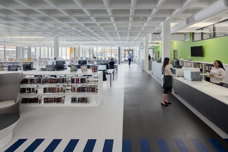
Respecting the modernist architecture of the existing building while incorporating contemporary elements was a core value of the design. The team reoriented the entryway and blended the existing exterior walls with new floor to ceiling glass. The exterior massing and material choice complement the existing mid-century architecture, allowing the original brick building to read against the lightness and scale of the new glass facade. The architects further decided to preserve the existing modernist coffered ceiling.
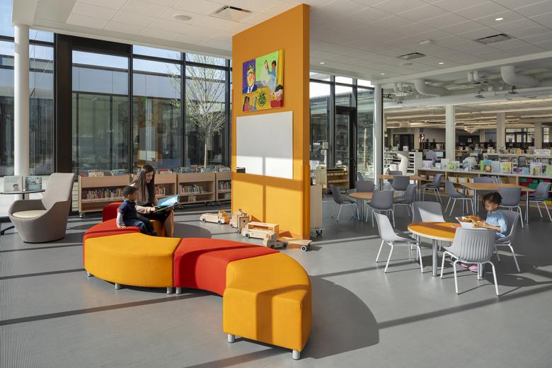
The library was transformed to create a 21st century library, with considerations given not only to traditional library functions but also state of the art technology, sight lines and open space, and community programming. The floor plan was organized to provide user groups both collaborative and individual spaces, while maintaining a cohesive design that is open and light. The original library had an exterior courtyard that was underutilized. The design team re-envisioned the central outdoor space within the new glass expansion and made it an integral part of the building plan, providing an exterior communal space for users, while creating a balance of nature and development.
Photo courtesy of bKL Architecture
What are the main ideas and inspirations influencing the design of the building?The main ideas and inspirations influencing the design of the Whitney Young Library was to respect the existing modernist architecture of the building while designing the expansion, incorporate contemporary elements, and to provide the neighborhood with the community-oriented space desired.
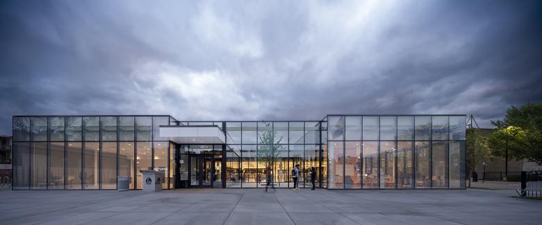
Incorporating contemporary elements to the existing modernist building, the designers reoriented the entryway from the west to the east side and utilized a neutral glass facade to highlight the existing structure while not overwhelming the existing building. The team saw an opportunity to reclaim and reimagine the existing building’s underutilized courtyard space, making it the focal point of the building expansion by positioning it at the entry creating natural light, air and depth.
Photo courtesy of bKL Architecture
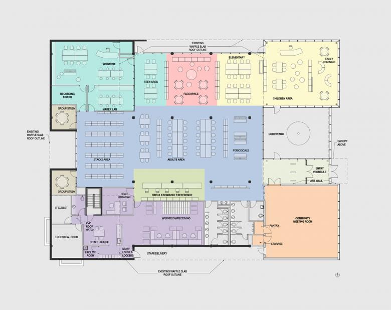
The original building had a centralized plan with solid brick walls enclosing interior spaces at each corner, but it was not symmetrical. The corner offices along the east side of the building were considerably smaller than the corner spaces along the west. These elements were tied together by the coffered concrete “waffle” slab, a distinctive design move which provided an efficient, durable method of creating a roof that was quite common in 1960s and 1970s design. While needing to be reconditioned, the designers decided to keep this element intact as it is a critical part of the building’s aesthetic.
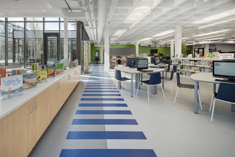
The central portion of the library maintains a large open space under the 11-foot coffered ceiling, where the designers used subtle changes in material and color to differentiate areas. The children’s room and community room fill the new glass-walled corner elements along the east side of the building creating open interactive collaborative spaces for community interaction, no matter what age. Teenage media spaces are provided in the reused northwest corner with office and library support services in the southwest corner, both where more private and quiet areas are required.
Photo courtesy of bKL Architecture
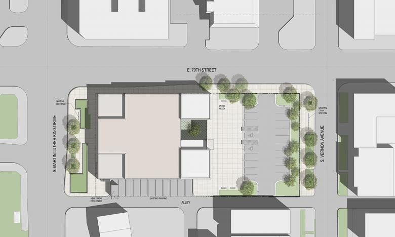
How does the design respond to the unique qualities of the site?Located at the southeast corner of 79th and S. Martin Luther King Dr., the library was entered off King Drive, with a central reading room and a protected garden at its rear. The city acquired five lots to the east, which allowed the designers to completely rethink the facility’s configuration while substantially expanding its functionality and adding significant outdoor spaces that can support neighborhood activities along this major South Side commercial corridor.
Engaging and communicating with the community on the design of the Whitney Young Library renovation and expansion was imperative from the start. The library is located in a historically rich neighborhood and serves as an anchor for the community. Reorienting the entry to the west side of the site allowed for the site to incorporate more parking, as this was a great need to users. Active communal space was also an important for the neighborhood residents. As such the community room was located with direct access to the courtyard, so that users had the ability to utilize both the indoor and outdoor community rooms, both of these active programs are located on the new enlarged entry plaza which welcomes pedestrian users from the street and nearby bus stop.
Drawing: bKL Architecture
How did the project change between the initial design stage and the completion of the building?Throughout the design process, it was crucial to consider the creation of a 21st century library. As libraries are now being utilized for more than quiet spaces with books, the newly designed Whitney Young Library creates a community space for the neighborhood to gather in safe, bright, well designed spaces. Initial design studies attempted to maintain the existing entrance and remove or hide the existing coffered ceilings. The design team learned quickly that utilizing the existing structure would be imperative to the design and acknowledgement of the existing structure. After multiple design studies, and after the acquisition of the additional five parcels of land, reorienting the entry and reorganizing the full library became the most successful and efficient strategy.
The floor plan was organized in such a way to provide user groups both separate and individual spaces, while maintaining a cohesive design that is open and light. The library now features an infusion of technology, YOUmedia lab, programming rooms, a music studio and design labs. Equally important, the library’s new multi-purpose room, located adjacent to the entry, provides a space where community activities can be accommodated.
The creation of the Whitney Young Library evolved throughout the design process thanks to collaboration with the community and the client. As a space for the community, it was imperative that communication between parties remain open to ensure the end result was tailor-made for Chatham residents.
Drawing: bKL Architecture3. What are the main ideas and inspirations influencing the design of the building?
What products or materials have contributed to the success of the completed building?Honoring the original existing architecture of the Whitney Young Library the design team preserved select masonry and glass walls and the entirety of its existing coffered ceilings, while introducing a vibrant and modern energy to the space with the new addition. The renovation portion of the project preserved 95% of the existing structural elements. New material choices were both respectful to the historical aspect of the project while also having high performance. The 2,500 square foot addition augments 11,000 square feet of renovated space, with the extension along the east side of the building strikingly defined by an aluminum curtain wall featuring low-E vision and fritted glass that faces the new plaza and parking.
The design team reoriented the entryway from the west to the east side and incorporated a neutral glass façade to complement and highlight the original architecture. A seamless design was achieved by blending existing masonry walls with new floor-to-ceiling glass walls. Fritted glass was selected on the perimeter of the expansion to reduce solar heat gain. The exterior massing and material choice are intended to complement the existing mid-century architecture, allowing the original brick building to still read against the lightness and scale of the new glass facade that frames the entry.
Email interview conducted by John Hill.
Gerelateerde artikelen
-
Whitney M. Young, Jr. Branch, Chicago Public Library
on 21-12-2020
