Studio Visit: Gensler
John Hill
9. januari 2017
Gensler's new NYC office (Photo: Garrett Rowland, courtesy of Gensler)
With more than 5,000 employees, Gensler is easily one of the largest architecture firms in the world, often topping the annual lists of architecture firms with the highest revenue. Founded by Art Gensler in San Francisco in 1965, the firm now has 46 offices on 4 continents.
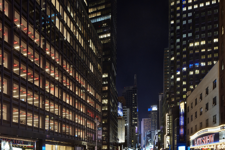
Last year the New York City office, which opened in 1979, moved from Rockefeller Center into five floors of an office building at the north end of the Theater District. World-Architects editor John Hill made a recent visit to see the new office in person, learn more about the firm, and check out some recent projects.
Gensler occupies the second to sixth floors in an office building opposite the Ed Sullivan Theater (Photo: Garrett Rowland, courtesy of Gensler)
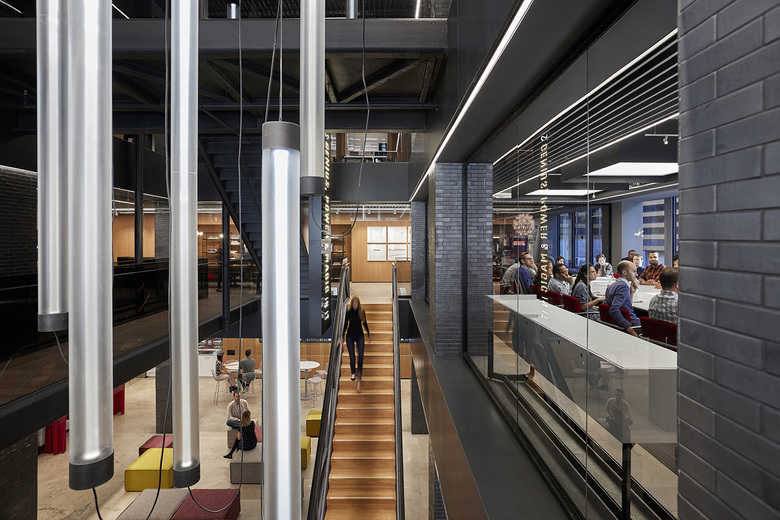
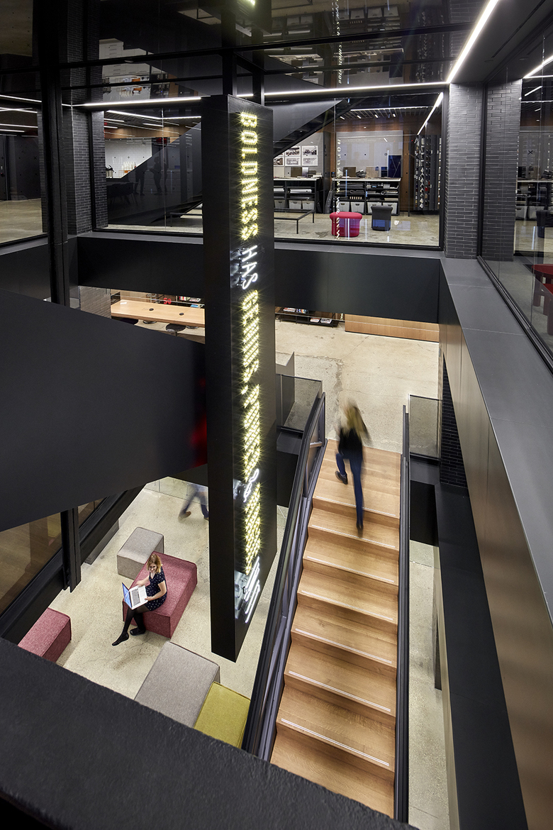
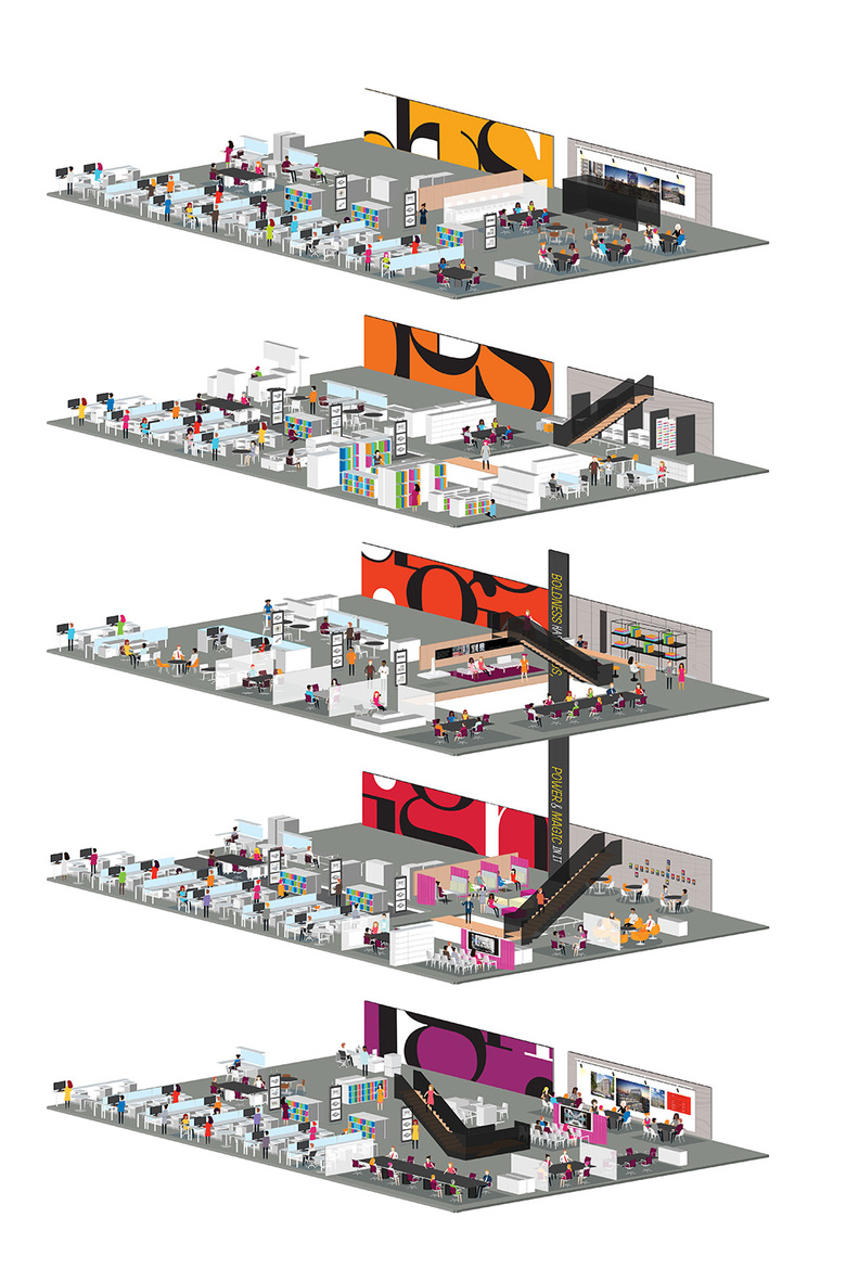
Visitors to Gensler's office at 1700 Broadway check in with security at the ground floor lobby and then take an elevator to the fourth floor – the middle of the firm's new five-story home. Next to the reception desk and waiting area is the office's big draw: an atrium with stairs and bridges linking the floors and a vertical marquee rising through the space. Here is where I met Gensler Principal Mark Morton, the Design Director who led the project. He described the design's big idea as "a backstage view with Broadway references" that were aimed at making the space "distinctly New York City." With exposed steel, dark brick, conference rooms, lounges and other spaces overlooking the atrium, and the Ed Sullivan Theater (now home to The Late Show with Steven Colbert) visible across the street, this analogy seemed entirely appropriate.
An atrium with a vertical marquee emblazoned with a Goethe quote sits at the heart of Gensler's new office. (Photo: Garrett Rowland, courtesy of Gensler)
With more than 600 employees in its NYC office, the atrium is not large enough to act as a gathering place for the whole firm, but the cluster of conference rooms and other spaces around it make it feel like the beating heart of the office. As Mark and I ascended and descended the stairs in our tour, the flow of people moving to and fro was nearly constant, much like the streets of the city beyond the office's walls. Designed at first to span the entire five floors, interactions with the city's building department led to the eventual three-story atrium. Regardless, the office is better with a scaled-down version in place than none at all; it's hard for me to imagine the office without this spatial amenity.
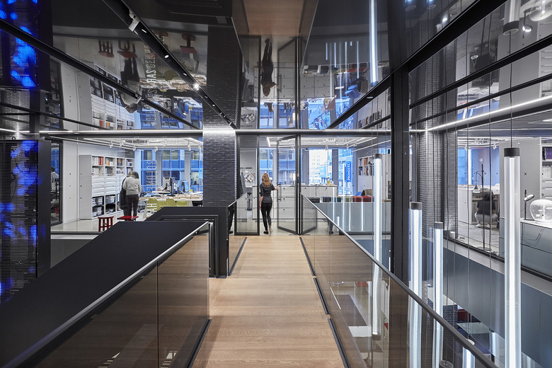
The bridge leading to the Design Center at the top of the atrium (Photo: Garrett Rowland, courtesy of Gensler)
At one point Mark and I stepped into the Design Center, a corner space that houses the firm's material libraries and samples. Overlooking the atrium through glass walls, the Design Center also benefits from natural light, something it didn't have in Rockefeller Center. For an office that works on numerous corporate and tech office spaces in Manhattan, Brooklyn and beyond, it makes sense for designers to be able to see materials in, literally, the best possible light. But also the Design Center's location expresses how the design of the office involved the input of many team members.
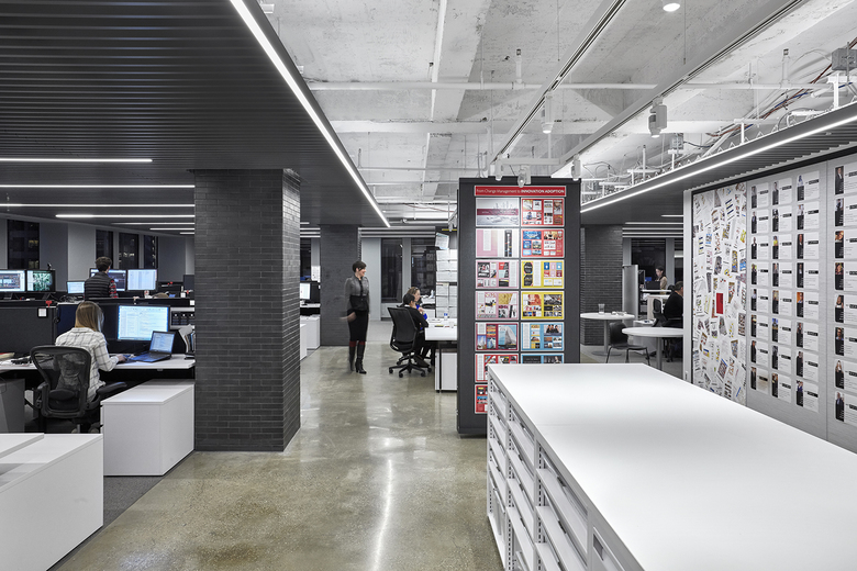
A typical studio space, with sit/stand desks visible at left (Photo: Garrett Rowland, courtesy of Gensler)
A couple other instances where input was incorporated into the office design include sit/stand desks by Knoll for everybody in the office (on our tour I observed about one-quarter to one-third of the people using them in the standing position, while the rest were sitting down) and what Mark called "collaboration avenues": casual spaces near the atrium where employees can grab a coffee, sit down with their laptop, or have a small, informal meeting. These features illustrate a younger demographic that embraces less-formal workspaces, though Gensler did not go so far as to embrace hot desks. As Mark explained to me, "architects just have too much stuff."
An isometric of Gensler's new five-story office shows the atrium/stair at right, but also the multi-colored graphic that spells out "design" in the elevator lobbies. (Drawing: Gensler)
Like many architecture firms, big or small, Gensler's New York City office is more than a setting for its employees to get work done; it serves as an expression of its design sense, which is particularly valuable in its relationship with (potential) clients. Though far from avant-garde, the design of the office reveals a willingness to embrace new ideas and take some risks, something that translates into a couple of projects completed last year in New York City.
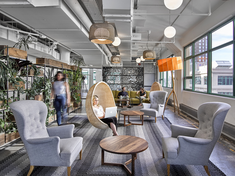
Etsy (Photo: Garrett Rowland, courtesy of Gensler)
When it came time for Etsy, the online marketplace for handmade goods, to move to a bigger space in Brooklyn, the company worked with Gensler on finding a location, eventually opting for a former Watchtower building near the base of the Brooklyn Bridge. In its design of the 200,000-square-foot space, Gensler's goal was to create an environment aligned with Etsy's community-oriented culture of artists, makers, and small businesses. As Gensler Managing Director Rocco Giannetti told me, the firm fittingly incorporated a number of the building's "found artifacts," such as objects embedded in the concrete slabs.
Etsy (Photo: Garrett Rowland, courtesy of Gensler)
With a mandate by Etsy to approach self-sustainability as nearly as possible, Gensler designed interiors that "blur the lines between work and habitat" and use local and reclaimed materials as much as possible. One of the building's old water towers, for instance, was obsolete and therefore removed, so the wood was reused for a communicating stair and a "maker hut." The design's green benefits have put Etsy on track to receive Petal Certification through the Living Building Challenge, a rigorous performance standard for buildings that, Rocco stated, should influence how Gensler approaches sustainability on future projects.
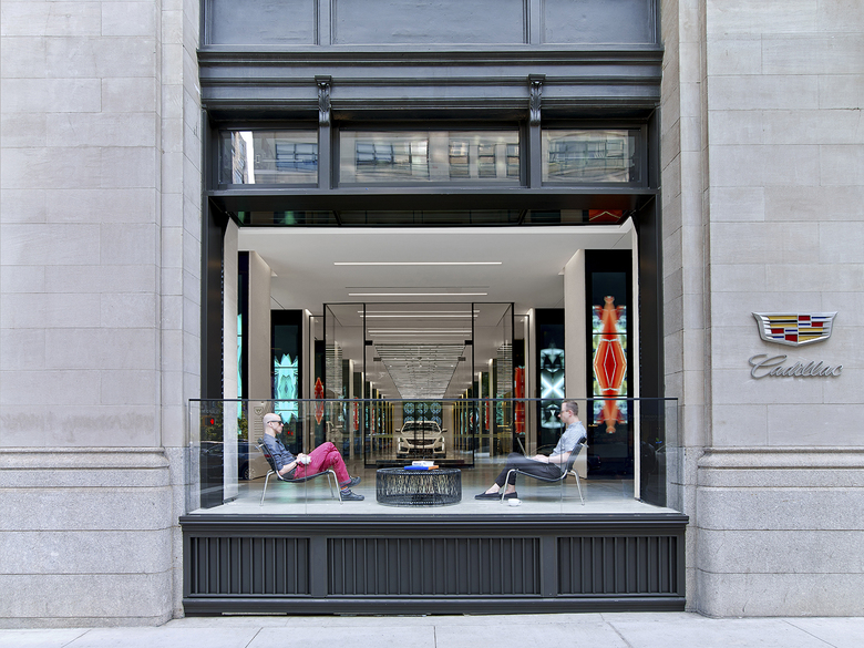
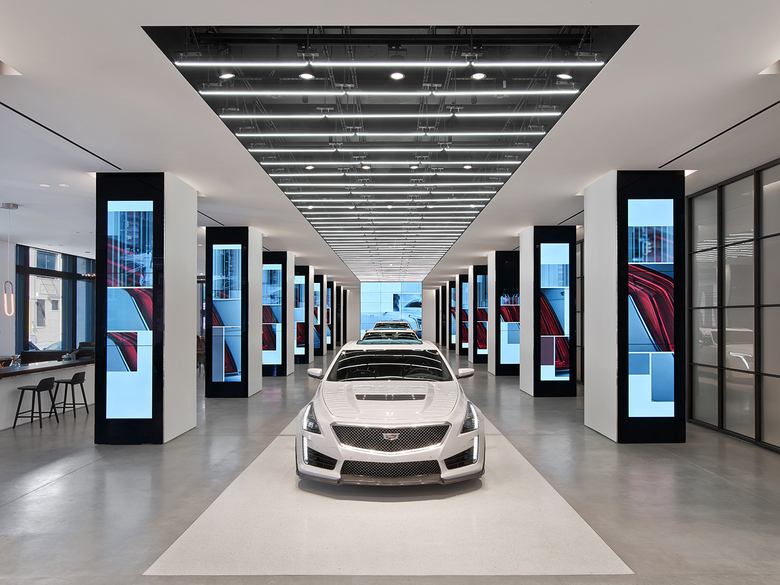
Cadillac House (Photo: Eric Laignel, courtesy of Gensler)
In Manhattan's Hudson Square neighborhood, Gensler designed the offices and "experience center" for Cadillac, which shifted its headquarters to New York City in order to "be on the pulse of the cutting edge and get ahead of trends," as Rocco told me. Most intriguing is the 12,000-square-foot Cadillac House at the base of the old warehouse building, where Gensler opened up part of the facade on Hudson Street. This slightly elevated outdoor space, located between the street and the experience center, functions like an urban front porch. It is a setting for a cup of coffee gotten at the cafe in Cadillac House, though it also serves as a "brand beacon" for the automaker.
Cadillac House (Photo: Eric Laignel, courtesy of Gensler)
Behind the "porch," Gensler incorporated technology into Cadillac House, most overtly in digital billboards that wrap the columns. These displays frame a catwalk-like space where cars are the models. Those in fear of brand overload need not fear; since its opening last year the flexible space has been used for an art installation and as a pop-up store for a young designer. It is, Rocco said, a "great community space that subtly talks about the Cadillac brand," while also engaging with the city at a level that typical auto showrooms rarely do.
To wrap up this Studio Visit, we present a couple of Gensler's in-progress projects, one in Brooklyn and one in Manhattan.
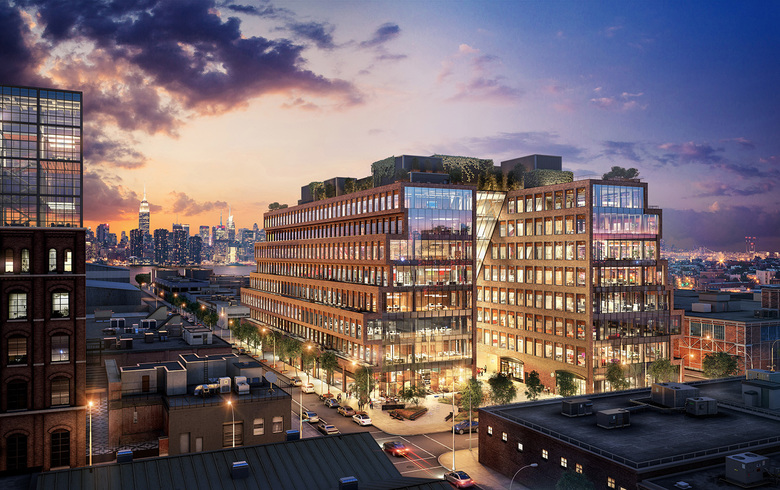
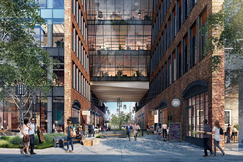
25 Kent (Image: Steelblue, courtesy of Gensler)
25 Kent
From Gensler: 25 Kent is the first ground-up commercial office development in Williamsburg in more than 60 years. In an effort to blend in with the neighborhood and become a part of the fabric of the community, Gensler designed a building that captures the Williamsburg character and industrial heritage, while addressing contemporary trends in workspace and makerspace design to suit growing technology and light industrial and manufacturing companies. (In collaboration with HWKN)
25 Kent (Image: Steelblue, courtesy of Gensler)
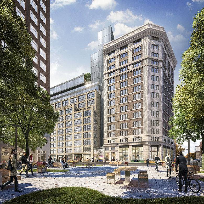
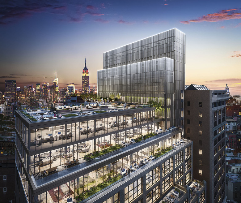
One SoHo (Image: Neoscape, courtesy of Gensler)
One SoHo Square
From Gensler: Given a flood of new development, there is heightened demand in Manhattan’s SoHo district for viable residential and commercial space. The owners of two adjacent Spring Street buildings approached Gensler to develop a repositioning strategy that would maximize the value and volume of rentable space. Gensler produced a signature design solution in joining the two buildings with an elongated common core and two-story lobby.
One SoHo (Image: Neoscape, courtesy of Gensler)
Gerelateerde artikelen
-
Studio Visit: Gensler
on 09-01-2017
