Mannheim's 'City in the City'
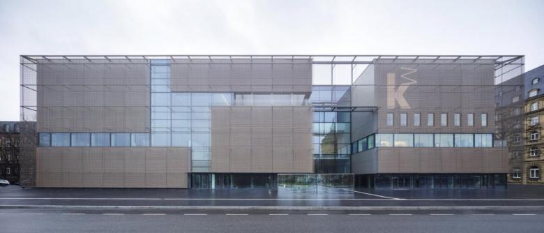
On the first day of June, the Kunsthalle Mannheim will celebrate its grand opening, with a new extension designed by Hamburg's gmp. The architects conceptualized the extension as a "city in the city," using the metal panels and metal mesh on the facade to express it.
Project: Extension Kunsthalle Mannheim, 2017
Location: Mannheim, Germany
Client: Kunsthalle Mannheim Foundation
Architect: gmp · von Gerkan, Marg und Partner
Design Principals: Meinhard von Gerkan and Nikolaus Goetze with Volkmar Sievers
Project Managers: Liselotte Bang, Kerstin Steinfatt
Project Team: Ulrich Rösler, Raimund Kinski, Amra Sternberg, Viktoria Wagner, Hanna Diers, Michèle Watenphul, Anna Falkenbach, Felix Partzsch
Manufacturer (metal mesh): GKD
Product: Custom stainless steel mesh
Manufacturer (metal panels): Eternit
Product: Equitone façade panel [natura] gray N 283
Facade Installation: Franzen Fassadentechnik
Building Area: 17,366 m²
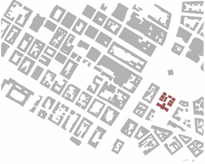
Mannheim is a square city. People say this in reference to the horseshoe-shaped city center between the Rhine and the Neckar, which follows an orthogonal grid starting from Mannheim Palace. This plan dates back to 1600 and Frederick IV, Elector Palatine of the Rhine. The urban development blocks resulting from this grid are called locally the "squares," labeled logically by a system of letters and numbers. For the Mannheim resident, it is not uncommon, for example, to live at F4, 28.
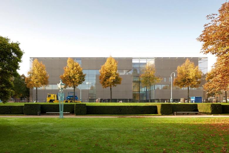
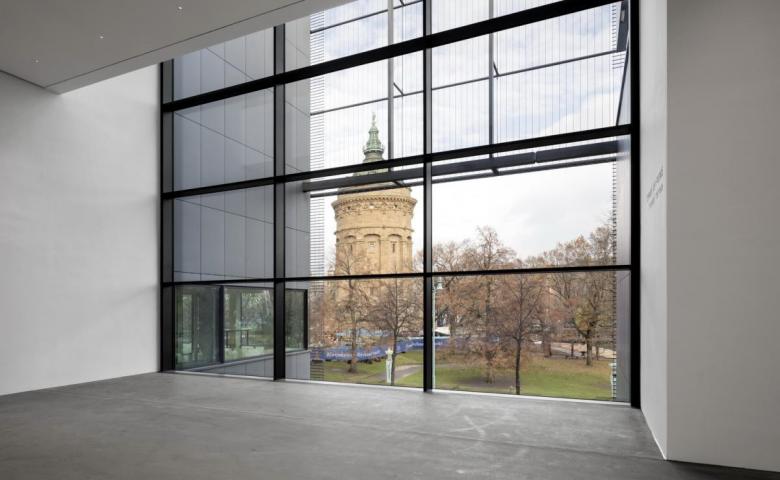
Friedrichsplatz sits on the southeastern edge of the city center, where the neo-baroque water tower stands, surrounded by some high-priced hotels, a nationally known congress and event center, and the Rosengarten. Opposite the rose garden is the Kunsthalle, built in 1907 by Karlsruhe architect Hermann Billing in the Art Nouveau style. A long-planned extension, designed by Mannheim's Hans Mitzlaff, was built in the mid-1980s, a post-modern building whose façades referenced the sandstone of the area's older buildings.
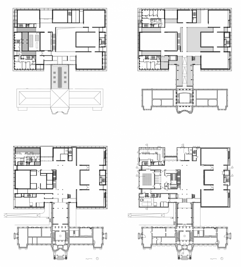
The Mitzlaff building was demolished by the Kunsthalle in 2014 — because of considerable construction defects and cramped spatial conditions — and has been replaced by a much larger building completed in December 2017. Hamburg's gmp won an international competition in 2012 with a design idea directly related to Mannheim: gmp took Mannheim's urban structure as a model, scaled it down, and made the extension a "city in the city."
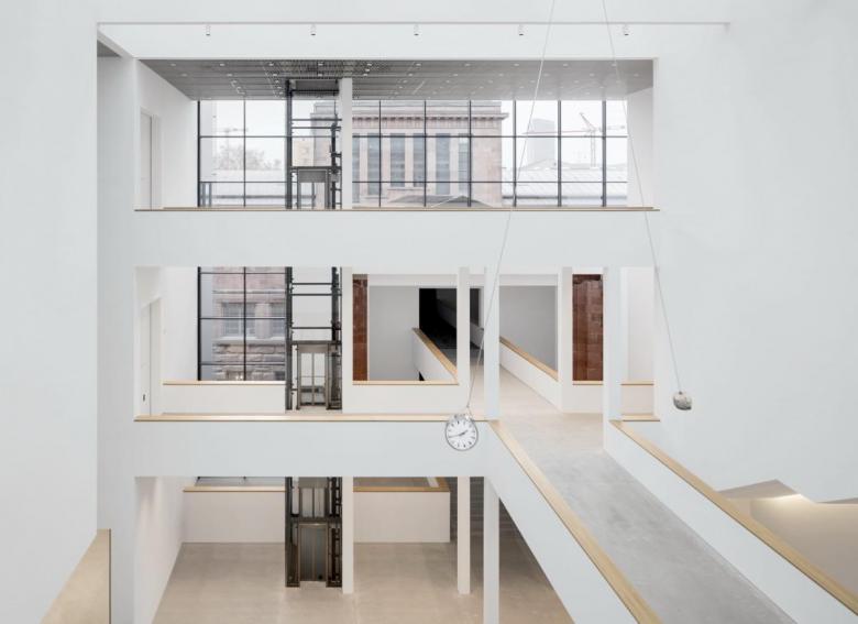
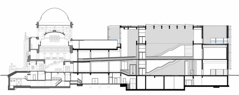
The new building consists of individual volumes — seven "exhibition houses" — that are contained within a simple orthogonal building. This plan creates a central atrium, where the volumes are connected via galleries, terraces, and bridges, an analogy to the space-forming elements of the city: house and block, street and square. For visitors, this creates closed and open spaces with changing views and always new spatial impressions.
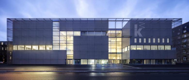
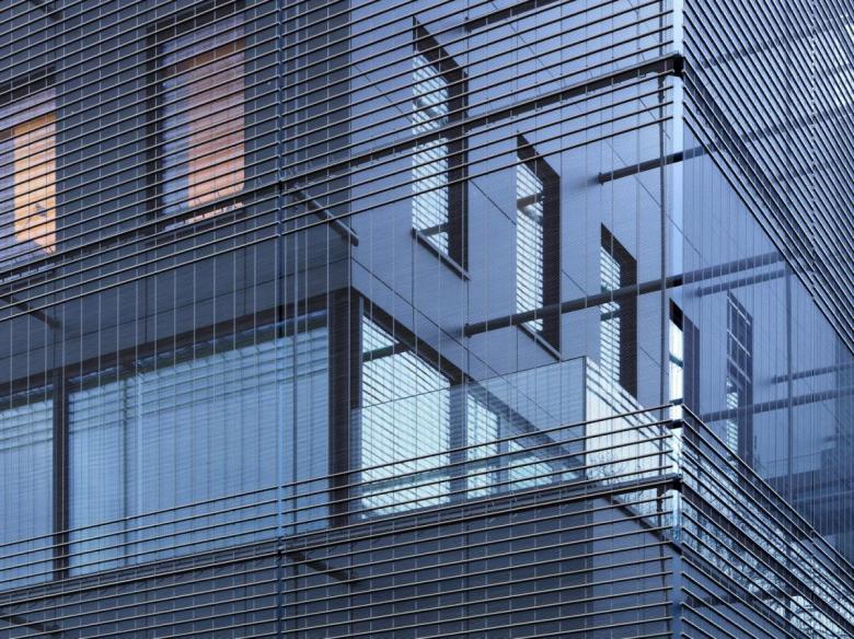
The outer skin of the volumes consists of dark gray facade panels (Eternit), invisibly attached with undercut dowels on an aluminum substructure; with their matte surfaces, they subtly reference the sandstone buildings in the area. At the same time they form the restrained background for a metal mesh that is draped over the volumes like an airy dress defining the extension's cubature. The veil is a custom, bronze-colored stainless steel mesh (GKD), whose size changes depending on whether there is a building or an opening behind it. The mesh consists of a total of 72 individual bronzed stainless steel panels, which together cover an area of 4,635 m². The mesh is a canvas for a shimmering play of light during the day, but at night it lets the new building's "houses" express themselves, inviting people to move from the city to the "city in the city."
A version of this article originally appeared as "Vom Quadrat zum Kubus" on German-Architects.
