US Building of the Week
ARRIVE Hotel East Austin
baldridgeARCHITECTS
4. janeiro 2021
Photo: Casey Dunn Photography
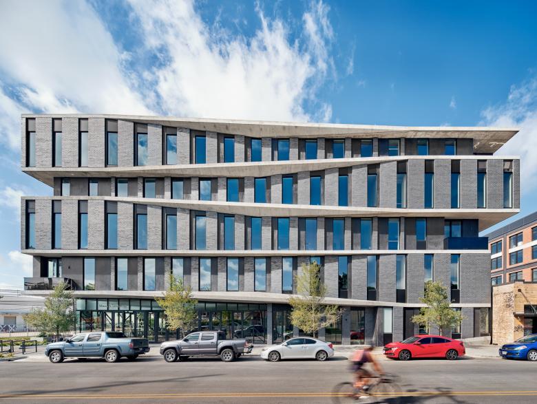
Although the striking five-story ARRIVE Hotel reflects the increasing density along Sixth Street in popular East Austin, the project retains an unassuming century-old, one-story brick building. It houses Lefty's Brick Bar, one of six dining venues in a hotel that clearly prioritizes pedestrian activity. Architect Burton Baldridge answered a few questions about ARRIVE Hotel East Austin.
Location: Austin, Texas, USA
Client: East 6th and Chicon Hotel LLC
Architect: baldridgeARCHITECTS
- Design Principal: Burton Baldridge
- Project Manager: Michael Hargens
- Project Team: Laura Grenard, Ryan Flener, Tyler Frost
MEP/FP Engineer: EEA Consulting Engineers
Landscape Architect: dwg. (Daniel Woodroffe Group)
Interior Designer: Chris Pardo
Contractor: Austin Commercial
Construction Manager: Garrett Waters
Envelope: Building Exterior Solutions
Acoustics: JEA Acoustics
Site Area: 29,150 sf
Building Area: 77,338 sf (57,820 sf Building + 19,518 sf Parking)
Photo: Casey Dunn Photography
What were the circumstances of receiving the commission for this project?The short answer is that we were directly hired by an existing client, but the path to the ARRIVE East Austin Hotel was circuitous. It involved two client teams and an Austin ordinance. And it began with a hotel that did not happen.
We were approached in 2014 by Brian and Bree Carrico regarding a smaller hotel in East Austin approximately a mile from the ARRIVE. We worked for a year until it became clear that community forces did not welcome the project. At the end of that process, our clients teamed up with the owners of ARRIVE Hotels – a new operation with a single boutique hotel in Palm Springs. ARRIVE had ambitions to create a brand-free hotel chain working within robust local neighborhoods. Its goal was to be honest to the neighborhoods it inhabited – to participate in them, use local artisans and pay living wages throughout construction. And it was interested in East Austin.
Concurrently, Austin was grappling with the gentrification of East Austin (formerly heavily African American and Latino). The city ultimately opted to densify development along East Sixth Street – a direct artery into downtown – while preserving the residential character of the neighborhoods to the north and south. While well intentioned, once this transit-oriented corridor (the “TOD”) passed, Sixth Street rapidly became a canyon between 60’ street edges of cheaply built multi-family buildings.
The now combined client team engaged our firm to assist in vetting properties within the newly minted TOD. We considered several sites but ultimately settled on a lot with a disused 1980s building along with a semi-attached masonry building that the city had designated as having “potential historical significance.”
Photo: Casey Dunn Photography
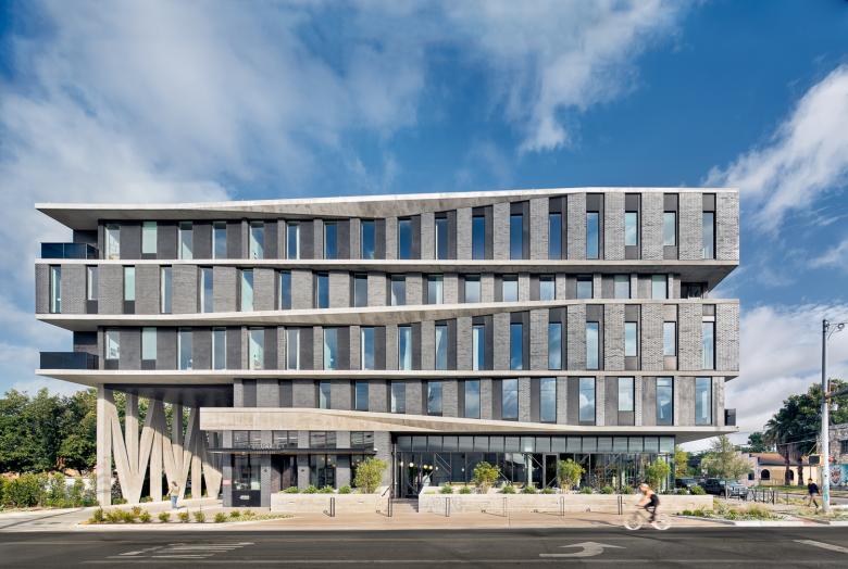
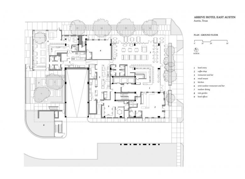
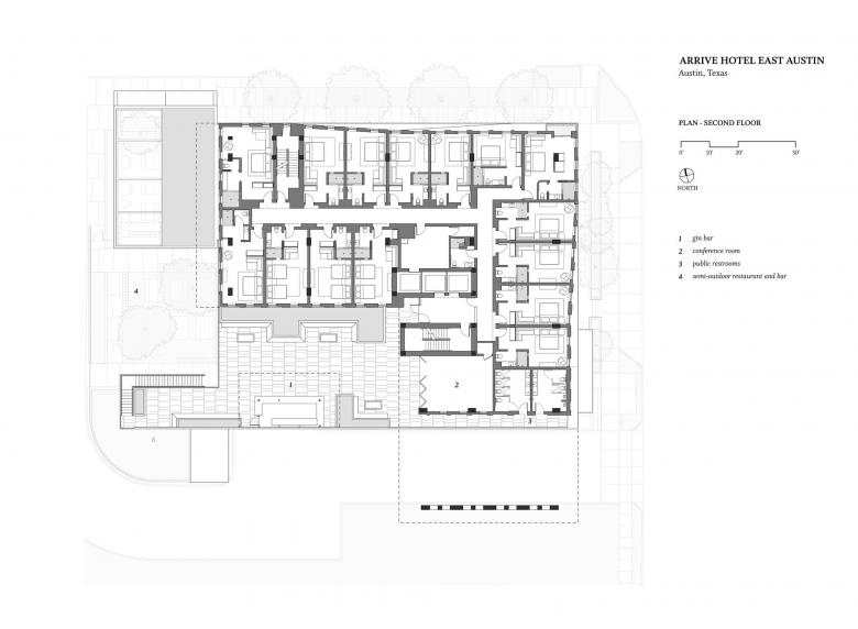
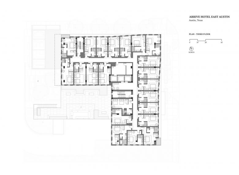
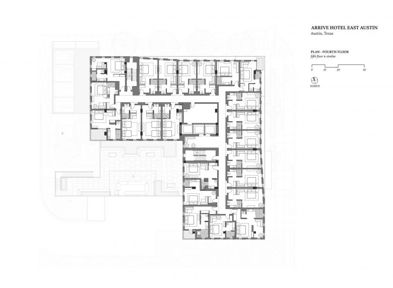
Please provide an overview of the project.The ARRIVE Hotel comprises eighty-three rooms and a multi-use podium housing two restaurants, three bars, a coffee shop, leasable street-side retail space and parking. The team sought to question established hotel tropes, minimizing the hotel identity and creating something that is less “hotel” than public oriented food and beverage building with hotel rooms above.
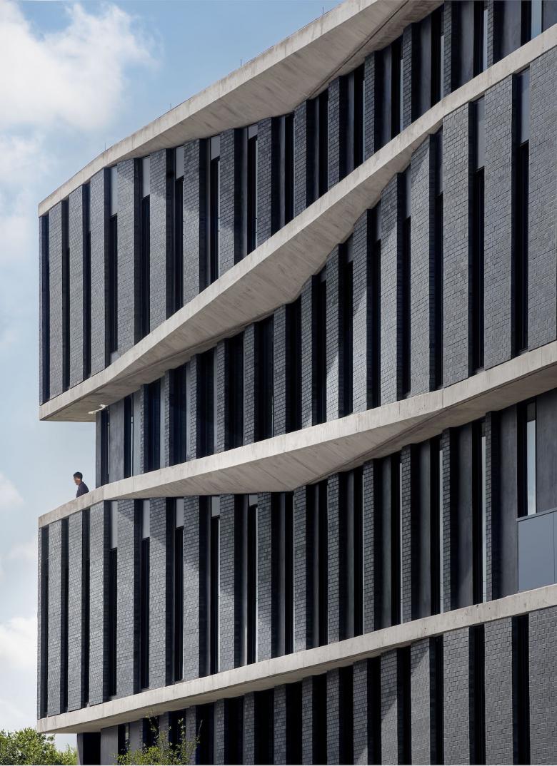
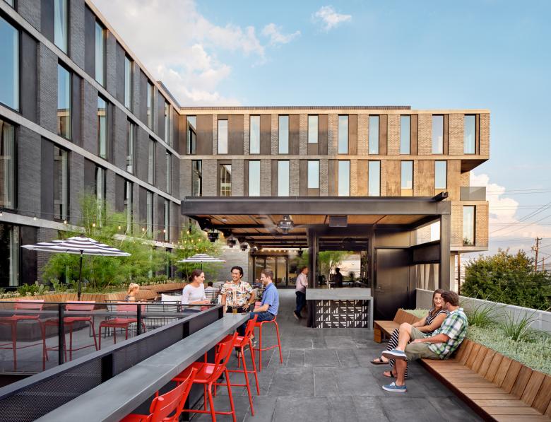
While it is a statement structure, street-level restaurants claim the pedestrian identity. Above, the undulating facade serves as a dynamic response to one of the more form-directive requirements of Austin’s street-side guidelines. In the process, the apparently shifting floor plates create balconies and covered porches for the hotel occupants. In the same way, the design employs the cantilevered building itself to create code required sidewalk cover (rather than the superfluous awnings the code suggests).
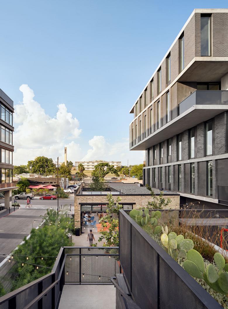
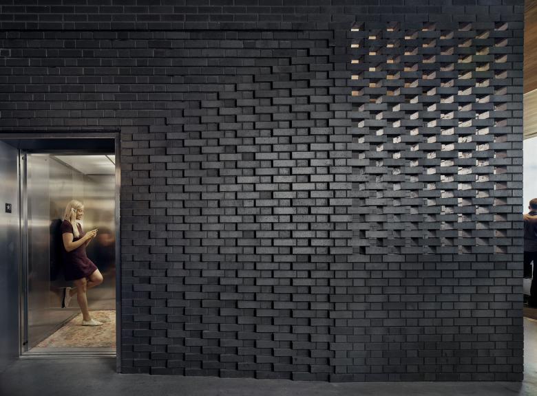
For materials, we looked to existing warehouse structures nearby. The masonry-infilled concrete structure evokes the neighborhood history without resorting to mimesis. semi-outdoor restaurant reuses a pre-existing masonry structure (now physically attached to the principal hotel by way of the kitchens) further tying the complex back to its original East Austin roots.
Photo: Casey Dunn Photography
What are the main ideas and inspirations influencing the design of the building?The team grappled at length with context, history and appropriateness. On the design side, we were looking to the building and material typologies that existed in the surrounding warehouses as well as the masonry and concrete construction found at Huston Tillotson University (an historically Black university that overlooks the ARRIVE). Above all, we all felt that it should be a high-quality building; one that honored its location and served as a redirection for the cheaper design strategies to the west.
On the program side, our clients desired a pedestrian environment that spoke to the public – food, beverage and retail establishments first and to lodging second. ARRIVE wanted a building that suppressed its identity as a hotel – it wanted a public amenity. And it wanted to retain the semi-historic masonry building.
The impact on the neighborhood remains to be seen. The retail establishments did attract a racially diverse clientele, and the food was largely (and by intention) relatively inexpensive. Covid-19 has derailed the operation for now. In the end, the building serves as a sign-post to others that this neighborhood is important and worthy of ambitious and durable architecture.
Photo: Casey Dunn Photography
How does the design respond to the unique qualities of the site?The core operational ideas favored by the client team certainly exist within the context of an evolving hospitality industry (there was nothing earth-shattering in their mission), but these only served to increase an element of appropriateness here. The ground level speaks to the food and beverage and retail establishments first and to the lodging second. ARRIVE specifically wanted a building that suppressed its identity as a hotel. The ground level establishments are less hotel amenities than they are public amenities that happen to have hotel rooms above.
The ARRIVE team’s hospitality ethos combined with its willingness to invest in a high-quality structure allowed us to design a building form and a façade that provides true pedestrian scale. All of this points toward the team’s dedication to context – ARRIVE wanted a development with its feet firmly in the past and present. That the entire team went to even greater lengths (at a cost of parking and room count, not to mention expensive shoring) to preserve and incorporate the preexisting masonry structure now housing Lefty’s Brick Bar speaks volumes about their sincerity.
Our ambitions were giant – this is what a small firm in Austin can do – this is what Austin (at its best) does. We were striving to create something that served its program and context but that was unassumingly world-class. It was an attempt to make good on this city’s outsized myth.
Photo: Casey Dunn Photography
How did the project change between the initial design stage and the completion of the building?The façade of the concrete and masonry structure is dynamic and undulating, but it is not merely decoration. Rather it is a dynamic response to one of the more form-directive requirements of East Sixth’s street-side guidelines. The shifting floor plates create (but do not telegraph) a 2-foot by 20-foot façade relief required by the local street-side ordinances – enacted in a somewhat misguided effort to create pedestrian scale.
What is less clear is that this was not the original design for the “skin” and form of the building. While there is ingenuity in the organization of the first and second floor plans, the gross massing of the project is largely generated by code and local ordinance. As the ARRIVE team desired a signature building, this placed increased importance on things like structural expression and façade articulation.
In fact, the distinctive ultimate form of the building was our third attempt at solving this issue (and is not the expression that is shown even in our site-plan permitting materials with the city). The first two attempts were, perhaps, more respectful of the initially declared budget. We were grateful to even receive a third try so we worked to produce something that honored what the client team seemed to want – even though the cantilevered and undulating concrete gymnastics did not comfortably fit within the stated budget.
In the end, the stakeholders all agreed the final expression was the correct one even though it required a substantial budget adjustment to achieve it.
Drawing: baldridgeARCHITECTS
Was the project influenced by any trends in energy-conservation, construction, or design?With the exception of the landscape, it would not be accurate to say the energy conservation trends were a primary driver for the project. But the owners, operators and property owners alike desired a long-term asset which led to durable design choices like concrete structure, masonry façade, and durable interior finishes like thin brick instead of drywall.
The design team incorporated thermally broken windows throughout, continuous exterior insulation (utilizing thermally broken fiberglass purlins), a high quality VRF mechanical system, and efficient LED lighting. Our engineer’s green-building model indicates an HVAC system operates 56% better than code with lighting exceeding code by 30%.
That said, the outdoor environments were built to be highly innovative and performative. Given the humid, subtropical climate where the sun is intense and droughts happen frequently, the exterior environment demanded a higher level of design sensitivity to create a more resilient and sustainable landscape. By implementing an innovative water management strategy together with a highly durable native landscape the project demonstrates a significant reduction in water use and brings the beauty of the regions tough native plants to the forefront where they provide shade and a rich urban habitat for guests as well as local fauna.
Rain gardens were incorporated to reinforce the importance of green infrastructure – designed to mitigate the adverse effects of stormwater runoff by reducing peak flows and retaining pollutants. In addition, soil cells were incorporated throughout the project to increase the amount of un-compacted soils for the adjacent trees and to encourage maximum rainfall infiltration into the subgrade on site. A custom soil blend application was specified to sequester carbon in the organic matter throughout the full improved soil profile within the confined urban spaces.
Email interview conducted by John Hill.
