LIST Gruppe Nordhorn/Bielefeld
Nordhorn, Germany
- Interior Designers
- brandherm + krumrey interior architecture
- Location
- NINO-Allee 16, 48529 Nordhorn, Germany
- Year
- 2021
- Client
- LIST Gruppe
- Planungsteam
- Melanie Leigers, Sabine Krumrey
- Architekt
- RKW Architektur +
- Fotos
- Joachim Grothus, a|w|sobott
Systematic openness
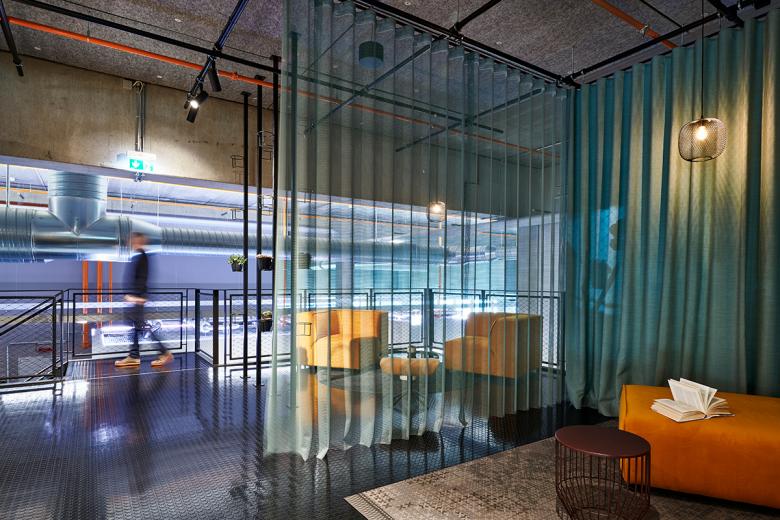
“Office real estate holistically thought through” is a motto of the LIST Gruppe. This comprehensive approach also shaped the design of the two new company headquarters. With the claim “Our Office”, the buildings in Nordhorn and Bielefeld were conceived from the inside out. The key idea was the image of a light-filled hangar. For the resulting working environments, brandherm + krumrey developed an interior design that is as open as it is systematic. The protagonist is a flexible spatial element.
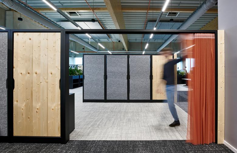
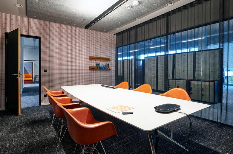
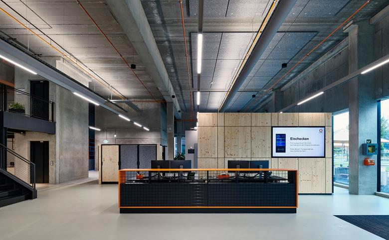
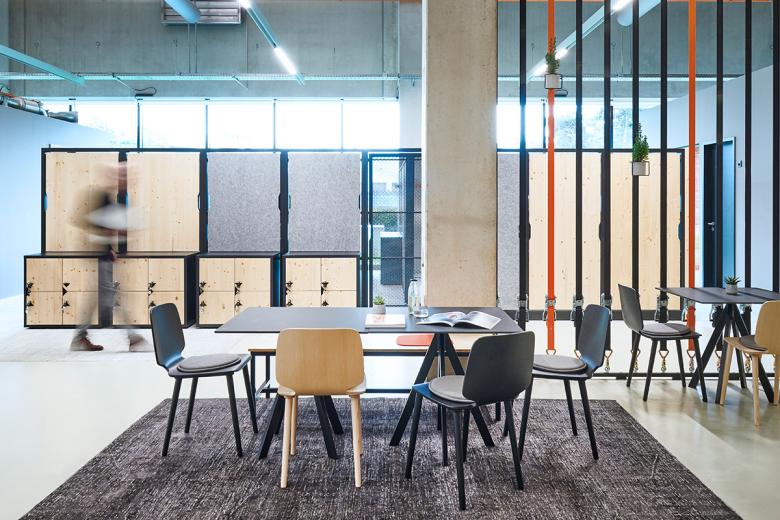
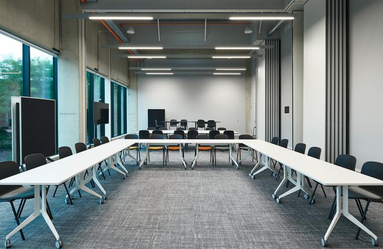
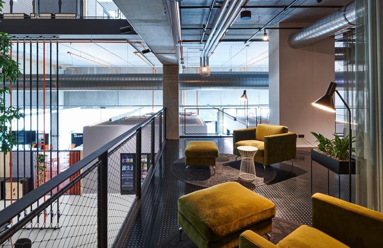
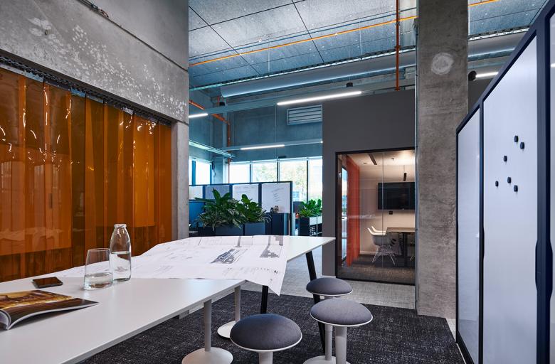
The office buildings, designed by RKW Architektur +, largely do without enclosed spaces. Ceiling heights of 6.40 metres and visible installations further emphasise the openness of the new two-storey buildings. Maximum flexibility and openness also play a central role in the office areas. They are designed for agile working and have almost no fixtures. To nevertheless enable the creation of individual areas, brandherm + krumrey developed an intelligent system furniture. The multifunctional steel grid consists of individual sections that function as flexible room dividers. Thanks to their low height, the open overall character of the hall-like interiors is maintained. The system elements can be used to configure variable areas and form hybrid project spaces. The modular structure allows flexible configurations with transparent and closed areas or with storage elements. Where meetings take place in larger groups, ceiling-high, movable partitions also allow for versatile possibilities of occupancy and use.
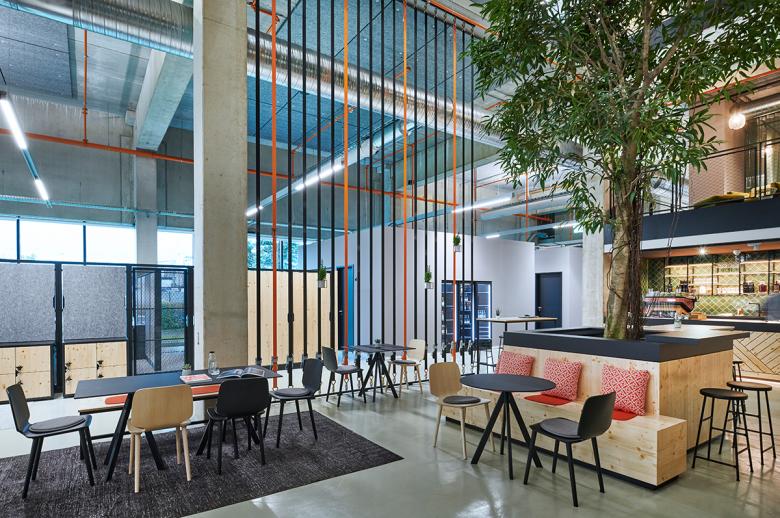
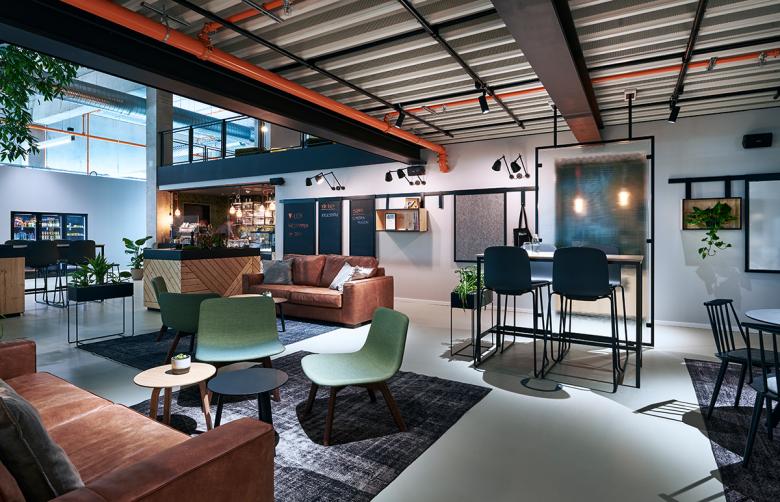
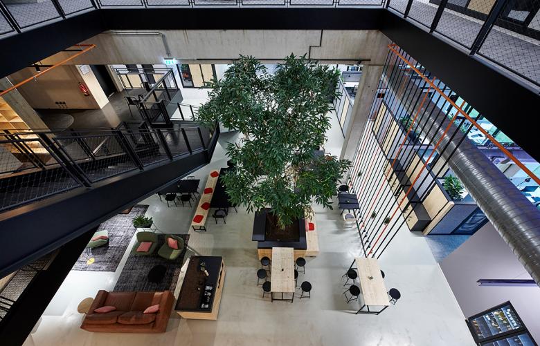
The social heart of each building is the centrally located “Deli” on the ground floor, where light meals are freshly prepared. Casually grouped tables and upholstered furniture invite staff and employees to spend time together. Carpets and many green plants add to the pleasant ambience. The eye-catcher in both new buildings is a six-metre-high tree in the centre, which contributes to the good office atmosphere. As a tongue-in-cheek reference to the business field of the LIST Gruppe, materials from the construction industry are used. Another feature based on the corporate design is the recurring use of the orange shade taken from the client’s logo. In the rather muted colour scheme of the new working environment, furniture, fixtures and accessories in bright orange repeatedly create colourful highlights. The extent to which the system concept is applied to the new buildings is evident in the overall structural design: if necessary, the buildings can be extended along the axes, so that here too, thanks to prefabricated construction, quick adaptation is possible. In the interplay of open architecture and room layout, extremely variable working worlds have thus been created for the ambitious corporate group.
Related Projects
Magazine
-
Winners of the 5th Simon Architecture Prize
4 days ago
-
2024, The Year in …
6 days ago
-
Raising the (White) Bar
1 week ago
-
Architects Building Laws
1 week ago
