V&A Fashioned from Nature
Shenzhen, China
- Architects
- Studio 10
- Location
- 中国深圳市南山区蛇口望海路1187号海上世界文化艺术中心一层主展馆, Shenzhen, China
- Year
- 2020
- Team
- Cristina Moreno Cabello, An Huang, Jiaying Huang, Meishi Zhao, Xin Zheng, Jiaxiao Bao (Project Assistant), Feifei Chen (Project Assistant), Shi Zhou(Director)
The spatial design of the exhibition Fashioned from Nature co-curated by the Victoria & Albert Museum (V&A), China Silk Museum, guest curator Edith Cheung and Design Society is an abstract yet poetic interpretation and comparison of the Eastern and Western Views of Nature, as well as the evolution from classical through contemporary garden spaces.
The exhibition consists of two sections: "FASHIONED FROM NATURE" curated by the V&A Museum and Design Society narrates the complex relationship between fashion specific to human society and nature since the 16th century, with reflections as well as an emphasis on environmental sensitivity and preservations, while the FASHIONED FROM NATURE IN CHINA: THEN AND NOW Section is an echo to the theme in the east.
The spatial design of the exhibition has chosen nature as the subject and “garden” as the theme. We hope to explore the similarities and differences of the natural views embodied in Eastern and Western gardens through the exhibition spatial design.
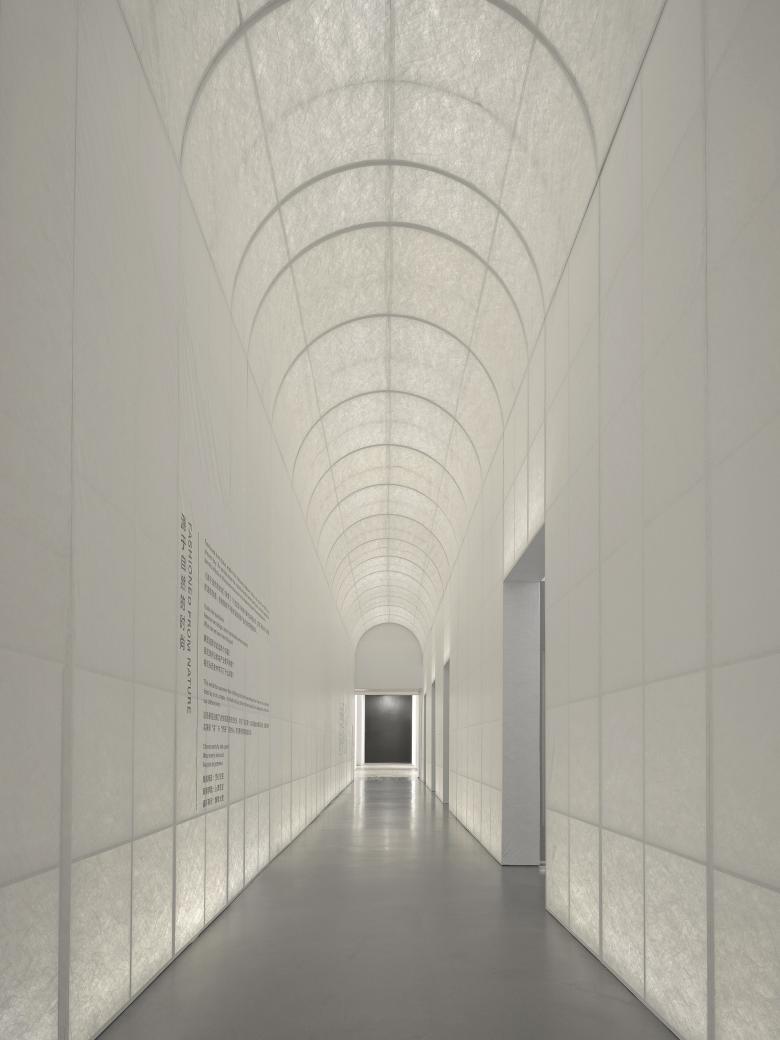
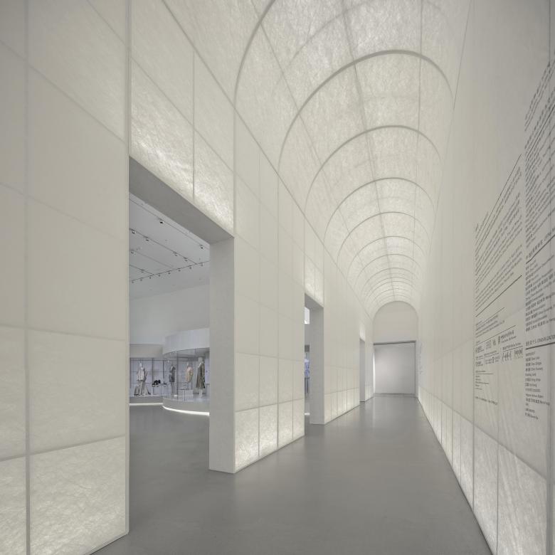
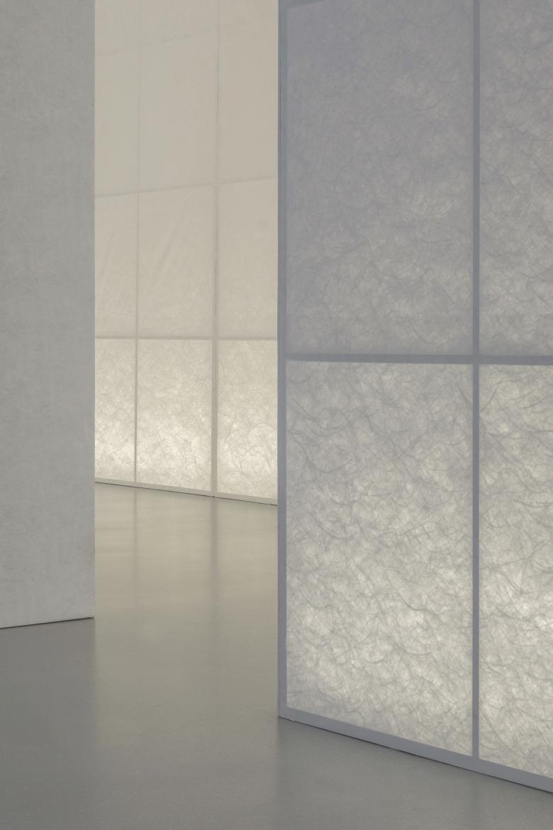
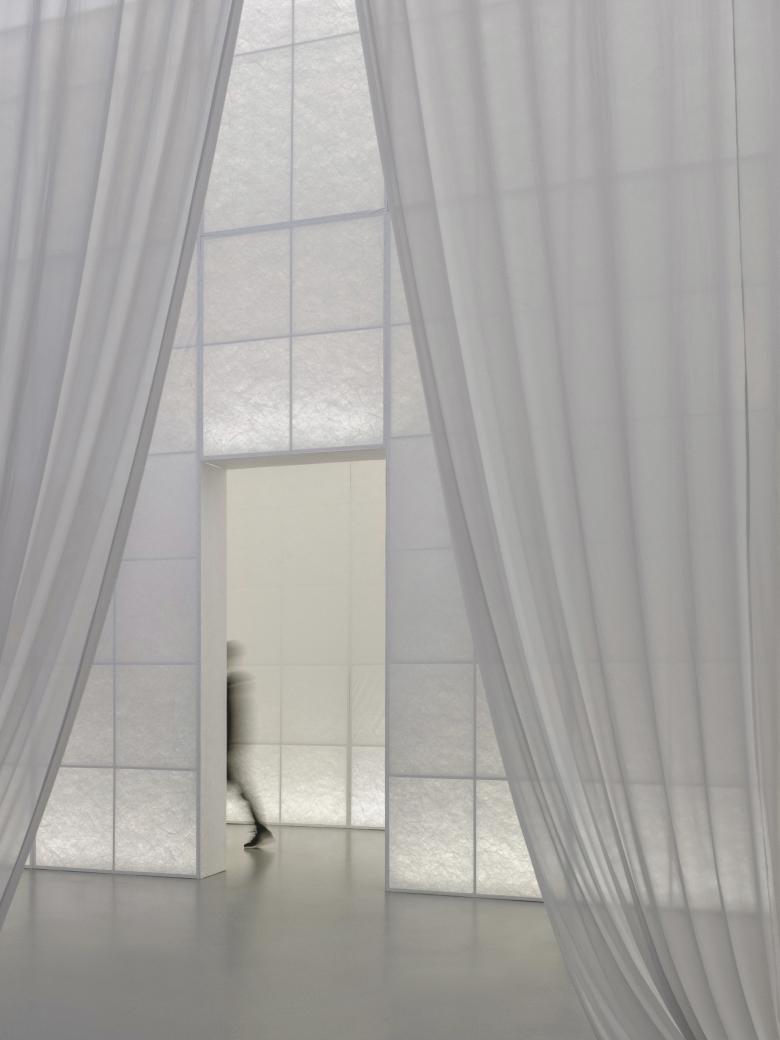
The entrance archway is finished with Tyvek. When backlit, it faintly reveals the vine-like fibers, forming an abstract “green corridor”.
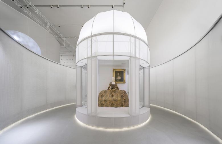
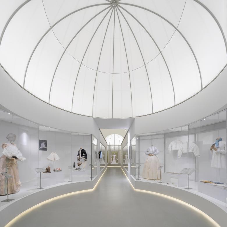
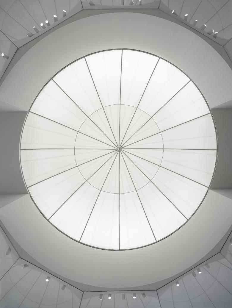
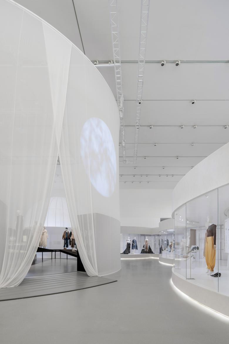
Through the green corridor, enters the first section of the exhibition, the classical period of the English section. Translucent fabrics are used to create an abstract “Western” classical garden, which is highly geometric, axially symmetrical, and perspective-driven while connecting circular spaces and showcases of different sizes through the axis. Just like the emphasis on the relationship between architecture and axis in Western classical gardens, there are three circular “Garden spaces” placed in the vanishing points, which are also the intersection of the axis. The three abstract and volumetric 360-degree circular independent showcases are used for displaying highlight objects.
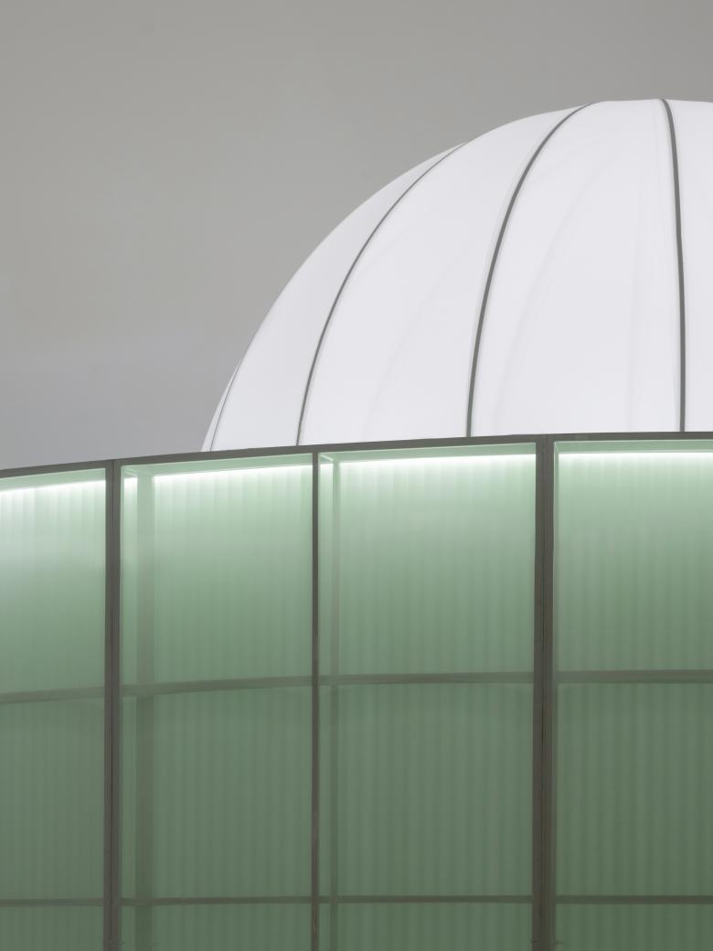
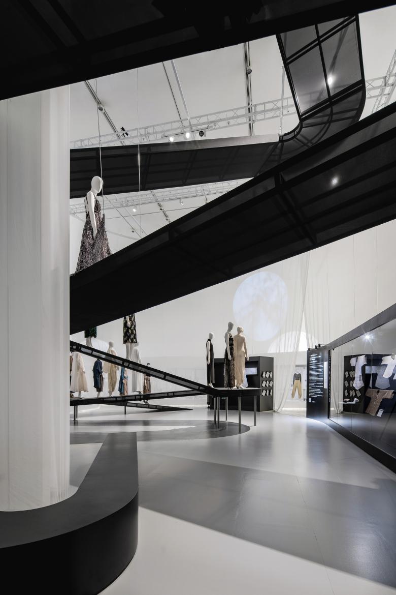
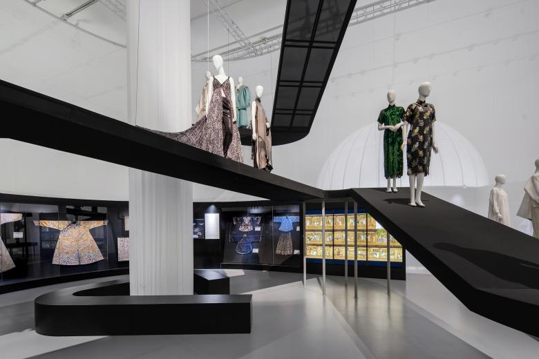
Then comes the last garden, which is formed by an array of acrylic tubes. The modern material implies that the narrative of the exhibition is coming close to modernity, where people began to contemplate and reflect on the relationship between fashion and nature. From there we enter the contemporary and prospects of the exhibition, the space instantly opens up, from classical confined circular showcases to one continuous, free-flowing showcase, echoing the flexible layout of contemporary landscape and spatial design.
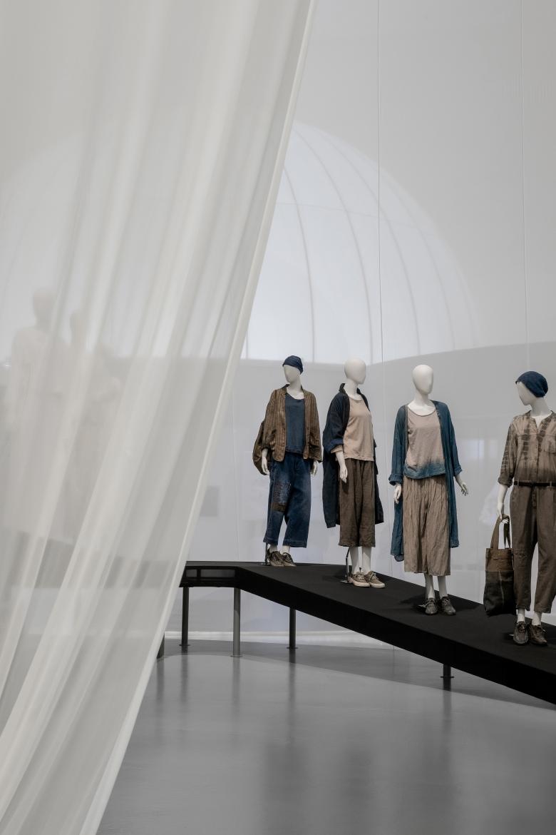
The Chinese section is the end of the exhibition, a pill-shaped plan enclosed with translucent fabric, leaving only a slit for the entrance. Visitors can vaguely see whilst wondering in the V&A section, which is a process of curiosity accumulation. In this section, the spatial design follows a natural approach - there is no axis or fixed linear circulation. A translucent ramp sits in the space, just like a mountain trail or stream meandering down from the sky, free and winding. The models dressed in showcased pieces are placed on the ramp, as if they are walking down the mountain trails. Visitors can roam around the space intuitively and freely, as if they are in a romantic and poetic nature setting.
The exhibition uses lightweight and translucent materials such as fabric, TPU, Tyvek, etc. to weaken the interposition of physical space and the existence of entity; expressing Eastern and Western, classical and modern garden’s abstract and poetic views through “void” and “translucency”, we intend to inspire visitors to ponder and reflect upon the relationship between human and nature from fashion and a broader perspective.
Related Projects
Magazine
-
Winners of the 5th Simon Architecture Prize
4 days ago
-
2024, The Year in …
5 days ago
-
Raising the (White) Bar
6 days ago
-
Architects Building Laws
1 week ago

