Viewpoints
John Hill
25. 三月 2013
Viewpoints - Uncommissioned work by Architectural Photographers
The importance of photography in promoting buildings and architects is undeniable. But what about the uncommissioned work—the personal explorations, the fine art exhibitions, the free work, the side projects—that architectural photographers undertake outside of their commercial jobs? That is the focus of this Insight, which gathers ten photographers from around the world and presents three photos and three questions and answers on their unique viewpoints.
hiepler, brunier
hiepler, brunier, Stillgestellt (immobilized)
Stillgestellt (immobilized) | Berlin, Germany | 2004-2011
Israel, Iceland, France, Lithuania, USA, China, Ecuador, Slovenia, Estonia and Brazil
Custom-made Gottschalt DS30 shift camera with different phase one digibacks (P45, P65, IQ180), Canon EOS 1Ds
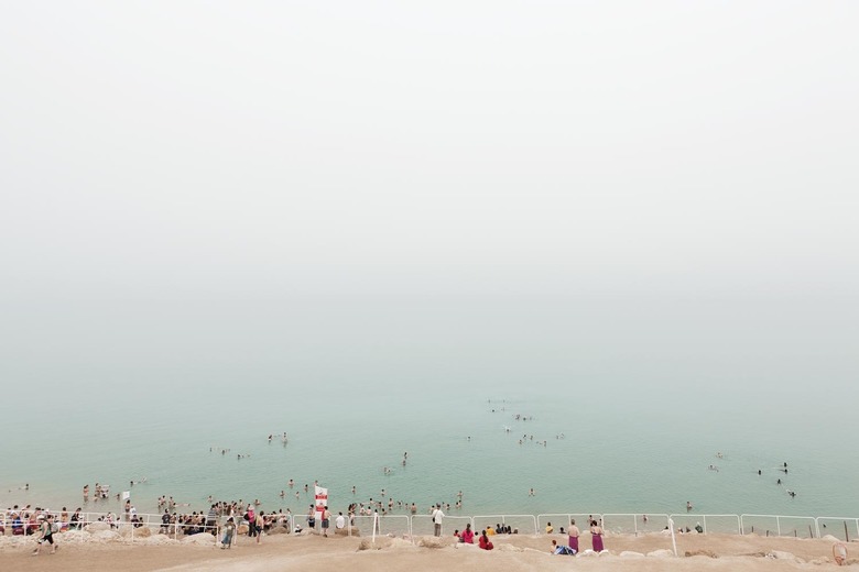
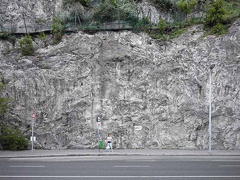
The book Stillgestellt (immobilized) was released by Panatom Book (Berlin, 2012, "Schweizer Broschur", 72 pages, 32 photographs). As the title suggests, hiepler, brunier, were dealing with moments and situations in which life somehow, literally or just felt, stopped — it is immobilized or, to use the German term, stillgestellt.
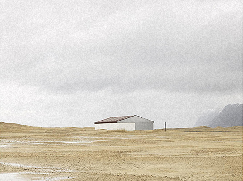
At the Dead Sea the sun loungers and parasols were moved away from the coastline by the constantly sinking water level. Now they are not in use anymore — almost abandoned. Or in Iceland, where the "blind houses" seem to encapsulate themselves in the face of the high-time of the economic crisis, waiting for the crisis to end. In the series "the waiting" time seems to stand still — there has always been waiting, for visitors, for the bus, the end of winter or simply better times.
The book contains texts by the Swiss philosopher Tomas Kadlcik, the New York-based architect Lonn Combs and the Berlin-based photographer Valeria Herklotz. It is the first volume in a series that will be published at irregular intervals, each with a new topic. Three of the books will then come together in a slipcase.
hiepler, brunier, Stillgestellt (immobilized)
How did you develop the theme for the series?Stillgestellt is first of all the title of the book. We were looking for one word that could have been a superordinate term to all of the series we brought together in the book. There are five series in the book: "the dead sea has no drain," "snæfellsness," "plätze der welt," "blind houses" and "the waiting."
hiepler, brunier, Stillgestellt (immobilized)
How do the photos relate to your commercial architectural photography, both in terms of subject matter and in your techniques and mindset when taking the photos?We are always trying to do our work with the same mindset, no matter if we do commercial or our personal work. We have a very "architectural" approach in all our images, no matter what we are taking pictures of; the image of a landscape, for example, is done and constructed with the same accuracy and the same effort as the one we take of the newest building, of e.g. David Chipperfield.
Philipp Schaerer
Philipp Schaerer, Mines du Jardin
Mines du Jardin | Zurich, Switzerland | 2012
Computer rendering
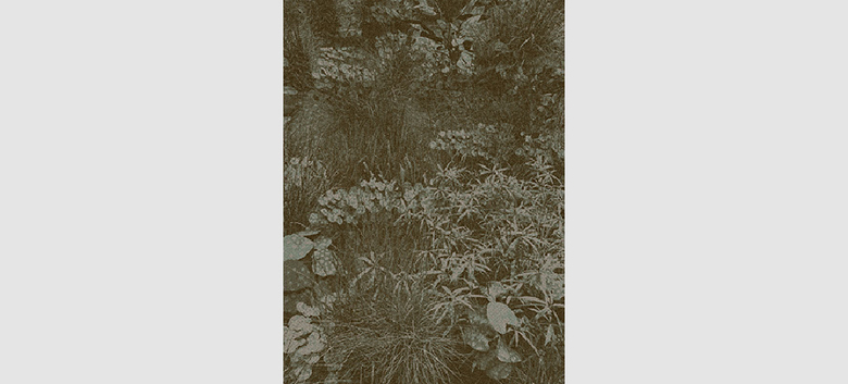
The theme of fictitious plant arrangements is not the main concern. It’s more an interrogation on contemporary aesthetics. The environment we live in is more and more visual and determined by digital media aesthetics. We increasingly portray ourselves in seamless, smooth, and constructed representations and models of our time. Digital image editing techniques, in particular, call for a critical examination of predetermined (visual) reality. In my visual works, I seek visual strategies that attempt to subvert the logic of photographic image concepts. The goal is to create images that break free from their external visual realities and become what they truly are – namely independent artifacts.
Philipp Schaerer, Mines du Jardin
How do the photos relate to your commercial architectural photography, both in terms of subject matter and in your techniques and mindset when taking the photos?In my personal work I experiment with image strategies where I can push much further than my commercial work. My interest lies in the creation of images which try to reflect a built, exaggerated reality. Today, digital image editing allows the creation of images which are nearly impossible to distinguish from a photograph. But what other image strategies and esthetics can be pursued with the help of digital image techniques – image strategies which are not only aimed at the most exact realization of photographic rendition? I am interested in the creation of images that in fact are based on a photographic language, but which can be abstract, model-like and exaggerated, and thus able to reformulate the question of the differentiation between reality and image.
Philipp Schaerer, Mines du Jardin
Can you describe the series and explain what you hope to express with the photos?The visual work Mines du Jardin is a computer-generated image series of fictitious plant arrangements. The work’s main research is focused on what extent atmospheric natural images can be generated through pure digital rendering, which not only follow a pure implementation of photographic representation, but are also capable of creating a picturesque haptic of their own visual reality.
The series includes three images. Each is a freely arranged 3D plant object that is completely computer generated. No photographs were used. All images have passed through several light calculation cycles but were abruptly interrupted in the middle of the calculations to obtain the different tonal values of the image. This is visible in the images through the fine checkerboard grid in the form of black, square spaces, caused by tonal value fields that were not calculated. This intervention in the image calculation, and the resulting influence on the "finished" image, offer without doubt analogies to traditional laboratory work in which the exposure of a negative largely influences the tones, contrasts and sharpness of the finished photo prints.
Peter Aaron
Peter Aaron, Swirling Autumn Clouds at Olana Viewed from the Hudson River
Olana's Dynamic Landscape | New York, USA | 2010-2012
Hudson, New York | Canon 5D Mark II and a Canon 5D converted to Infra-red only
I live by the Hudson River in rural Columbia County, New York. Olana is a nearby mountaintop mansion that was designed and built around 1875 by Calvert Vaux and Frederic Church. Church was one of the most successful American artists of that time. The house is unique in that Church insisted on a Moorish design based on his travels in the Middle East. I wanted to document this unusual place using my skill as an architectural photographer.
Peter Aaron, Olana From the South With Dark Clouds
How did you develop the theme for the series?I found out that Church's architect Calvert Vaux had designed the buildings and bridges for New York's Central Park. Frederic Church at one point was the Commissioner of Parks in NYC. He cared as much about the landscape of Olana as he did the house and had help from Olmsted and Vaux in designing the Romantic landscapes for his property. So I turned the camera on the foliage and views rather than the house itself.
Peter Aaron, Frederic Church Studio Section of Olana Above the Hudson River Fog
How do the photos relate to your commercial architectural photography, both in terms of subject matter and in your techniques and mindset when taking the photos?The resulting pictures have much more landscape rather than architecture in them. They are based on seasonal weather highlights and thresholds to vistas that Church would have planned. In addition I used a Canon 5D that was converted to capturing infrared black & white only. Half the exhibit used this technique; one quarter was in color and the rest in color converted to black & white.
Brigida González
Brigida González, 1.27 p.m. on Location
Metawork | Stuttgart, Germany
4x5-inch analog + digital processing
At the beginning of each job there is the question: "Which impression of the object do I want to cause by producing the photographs in a certain way? Which emphasis should be given?" By using a strategy that is comparable to creating a "metawork" I get access to possible answers. Therefore at the beginning of each job a mentally and often real overlay and synopsis of contrasting elements will be created. These elements are assembled into personal images that accompany and guides me through the whole project. So the "metawork" is a kind of tool that I use as a guide in my everyday professional life. The image of a "metawork" is an idea, a fiction, a dream, a surreal view. In the course of the process it becomes a specific photographic work.
Brigida González, 5.47 p.m.
How did you develop the theme for the series?The series "metawork" has no specific subject. It is all about "utopian architectural photography." The principle that pervades, however, is creating a montage. My intention is the combination of very contrasting image elements coming from very different contexts. Something surprisingly new can be created by the encounter of those elements: a harmonius collocation which seems like a compressed idea of my perception of an object and its interpretation.
Brigida González, 1.50 a.m.
How do the photos relate to your commercial architectural photography, both in terms of subject matter and in your techniques and mindset when taking the photos?"Metawork" is dealing very directly with my profession because they express my attitude and approach as a photographer. The used image elements coming from the world of my commercial work are reassembled according to my mindscape. Therefore my commercial work and the "metawork" are always in a direct correlation. The "metaworks" have the function of an abstract outlining concept. Those used fragments of reality will later appear again in any form whatsoever, in my commercial work.
Hugo Moura
Real Imaginado | Porto, Portugal | 2012
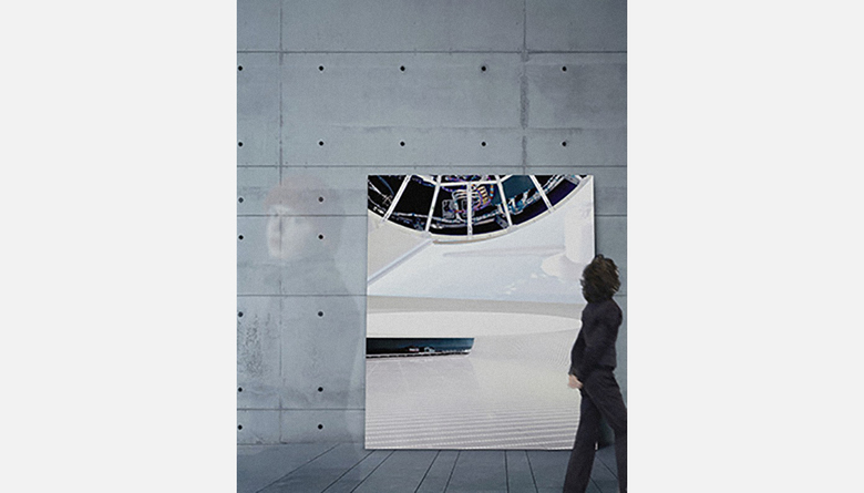
This project is about research on the power of images to recreate reality. Redefining their physical dimensions by manipulating perception at the time of its capture made possible the reconfiguration of space, giving it new dimensions, new imagery—a new reality. This is an ambiguous reality that reveals a different way of seeing and understanding space, allowing each viewer to experience his or her reality imagined.
This project was developed in a ruin of an industrial complex. Like every building in a state of a ruin, this one lost the functions for which it was designed; as time passed many parts were destroyed and others were stolen, creating a unique place with unusual forms and spaces. Therefore it was clear since the beginning of the project what story I wanted to tell. I was immediately attracted to the ambiguities of the space that were presented before me, where I could easily lose the references of three-dimensional space. This became a project where I could question the way we perceive reality and how we can be manipulated.
Although my thoughts are based on formal codes of architecture (my young-age goal of being an architect and my subsequent degree in architecture conribute greatly to this), I must say that my references depart from a much bigger palette of inspirations, such as photographers who base their work far from architectural photography, as well as the arts, literature and cinema. Each project is an opportunity for transformation and recreation of reality. Photography allows us to interpret each space's transformation, creating a new story and in the end creating the conditions for others to see and generate something new. This is a reference that allows me to guide my work whether it's personal or commercial. To represent every experience in photography is impossible. What we can do is try to reduce the message, making it clear and objective in order to comprehend it and create the opportunity for a new story.
Frederik Vercruysse
Compositions | Antwerp, Belgium | 2011
Mamiya 645 & technical camera combo with phase-one back
The constant quest results in perfectly measured geometric combinations in which being able to recognize the photographed objects is only of secondary importance. A slice of cheese or a cutting board are taken out of their daily context and reduced to abstract combinations, shapes and colors. The technical camera used to capture these still lifes reinforces the abstract result: perspective gets bent out of shape, suggesting a 2-dimensional image. The texture of worn-out objects compensates for the clean look of the image.
Inspiration for the compositions came from classical still lifes and the work of Mondrian, Louise Bourgeois, Jan Van Tongeren and Morandi, translated into a contemporary visual language.
I describe my work as still life photography in the broad sense of the term. I approach my architecture and interior photography from the same angle, looking at buildings and furnished spaces as compositions; it is the same when working with object compositions or even portrait photography. The ultimate ambition is always to photograph the subject in a pure and minimalistic way.
Anja Schlamann
Siebenbürgen (Transylvania), Romania | Cologne, Germany | June 2011
Copşa Mică, Transylvania, Romania | Large-format camera, analog
Siebenbürgen, the title of the series, is a region in central Romania - also known as Transylvania. The names are evocative of childhood stories. Like rockets that are ready to be launched into space and then were forgotten, the ruins of the carbon black factory stand in the green, hilly landscape. The former lungs of the "black city" Copşa Mică have dilapidated into a shell: hollowed out on the inside, the wind blows through the fallow walls. On the outside, the soot deeply blackens the façades. Once a place of production and employment, the carbon black factory became the destiny of a whole city and a gigantic industrial wasteland. Decay determines its existence.
I'm interested in antagonisms and contrasts, the confounding factors in the harmonic idyll: the destructive past clings tight to the former carbon black factory like the soot to the stone. Nowadays, it appears like a surreal moon landscape amidst playing children and the small-town goings-on at the foot of the Carpathian Mountains. Romania is full of these contrasts, in architecture as well as people. Simple life meets rapid progress; placid life models stand next to monumental buildings. I meet these people during my visits, listen to their stories and find the matching places.
The basic geometric forms and monochrome color fields result in an almost constructivist visual language. Against the background of the green and lush landscape, the appeal and aesthetics of the place unfold for me. The buildings, as well as their surroundings and their past, find a textual and formal counterpart in the series, which is an aspect that's also very important to me in my commercial work.
Albert Vecerka
Manhattanville | New York, USA | 2009-present
New York City, 125 Street to 133 Street, between Broadway and the Hudson river | Full-frame Canon DSLR and mostly PC & TS-E lenses
This project is about the evolution of a neighborhood, Manhattanville. I believe that taking a closer look at our immediate surroundings and the forces that shape them is valuable. Places that were, places that are, and places that will be speak about our humanity. I've lived nearby for 20 years. When I first moved in, I witnessed the slow evolution brought by the arrival of Fairway (a large gourmet supermarket), some restaurants, and offices in mid and late 1990’s. This relatively slow and organic change has now been replaced by grand gestures as redevelopment by Columbia University is underway—a Robert Moses-like intervention. It remains to be seen what this very controversial move will bring, and my project will have to evolve accordingly.
As someone in the visual communication realm, I look for visual cues and elements and try to assemble those in a composition just like a writer would compose a sentence or a paragraph. Looking at the old Mahattanville, I examined its pieces and how they related to the whole. Sometimes looking and learning about what is in front of you enables the theme to emerge and defines the future direction of the project.
I’ve always been interested in the built or natural environment in which we live. I learned the basics of photography as I studied electrical engineering when I lived in the former Yugoslavia. My first subjects were architectural, mostly street scenes. When I moved to the United States, I studied both architecture and photography, and when I decided to take the photography route, architecture lent itself as a natural subject. In my assignment work and in my personal projects I look to tell a story about a place; a neighborhood, a building, a room. Looking for the right light, right day, or right time of day is a part of that narrative, and it is no different for commercial assignments than for personal projects. Equipment is just an extension of that, so in this case a full frame digital SLR provides great lens choices, least bulk, ease of use, and an economical way to work.
Upasana Jain
Rainy Window | Mumbai, India | 2012
Mumbai | iPhone 4 camera and camera+ app for editing
Mumbai, an ever-changing city, transforms dramatically during monsoons. The traffic stalls, but what doesn’t seem to change is Mumbaikars’s spirit of braving it all with heightened enthusiasm. Mumbai Monsoon series 2012 is a visual diary of twelve selected images, many taken with a camera phone from a closed, side-glass window of a moving car while stuck in traffic during one such heavy downpour. The 50-minute ride quickly turned into a 3-hour commute to work, but with closed windows and rain dripping over the glass. A painterly visual experience was created with each image, leading to a rainy window view of an ever changing city and its resilient people.
While growing up in Mumbai, I remember monsoons as the most awaited season; after the brutal summer heat the first rains were always very special. Getting drenched in pouring rain, eating garam pakodas (fritters) and corn, and making paper boats were few of the things I would look forward to during rainy season. Rainy season was also the beginning of new school year after three months of summer vacation. Furthermore, the change in landscape brought the romantic side of nature out. Hence, having moved back to Mumbai after a decade, I was very excited to capture first rains in the city. Although I never got drenched, watching rain drops falling while driving to work brought back memories of experiencing Mumbai rains. I would say the theme was developed even before beginning of monsoons.
Architectural photography requires a keen eye, an excellent knowledge of lighting and composition, and the necessary equipment to deliver your vision. Fine art photography does require a keen eye, where subject matter is more important than knowledge of lighting or the equipment used. Also, fine art photography can be more spontaneous and random, where the subject matter determines how and when it will or will not work. In architectural photography one needs to have a good understanding not only of the of camera, lenses and ambient light but also of the space and context, along with an eye to capture or document the building or interiors designed by the architect. Architects and interior designers who are creating work for their clients also take into consideration form, composition, lighting and many of other factors that influence their design. And you as a photographer are being employed to capture a visual record of their work looking as good as it can. Hence, in order to deliver the high quality professional photographs, it becomes more pertinent not only to get the composition right but use the best camera equipment available. I am highly grateful to have been trained as an architect with a passion for interior and architectural photography.
Aaron Dougherty
Photos of Noble Savages Enduring Wretched Circumstances | Kansas City, USA | 2011-present
Kansas and Missouri
Early on studying photography, the idea was planted in my head that a body of work should only be undertaken with a clear concept in mind—a message to be communicated, an intent—ahead of setting out with camera. I've spent decades questioning that wisdom. This series is the first I've wholly approached with nothing more in mind than to trust my eye.
The series has been developing itself for years now in the background while perusing other projects. I'm not sure how to describe their theme beyond the fact that each possesses some singular strength that resonates with me. Like looking at rocks on a beach, I'm picking up the ones that catch my eye. I'm recognizing the glue that binds them as the collection grows, but I'm hesitant about trying to put it into words.
My architectural work for clients is all about showing the building at its best and communicating the experience of that building to a viewer who isn't there to see the place first-hand. I feel strongly that there is no place in such work for my need to express myself. On the other hand, I can't escape seeing the world through architect's eyes, and even my most casual photos tend to have that bent. Though I freely subject that influence to various devices in my "other" work.
One of the unexpected pleasures of doing architectural photography is getting to see towns and landscapes I wouldn't otherwise, and spending time driving to and from assignments with nothing to do but enjoy the sights. I'm not sure if it qualifies as a technique as such, but I drink a lot of coffee on the road.
