A Digitally Drawn Facade in Frankfurt
John Hill, Thomas Geuder
31. 十月 2014
Photo: Oliver Tamagnini
Good architecture takes its environment into account, particularly surrounding buildings. In Frankfurt am Main, Franken Architekten has taken a literal approach through a digitally drawn façade for a new home and studio in old town Sachsenhausen.
Frankfurt’s Alt-Sachsenhausen is a neighborhood that, according to the city, urgently needed to change. Until the 1990s, traditional cider houses dominated the area valued for its entertainment and nightlife, but it was heavily run down in recent years. The city created a preservation statute that placed premiums on the conversion of the gastronomy establishments to housing and other uses. A small scene of art galleries, ad agencies, and fashion and designers shops sprung up in the area, leading some people to call the district SoMa (South of Main), inspired by New York’s famous SoHo (South of Houston) area.
Photo: Eibe Sönneken
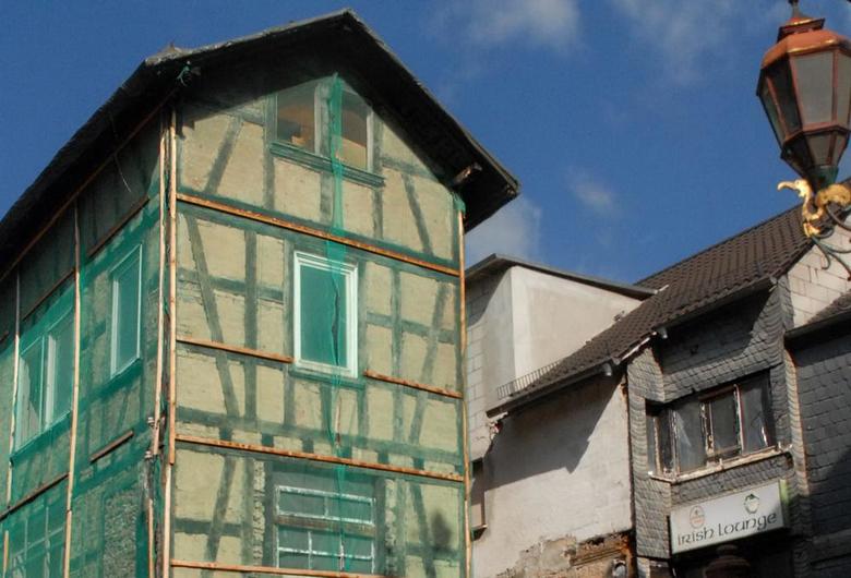
Franken Architekten was commissioned to renovate an existing building into a home and studio on Rittergasse in the heart of Alt-Sachsenhausen, but preserving the run-down, three-story building turned out to be prohibitive from the perspectives of economics, construction, and even architectural history. So the architect and client decided to demolish the building and create something new that would nevertheless fit in with the small-scale, village-like atmosphere of the district. The building’s scale and façade had to integrate themselves successfully, so the architects duplicated the form of the existing, simplifying it through the removal of the roof overhangs and tying them together with a stone base.
Photo and Drawing: Franken Architekten
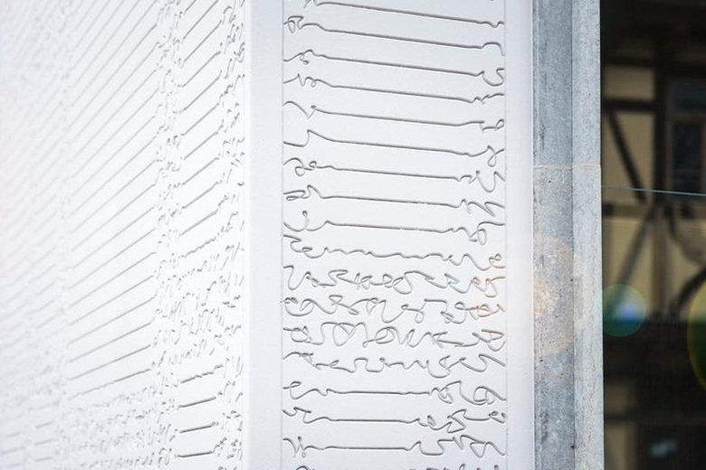
But it's above the stone, in the plaster walls, where the architectural delight is found. For the façade, Franken Architekten employed the notion of the afterimage – the effect of staring at an object for a length of time and seeing a blurry or faded rendition of it after closing ones eyes. So a fuzzy picture of the demolished building (visible at bottom) would be produced in the new building, but an image that would be blurrier the closer one gets. To achieve this, a computer algorithm scanned drawings of the original to create a new drawing of parallel lines and inserting a "parametric jitter" each time it crossed the trusses. The below video, though in German, illustrates this process both in drawing and in fabrication.
Photo: Oliver Tamagnini
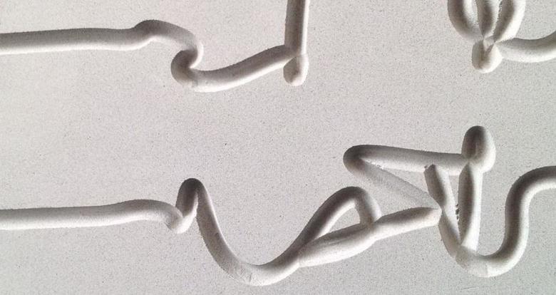
The transition from drawing to material reality was seamless, since the jittery lines were milled into the plaster panels using a CNC (computer numerical control) router. The architects opted for StoDeco plaster panels, 144 of them with joints patched to create a seamless effect, so the panel joints do not compete with the lines expressing the old building's afterimage. Furthering the overall effect of the façade is its monochrome finish, which makes the afterimage a subtle effect, rewarding those who take a longer look at the building, rather than just a quick glance.
Photo: Eibe Sönneken
Photo: Franken Architekten
相关文章
-
Spotlight on Italy
on 2018/5/16
-
Bologna Shoah Memorial
on 2015/7/20


