A Pyramid Veiled in Brick
Expanding a famous museum that so happens to also be an industrial icon in brick requires an expressive architectural solution. Herzog & de Meuron achieved a balancing act with a new building for the Tate Modern that is elegantly linked to its South Bank London surroundings.
Project: Tate Modern Expansion, London, 2016
Client: Tate, London, GB
Architect: Herzog & de Meuron, Basel, CH
Partners: Jacques Herzog, Pierre de Meuron, Ascan Mergenthaler (partner in charge), Harry Gugger (until 2009)
Project Team: John O ' Mara (Associate, Project Director), Kwamina Monney (Project Manager), Ben Duckworth (Associate), Christoph Zeller
Manufacturer: GIMA, Marklkofen, DE
Product: NF/DF clinker, TM2 color
Façade Engineer: Ramboll UK, London
Façade Consultant: Billings Design, Dublin
Façade Area: 11,790 m²
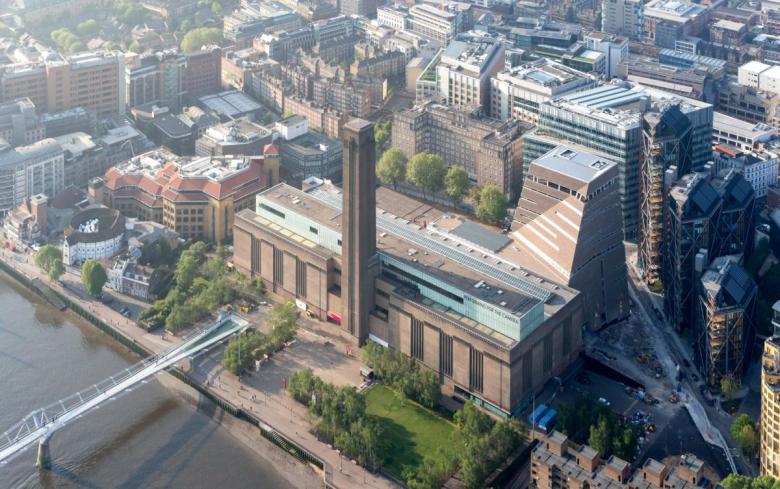
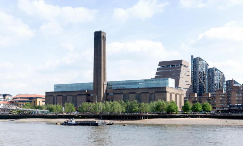
Since 2000, the Tate Modern has enriched the city of London and the more than five million people who annually visit the museum. The former Bankside Power Station – an impressive edifice situated on the South Bank of the Thames and matching the height of St. Paul's Cathedral across the river – was converted by the Swiss architects Herzog & de Meuron after they won a 1995 competition. Since then it has served as a model for the conversion of similarly oversized structures. Although the site of a power station since the 1890s, the brick building is more recent than one might imagine: It was built in 1952 per a design by Sir Giles Gilbert Scott, who was responsible for the Liverpool Cathedral, the Battersea Power Station (part of a mixed-use redevelopment now underway), and the city's world-famous red telephone boxes. The 200-meter-long Bankside building was built with a steel frame and covered in bricks, in a sort-of industrial neoclassical design with an unmistakable chimney facing the Thames. With its transformation from a power station into an art museum, the large turbine hall gained the most attention due to its impressive size and being used a setting for specially commissioned artworks.
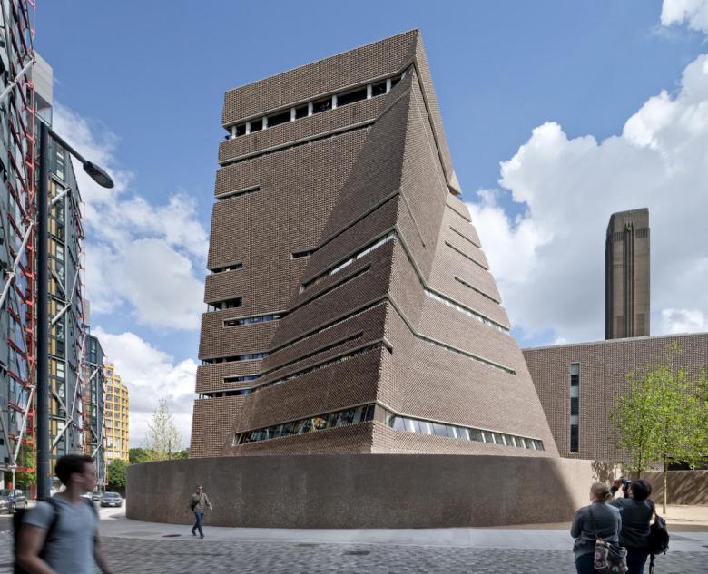
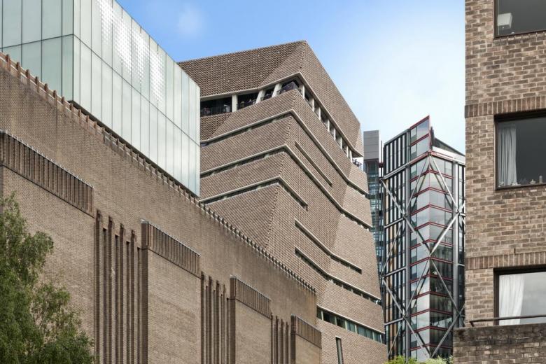
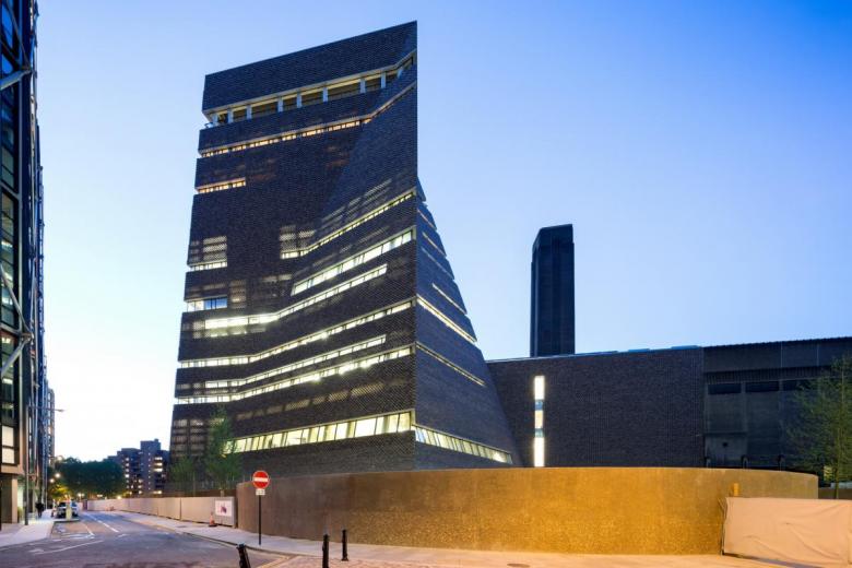
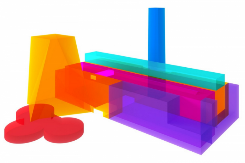
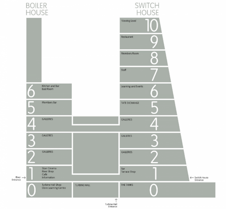
With the Boiler House, as the 2000 transformation is called, quickly reaching its limits in terms of capacity, an extension was deemed necessary and a competition was held in 2005. Needless to say, Herzog & de Meuron ably won and got the chance to add to their earlier creation. They developed a design that is sited behind the Boiler House and takes up the architecture and material language of the original but translates it into an unexpected form. While the architects excavated the Turbine Hall to create a grand public space, the extension sits atop clover-shaped subterranean oil tanks that now serve as an exhibition space. Above this grows a truncated pyramidal form, "generated from the combined geometries of the site context and existing building," per the architects' website. Called the Switch House, the extension's design responds to the need for it to be visible to visitors approaching from the north via the Norman Foster-designed Millennium Bridge, yet without it moving into the foreground or competing with the iconic chimney. As well, the architects strove to create a building conglomerate rather than distinctly different phase-one and phase-two buildings.
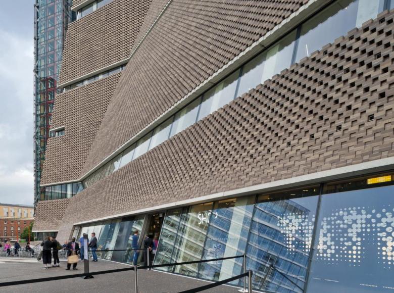
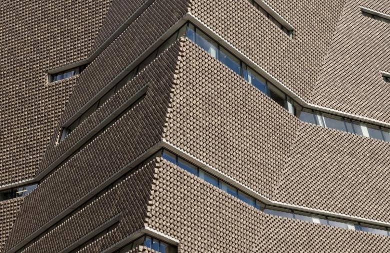
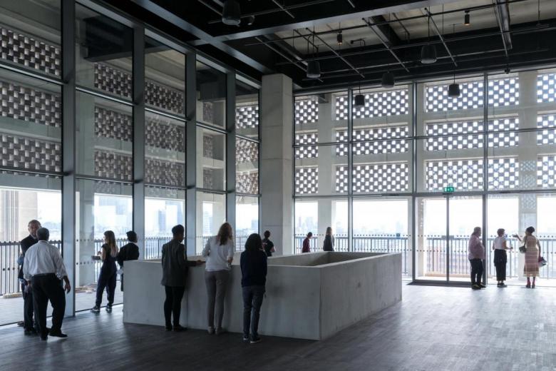
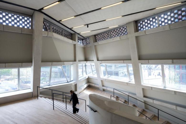
Thus, the Switch House was clad with special bricks that echo those on the existing building, but it does so in a completely new way. The clinker bricks from GIMA have a basic size of 215mm square with a height of 69mm. However, instead of being laid in the conventional manner, the bricks were assembled into modules, each made up of two bricks held together with mortar and laid following the principle of a bracket-mounted, rear-ventilated facade. In order to adapt the masonry to the building's three-dimensional form, the façade was divided into sections and the 336,000 clinker bricks of 212 different types were joined to the substructure in blocks with stainless steel pins and synthetic resin joints.
A few different types of brick were specified for the faceted façade: Staggered bricks for the perforated areas and for vertically closed areas; flush-mounted bricks for the vertical and angled closed façades; and individual bricks and cut-to-size bricks for the edges and folds where the inclined planes meet. In order to achieve some uniformity, the bricks were produced in batches with a pre-defined percentage of light, medium, and dark dyes to provide some apparent depth. Thus, the bricks form a kind of veil, one that acts like a filter during the day and through which the light shines from within in the evening. Yet the veil is lifted, in essence, at precisely placed horizontal slots to allow for impressive views of the city, distractions from the art inside.
A version of this article originally appeared as "Verschleierte Pyramide" on German-Architects.
