13. 九月 2018
Photo: Hufton+Crow
Kengo Kuma's V&A Dundee, opening to the public on 15 September 2018, is one of the most anticipated openings of the year. A branch of London's Victoria & Albert Museum, V&A Dundee is also the first design museum in Scotland and a key component in Dundee's urban regeneration. Ulf Meyer visited the museum before its opening weekend and filed this report.
Project: V&A Dundee, 2018
Location: Dundee, Scotland, UK
Client: Victoria and Albert Museum
Architect: Kengo Kuma & Associates
Floor Area: 8,500 m²
Photo: Hufton+Crow
Along the Northern bank of the Firth of Tay, the Scottish city of Dundee reveals its urban panorama. Above the brown water of the River Tay towers an equally brown silhouette of characteristic sandstone facades. In the 19th century, Dundee was the heart of the jute industry. Even if jute bags are currently experiencing a renaissance as an alternative to vinyl shopping bags, the times of the jute industry in Dundee are long gone and the port, which used to cut the city off from the water, long ago lost its function. As part of a waterfront redevelopment that will cost over £1 billion, Kengo Kuma — the most prolific Japanese architect of our time — has designed an unusual museum devoted to design.
Photo: Hufton+Crow
Inaugurated on 15 September 2018, it is Scotland‘s first design museum and the first branch of London’s Victoria & Albert Museum. Kuma won the architectural design competition for the V&A Dundee back in 2012 (against 120 architects from all over the world), but some design changes were necessary after the budget nearly doubled from 45 to 80 million pounds. Scotland covered 25 million pounds, but the UK government and lottery had to shoulder the rest.
Photo: Hufton+Crow
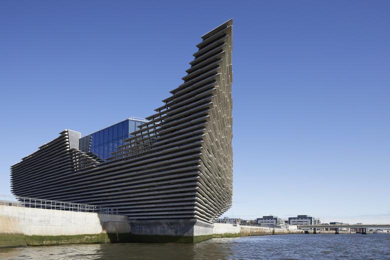
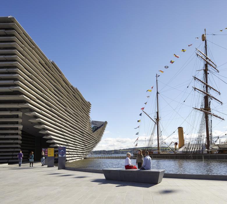
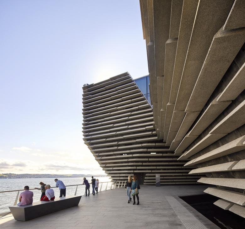
Kuma made it his goal to translate “the beauty of the Scottish North Sea Coast into architecture” and he succeeded in that. It was equally important to create not a pure object, but instead a building block of a larger urban transformation for Scotland’s fourth city. Kuma has labeled his first completed building in the UK an “urban living room.” The best views of the facade's scraggy texture are to be had from the other bank of the Tay or one of the two bridges that span the Tay.
Photo: Hufton+Crow
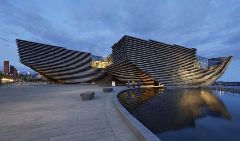
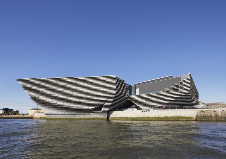
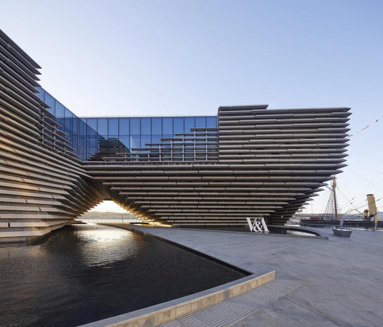
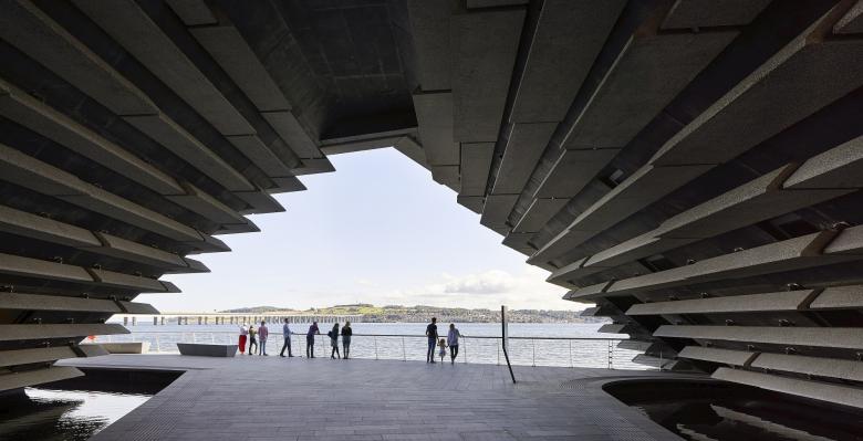
Like the granite cliffs along Scotland’s rugged Eastern coast, the building has no true silhouette — it has a “wild, raw and strong” shape, to use the architect’s words. The facade is made of 2,500 prefab pieces of sandstone that are attached to the black concrete walls. From nearby, the detailing seems rather rough. When they partially cover windows behind them, they act as brise-soleil elements. At nighttime the shape of the new museum is accentuated by integrated lighting design. During the daytime the building mirrors itself in a water basin that it stands in. The gaps at the bottom frame views and create entrances, while the cut outs on the top floor create roof top terraces.
Photo: Hufton+Crow
The building is made of concrete, and although its structure and geometry are quite tricky, it is not a look-at-me building that demands to be marvelled at like the Guggenheim in Bilbao. That is not to say that Dundee, a city known to have the highest unemployment rate in the United Kingdom, would not mind if the new Museum gives the city an economic shot in the arm. In order to achieve that, the building would need to prove itself to be a lasting international magnet, an anchor for a new urban quarter. The commercial buildings popping up around the new museum are already threatening to act like a corral, hiding the new jewel from the flaneur’s view. The urban design proposal for the new Dundee, designed by Keppie architects from Glasgow, lacks a certain refinement, unfortunately. The new museum is not only twisted to add visual excitement to what is essentially a black box, but also to point to the Caird concert hall in downtown Dundee.
Photo: Hufton+Crow
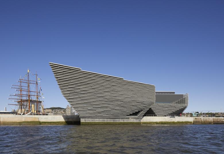
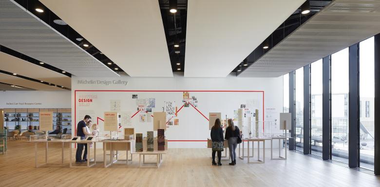
Inside the new V&A, a permanent exhibition about Scottish design shares space with traveling exhibits. The inaugural show, called Ocean Liners: Speed & Style, features the design and cultural history of the Ocean steamer. It seems a little exchangeable; Dundee did not play a role in the development of the Great Steamers and therefore the show could have been displayed anywhere. The three-masted sailboat Discovery, once used by Scott and Shackleton for their Antarctica expedition of 1902, is anchored next door to Kuma’s new museum, adding a nice contrast between the delicate masts of the ship and the cliff-like shape of the introverted museum.
Photo: Hufton+Crow
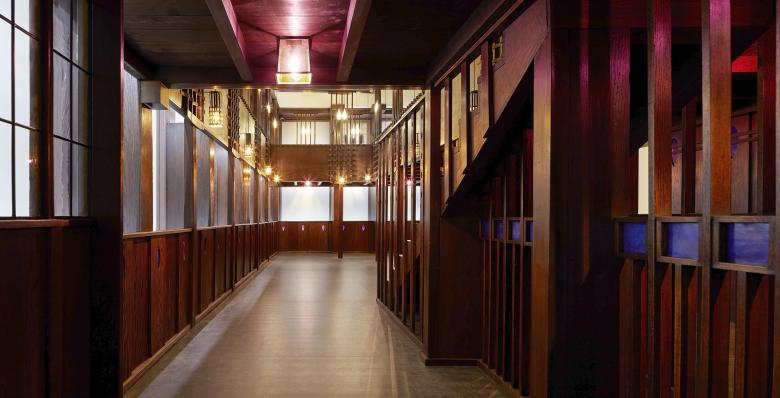
There is a local, “bonus” exhibit to be discovered inside: Charles Rennie Mackintosh’s famous Oak Room has been restored for the new museum including all panels that were once crafted for the Tearoom in Glasgow in 1907, commissioned by Miss Cranston. In 1950, the Ingram Street building it occupied was acquired by Glasgow Corporation and the tearooms were used for storage. When the building was slated for demolition in 1971, the Oak Room was saved. The 600 pieces have been restored, at a cost of £1.3 million; this may seem like a lot of money but it is well worthwhile. Mackintosh was greatly influenced by Japanese art, and thus the tearoom builds a cultural bridge to the Japanese architecture of its shell. Also, because the most famous building by Scotland’s most famous designer — the Glasgow School of Art — burned down, Scotland’s design heritage has been stripped of one of its most important treasures.
Photo: Hufton+Crow
Traditionally, Kuma does not see himself as a vain “starchitect.” His designs are often anti-grandiose, preferring lightness, transparency, and permeability over solidity. The preference for vague and ambiguous architectural spaces is deeply Japanese. In Dundee, Kuma did not seek a “contrast with the environment”, as he says, but wanted to “be the translator of the voice of the place.”
Photo: Hufton+Crow
In Dundee, Kuma designed a tall atrium, clad in oak louvers of varying lengths, as the central heart of the museum. Slim, dotted panoramic windows bring daylight into the foyer and allow for some glimpses of the water and scenery outside. A continuous bench invites visitors to take a seat before stepping on black limestone steps to head upstairs. Philip Long, the director of the new museum, agrees with Kuma’s take on a contemporary museum, when he says that he wants “people to understand why design is important to every aspect of our lives.” While the idea of turning the former docklands into a new design-themed urban districts seems a little 1980s, it has worked so well in other cities with access to water that there is no reason why this tested formula shouldn’t prove to be viable in Dundee as well.
