Hachette Livre Headquarters
Vanves, 法國
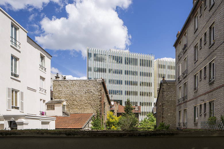
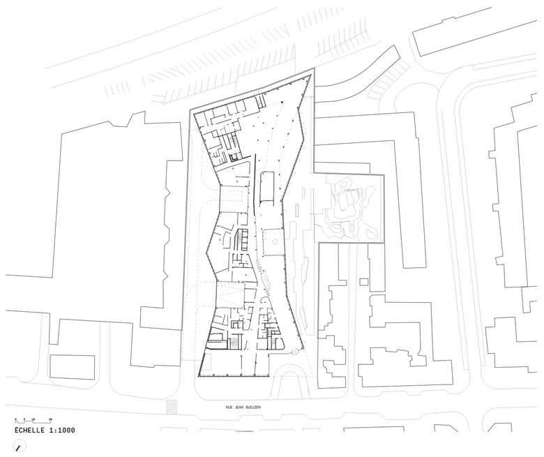
The complexity of the site called first of all for a detailed constructibility review. All constraints were modeled on the current PLU (plan local d’urbanisme – local urban development plan) – building heights, street alignments, distances from buildings on neighboring plots – in order to obtain the greatest possible constructible volume. From this potential form, an initial model was developed, enabling us to define the various design options possible under the current regulations, as well as possible adaptations that could be envisaged in the event of the PLU being revised.
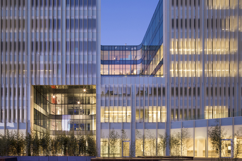
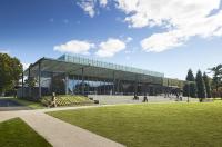
Two key choices were very quickly identified. First, since the most visible angle of the site is in the northwest corner, this is where the main entrance and esplanade are located. From this corner, the western façade deflects inwards, away from the site boundary, freeing up a generous outdoor area: here, we proposed to create an extraordinary green space, the papyrus garden, on to which all the building’s communal areas, reception spaces, show spaces, dining areas, and so forth, would look out.
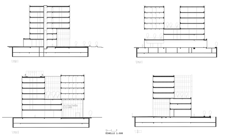
From these starting points, we then developed a number of design options, all of which sought to take into account not only the urban dimension but also the way in which people would work in and use the building. The offices all benefit from direct daylight and outside views, and form what could be regarded as the building’s "inhabited envelope." All the façades are fitted with a second "skin' in the form of a giant slatted blind, which filters the natural light. In this way, the façades are perceived as independent units, eschewing the mundane appearance of a traditional office building and creating a strong urban architectural image.
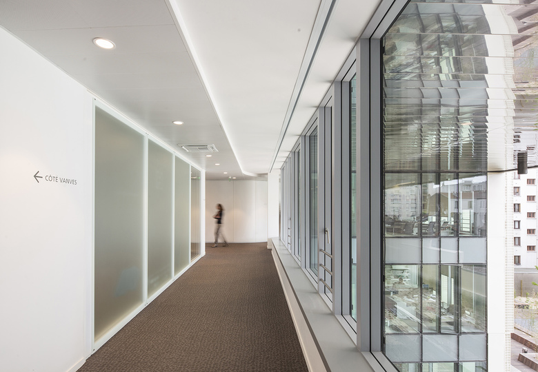
At the heart of each floor, we have combined user flows and all the other functions of the project in a single fluid space. The interior of the building is the polar opposite of a conventional corridor lined with a monotonous array of doors on either side. The unique floor plan allows for a variety of flow options, and consequently also a flexible and adaptable distribution of spaces between the group’s various publishing houses and imprints across each floor. The result is a generous communal space, punctuated by loggias and patios, that links together a series of different atmospheres, encapsulating the individual personalities of the different entities present.
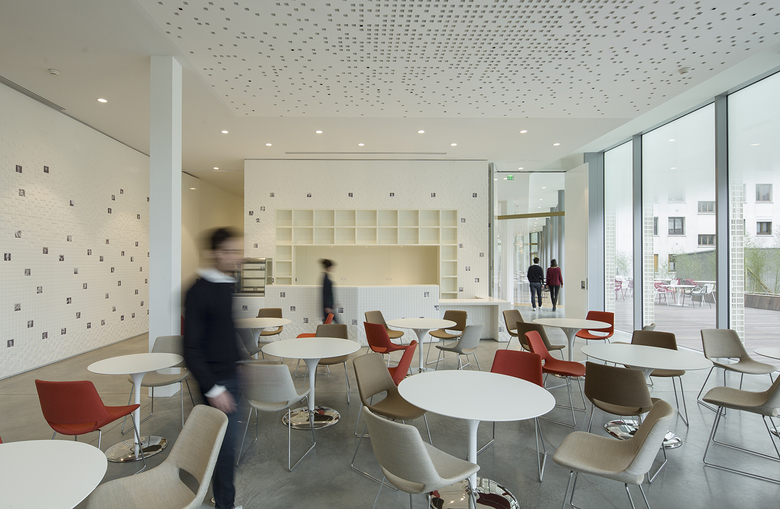
The core zone that concentrates the bulk of user flows forms the center of gravity of this fluid space, linking it directly with the cafeteria and restaurant, which look out on to the papyrus garden, a unique landscape in the Paris region and an open-air extension of the ground floor in the summer months. This garden, with its curtains of vegetation, not only forms a remarkable landscape but also creates a certain distance from the surrounding environment. While private, the garden is hinted at from the street, and accompanies the visitor from the esplanade through to the entrance hall. It creates a memorable image for outside visitors and the building’s occupants alike.
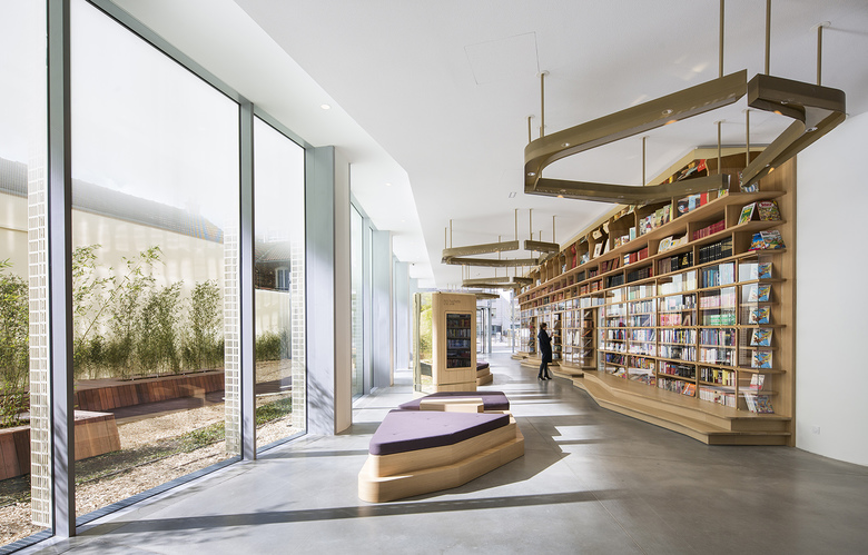
Visitors enter the building via the bookcase gallery, where a number of showcases display recent publications and illustrate the history of the group’s various publishing houses. After leaving the reception area, they can access the upper floors via the central core. VIPs, on the other hand, are led through to the reception gallery, a cosier and more intimate extension of the bookcase gallery. This opens on to the boardroom and a meeting room, which, in conjunction with the adjacent cafeteria and restaurant, can be adapted to accommodate all kinds of events and activities. In the reception gallery, a VIP lift serves the top floor, where the rooftop pavilion, an additional meeting and dining space, is located. It is set in the heart of a second papyrus plantation and boasts views up to the sky, creating a serene, sophisticated reception space.
- 位置
- Vanves, 法國
- 年份
- 2015
